

Minnesota Flag Redesign

Entry posted by Jean Valjean
1,179 views
 I come from Iowa and Minnesota, and I hate both of their flags. Yet, they both have so much potential to be cool. The principal flaw of Iowa's flag is that it has its name written on it (which means that it has failed as a symbol), but also it has writing on a ribbon held within the beak of its bald eagle. The eagle is actually incredibly cool; the writing is not. I love that the flag is designed to look similar to France's flag, actually, and that shows some interesting heritage of the region, so it has that going for it. Basically, I would keep the eagle and the French tricolor, and I think that it would be a pretty awesome flag. I would be proud of that flag and want my coffin to be wrapped in that flag. As it stands, no.
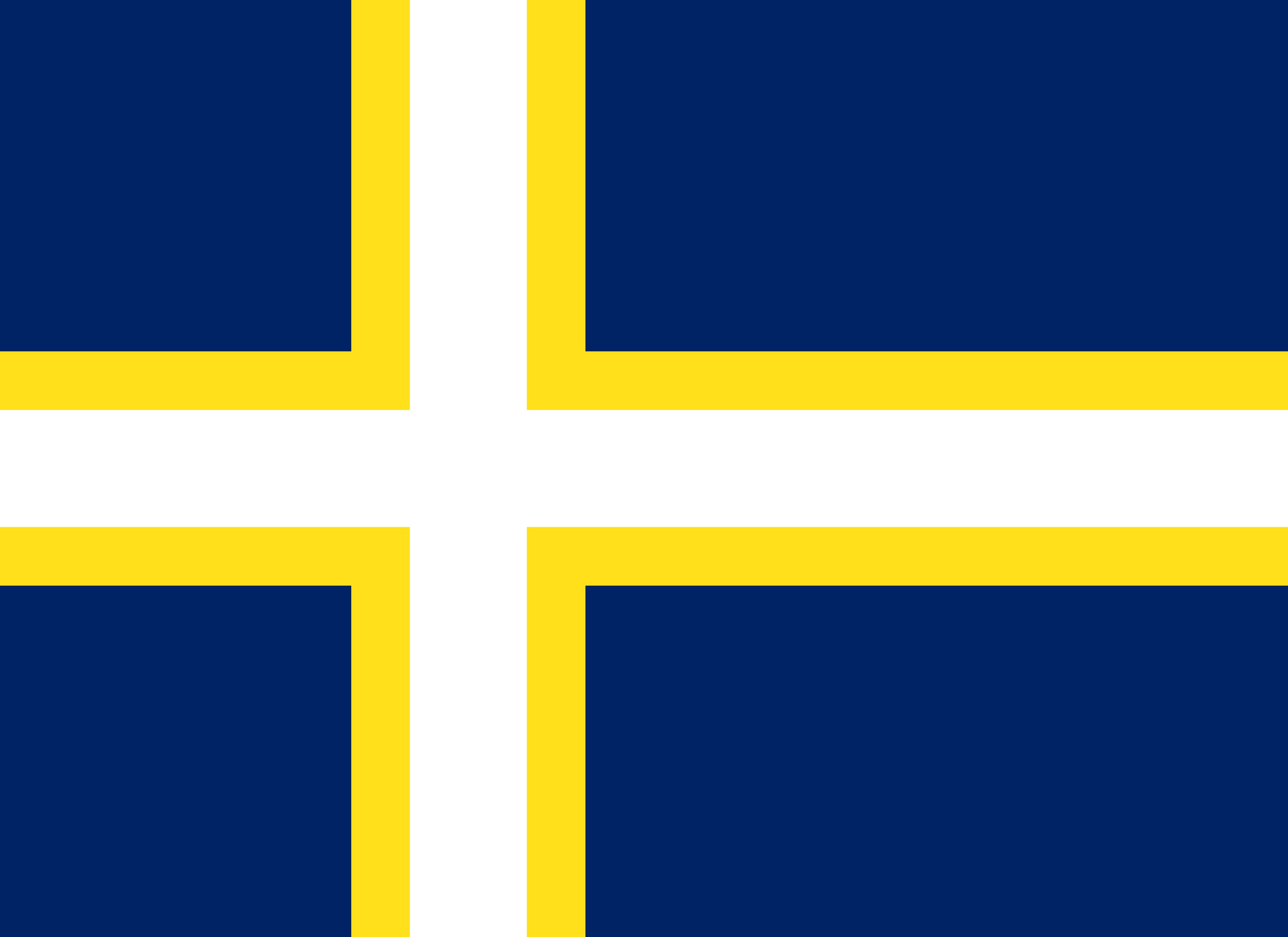
The Minnesota flag looks pleasing enough, but it's pretty bad from a designer's point of view. A child can't draw it, and it requires a quite a few differently colored fabrics in order to produce the seal in the center. Like Iowa's flag, it also has its name written on it. That has to go. Every bad flag has the elements of a good flag in it, though, and really, when you look at it, the only elements that you need to keep are the navy blue field, the yellow bordering its seal, and the white of the field surrounding the shield. If you stick to just those three, I think that you have colors that Minnesotans can get behind.
So here's my redesign of the Minnesotan flag. There are a lot of Norse people here, so I based this sketch off of the Norsk flag, and I used its proportions. There's also another significant chunk that hails from Sweden, and the largest sports team is called the Vikings, so in general I liked the idea of basing the flag off of a Nordic design.
Unfortunately, where this design falls flat is that it doesn't represent the German and Irish, and it doesn't reflect the growing Hispanic and Somalian populations. Because of its failure to represent literally all of Minnesota (in fact, it doesn't even represent the majority, since the Norsk and the Swedes combined only make up about 27% of the population, although that's a higher proportion than other states), I highly doubt that the state were to adopt it. I still like it better than the current flag, though, and this was my best idea. I think that it looks nice.
24601
5 Comments
Recommended Comments