Jump to content
  • entries
    47
  • comments
    248
  • views
    47,936

Matoran Anatomy Sketches


They

850 views

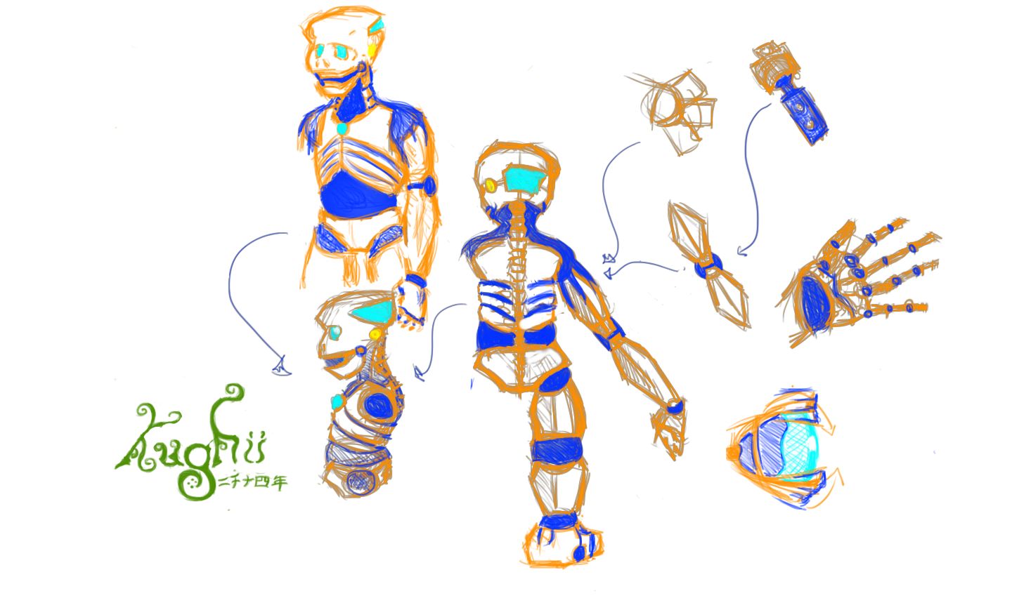
I really didn't want to put this up in the art forum because, hey, it's really just a sketch (or a dump, whatever you prefer to call it is fine), but I was just doodling around on the Wacom and getting the hang of digital medium art and suddenly realized I'd begun drawing an anatomy concept for matoran in the BZPRPG, where characters are far more organic than in TLG canon. Orange is inorganic components, cyan is eyes, heartlight, and brain; yellow for auditory, and deep blue for organic components. Hopefully in a couple days (more like weeks), I'll have something a little more detailed including possibly an organ sketch, dermal view, and action poses.


320px-Matoran_Anatomy_Dump_A.jpg

(Click for Full Size resolution.)

  • Upvote 1

2 Comments


Recommended Comments

That's actually pretty cool. It would be awesome if you did make something with organs included.


Even though it is supposed to be more organic than canon Matoran, it looks to me like a good representation of them anyway (except I'd put more pistons and the like on, sort of similar to mechanical muscle tendons).

  • Upvote 1
Link to comment

Interesting design, and good proportions. I typically liked to style my own Matoran drawings after the 2004 Matoran shapes and proportions. 2001 Matoran were cute, and 2003 Matoran did a good job beefing them up while maintaining similar body proportions, but I feel like the designers realized after Mask of Light that more lifelike proportions were more conducive to animation.


I wasn't nearly so fond of the increase in height in 2008 — I preferred the slightly dwarfish legs of the 2004–2007 Matoran, since it made the characters look short even without a Toa standing next to them for comparison. The BIONICLE Stars did a good job demonstrating why this was necessary. Unless you compared them to previous sets like the 2006 Piraka or 2009 Glatorian, there was nothing about their size or proportions that looked unusually small. Of course, this worked to the Stars' advantage — not so for the 2008 Matoran.


This drawing of mine from 2009 shows the Matoran and Toa designs I sought to emulate in my drawings at the time. I used those proportions for this Macku drawing which I'm still fond of, as well as my Jaller drawing from the BZPower Flash Fire contest.


I look forward to seeing what other drawings you might create based on this one. I'm curious, though: what do this Matoran design's feet look like? I hope you keep the two-toed look that characterized all Matoran from 2001–2006, as I was fond of that.

  • Upvote 1
Link to comment
Guest
Add a comment...

×   Pasted as rich text.   Paste as plain text instead

  Only 75 emoji are allowed.

×   Your link has been automatically embedded.   Display as a link instead

×   Your previous content has been restored.   Clear editor

×   You cannot paste images directly. Upload or insert images from URL.

×
×
  • Create New...