

Vector Art In Powerpoint: Quality, Inexpensive, Easy
Entry posted by bonesiii
2,385 views

Today the Bones Blog presents the method I use to produce quality vector graphics with Powerpoint. I'll organize this by basic tools and concepts you need to understand, using screenshots to illustrate key aspects. Click image thumbnails for full images -- these contain important details too. Also note the cursor is auto-removed in these printscreens, so sorry for any confusion that causes.
Part 2 is now available here: Coolifying With Powerpoint Vector Art
Powerpoint as a Vector Graphics Program
Many people have asked me how I make art such as my "Coolified Stuff" (see bonesiii_topics), and curiousity goes up when I say I used Powerpoint. A lot of people think "Powerpoint" means words in a slideshow designed to bore employees and students to death. If you read any basic description of Powerpoint, you will be hard-pressed to even find a mention of graphics creation.
It can actually do a large percentage of what high-end vector graphics systems like Macromedia Freehand or Adobe Illustrator can do. This is great, because those programs are very expensive -- Freehand is listed on its website as 400 US dollars, for example -- but Powerpoint comes automatic with Microsoft Office, which most PCs have standard. It is about as close to free as you can get. Many of you probably already own it.
I have used both Freehand and Illustrator, though I cannot afford to own them, and it is certainly true that if you want to get into professional graphic art, Powerpoint ain't gonna cut it. However, the most important tools those programs offer, Powerpoint can replicate easily, so when you buy those, you are paying for many extras you probably will never use, especially if you just want to make an avatar for your BZPower account that will be too small to make out many details anyways. So, do consider those programs, if you have a lot of disposable cash, but otherwise, Powerpoint is far more accessible.
Note that this guide will be written for PC use. I hate Macs.
 Much of what I'm going to show you is a little harder with a Mac, despite what their ads might lead you to believe. Not even sure if Powerpoint comes with these options for Macs. But Mac users can make the best out of this, hopefully, figuring out the closest method to use. (For example, the Macs I've seen have no right mouse button so you have to hold down the CONTROL key on the keyboard to get the rightclick menu. Ugh.)
Also note: The banner for this entry shows some of my favorites I made with Powerpoint. Note that the upper left hand image was an old avatar made with a different (raster/pixel) program, that isn't included in this guide as it's a rare program; I used that image for inspiration while making my currect av, which you can see in the center. To the upper right you see half of the new Reference Keeper Team shared account's avatar, and to the lower left you can see the original coolified Rhotuka drawing.

One final note: I had planned to use an avatar request from Great Being #1 as the example of this entry, but I've run out of time and space to add it in, and as I went it was clear I could illustrate how to do this easier with simpler things made from scratch. Sorry, man.
But there's so much more to the actual coolifying process, I plan on making a second entry focusing on that. When homework lets up again... in the distant future... 
Polygon/Freeform Tool
Powerpoint has a whole range of various graphics tools, most of which you are probably aware of, such as drawing a square or circle. But one tool in particular is the key to vector graphics -- the polygon tool; also called the "Freeform" tool.

Click for full image.
Here you can see the "lines" toolbar with the freeform tool selected. In the full image, you can see how to get this toolbar; go to Autoshapes, Lines, then click the top part and drag out of the menu to make the toolbar stay in easy access. You can snap it into the bottom of the window with the other buttons or move it anywhere in the work area. I prefer to move it out right next to what I'm working on; easier to grab it.
Also note where the zoom control is (the red arrow in the image above). You'll want to zoom in a lot, like 150% to 300% to draw your shape, so that when you zoom out to printscreen when you're done, any jagged edges in mock-curves will look curved, and just so that you can more easily control the mouse as you draw. Pay attention to what the line thickness looks line in the final zoom, the size you want your actual image to be, not the thickness when you're zoomed in.
Before Using the Polygon Tool:
Two important settings must be fixed before we can continue:

Click for full image.
Make sure these options are turned off. The grid forces each click into rigid squares that make artistic drawing nearly impossible. By default the first one is on, so you'll have to fix that every time you make a new file.
Also, be aware that each time you make something with the tool, you'll have to select the tool again to make a new thing, so you won't accidentally make a new polygon everywhere you click, heh.
Four Polygon Abilities
There are four main abilities of the polygon tool.
1) Click, release, move mouse, click release again, so you create a polygon. Close the shape by end-clicking where you started, or finish the unclosed line by double clicking. This is what I use most.
2) Hold and drag to draw with a pencil. Only use if your hand-mouse coordination is strong. When you release it generates a polygon roughly in the shape you drew. I never use this.
3) Filled areas -- usually, close the polygon and a fill color comes up automatically. Settings can also create this and manipulate it in some useful ways. I use this with gradient effects to create mock-3D surface lighting effects in my coolified avatars. Double click an object or rightclick and select properties to get to the color options.
4) Edit points (right click on a made object for menu) -- after you've drawn something, you can edit the points of the polygon, even make them curve points, to fix minor mistakes without needing to start over, or even to reshape the shape completely. Sometimes I only put down two starting points and draw totally with this option.
Here's an ubercheesy example of all four:

Objects (Autoshapes)
When you draw a shape with the polygon tool, the square, circle, or any other Autoshape tool, it becomes an object. It is not pixels like in Paint -- that would be raster art, but this is vector. These are mathematical formulas that can always be selected, moved around, modified, even after you draw other shapes.
Click an object you've made to select it. It gets eight white dots around it, plus a green dot at the top. Right click it for a menu full of options, the most important being "Format Autoshape."

Here are three major things you can do with an object just by selecting it and clicking something:
1) Hold and drag to move it around. Hold Shift to force its movement into straight lines up, down, or to the sides.
2) Drag the white dots to expand or shrink the object. Hold Shift to keep the shape undistorted as you resize it from the corner dots. Side dots stretch/compress it sideways.
3) Drag the green dot to rotate it. Hold Shift to snap its rotation into the major angles like 45 or 90 degree angles.
(The result of the above is #4 in the image below)

Click for full image.
Click on white space or another object to deselect an object.
Here are some of the basics of the Format toolbox for objects:
1) Fill Color options. Select from preset colors, mix your own, and more. More on this later.
2) Fill Transparency. This can create cool effects with backgrounds. Note that any lines of objects behind will show through, which sometimes creates problems with complex multi-event objects such as my avatar -- if I made that transparent at all, lines of the skull would show through the mask, which would look weird. But used carefully, this is cool. Also, more on this in the color section later.
3) Note you can also type in an exact transparency.
4) Line color. Similar options as the Fill color, except minus some features since lines are one dimensional.
5) Line thickness. I usually go with the standard 0.75, but sometimes if you're making an exceptionally large artwork, you'll want them thicker. Or thinner for tiny details, etc. Note that the line thickness is relative to the zoom, not to the artwork itself. If you zoom out far enough, the lines look way too thick compared to the artwork itself, as you can see in the second of the following images with my avatar art. More on this in the Printscreen section below.

Click for full image.

Grouping
Multiple objects can be combined into one by grouping them. This makes manipulating a whole group much easier as you can select everything in the group with one click and reduce the chance of mistakes that would move one part of the whole artwork where you don't want it. Here's the details on grouping:
1) Select the objects you want to group. You can click and drag a box over them, as shown in the example. You can also click one object, then hold down Shift as you click each object individually. Sometimes there might be one object in the box range that you don't want to include, so the clicking method can be used to avoid including it.
2) Rightclick, go to Grouping, and click Group.
3) This shows the grouped ubercheesy skull object.
4) Click object inside the group to manipulate only them. Hold Shift to select multiple parts of the group. This option you will use less often, because you can do the same thing without grouping, but it can save time once you've already grouped something and you realize there's more to change about it.
5) The results of manipulating parts of the groups -- a color change, obviously.
6) You can also ungroup by rightclicking, selecting Grouping, and clicking Ungroup. If you want to move parts of the artwork around related to other parts, you'll need them to be ungrouped.

Click for full image.
Fill Color Options
Note that I've drawn a polygon and a circle (with the actual circle tool) for this example.
When you doubleclick an object or rightclick it and select "Format", then click the Fill Color menu, you get the following:

Click for full image.
You can select those colors, or select No Fill to remove the fill.
If you click "More Colors..." you get this toolbox with two tabs, "Standard" and "Custom":

Click for full image.
Controls of those are pretty self explanatory.
If you click "Background", whatever color the background of the slide is set to will fill the object you have selected. Not that useful.
If you click "Fill Effects", you get this toolbox with four pages. This takes some in-depth explaining. First page has four main uses:

Click for full image.
1) Gradient. Most useful one. Gradients are one color fading into another. You can use this to create lighting effects, to an extent. Note that they cannot be curved in Powerpoint polygons, though -- this is the one main weakness Powerpoint has compared to the expensive vector art programs. Used carefully, though, it can still create roughly 3D lighting illusions, as I have shown with my coolified stuff many times. Just depends on where you put the gradients. Somtimes gradient objects with no lines can be effective, placed carefully in radiating formations to create an illusion of a curve. Here's a quickie example:

2) Preset gradient. Try these out; they can sometimes be useful. Most of them contain more than two colors, which is impossible to create on your own with Powerpoint (at least not in one object).
3) One color -- darkness or lightness gradient. Works off of the color you selected. Can be useful in shading effects.
4) Double Transparency. This one is very useful; you can have one color non-transparent, but have the other totally transparent to create all sorts of cool effects. Perhaps the coolest is if you use the "From Center" option in a circle or oval with the edge transparent (trying "From Center" with all other objects gives an awkward squarish effect, but not so with circles/ovals). Can be used to make shining effects too.

The second page of the "Fill Effects" toolbox has a selection of textures to choose from.

Click for full image.
Here's the Full Selection of Default Textures. You can also import other textures. Sometimes I draw my own textures with my other program and import them.
The other two pages of "Fill Effects" are self-explanatory so I won't bother screencapping. Patterns are made of just two colors. Not that useful, at least not with "cool" in mind. Picture is useful if you have a photo or other such image you want to use to fill a shape, though I can't recall ever using it.
BZP Blue
One of the most important colors for BZPower avatar creation is BZP blue, the color that's exactly between the two slight variations of background blue in BZPower posts (for some reason, the two slightly different colors alternate with each new post, though it's hard to tell). This color can be used as a background sqaure for av art in powerpoint, like with the examples you see in the banner for this blog entry. Then you can make it transparent with a gif program later, and all pixel fading on the edges looks natural still when such an av is used on BZPower.
BZP Blue's RGB settings are Red 237, Green 244, Blue 252.

Symmetry
Usually you want both sides of your artwork to look identical, although of course there are exceptions. When making most Kanohi, symmetry is essential. It's virtually impossible to draw symmetrically on your own -- the trick is to draw only one half of the artwork, on a vertical line, then copypaste and flip the half to form the complete shape.
For example, when I designed the Kanohi Ehkuata, the mask of Reference, I began with a square (use the square tool) colored BZP blue. Then I put a vertical line (using the line tool and holding Shift as I drew it to make sure it's perfectly vertical). This gives me an artpad on which to work:

Then I used the polygon tool to draw the parts of the mask that touch the vertical guideline, clicking on the line to start, and clicking on the line to end. Note that this gave me an unclosed shape, so by default it had no fill, as you can see in the first image below and the second showing it without the guideline. So I had to go into properties and give it a fill -- this can be done without closing the shape. These unclosed parts are essential to the final product, as it makes sure there's not a mysterious black line going down the middle of the final mask.

I drew the rest of one half of the Kanohi. Note that from time to time you may want to skip ahead to the copypaste step and then delete the copied side, just to remind yourself of how wide the final product will look. Many times I have drawn what I thought looked reasonable when I was only looking at one half, but when I put the two halves together, it was far wider than I wanted it.
Then I select all of one side (being careful not to select or click on the artpad and guideline), group it, and copypaste it. It's very important that you group it before copying and pasting, as you'll see. Note my use of transparency for the visor.

Click for full image.
So now we've got two overlapping identical halves. To put them together, we have to use a few tools.
First, select both by dragging a box over them or by holding Shift and clicking both. Go the "Draw" menu, click "Align or Distribute", and click the bar at the top to drag the menu out to float. Make sure "Relative to Slide" is off, click "Align Left" then "Align Top". Now you've got both halves perfectly overlapped.

Click for full image.
Click in whitespace to deselect both halves.
Then click the top half. Go to The "Draw" menu, select "Rotate or Flip" and click "Flip Horizontal."

Hold down Shift and drag to the left until the two halves meet at the vertical guideline. Use the left and right arrow keys on your keyboard for precision once you've got it roughly in place, so that you cannot see the guideline through any crack in the middle. Be careful to use Shift and not to move either half up or down!


Then move the guideline to the back, or delete it, and stitch up the errors in overlap in the center (see below for details).
Layers
Since these are objects, not pixels, each individual object is either on top or below other objects on the powerpoint slide. You can move objects to the "front" or to the "back", or select them and move them forward or backward with relation to other objects to change how objects overlap.
For example, you might be drawing something, but realize you want one shape to be behind something you already drew. Simply draw the new shape, and send it back a few layers.
The Layer control buttons are found by rightclicking an object, going to "Order", and pulling that menu out.

1) Bring to Front
2) Send to Back
3) Bring Forward
4) Send Backward
After I've put both halves together, I usually send the vertical guideline to the back rather than deleting it, so it is behind the BZP blue square, and can be brought forward again in the right spot easily should I need it again.

Click for full image.
Now, you can see that there are overlap problems. This is because the entire left half-group is totally on top of the entire right half, and when I drew it, I must have been off by a pixel-width or the like. Rather than getting a headache trying to edit points and recopy, simply ungroup everything and rearrange the order as needed.
In this example, I select all of the "gaps" in the mask's forehead (really shapes on top filled with BZP blue), and bring them all to the front, then move them left and right with the arrow keys until their fills meet. Make sure you move both sides the same amount towards each other -- count your taps of the arrow keys.
Since all of those are now on top, nothing from the mask below will overlap it, and I can also move in the halves of the mask below that are overlapping. I also shift a few other pieces of the mask around and move them forward or back so there are no line-ends sticking out too much. Zooming out to 100%, I have a complete mask!
Printscreen it!
Zoom out to 100%, or whichever zoom makes the artwork fit the scale you want the actual image to be. Check your line widths again.
Then press "Printscreen" on your keyboard, paste the image into Paint or some other image editing program, crop it, make sure it's within av or sig guidelines if that's what it's for, and upload to brickshelf, majhost.com, or another image hosting site. Voila, there's your pic. You can also use gif programs to select BZP Blue as the transparent color. I use Microsoft Photo Editor, which has also come with all my versions of Microsoft Office (though some people who have Office tell me they do not have this; there are free online gif programs too).
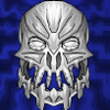
Whaddya think? Should it be my new avatar?

Post comment any questions you may have. And stay tuned, if you're not GB#1, for the guide to coolifying. If you are GB#1, stay tuned for that and your avvie.
Edit: Part 2 is now available here: Coolifying With Powerpoint Vector Art
57 Comments
Recommended Comments