

Coolifying With Powerpoint Vector Art
Entry posted by bonesiii
1,673 views

Today the Bones Blog brings a walkthrough of tips to consider when drawing vector art with Powerpoint. This is Part 2 of the two-part feature begun here: Vector Art In Powerpoint: Quality, Inexpensive, Easy. That entry focused on the inexpensive and easy aspects. This entry should help with the quality aspect, listing many important concepts I use when I "coolify", though they can be used for original artwork too. I will use an avatar request from Great Being #1 to illustrate these concepts. Enjoy!
Note that "quality" here is partly defined in my own tastes, since all I know how to do is my own style. A lot of what I'm talking about is my own definition of "cool", as previously defined by this blog entry: Ruthless Elegance: A Visual Guide to Cool. However, many of these concepts can be modified for other styles, and I will point out some techniques I use that can help with any vector artwork. If you don't see "cool" the same way I do, don't fret.
Note also: Images will follow the text of each short section, as many are quite large (but not very wide so hopefully not screenstretching). Lemme know if these take too long to load. (I was too lazy to thumbnailify most of 'em.
 )
)Order is roughly a mix of relevance, and just the order of which subject comes up in order as I drew.
Setup Artpad
Okay, here you see the "artpad" that I created in the first part of this feature. Below the drawing area, I pasted the quote from GB's PM. That is the guideline I have to keep in mind as I go. To the left I put an image of the Ignika, so I can easily glance at it as I go.
Since he's asking for a meld, I could have also pasted in a Miru pic, but I know its shape by heart so I didn't bother.

Zoom In!
Don't try to draw it at 100% zoom. I go into 300%, usually.
Note that you should click the BZP Blue square before zooming so that the new zoom will center screen right on it. Otherwise it just goes into the center of the whole slide and you'd have to scroll around to get to the right spot. Zooming always centers on whatever you have selected.
Conceptualize
It helps if you imagine what you will probably end up with before you start clicking. In this case, I knew I needed to find similarities between the Miru and the Ignika. There are a lot; they're really the same basic shape except the Miru's nose area bulges out and the cheek areas have those biggrin gaps. I noticed that there's a line on the cheek areas of the Ignika next to those serrations that could have a gap added in, and imagined from there.
So before I even clicked once, I knew roughly what the final product had looked like.
I also sketched it on paper real fast at one point. That can be helpful if you're proficient at sketching (as I am). Try not to overthink the paper version, though, because you might end up drawing something so cool you'll wish you'd done it on the comp and then get lazy for that step.
Note that if you have a scanner, you can also scan a sketch, paste it into Powerpoint, and draw lines directly over it. I have done that for some coolified Kanohi.
Spikes
Spikes are the key, IMT. What I love about sets like the Piraka or masks like the Ignika itself is spikes. It's a central concept to my style of "cool", and it's also very important for "coolifying".
The Ignika has some spikes, but right off the bat, I notice that the four in the mouth area and three at the top could use extending. So I draw them sharper and longer.

Serrations
Serrations, like on the sides of the official Ignika, are another key to my style of cool. Serrations are basically three or more parallel ridges or the like.
As I drew, you can see I originally put some "gap" serrations on the forehead. Dropped 'em later, but that's a type of serration too; long gaps arranged in parallel. Also used on tons of my coolified Kanohi. Serrated rectangular prisms, flat, are used on the sides of the mask later.

Mock Curves
You might recall I said that in the Edit Points mode, you can make a point on a line into a "curved point". This alters the mathematical formula behind the vector object to make the line literally curved.
However, it's tedious when you're manipulating ten thousand points. If you're drawing a company logo, you would use that feature in a professional vector art program. For making an avatar, it's pointless because 64 x 64 is too small to see that kind of detail. Even 100 x 100, my avatar size, is too small.
So you can make "mock curves" by simply clicking enough dots in a curve shape to mimic the effect when you zoom out. I never use actual curve points anymore. Too complex for free stuff.
Use the Edit points mode to make any slight corrections needed if the result accidentally looks too "cornery" to you.
This image goes back in time a little compared to the last one but it illustrates the concept. The dotted red line is a point I was moving when I printscreened:

Line Coherence
The above looked horrible IMT -- but it was fine for the moment because I got something down on paper (as it were). The beauty of vector art is that you can change anything you drew just moving points around, unlike pixel art. But why did it look horrible?
Because there was no "line coherence". Coherence is a fancy term for not being a blob. If you look at a sword, it might have a curved line, but that curve is steady along its width. It doesn't waver wimpily like the goofy cheek area in the above attempt at the mask. The word also strongly implies that different parts of the same mask "line up" in ways that make the whole thing seem like a whole, rather than a conglomeration of different parts. Strong curves, lines, angles, and lining up those things all come together to form "coherence".
So I edit points like mad until the whole thing feels "coherent" to me.
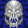
Notice in the final mask in the banner: the outer edge of the cheek gaps lines up (continuing the curve) with the outer edge of the eyes. The inner edge of the gap next to the eyes lined up with the outer edge of the mask, and the outer edge of that gap lines up with the outer edge of the lower half of the mask. The mouth spikes all line up, and their outer edge forms a rough 90 degree angle with the lower edge of the upper half. A rough curve exists between the points of all the lower end of the spikes. Etc. All of this contributes to the mask's coherence.

Strength
Speaking of strength, remember that this style is supposed to be "ruthless" elegegance. But as I went, I realized those chin-spikes looked more "dainty" than ruthless. So I thickened them, and made the sharp "blade" point more like the number 7. Later I realized it needed to be even thicker and the thickening of it increased its appearance of strength.

Detail vs. Space
There are two conflicting ways to go with any given flat surface area. You can add detail, or make it "smooth", making a space with no detail other than maybe a gradient or texture, etc. Both are important.
Detail can give a piece of art a greater sense of reality. If I make some details of a coolified Kanohi too small to totally make out in the zoomed out view, it creates the impression of a real object that you could see more of if you zoom in. Compare the final avatar with the banner for this blog entry; you might see a few details in the zoomed-in banner that you can't quite make out in the avatar.
Space on the other hand can give the mind a sense of peace. If you just throw a pure wall of detail at someone, especially if most of it is too small to make out clearly, you just confuse them. Might even give 'em a headache. If you zoom out and have to squint at the screen to see your artwork, you need more space. Cut stuff out.
This is always the hardest aspect to balance when coolifying, especially with the 64 x 64 avatar limit. I much prefer making avs for 100 x 100, but only staff can use those.
As I went, I realized that I was trying to put too much detail on the forehead of this mask. Even after I cut some forehead serrations (that I forgot to printscreen), when I zoomed out, I had to squint. Had to edit several times. Helps to do so when you're very tired and your eyes are getting blurry at night, BTW.
Even the final version of this might have too much detail; I'll leave that for GB to judge, heh.
Usually these aren't problems with big art though.
Set Autoshape Defaults (Color, etc.)
Note that as you draw, you can right-click an object and select "Set Autoshape Defaults". If you do this with a green object with a black line, those settings will become the "default" for when you draw a new object. Useful since you want your whole thing to be in some color other than that weird bluegreen Powerpoint has as its default. This way you don't have to keep editing the colors of every new shape you draw.
This will reset every time you make a new file.
In the example, you'll notice that I had started out with blue, which had been the default for the objects in the last blog entry (I'm using the same file, obviously). GB hadn't given me the color he wanted until this point, so I had to edit them myself once he did.
Then, I set the main green as default, and every object I made was this color. Note: still requires modification sometimes with gradients or shading or cast shadow objects, but in general it's easiest.
Gaps
You can "poke holes" in a mask by simply drawing a gap on top of it. That is, draw a new object in the shape the gap would be, and then just make it the same color as your background.
Note that this isn't possible with any kind of gradient, texture, or image in the background, unless the gap is tiny enough that you can recreate the color from that part of the gradient to estimate. In general, use it only for solid color backgrounds like the BZP Blue background in this example.
3D Thickness
Remember you're drawing a 3D object. This might be a lot harder to do for a beginner than I can identify with, having been drawing 3D for years now, but basically, pick up a piece of plywood sometime and hold it at an angle. Notice it's not just a 2D piece of paper, it's got thickness.
You can draw that sort of thickness into a Kanohi or other similar things with thin polygons drawn on top of gaps' edges. In terms of layers, these "thicknesses" on the eyes are actually above the BZP Blue objects that form the "gaps".
Gradient Shading
3D objects with curved surfaces have a gradient "shading" effect (not to be confused with a shadow; shading is on the surface of the object itself). You can mimic this with Powerpoint gradients that start with your main color and blend into a slightly darker version of it. With symmetrical objects, it's easiest if you simply aim the darker side of a gradient fill towards the outer edges of your mask or whatever. In this example, it is as if light is cast onto the green mask from directly in front, so the parts to the sides are dimmer.
Be aware of diagonal gradients too. Also, to convey a concave shape, you can flip the gradient so brighter is on the edge and dimmer in the middle. I use that for mouth areas sometimes with Kanohi to convey that the chin is jutting towards the screen. Not used in this example.
Cast Shadows
Use a transparent black object with no line over parts where a light from slightly above would cast a shadow onto other parts of your artwork.
In this case, I wanted to convey that this is half Miru, and Miru has a far-jutting nose area, so I used a cast shadow under that area, transparency about 80%.
Be consistent -- if you use cast shadows in one part, pay attention to where else one would realistically be cast.

Size
Remember the zoom -- and that the size of each part might look big as you draw it, but when you zoom out to the real size (like for a 64 x 64 av), that part might look tiiiiiiiny.
Was the case with the mouth area ridges on this mask. When zoomed out, I could barely even see them, so I had to enlarge them by more than double the original size. I did this in this case by Editing points and moving the outer edge points of each spike out even farther.
This same concept helped judge "Detail vs. Space"; there was a lot more line detail around the eyes originally, but when zoomed out, I could see that that made the area look too "small". So I cut some of that detail, and it created the impression of larger parts.
You're drawing a germ through a microscope. Keep that in mind.
Ruthless Revision
If a part of your artwork is looking ugly, don't be afraid to change it or cut it completely. Be your own worst critic as you're making it. You should design it to please yourself above all, since that is pretty much the only thing you can be an expert on. So be honest, is something you just made displeasing you? If so, change or cut.
I cut almost half of what I drew with this mask, and the final shape is a lot different than what you see in the earlier pics. Maybe a grand total of 20 points are untouched out of the whole 200 (or whatever) since I drew them. Estimating wackily, but you get the idea. Even then I was not yet done, as the below is not the same as what you see in the banner or GB's avatar:

"Proofscreening"
You write a story, you proofread. You draw something that's designed to be printscreened, you "proofscreen." That is -- by all means, printscreen when you think you're "done", but don't let the ruthless revising stop there. Be honest -- once it's put into the final image, does it really look perfect? If not, is there anything you can still do to improve it?
In this case, I again went back to the powerpoint file and widened the mouth parts once more to what they are now, even after I had actually uploaded one version to brickshelf and was about to PM it to GB. It just wasn't right yet.
So I widened them, and went through the whole printscreening process again. Might sound tedious, but get it over with while you still have the file up, or you'll probably never go back to it. Don't let the "but I thought I was done!" idea discourage you from putting out your very best. Of course, if it's 11:30 at night and you have homework, like me right now, do call it quits and call it best job possible (for now). But otherwise, fix it. Shouldn't take too much longer.

Also, one note about printscreening. It can be hard to get the line thickness juuuuuuust right for the zoom you need. Not to mention getting the zoom exactly right. (Remember the line thickness is not related to the size of the artwork, so if you zoom out, it seems thicker, maybe too thick.)
So if you have a good program that can resize images without distorting them too much, feel free to printscreen a little larger than your final size, and shrink it a little. Remember to hold Shift to make sure its width and height stay undistorted. Also, if there's an "Anti-Aliasing" option, make sure it's turned on.
(That program that I use for pixel/raster art is iPhotoPlus 4; just a prog that came with an old (now deceased) scanner. It roxors, but as far as I know, few have it, and pretty sure it is no longer available. But there are tons of other programs out there that can do simple resizing, including Microsoft Photo Editor, which, as I mentioned before, sometimes comes with Microsoft Office.)
Aaaand, all that done, here's the final mask in two zooms:

And here's the actual avatar, background turned transparent and converted to a .gif in Photo Editor, as sent to GB#1 already:

ZOMG that's cooler than I ever imagined thanks Bones.
You're welcome.

22 Comments
Recommended Comments