

.ppt Face Contest Winners!
Entry posted by bonesiii
1,290 views
The time has come to announce the winners of the Powerpoint Faces Contest! This was an awesome contest, with so many great entries that Ojhilom and I agreed we couldn't just judge by the usual percentage of entries, but instead by a par of work, quality, and craftsmanship put into the entries, keeping in mind that avatars were the goal of this. So as long as it looked up to good avatar quality, we accepted it.
As such, we ended up choosing seven top winners, eight other winners, and only four entries actually lost. It just seemed right since we didn't get hundreds of entries but the 15 winners obviously put a lot of work into it. Now, the catch here is, there are only seven top winners, and this isn't just a title -- it comes with a surprise bonus prize!
With many many thanks to Black Six for approving this, the top seven winners will receive 80x80 avatars!
Also, many thanks to Black Six for uploading all of the winning avatars to BZPower's server! You guys now do not have to worry about any outside image hosting site having downtime or going offline -- as long as BZP is running so your posts can be seen, your avatar can be seen too.
 (Of course, this only applies to these avs.)
I'd also like to thank my brother Ojhilom for helping me judge these entries. Wasn't easy to do!
And without further ado, here's the winners!
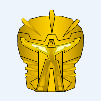
1st Place
Member: Ary
Avatar Link (to be used ONLY by this member).
Any bio info: A picture of Ary.
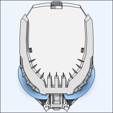
My comments: The top three winners here are all super-super excellent. It was very difficult to decide what order to place them in. Ary gets the first spot because it's the best overall package and the best art in technical terms. It is a "coolified" Bohrok head, but not just with my usual method of coolifying -- it works by exaggerating how large and small certain parts of the Bohrok are, turning the eyes into curved eyes, and showing the whole thing at a very steep angle, making it the Bohrok look very intimidating, similar to one scene that stands out in my mind from the 2002 flash anims where a Bohrok bent its forehead forward like that and gave that well-known growl.
The art is perfectly done, and what's more, it looks awesome in avatar size, yet when you zoom in, you keep seeing that Ary filled in more and more detail. You can't even appreciate all of it fully at the zoom shown above. He's got the lighting and shading done perfectly, and the wide empty area also gives it a sense of space that makes it work for avsize despite how detailed it is. There's even a subtle backwards glow effect on the eyes that makes the center look darker rather than traditionally brighter, making it look even more intimidating. This perfectly captures, IMO, why Powerpoint can be used, with skill and work, to produce art virtually up to par with super-expensive equivalent programs -- it deeply impressed me. Sheer awesomeness, Ary!
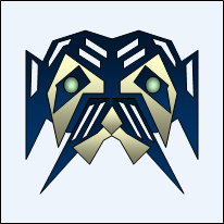
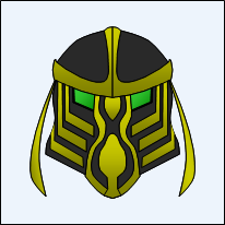
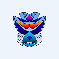
2nd Place
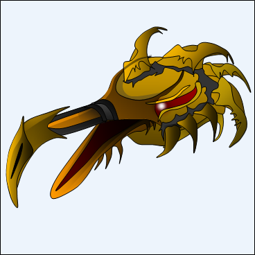
Member: Rangan Mercenus™
Avatar Link (to be used ONLY by this member).
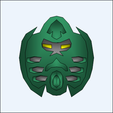
Any bio info: Named Firefly (Ta-Miruan). Ancient, powerful, Gukko-esque creatures, with an omnipotent mind and a shrill matoran voice. This Bird is one of the few remaining species, almost on par with species wide extinction, they are in hiding, waiting for the shadow to come...
My comments: Rangan entered this before most of the other entries. When I saw it, my jaw literally dropped and I stared in amazement for a few seconds. I'm frankly at a loss to describe how awesome that bird head is. Wow. Until Ary entered I thought it would be impossible to beat. However, though it doesn't show up in avsize, there is an erroneous line in front of the forehead tuft thing, and really those tendrils probably shouldn't be going down only one side of the head there as it appears (the back of the head between the first two tufts, and the forehead, should be lower). They are very minor errors, just enough to push him down to number two.
The great parts of this? Dang. Everything else? The color scheme is perfect and creates a very creaturey look, the texturing looks just right of a balance between organic and coolified, the glowing eye makes it distinctively Bionicle -- and these things together make it look worthy of appearing in a Bionicle movie. IMO it's cooler than the MOL Gukko by far. There's a complex lighting system going on that you might not notice at first, that is following the shape in near-perfect 3d mimicking, although it could do with some shading on the lower right side of the head (my right, not its right). One thing you can't see in this that I got to see when he sent me the .ppt file was that the jaw was added seperately, always a good idea, so theoretically it could be animated to work like an actual jaw.
Must mention this too -- Rangan also entered an awesome Kanohi of Madness. I really couldn't decide between the two, since that is awesome too. I had to have him choose via PM which of the two he preffered. Rangan, if it's possible, I'd love to include that mask sometime in my fanfics as a "Rah-Kanohi."
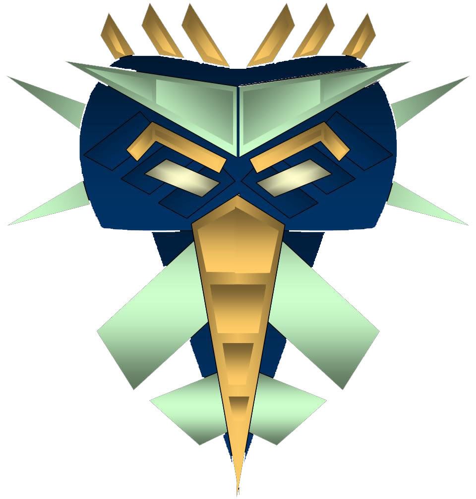
3rd Place
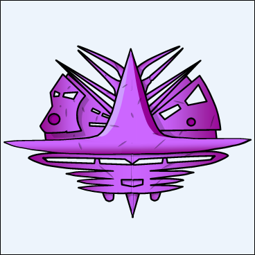
Member: Thormen
Avatar Link (to be used ONLY by this member).
Any bio info: It is the Kanohi Krunoch, the legendary Mask of Chaos. It is not just sentient, it is also schizophrenic, wrecking chaos in the mind of whomever dares to wear it.
My comments: I heart the Krunoch. There had been some debate going on recently about Chaos working as an element suggestion (which I would definately support for evil element). Thormen's entry here captures the awesomeness of chaos. Purple is the best color choice, definately, for one. The whole thing forms a Vahi-esque mask shape with the eyes being the gaps between some of those spikes at the top (I'm not even sure which spikes, and that's good, considering the theme). Yet there are four other faces stuffed in there.
There's great lighting on the whole thing, with an edge effect making the mask looked curved like a bowl with the edges farther from us than the front, and the lighting on the center thing. There's a subtle modification of one of the spikes. The center thing actually forms a sort of sombrero (Hey, I know how to say that in Spanish, can you guess?) over the lower face, which looks like a Pakari. The faces to the right and left look very 2001-ey. Plus there's the simple tiny face stuffed in on the left side of the sombrero. But the best detail doesn't even show up in the av-size; those scratches. Gives the mask a great texturey look and, again, fits the theme.
The main flaw is that his use of 3D stops with the lighting; there really oughta be thicknesses in the eye-gaps and the like. Also, for the sake of the avatar size, that sombrero spread so wide the rest of it looks kinda small. Won't be so bad now with 80^2, but it is a problem. Also, it's a shame about the scratches not showing up in avsize, because that is an inventive idea. So Thormen gets third place, but believe me, all three of these are so close to equal it's unbelievable. This worked out great since I promised the top three would get featured directly in a sidebar. Awesome work to you too, Thormen!
And BTW, I'd also love for this to be the mask of Chaos in my fanfics if you approve, Thormen -- I've already planned that as a Legendary in there but planned nothing specifically after that. Pwetty pwease?

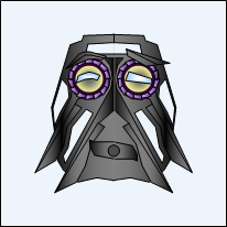
4th Place
Member: Atako
Avatar Link (to be used ONLY by this member).
Any bio info: N/A
My comments: Atako entered three neat ideas. I almost went with his Miru, but Ojh and I finally agreed that this "modified Pakari" was better. The pic above speaks for itself as to why. But I'll say it anyways because I want giant paragraphs that torture you guys horribly upon readifying.
*ahem* I have never seen anyone do plastic so perfectly as Atako does here. Notice there are no black lines at all, unlike all of my own work and the top three (and all the other) winning entries. This, combined with incredible attention to lighting, makes a near-photo-quality plastic mask. For that alone this had to be a goldstar winner. Now, look at the curvy serrated gap area. Now, repeat after me: "Wow." I honestly could not tell until I zoomed into 400% (Powerpoint's max standard zoom) that those parts were drawn as vector and not real plastic. Hugo Kudos!
Now, it's not one of the top three because there are a number of big errors here. Mainly, just about all of that awesomeness is lost in the av-size, and this was an avatar-related contest from the start. Look closely at the eyes and you'll see it pretty much has to be a single eye, and it doesn't look intended to be a cyclops. There's gray mysteriously behind the eyes, but nowhere else -- where's the rest of the head? These negatives are unfortunately enough to push it down to fourth.
But that doesn't negate the awesome, awesome job done with the lighting and texture, so this goes no lower than 4th! And BTW, your other masks were pretty good too, Atako!
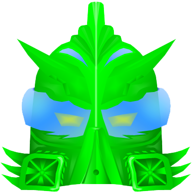
5th Place
Member: ~~Zarkan~~
Avatar Link (to be used ONLY by this member).
Any bio info: The Kanohi Maleka, the Mask of Size.
My comments: Judging by his comment when he entered, Zarkan will be surprised he's ranked so highly. And I do have to say, the next three's specific order wasn't worried about too much as Ojh and I thought they ranked about equally. But there are three reasons why this is #5, aside from the fact that I just plain love the shape -- it looks like a turtle, and I heart turtles.
First, it's the exact opposite of Atako's mask above -- it doesn't look super amazing zoomed in as big as above, but click the avatar link and look -- it looks awesome in avsize. One of the things I was looking for in this contest was avs that designed well to avatar size, since I announced that beforehand (and 80x80 isn't super larger than normal). Of the entries that work well small, this is IMO the best.
Second, he makes use of a shading technique inside the gaps of the mask for the cast shadow on the gray head behind that I hadn't thought of. It's the standard rectangle center gradient effect, but aligned just right for this position. I had always used overlayed trans-black for shading myself, which isn't as cool looking as this.
Third, I think this shape is one of the most coherent and striking in the contest. It has a slight resemblance to a Pakari (like #4), but is different enough that it's not super-obviousa and looks like it could work as a Mask of Size rather than strength. The whole shape flows together perfectly yet has plenty of variety.
It could be improved by some light-reflecting lighting like Rangan's bird's beak, a glow effect on the eyes, better handling of 3D in the center/mouth area, and a better mock curve on the outermost edges. But these are all cosmetic and weren't enough to push it lower on the winners' list.
And Zarkan, I'd love this one to be in the Paracosmos also, if it's okay with you. Was planning a BP mask of size since 2001 but all my previous designs stunk so never worked it in anywhere.
6th Place
Member: Zyglakky Yoshi
Avatar Link (to be used ONLY by this member).
Any bio info: N/A
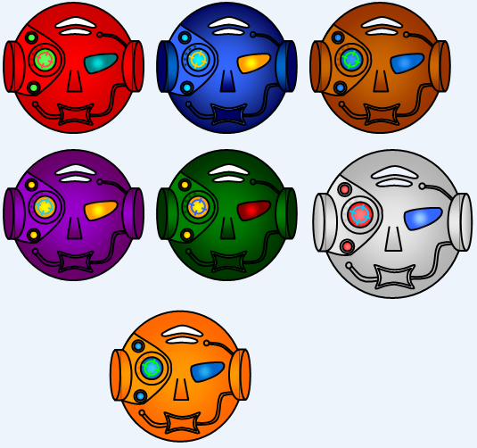
My comments: Zyglakky grabs spot # six in a way I completely didn't expect -- not so much for the single mask itself, but for the overall work he put in. The slightly larger white mask above is the one he chose as the actual winner, and he didn't actually enter anything else -- instead, he recolored the mask in a variety of ways -- some not even shown above -- in Powerpoint. I have never bothered doing recolors in Powerpoint because it is tedious work. If you've never tried it you can't appreciate just from looking at the recolors how complex it can be. And he did it tons of times. I've selected a set of six including the white one above to look like the standard six elements, plus one that looks Bones Bloggish.
One of the other reasons he places so high is the inventive use of the target reticle. Makes perfect sense for a vision-esque mask. He actually assumed it wouldn't show up in the av-size and didn't include it in the recolor for his av, but as 80x80 avatar IMO it looks nice, although I admit it still doesn't look as good as the fullsize.
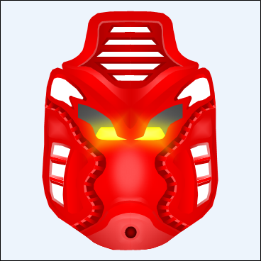
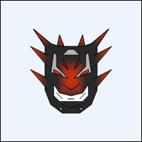
7th Place
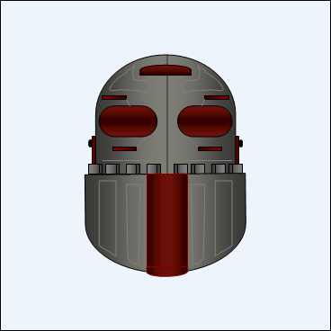
Member: Mr. Mord
Avatar Link (to be used ONLY by this member).
Any bio info: The Kanohi Mâhne- The Great Mask of Adaptation.
Known wearers- None.
Power- Obviously stated. Acts like adaptive armor. Also makes the wearer look like a fool.
My comments: Mr. Mord places seventh with what I think is unquestionably the weirdest entry in the contest. It looks very old-school robot, villainesque perhaps. He's using a few good effects here, including 3D serrations, edge-effect lighting, dark-center eyes, and a new effect, slightly lighter lines decorating the surface. The latter makes it look nearly realistic as a metal material and is the main reason he gets the last of the seven 80^2 avs.
This could have been improved by a more purposeful eye shape; that would have been enough to place it 6th or even 5th. But even without that, he gets a larger av!

8th Place
Member: Bepura
Avatar Link (to be used ONLY by this member).
Any bio info: Bepura's character's mask, the Bevokai, Great mask of limited invulnerability.
My comments: Here we start on the other winners. The level of quality I was looking for here was up to basic par for an avatar that I might actually post in an Artwork topic for people to use if I had made it. I daresay many of my avs are higher quality IMT than some of these entries (
), but still, all of the following work perfectly as small avatars and so they claim a spot on the winners' board as well. But yall get stuck with normalsized avs, sorry. 
Bepura's entry here is a pretty much flawless mask design for a small av. There's only a few hints of details that you see on zooming in, but he makes up for it by filling the rest of it with an oak-leaf style serration collection. Better lighting and 3D thicknesses would have enabled it to place higher, but that doesn't detract from how cool the mask looks IMO. Alas, you can't all win Goldstar level.
9th Place
Member: Adventurer
Avatar Link (to be used ONLY by this member).
Any bio info: N/A
My comments: This is one of Adventurer's oldest faces, made back when the original guides were posted. It showcases his very tribal style well, and of the three he entered, it was the best IMT. His entry#1 was pretty good too, but wouldn't have looked good enough in either av-size, IMO. For the record, Adv, I was a little disappointed you didn't enter several of your others, which I would have places higher, namely this and this. Still, this face catches your style just as good as them; it would have been for more technical reasons that the linked concepts would have ranked higher. All of your work is a very unique style compared to most of the entries, just like Atako's entry, and that deserves big kudos alone; you've made .ppt "your own" as TV talent show judges are so fond of saying.
10th Place
Member: Toaraga
Avatar Link (to be used ONLY by this member).
Any bio info: His favorite mask.
My comments: Toaraga claims 10th place with a literally last-minute entry (although since he had PMed an earlier version of it to me already I would have accepted it anyways). This is a very set-accurate Matatu (my favorite power from 2001, incidentally), but it takes a very "Paper Mario" twist on it that works well. He was in danger of placing a lot lower from his first draft which was a lot simpler, but this creates a unique look, perfectly done, and manages to present its own style as well.
What I would have done to improve this is first, the cast shadow is needed behind the eye gaps too, and then add a sliver of reflected-light along the upper and leftmost edges of the mask itself, sortof coolifying the Paper Mario esqueishness. Adding a gradient effect to the lighting and maybe a shine on the left-upper-most corner is also a trick I would have done. Those additions would have made it more technically correct and at the same time, shown more clearly that the flat look was intentional (I'm not even sure if it was; but I like it anyways
). If it looked striking enough this might have placed goldstar. Note, though, that Toaraga gets a 100x100 av because he's a staffie.
Probably worked out best ranking semi-low since 80x80 wouldn't exactly be special for him. 
11th Place
Member: Toa Talvak
Avatar Link (to be used ONLY by this member).
Any bio info: N/A
My comments: Toa Talvak entered three neat ideas including a caterpillar head thingy and a wolf head; I had to give him his choice of the winner as I couldn't decide. This mask is probably the best choice anyways since it is the most Bionicle-esque. This is a another mistake-free entry that's good for the higher range of other winners, but could have used more lighting and some 3D thicknesses. It's a simple but great entry that looks great as an avatar.
BTW, I do have to say that if this hadn't been a "Bionicle-style" contest, the wolf's head would have definately been chosen because it would place higher. It roxorz.
And same with the caterpillar thing. However, it IS a Bionicle style contest, so that's why I saw those three as roughly equal and gave him the choice. Good drawing on all three, Toa Talvak!12th Place
Member: Nuju Metru
Avatar Link (to be used ONLY by this member).
Any bio info: Mask of Life.
My comments: Nuju Metru claims 12th place with an Ignika. Now, this one actually disappoints me because at first glance I actually ranked it as a Goldstar winner. Ojhilom warned me that it was out of proportion but I didn't quite see it. I was noticing that it obviously took a fair amount of work and pulled off a great Ignika, that IMO was the clear winner of the three things he entered. Unfortunately, that was just because of my blurry sizing down of his entry image to estimate its size -- when I got the .ppt file, I realized that the line on the upper left serration thing was too light, and the proportion WAS off in the mouth area (compare the right side to the left). What's more, when I ungrouped in an attempt to adjust the line mistake on the forehead, I realized he had apparently been working with text objects instead of normal shapes, so I couldn't click on it -- something else in front was blocking it. To work around that would have been more my work than his, so I couldn't justifiably do it.
So this one moved down mainly because those errors show up glaringly with 80x80, but in normal size they're not quite so glaring. So in a weird way, it's a good thing for the entry. Now, these errors ARE kinda small when you consider that it's a very striking Ignika shape overall. So it's definately a job well done -- just for future reference, Nuju Metru, try using the Polygon tool and reading the Symmetry section again in my guides, as those things would have avoided these difficulties.
I must also take some of the blame here because if I'd listened to Ojh maybe I could have picked one of his other two entries in time and it could have placed higher. But I ran out of time, I'm afraid.
13th Place
Member: Bundalings the Bunny
Avatar Link (to be used ONLY by this member).
Any bio info: The Mask of Alternate Paths, not to be confused with the Olisi.
For instance, you come up to a fork in the road, and you don't know which way to go. Just activate the mask, and you can see what will become of your decision in the near future. You find that one way you'll walk into fog and plunge off a cliff and find yourself in a swamp full of angry Makika toads, and the other way goes to the Matoran village.
It is flawed in one aspect however: it can only see a limited way into the future. It may be that if you fell in the swamp, you would defeat the toads and find a cache of Kanohi, so in the end it's a better choice. Making decision while using this mask can be very tricky, and full of regret.
Note the Happy/Sad face, modeled after the theater faces. The idea for this mask came from my longing for a mask like this in the story, and perhaps I will include it in one of my fanfics.
My comments: Poor Bundalings gets the unlucky number.
Unless of course you're an ancient Mayan in which it is a holy number... but then they might eat you alive so yeah no thanks. Anyways, this is a neat mask shape (with a neat bio BTW). Looks similar to something I would draw. It places a little low mainly because of symmetry "sewing" errors (the worst of which I did remove for the art above and for the avatar), and inconsistent use/disuse of 3D thicknesses. But it's a cool shape. Not much more to say here.14th Place
Member: xccj
Avatar Link (to be used ONLY by this member).
Any bio info: An enemy mask xccj plans to use in an epic.
My comments: xccj has shown .ppt works before, and he deserves big kudos for previously making tons and tons of Bionicle characters in Powerpoint. I had to judge based on his actual entries though, and of those, this was unfortunately the only one I thought was up to part to win in this contest. It's a good enemy mask, and like I said earlier, paying attention to working good in av-size is important, which this qualifies for. The gradients on the spikes and the face are the main reason it won; also notice how the standard rectangular lighting works well here by creating a jutting-forward-nose effect. I usually shy away from using the rect-lighting effect because I've never been able to think of a good use for it, but right here is a great use of it, similar to Zarkan's use as mentioned earlier.
15th Place
Member: Toa Z
Avatar Link (to be used ONLY by this member).
Any bio info: N/A
My comments: Toa Z claims the 15th place with an ape-like face/mask. Again, not all that much to say, except the use of gradients works well for an avatar size, and this is the second most colorful entry in the contest aside from Rangan's entry (defining color as specific colors, so different shades do count, since you have to do work to put even a single such color in), yet that color doesn't clash but complements. And it's also a cool shape.
Special Notes:
NOTE to the Goldstar 7 winners: You must PM Black Six after you apply your av to your profile to have him resize it up to 80x80.
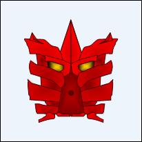
One member was planning on entering, but failed to meet the deadline. I gave Takua the Wanderer a chance to enter on the weekend (directly after contest closure and since my weekend job eats the whole time anyways), but he chose not to enter for honor reasons. Kudos for that choice though I wouldn't have faulted him had he chose to enter late.
For the record, however, if you had entered this mask, TtW, you would have placed as a Goldstar winner.
Finally, thanks again to Black Six for allowing the prize-uploading! Enjoy your avs guys!
---------------------------------------------
Enter the Second Chances MOC Contest: Beasts! Winning beasts will be featured in Bionicle Paracosmos Epic #4: Twisted Island!
Enter the Second Chances MOC Contest: Beasts! Winning beasts will be featured in Bionicle Paracosmos Epic #4: Twisted Island!
19 Comments
Recommended Comments