

New Av -- Yes, Done With Powerpoint :p

Entry posted by bonesiii
373 views

Minor entry today. I made a new avatar for first time in forever. (Now with larger avs, which is a newish staff perk, admins have to handle the sizing every time us staff change avs, and I've just been not bothering 'em. Plus I still love my old av.
 ) Just decided it was time to make a newer one.

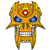
I designed it primarily to provoke the response of "You made that in powerpoint?!", and it has worked.
 Here it is a bit bigger:
For anyone who's curious, here's some tidbits on how I did it. Blog banner shows smaller version of this pic of the background and white edge border.
For the face, I used mostly the same techniques I've already outlined for coolified Kanohi style faces in my past blog entry guides (See important entries list to the right). Mock curves especially -- if you look closely, you can see that everything is angles instead of actual curves. I also used some of the lighting techniques I mentioned in the guides more than I ever have before. Translucent blacks and whites give metallic-like shading effects, and I added a ropy sort of texture to each bit of shading to make it more interesting.
Most important rule I used for this was that it was designed totally for the 100^2 image that would be the end result. So all the above-mentioned tactics are only slightly visible in the small version. This gives it almost a sense of photo-realism, because when you look at bitmapped photographs of real things, it's as if the texture and lighting texture especially are more detailed than you can clearly make out, giving the sense that if you zoomed in you'd see more of it.
Yet, I didn't waste time or space with details or accuracy beyond that, so if you zoom in much beyond that, you see that the curves aren't curves, etc.
This image shows a much farther zoom even than I drew with. You can see that a lot of it isn't as accurate as you might think just from seeing the avatar. The serrations on the teeth especially -- also, the upper eyelid actually is missing its fill.
 I liked it better that way in the av-view; made the eye look sunk in a little even though it was lidded, so I didn't "fix" it. Oh, and the lighting overlaps two of the lines on the top on accident. I thought it actually looked better that way so left it alone too. Much about art is made of happy accidents. As for the serrations, the mistakes don't show up small, so not a problem.
Another note about metallic lighting -- almost always, you want the dark edge, away from the light source, to have the extreme edge to actually be brighter, not darker. This gives the sense of reflection, and the more such "light texture" you can have, the better, as most locations have multiple light sources and objects, etc. I actually wanted a lot more light texture than I could fit in the av-view.
Actual design? I wanted something that looked much less like a human skull this time, more like my blog skull than my old av. Human skulls are good, but what I really enjoy is modifying them into something similar yet alien. And of course, here I'm bringing out the undead-ness in a different way than in the past.
Now just for nostalgia and/or progression's sake (
), here's all the avs I've had in order:


Not a giant list, lol.
And I'd list the Bones Blog skull as kinda sorta in that list before the newest one, as it's inspired a lot by the blogskull. My realistic av I always actually liked best of all these. My last one with flashing eyes was distinctive, but I rarely got comments like "wow" from that one. From the realistic one (the third), which is an edit compiled from skull photo, and a different colored real racing helmet pic, I got a lot of such comments. 
What stood out about that one to me was its "creepy" value. Half the comments were "that av is freaking me out" -- and half were "whoa, that rocks!" To get the second, you need the first, IMO.
(Plus half the first kind were saying it as praise anyways -- which I consider high praise. ) So I aimed for more of that in this new av. (And response so far is very similar to the third av.  )
)I expect I'll do different skulls in future.
So anyways. Boring entry by an artist obsessed with explaining his own work is over now. Back to normal entries soon.
-----------------This entry brought to you by:-------------------

12 Comments
Recommended Comments