

My 2009 Sets Thoughts, Part 1

Entry posted by bonesiii
602 views
Today the Bones Blog brings you the first part my reactions, analysis, predictions etc. about the 2009 sets we've seen pics of thus far. All set images are taken from the Official 2009 Story Topic and approved by Black Six for use on BZPower. This part deals with the best of the 2009 lineup (in my opinion/tastes at least) -- the Glatorian.
Please note that I only skimmed the comments and glanced at the images of the actual sets that some members have posted in the Sets Forum -- I believe it is essential that a set be judged based on its marketing images alone before such in-hand reviews are considered, as those are what really sell the set vast majority of the time, by kids and/or parents just walking down the toy aisle and picking sets whose images stand out at them. (Besides, I don't have time right now.) So if my analysis seems to be glaringly lacking knowledge from those topics to you, that is why.
Finally, note that I will try to differentiate from my personal tastes and my opinions about how most fans will react to the sets. Apologies if that is unclear in any part -- chances are if it is, I am speaking only of my own tastes and should not be construed as an insult to anyone else.
I won't comment on the hands here except to say that I strongly, strongly support this move and hope it continues and improves in future sets. I'll be doing a "History of Hands in Bionicle" blog entry soon that will deal with this.
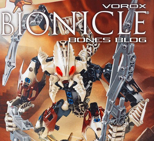
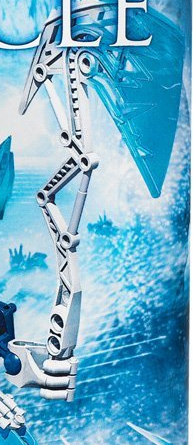
I'll begin with my top fave -- Vorox. Three things make this set immediately stand out. Okay, four, I suppose.

One. The face. Is. Awesomeness. Incarnate. Times. Five. Thousand. Million.
This is a coolified face! It is so cool, I could change virtually nothing about it when I coolified the six Glatorian faces for avs. Just... sheer perfection in terms of ruthless elegance.
Two, the scorpion tail. Plain old humanoids get old fast (IMT), so it's nice to see the return of a canister set that has a more animalistic appearance. (This most likely will make him a villain judging by patterns of both set design and kids' preconceptions we've seen before, though the arena-battle setup of 2009 story might make the definition of that a bit obscure.)
Three. The brown-doom prophets have been proven wrong yet again.
 Exactly as I predicted, Bitil's yellow represents a range of variety for canister sets, not the end of brown.
 Four -- what's more, it's both brown and tan, a color I personally have thought waaaay underused in Bionicle, and one I suspect will sell a bit better than normal brown. The blending effect between the two looks great.
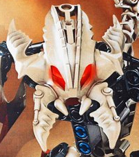
The rest of Vorox is pretty standard, except that he showcases the only new armor piece I see in the Glatorian:
It's a nice addition to the armor collection.
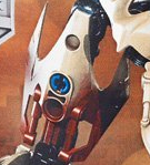
Here's Vorox's thornax projectile. It's a nice combination of Kanoka disks and Zamor spheres in functionality, and I love the idea of the spiky fruit design and story.
I predict Vorox will sell a little better than the traditional brown sets, and his rad-cool villainey appearance just might make up for the color scheme enough that he will sell on the level of the other sets. Whereas I usually predict that the brown set will sell worst of the set despite my and many BZPer's love of the color scheme, this time I think all six will sell roughly equally well.
Of course, if I am wrong and Vorox does sell particularly poorly despite all the benefits, the brown-doom prophets might become right after all and brown will disappear entirely. (One alternative would be to be cautious to only use brown in combo with a popular color like red or blue, though, which I would actually love even more.)
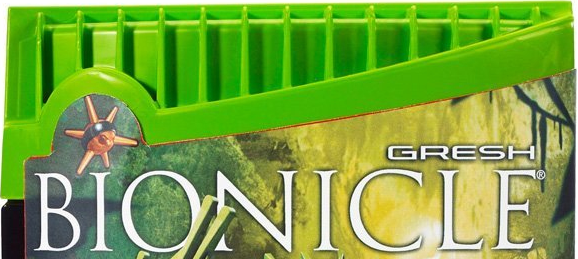
Gresh is my second-fave, due to the tool. I wanted to focus first on the canister though, as I like the color scheme of this canister best. The canister top is another fine addition to a collection -- Bionicle's canister styles have remained interesting since 2001, for the most part.
I still think Bionicle could try out the cardboard box mixed with plastic decorations style of canister through to lower the price a little, maybe even make it a cardboard cylinder -- it would still be distinctive. But with gas prices down right now that's probably not important.
Of the six canister pic backgrounds, I like Gresh's the most. Wanted to showcase the background only, so here's a view of it with every other detail blacked out:
Gresh's tool is the highlight of the set IMT and the best Bionicle tool I have ever seen. I love its resemblance to a cool leaf, as I mentioned in my Coolology entry about autumn leaves. I also like that it can be held with one half in one hand too.
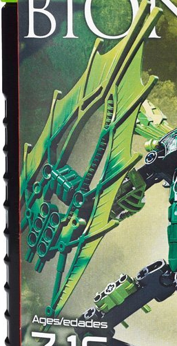
Best part about it to many people will most likely be the colored tool. Finally, finally, finally, we see the end of the silver-only trend. Yes, I know 2005 had colored weapons, but they were done so poorly for the most part (IMO) they don't really compare to the 2001 weapons. (Sorry... "tools."
) Also, many of them were combos with silver. And yes, I know there are silver tools too. But this is the first time since 2001 that some of the weapons have been both cool in design and totally colored in such numbers, IMO/IMT. I hope it works -- I like silver tools, but the occasional totally colored tool rocks too. (Color -to-color mixes make 'em even better!)
Gresh's face is a tad disappointing IMT -- it doesn't come close to comparing in coolness to Vorox's face.
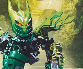
On the plus side, it's still a lot cooler than your typical Kanohi mask IMT and features color shifts, which I always support. Also, its lack of "coolness" to me might be seen as a greater heroism to most fans, so I doubt it will negatively impact sales.
In that image you also see the Tahu armor/blades, used correctly this time IMO to make cool shoulder decorations. Those are awesome pieces that work as "spine-decorations" and as claws, a move I strongly support. I still think they look a little awkward as armor (as Gresh's legs use again), but they're "okay" in that use too. I am glad to see them used flexibly in that use -- too rarely do set designers showcase their ability to use pieces flexibly IMO. So I'm fine with it.
And the arm armor piece there is one of my faves.
Finally, Gresh uses my all-time favorite piece as feet:
I predict Gresh will sell in the top three of the Glatorian.
Strakk is so awesome he might upset the traditional red-blue-green-whiteandblack-brown sales success pattern.
Here we see coolification used in the face and shoulders more than on any other set or even piece ever, IMO. I like him third behind Gresh and Vorox only due to the unfortunate use of several clumsy and unattractive pieces IMT, but I'll get to that. First, the awesomeness:
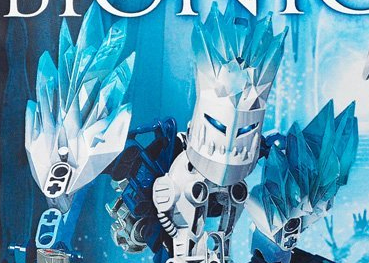
I strongly support the shoulder piece used as chest armor there too BTW. Armor is something too many past canister sets have lacked. Glad to see it present in all but two Glatorians -- and on them I don't think it detracts. (Vorox's torso design flows well, and Skrall's torso design is so unique it is probably better sans armor.)
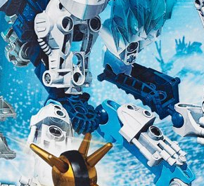
Now here's his torso shown properly along with his leg armor, using another of my favorite armor pieces.
In my judgement, the designers are doing an awesome job of mostly only bringing forward the best of the best of limb armor from past years to combat clonism, while dropping less attractive pieces. (If only they'd do this with feet -- I abhore that lumpy round Inika foot that won't die -- but maybe I'm either weird on that or we just don't have enough feet yet to replace them.
 )
)And of course, note the bent torso. I'm very foggy on how exactly, from the pic, that is put together, but here's a zoom.
This shows what appears to be a gear!
 Have the designers done as I proposed in my Bring Back Gears entry?! Bringing a gearlike system back in just one canister set? I dunno, but it looks interesting. (Here's where anybody who knows from the in-hand reviews gets to show off their knowledge in a comment. )
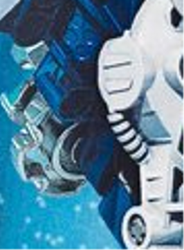
Strakk suffers IMT from the lump-foot, and unfortunately from a massive but clumsy ax design:
I like the basic idea of it, don't get me wrong... but the superthin handle combined with uncool blade backing make it look impossible to actually hold. It looks like he is balancing a baseball bat by its narrow tip instead of firmly gripping a powerful ax.
I would have rectified this easily by flipping the down-pointing blade backing up, so it could act as a spear of sorts or just turned it into a symmetrical two-blade design, aligning the X-ish stretching effect area symmetrically so it looked cool instead of totally random, and maybe made a bottom half to the handle that came out below the hand piece so it looked like he was gripping the handle, not balancing it on its tip. Really, just making the X effect symmetrical would have done the trick IMO.
I predict Strakk's sales to be unpredictable. :-P The super super super coolness of the shoulders and head just might put it ahead even of the red set as the best set ever. Or the fact that it's white might make it sell mediocrely as in the past, but I doubt it given the abundance of iceblue in it.
All I know is, despite my lack of cash it will hard to resist buying him in addition to Vorox and Gresh.
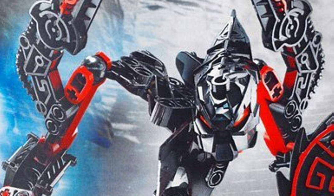
The next three I have no preference for over the others, so I guess they tie for fourth. I'll begin the with obvious best-seller, Malum.
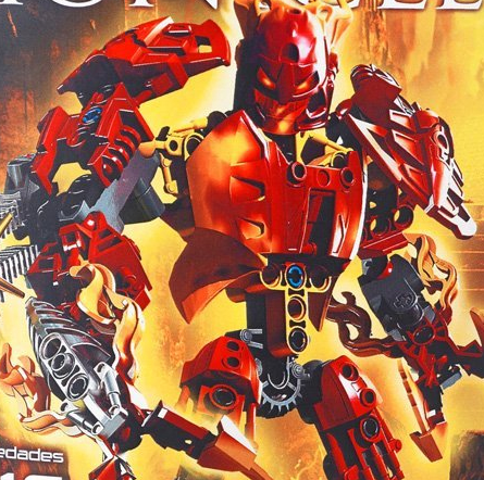
Malum's body design and limb design is, IMO, perfection. He has the bulky look combined with that could come across as a powerful top-notch hero OR or a great villain, so either way I predict his sales will be stellar. In the story it sounds like he will fittingly be somewhat in between a villain and a good guy.
He suffers in my personal ranking only because I would have wanted a cooler face and I am just biased against red.
I will concede that if ever red was done perfectly, it is here. Like Strakk, I will have difficulty NOT buying him. 
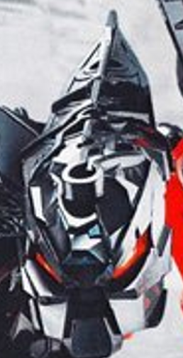
The face:
I really like the concept of this face, but it is just dissappointing to me that they didn't go as far with it as they did with Vorox or Strakk. I would compare it to most of the Makuta 2008 sets, but better than all but Krika. But it doesn't take us to a level above even the sheer awesomeness of Krika. Maybe I'm spoiled, but I was hoping for that.
I would have widened it and made the flames brighter like Strakk's ice in coloration/contrast, and more clearly orange fading into yellow instead of red fading into orange. (Basically, what I did in the coolified av.
)BTW, though I assume all the 2009 faces are like this underneath, I love the trans-skull appearance of the face. A step up from Hordika eye structures, way better than Inika faces though similar, and yet something inventive beyond the typical Metru/Mata/Tohunga/etc. faces. Good.
On to the tools:
Best fire tools ever, no doubts there, and better than most other tools. IMT I still like Gresh's better, but hey. I strongly suspect many fans will see this as the best tool ever bar none.
Beyond just the cool design and color blending, what I like is the feeling it gives off that he is clenching fiery clawed fists and punching forward at the same time. It gives a great sense of motion to this set, more than any other.
Like on the head, I would have prefferred a brighter take on the flames. It's a little hard at first glance to see that they are flames since they blend in with the rest of the set. What I'd really love is trans orange fading to trans yellow. (Or better yet, vice versa more like a real flame). Alas. But perhaps someday.
Like I said, Malum will definately sell best of the six, unless Strakk's best aspects carry him to a surprise first.
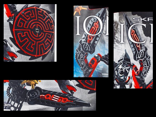
Skrall's shield and weapons are freakin awesome. This is nearly the ideal use of red IMT -- sparingly and contrasted with black or a similar dark color. The maze design of the shield is like nothing we have ever seen in Bionicle before -- I applaud this loudly. Well, imagine I'm applauding loudly anyways -- I'm not actually clapping.
And that aspect in the tool looks good too.
What interests me most about the Skrall once I get past the awesomeness of the red lines is the apparently technological feel these tools give off. They remind me of old insectoid alien spaceship LEGO lines. In a good way. It gives me pause though -- Bionicle fans might not be attracted to the look. I dunno.
Perhaps I'm simply misinterpreting and it's really just another take on the mechanical styles of yesteryear with red lines thrown in for decoration.
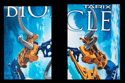
Regardless, I personally love it. For these pieces alone I will aaaaalso have difficulty not buying this one. Yeah, same for Tarix, for those of you who are detecting a pattern here. :-P
And I love love love the blade/tool pieces used on the shoulders. I'm a big proponent of "spiky shoulders" wherever they can be used.
The rest of the set is alright, but doesn't strike me as awesome. Perhaps this is unfair, as he uses the Vorox armor pieces and my favorite feet:
But the other red pieces feel excessive in color to me, the torso design, while innovative, doesn't strike me greatly, and the face is very dissapointing in that it doesn't carry the same awesome red line decorations the tools do.
Now, again, the torso design is innovative. It goes away from the humanoid cliche. So it's fine. And like I said, maybe it doesn't need extra bulk in the form of chest armor (I'm not certain, but that might BE a limb armor piece used as armor there). If you like the skinny animalistic style of torso, similar to Takadox, this should appeal to you. Personally it doesn't all that much -- I just appreciate the uniqueness of it.
I would have made all structural pieces black, and used black-with-red-lines chest and limb armor pieces to bulk him up, if it was me.
The head is VERY difficult to make out from the image. Here's a zoom of it.
I like the elongated look, and it is -- miracle of miracles -- actually posed correctly for an elongate head so you can actually see that it IS elongate, unlike the unfortunate case of Mantax. And I also like the rock effect on the forehead, though it looks more like random nonsense when not zoomed in.
I just think this head should have been waaaay better. It should have had red line decorations. The rock effect should have been colored differently with a blending effect, probably with grays, like Strakk/Gresh/Malum's color blends. Finally, I think it would have looked better with the saw-blade spike effects as are seen on the shield. (Again, all the above was used in my coolified Skrall avs).
I predict Skrall's sales won't be off-the charts, but also won't be too bad. The red will definately help.
Part 1 ends, fittingly, with the first ever set colored in Bones Blog colors. On a selfish note I applaud the set designers for that alone. :-P Biggest reason I will have trouble not buying this set.
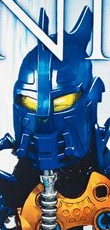
This is a great face -- if all you want in a 2009 set is a typical Ga-Toa Kanohi design. That's what it looks like to me. I like the design, don't get me wrong. But it's also all one color, unlike Gresh/Malum/Strakk, and given the orange and silver so prevalent in the rest it is immensely dissapointing to me that the mask is not representative of those. I believe a canister set's face should, ideally, represent the rest of the set in color scheme.
It's also the only of these six faces not to at least go a little beyond the typical Kanohi we've seen before. It looks like an Ingika. Now, if this IS the Ignika I'll eat my words as it's supposedly going to be in a set this year. :-P But even Gresh's face went beyond Kanohi with a color mix. Here's there's nothing. Just a cool masklike design in totally blue.
On the plus side in that category it does plug in Mahri-style to a gray tube that helps a little in this category. (In my coolified version I replaced the tube with several silver spikes and added orange bits.)
The essence of this set is in the shoulders:
That is just perfection. The blue and orange works great together, and the spikes are an awesome twist on the always-great spiky shoulder look. The silver works well with this color scheme. And nice to see those holes in the shoulder pieces actually used for something -- again, the set designers finally showing a lot of flexibility in piece usage. I'll even forgive the use of the IMO-ugly Metru leg pieces for arms.
They work here.On to the tool, which is horribly hard to make out in the pose of this image -- I've shown it with background and cut out from the background for clarity:
It's decent. I like the design just fine, except I would have made the "stick" handle into something blue and something fancier. I'm torn about the light blue. On the one hand, it looks elemental well. Fine fine. On the other hand, though, it's a fifth color in addition to the three main colors and the inexplicably yellow eyes. Too much color going around. I think a dark trans-blue would have looked better -- and even better yet, blue fading into the lightblue would have made the fifth color tolerable and even cool.
(And the yellow eyes reeeeally should be orange. Three colors should be the maximum of any color scheme.)
I predict Tarix will sell in the top three too, unless Strakk upsets the usual order.
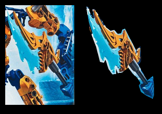
Now, I promised something more about the weapon; I've saved it for this one as Tarix's pose clearly shows off the weapon:

Here's a zoom of the same image:
IMT/IMO, this is the absolute best projectile launcher EVER.
Why? It's super-simple, it's cool, it looks effective, and it also looks excellently MOCable.
Previously I have judged the Zamor launcher to be the best launcher ever. Kanoka launchers were close behind, with the Vahki-mouth launcher being the best (but never used the way IMO it should have been as a handheld launcher far cooler than the Matoran's). The others fall somewhat in line behind that with the squiddy taking last place.
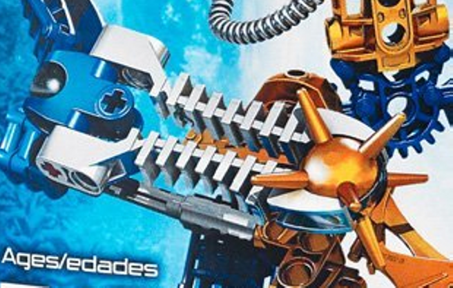
This launcher looks to be made of five simple pieces -- two of them pins and one the thornax ammo itself. It is constructable like the Zamor and unlike the squid launcher, yet not confusingly complex to construct like the Vahki heads. What I like best is that unlike any previous launcher, the two halves appear to be totally seperatable pieces, not a single piece.
It looks to be fired like a Kanoka launcher, but takes it a step up in that it can apparently be fired at any angle. Up, down, tilted, it doesn't matter. Even the Zamor launcher could not be fired properly tilted unless you held the firing pin in a bit to prevent the ammo from falling out.
On top of it all, the pieces could be used tons of ways in MOCs and maybe even future sets as decorative spikes, parts of titan armor, whatever! Even the Zamor's base piece couldn't be used as flexibly as these pieces -- which is why simple is sometimes best.
I'm assuming it's silver rubber like the squid launcher -- not sure -- but either way wouldn't matter to me in this case. The only sure downside is the lack of any possibility of an ammo clip as with the Zamor, but I think the rest of it more than makes up for this.
In general these canister sets are definately up to par with the best of yesteryear and I would say that all of go at least a little beyond previous sets (Krika maybe being the exception, but he was just a few months ago). Some of them take the sets way beyond anything we've seen before, and I predict these will sell better than Bionicle has ever seen before.
A bit of a story note that answers a set-related concern I've had before. 2008 tried out the "split release" approach of breaking the hero and villain teams of six into two, releasing them 3 against 3. This was great as it allowed for kids to buy two sets right away and roleplay immediately, instead of having to wait six months before they could start proper roleplaying with heroes vs. villains. It was a brilliant idea -- or perhaps one they should have thought of long ago. :-P
But I worried that its plausibility would go down in the future. Could we accept that every single year the situation would just so happen to require our heroes to split up into two teams of three? Could we accept that in addition to that the villains would think of the same thing?
This year's approach appears to be that at least for this first half, all six are members of a free-for-all gladiator system. It isn't crystal clear at this time who is good and who is bad (it seems that the Skrall are the only ones that are clear villains, but that's just from comments I've seen in the 2009 topic, don't quote me on it being official fact). This "muddies the waters" enough that it's perfectly plausible, and doesn't even remind me immediately of the 2009 system.
In short, 2009's first half looks like it will be a self-contained story similar to the Bohrok Kal and Rahkshi halves of 2003, but with both good and bad in one half. This is a pattern I could see plausibly extending forever.
No idea what 2009 summer will bring us, but this sets a good precedent.
Finally, everybody and their brother always points out the multicolored pins in all sets. I didn't see these as conflicting in any way with these six sets, so I bring it up only as a nod to the many that seem unable not to get all worked up over the ease-of-building color code system of today. I have seen some as conflicting in the past but they seem tolerable here. Maybe it's just the poses.
And that's all I've got for now. Due to the number of images above my reactions to the other sets will be in a different blog entry, hopefully coming soon.
Comments?
19 Comments
Recommended Comments