

HS01's New MP Nav

Entry posted by Swert
782 views
Alright, so as mentioned on HEROsector01's main page news, we're planning to upgrade the main page to the same layout as BS01's, or close to it. One of these includes my pretty clever navigation system (yes I did actually create the concept, even if SK and Metax managed to make it all work... kudos to them, though).
What comes with this navigation? An actual button grid:
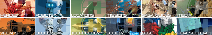
And if you weren't aware, BS01's main page navigation works by clicking a tile, and a menu slides from the right to the left with a list of both relevant and popular links under that subject. HS01 will have the same treatment, and I look forward to bringing it to you all.
I am open to constructive criticism, and possible alternate images for the grid itself, as well as possible color changes, but the categories themselves will stay. I -might- change Saga Guides if I can get a better category there.
3 Comments
Recommended Comments