sunflower Posted November 20, 2013 Share Posted November 20, 2013 "...other than it bein' four feet lower than mine." I mean really, seriously one of the best quotes in the entire game. A request by our esteemed role-player Ghosthands over some tea and biscuits/physics and quantum mechanics discussion, I don't think I could say no to something like this. And so, without further ado, I give you the most savvy, swashbucklin', death-defyin', good-lookin', alcohol-drinkin', one-liner-droppin', sword-duelin', marine-insultin', ship-sailin', gold-thievin', lady-wooin', Infernavika-captainin' Lesterin pirate that ever did grace the waters of Mata Nui with his handsome mug. If you don't know this face by now, well... I had a lot of fun making this. At this rate, I'll end up drawing the entire crew. I've got my own ship, too boot. luv ya ghostie keep on making glorious lohkar posts Quote - BZPRPG - Link to comment Share on other sites More sharing options...
25K Now! Posted November 20, 2013 Share Posted November 20, 2013 (edited) It's beautiful.Please include constructive feedback in your posts. What about it is beautiful? Not backing it up makes your post spam. -B6 EDIT: Reason time - the style fits Lohkar pretty well. You can see the swashbuckling-ness of his pose. Will love to see more art of yours. Edited November 20, 2013 by Totally Prodigious Artist Quote http://vimeo.com/198967785 BZPRPG Profiles Link to comment Share on other sites More sharing options...
Ghosthands Posted November 20, 2013 Share Posted November 20, 2013 wuv u 2 gravy ^-^ The shade of blue is a bit more teal than I'd have chosen, but that doesn't matter; overall, it's very nicely done. Great to see Lohkar drawn for the first time Quote Link to comment Share on other sites More sharing options...
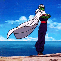
sunflower Posted November 20, 2013 Author Share Posted November 20, 2013 wuv u 2 gravy ^-^ The shade of blue is a bit more teal than I'd have chosen, but that doesn't matter; overall, it's very nicely done. Great to see Lohkar drawn for the first time c: I suppose you could call the colour choice artistic license, mainly cause I used the colours from the ocean background in order to give some fluidity. Basically, more ocean-blue than Mata-blue, but hey. It was totally fun. Quote - BZPRPG - Link to comment Share on other sites More sharing options...
Ghosthands Posted November 20, 2013 Share Posted November 20, 2013 Yep, it works ^^ Quote Link to comment Share on other sites More sharing options...
They Posted November 20, 2013 Share Posted November 20, 2013 Wow, Grav's, you just keep getting better and better. I like the comedic sort of coloring to it. The lightened highlights in the azure areas are fantastic additions, giving more detail while not attracting attention. Quote http://www.bzpower.com/board/index.php?showtopic=9733&page=2&do=findComment&comment=546628 Link for the BZPRPG 2013 arc profiles. Link to comment Share on other sites More sharing options...
Taka Nuvia Posted November 21, 2013 Share Posted November 21, 2013 I'm very much out of touch with the BZPRPG and so I don't really know about the backstory - however, I recognise a great piece of artwork when I see it. ^^ The colours go together well, the golden parts fo the armour provide contrast against both the blue parts of the armour as well as the mostly blue background. All shades of blue work, too; overall, the colour scheme looks very balanced. Speaking of armour, I absolutely love the design, as it combines meachanical and biological aspects. Particularly the knees stand out to me, they look absolutely fantsatic and I adore them xD The facial expression is adorable as well. Determined, absolutely sure of himself. Annd cute. There's only thing I am not 100% sure about, and that's the outlines. They're very soft, almost too soft, causing everything to blend together a bit. While that's okay on the parts behind the charater (I assume you were going for some kind of depth-of-field effect?), I think the outlines on Lohkar could be a bit sharper to help make him pop more. That's just a small thing, though. Overall it's a really cool pic! Quote My art collection topic - updated! (21/09/2021) Link to comment Share on other sites More sharing options...
sunflower Posted November 21, 2013 Author Share Posted November 21, 2013 I'm very much out of touch with the BZPRPG and so I don't really know about the backstory - however, I recognise a great piece of artwork when I see it. ^^ The colours go together well, the golden parts fo the armour provide contrast against both the blue parts of the armour as well as the mostly blue background. All shades of blue work, too; overall, the colour scheme looks very balanced. Speaking of armour, I absolutely love the design, as it combines meachanical and biological aspects. Particularly the knees stand out to me, they look absolutely fantsatic and I adore them xD The facial expression is adorable as well. Determined, absolutely sure of himself. Annd cute. There's only thing I am not 100% sure about, and that's the outlines. They're very soft, almost too soft, causing everything to blend together a bit. While that's okay on the parts behind the charater (I assume you were going for some kind of depth-of-field effect?), I think the outlines on Lohkar could be a bit sharper to help make him pop more. That's just a small thing, though. Overall it's a really cool pic! Thanks a bunch. As for the colours, I'm surprised they worked out as well as they did, mainly because they were the result of trying to interpret the colours of the MoC into a more comic book (I suppose is the right term for this style) feel. As well as keeping the original hue (Keetorange, Mata blue, etc) while at the same time giving it some personality rather than just the flat plastic colours. Funny that you should mention the design, if only because I felt that this was more mechanical than what I had envisioned for the character. Then again, I always find that the stylings with the exposed organic muscles (as in MoL, LoMN, and WoS) to be an excellent balance of organic and mechanical, rather than the squishy bits being covered up as in this instance. Haha, glad I pulled off the facial expression. The lineart is pretty blurred out, much more so than what I'd like and am used to. Most likely the result of my relative inexperience with using a tablet (ergo, the visual disconnect that comes with using it for initial lineart), and my attempts at going back and sharpening up didn't turn out too well. But with me being OCD about such things, I'm probably going to go back and clean it up once I get the hang of using a tablet. Thanks for the response! Quote - BZPRPG - Link to comment Share on other sites More sharing options...

Recommended Posts
Join the conversation
You can post now and register later. If you have an account, sign in now to post with your account.
Note: Your post will require moderator approval before it will be visible.