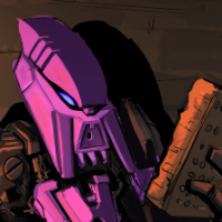
TuragaNuva Posted October 28, 2011 Share Posted October 28, 2011 (edited) UPDATED.All right, time for the third MOC from the downtime (keep in mind that I'm not posting them in the order that I built them). Here's my Toa of Time:^as usual, click for gallery (when public)^And some more pictures!BackLeftRightAction pose of some sortUPDATE: Picture of new back buildComments and/or criticism are, as always, much appreciated - Edited October 31, 2011 by TuragaNuva Quote Link to comment Share on other sites More sharing options...
Blendercat Toa of Coldplay Posted October 29, 2011 Share Posted October 29, 2011 The Vahi seems a bit overused on this, and I think the orange mask on the head stands out a bit. I was going to talk about how the arms were blue, but it was just the lighting. They are black. Love the staff as well. Quote I figure I may as well do PBZPs now. But, I have a terrible work ethic,so they may take a while. A B C D E F G H I J K L M N O P Q R S T U V W X Y Zblue=taken, red=in progress Link to comment Share on other sites More sharing options...
TuragaNuva Posted October 29, 2011 Author Share Posted October 29, 2011 The Vahi seems a bit overused on this, and I think the orange mask on the head stands out a bit. I was going to talk about how the arms were blue, but it was just the lighting. They are black. Love the staff as well.Thanks! I spent a while trying to decide what piece(s) to attach to the staff below the claws; it's nice to know that what I decided on looks good . As for the Vahi, I can understand your opinion, though it does emphasize the whole 'Toa of Time' thing. ...but the real reason is actually the reason that I built him in the first place: I was looking at all the Vahis that I have, thinking "I have to do something with all of these!" Thus, the MOC you see before you Quote Link to comment Share on other sites More sharing options...
PooZy Posted October 29, 2011 Share Posted October 29, 2011 If I were you I would've used just one vahi and then put cogs on him to make him look clockworky - but each to his own.It's a very good model but I feel the arms and head are small Quote Link to comment Share on other sites More sharing options...
Obsessionist Posted October 29, 2011 Share Posted October 29, 2011 I, for one, really love the Vahi use here. The shoulders in particlar look really good. I don't like the bohrok faces on his back, they bulge, contrast in their smoothness and make him look like some sort of bug from certrain angels. I like the torso design in general. The lower arms could be better, but this is a fantastic creation overall. Quote Link to comment Share on other sites More sharing options...
Big Macintosh Posted October 29, 2011 Share Posted October 29, 2011 How did you get so many Vahi? This is a well-built MOC. It seems a bit too bulky to me, but that's my only gripe with this MOC. It's a good build. Quote My BZPRPG Characters Link to comment Share on other sites More sharing options...
TuragaNuva Posted October 29, 2011 Author Share Posted October 29, 2011 (edited) If I were you I would've used just one vahi and then put cogs on him to make him look clockworky - but each to his own.It's a very good model but I feel the arms and head are smallHmm, cogs... I actually hadn't thought of that (even though I've seen Toa of Time MOCs with that idea). If I decide to work more on him, I'll definitely keep that in mind! As for the arms and head: while I suppose the head might be kind of small, the arms seem, proportionately, long/large enough to me.I, for one, really love the Vahi use here. The shoulders in particlar look really good. I don't like the bohrok faces on his back, they bulge, contrast in their smoothness and make him look like some sort of bug from certrain angels. I like the torso design in general. The lower arms could be better, but this is a fantastic creation overall.Thanks! Glad to know that someone likes the Vahi . I'm somewhat uneasy about the Bohrok headplates myself; I just wasn't sure what to replace them with at the time, and I wanted to use up as many keetorange pieces as I could, since I almost never use it. However, combined with PooZy's clockwork suggestion... who knows, maybe I could build a new back that gets rid of the headplates and incorporates the cogs.How did you get so many Vahi? This is a well-built MOC. It seems a bit too bulky to me, but that's my only gripe with this MOC. It's a good build.That's actually not all of my Vahi . I only bought two of them myself: one gold one in a special Vahki set, and my only orange one on ebay. The rest of the gold ones mostly came from other people: I've bought a lot of bins/boxes of old Bionicle from people that happened to include a gold Vahi (or even two), and whenever one of my friends outgrew Bionicle, they'd usually give me their sets, so I acquired some from them.Now, on to your actual review: Thanks! I feel like if I remove the Bohrok headplates (like Lego Obsessionist suggested), it might help deal with the bulkiness.Thanks again for your comments, everyone! Edited October 29, 2011 by TuragaNuva Quote Link to comment Share on other sites More sharing options...
The Invisible Handman Posted October 29, 2011 Share Posted October 29, 2011 Nice solid moc but ... the armour on his back makes him look wider than he should.Secondly the orange Vahi is different than the rest of the colourscheme, which I dont like. Quote {Brickshelf Page - BZPRPG Profile - HFRPG Profile - Project Protodermis Profile} Link to comment Share on other sites More sharing options...
Akuna Toa of Sonics Posted October 30, 2011 Share Posted October 30, 2011 I wish I had that many Vahis, lol. The orange one looks a little out of place, though. Quote Does anyone want to play the Master Chief Collection with me? I'm trying to get a team going for ranked. PM for GT. Link to comment Share on other sites More sharing options...
Toa Kanas Posted October 30, 2011 Share Posted October 30, 2011 Instead of making a cool moc with all them vahis.... I would have bought acouple. Quote Did you hear?? FORUMS ARE BACK! Link to comment Share on other sites More sharing options...
TuragaNuva Posted October 30, 2011 Author Share Posted October 30, 2011 Nice solid moc but ... the armour on his back makes him look wider than he should.Secondly the orange Vahi is different than the rest of the colourscheme, which I dont like.I am currently working on a new build for his back; I have ditched the Bohrok headplates, so it should look a good bit better. Sadly, when I went to see how he would look with a gold Vahi instead of orange, I couldn't find any more. I could have sworn that I had one or two more, but apparently not... Thanks for you comments, though!I wish I had that many Vahis, lol. The orange one looks a little out of place, though.Sadly, I have no more gold Vahi. If I manage to find another one, I promise that I'll check out how he looks with it instead of orange.Thank you both for your comments! Quote Link to comment Share on other sites More sharing options...
GeluNumber1 Posted October 30, 2011 Share Posted October 30, 2011 Wow, he sure does have a lot of time on his hands. And his arms, legs, and entire body. I like the kneeplates and arms. The body design is cool, too. But the head looks small oon it. Overall, good. Quote Why are orange and black such a good color Combination ? Purple is pretty, and so is blue. Pink hurts your eyes, green is quite mellowing, black is very threatning, red is cool, orange is SO awesome, yellow's hard to read... But you can't see white at all! Oh, wait. I forgot brown. Here's my thoughts: If a person tells the truth and says, " I always lie," Is he lying? Or is he telling the truth? And what has a mouth, but no head, and a body, but no torso? Do caterpillars like to tend to supporting colum of stone's every need? Or is that name misleading by nature? Speaking of nature, why are the children of animals called offspring? don't many young beasts come alive in spring, and thus, should be called onspring? Heeeeeeyy..... I got the first post on a page for the first time. Who knows; it may happen again. What the... It did happen again... and again... YEAH! I'M ENCOUNTERING PROTODERMIS! Link to comment Share on other sites More sharing options...
TuragaNuva Posted October 31, 2011 Author Share Posted October 31, 2011 UPDATE:I have changed the Toa's back and completely done away with the Bohrok headplates! Here's a picture.And here's a bonus picture of him riding my lion MOC (a pretty awesome picture, in my opinion).- Quote Link to comment Share on other sites More sharing options...
Sumiki Posted November 1, 2011 Share Posted November 1, 2011 I like the use of the gold Vahis all over the body. However, this presents some problems when you get to the face - it's orange and nothing else is. You either need to put orange elsewhere on the body, or replace the orange Vahi with another gold one. The lower arms also look a bit too wide. I like the custom look, but they're still too wide. The new back build is a definite improvement. Quote avatar by Lady Kopaka Link to comment Share on other sites More sharing options...
TuragaNuva Posted November 6, 2011 Author Share Posted November 6, 2011 Wow, he sure does have a lot of time on his hands. And his arms, legs, and entire body. I like the kneeplates and arms. The body design is cool, too. But the head looks small oon it. Overall, good.I don't really have much to say in response to your review; I just wanted to say that I greatly appreciate the pun I like the use of the gold Vahis all over the body. However, this presents some problems when you get to the face - it's orange and nothing else is. You either need to put orange elsewhere on the body, or replace the orange Vahi with another gold one.The lower arms also look a bit too wide. I like the custom look, but they're still too wide.The new back build is a definite improvement.Thanks for the compliment on the new back! I'm rather happy with it, actually. I feel like the issue with the arms is an illusion caused by the angle of the picture(s), but I might see how they look if they're thinner. As for the orange Vahi, I sadly have no other gold Vahis to use for his face, and, when it comes down to it, I prefer him with the orange. But, so you all can see what he looks like with a gold Vahi, here is a picture of him wearing one (stolen from his leg). I feel like it makes the color scheme too bland, but hey, maybe that's just me.Thanks again, both of you ! Quote Link to comment Share on other sites More sharing options...
JohannDakitsch Posted November 6, 2011 Share Posted November 6, 2011 Good one. A bit 'fat', tough, and could use some more orange on the rest of the body, so color scheme would be more consistent... Limbs could be improved a bit, and why does it have fingers only in one hand? Anyway, overall nice MOC. Quote The night is dark and full of terrors... Link to comment Share on other sites More sharing options...
Toa Titan Posted November 6, 2011 Share Posted November 6, 2011 Because the staff takes up the holes on his other hand.Personally, I love this MOC. And, unlike most of you, I like the use of the orange Vahi; it kind of mixes it up. The arms do seem a little, erm, unorthodox, but not necessarily bad. Quite frankly, this is awesome. Quote If you have no life outside of the Internet, copy/paste this into your sig. Link to comment Share on other sites More sharing options...
iPenguin Posted November 8, 2011 Share Posted November 8, 2011 I dig the usage of the Vahi. Really creative. Though I think the head should be raised a little... or maybe it's just me. Quote Majhost sucks Link to comment Share on other sites More sharing options...
TuragaNuva Posted November 17, 2011 Author Share Posted November 17, 2011 Good one. A bit 'fat', tough, and could use some more orange on the rest of the body, so color scheme would be more consistent... Limbs could be improved a bit, and why does it have fingers only in one hand? Anyway, overall nice MOC.The 'fat'-ness has actually been fixed: take a look at the new back picture, where I've removed the Bohrok headplates (hopefully I'll get the main picture updated soon). And Toa Titan's right about the fingers: his staff prevents me from attaching fingers the way I did on his left hand, and I don't have the right pieces to attach them another way right now. Thanks for your comments!Because the staff takes up the holes on his other hand.Personally, I love this MOC. And, unlike most of you, I like the use of the orange Vahi; it kind of mixes it up. The arms do seem a little, erm, unorthodox, but not necessarily bad. Quite frankly, this is awesome.First, thanks for pointing that out about the fingers. As for your review of the MOC, thanks so much for your compliments!I dig the usage of the Vahi. Really creative. Though I think the head should be raised a little... or maybe it's just me.Hmm... I think that might be an optical illusion from the angle of the picture. Tell you what, when I (hopefully) update the main picture, I'll either see how his head looks a little bit higher, or try to take the picture in a way that shows it's not that low. Thanks for your compliments about the Vahi!Thanks again, everyone! Quote Link to comment Share on other sites More sharing options...

Recommended Posts
Join the conversation
You can post now and register later. If you have an account, sign in now to post with your account.
Note: Your post will require moderator approval before it will be visible.