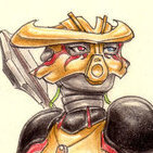
Taka Nuvia Posted March 11, 2012 Share Posted March 11, 2012 (edited) Another thumbnail which takes you to the full drawing. ;3Slightly rough-ish CG art featuring Brutaka. He';s always been one of my favourite characters. ^^ I'm not too practised when it comes to digital art, so I did a doodle today. I love the light-on-dark technique, as you can see.It is not obvious that I used Brutaka's actual head for reference, huh? x3Comments and Criticism greatly appreciated. :3 Edited March 11, 2012 by Taka Nuvia Quote My art collection topic - updated! (21/09/2021) Link to comment Share on other sites More sharing options...
Weranisma Posted March 11, 2012 Share Posted March 11, 2012 I really like this!Although I don't know which side is the evil one, and which one the good....does he even have an good side? Or does he have just two differend evil sides.....However, I really love the way you did the eyes! ;)The Mask looks a little frazzeld (is this word right? Me dunno )Very good picture Quote Link to comment Share on other sites More sharing options...
Dralcax Posted March 11, 2012 Share Posted March 11, 2012 The top is a little too wide... Quote Link to comment Share on other sites More sharing options...
Maganar Posted March 11, 2012 Share Posted March 11, 2012 The top is a little too wide...Well, I don't know about you, but I actually kinda like it that way...XPLighting is superb. The green swirls have a little gap between them and the mask that makes it look a little disjointed. If I were doing this, I'd take into Photoshop, put the mask on one layer, the swirls each on their own layer below that one, and the background as the farthest back layer. Then I could just nudge the swirls intil the edge of the mask covered it up without a gap. Then again, if I were doing this, I doubt the overall product would look this nice. I don't know what you used to make this, but if you couldn't create layers on whatever program (I'm assuming not?), then that's about as good as it gets. Quote Review Topic I AM OFFICIALLY BACK! After 18 months on hiatus, I have returned, but I have spent that time well. If you want to see how it was spent, click on the banner to start reading the result or click on the linky-link below to get further information off of the review topic. Link to comment Share on other sites More sharing options...
Taka Nuvia Posted March 12, 2012 Author Share Posted March 12, 2012 I really like this!Although I don't know which side is the evil one, and which one the good....does he even have an good side? Or does he have just two differend evil sides.....However, I really love the way you did the eyes! ;)The Mask looks a little frazzeld (is this word right? Me dunno )Very good picture Well, I think the side with the green eye is evil, also becasue it's darker... but in the end, does it matter that much? ^^I would have used the word 'frayed' but I know what you mean. May I point out that this is a rough pic, though. xDThankies! The top is a little too wide...I know. It's a mistake I always make... The top is a little too wide...Well, I don't know about you, but I actually kinda like it that way...XPLighting is superb. The green swirls have a little gap between them and the mask that makes it look a little disjointed. If I were doing this, I'd take into Photoshop, put the mask on one layer, the swirls each on their own layer below that one, and the background as the farthest back layer. Then I could just nudge the swirls intil the edge of the mask covered it up without a gap. Then again, if I were doing this, I doubt the overall product would look this nice. I don't know what you used to make this, but if you couldn't create layers on whatever program (I'm assuming not?), then that's about as good as it gets.Well thanks. ^^*raises finger* I did it in photoshop, with layers :mellow:But I see what you mean. I, however, prefer them to be slightly apart from the mask, for they were thought to be rather decoration that really there... *coughlameexcusecough*No, really, thanks for the honest critique, and I'll keep it in mind next time. Quote My art collection topic - updated! (21/09/2021) Link to comment Share on other sites More sharing options...
Brickeens Posted March 15, 2012 Share Posted March 15, 2012 I really like the the different colored eyes and the swirls. They make it seem kind of dreamy or otherworldly. Quote Link to comment Share on other sites More sharing options...
Paleo Posted March 15, 2012 Share Posted March 15, 2012 I love the flowing look you gave the Olmak. It looks like vapours coalescing to form a mask. However, I think the mask could be a bit wider at the cheek-things. Quote Flickr Link to comment Share on other sites More sharing options...
Jean Valjean Posted March 23, 2012 Share Posted March 23, 2012 The head looks a little squashed. It makes me think of a pudgy Wolverine, except with green hair. Come to think of it, Brutaka's Olmek was gold instead of green, so I'm wondering why you changed the color, unless you were trying to imply that it was infected. In that case, it would have been interesting if one side had been infected and the other wasn't, since you have two different colored eyes. It would have added some additional focus to the picture. Another potential pattern to go with would be to make infections look like the old MNOG depiction of infected masks. The swirls of color in the background can be changed to specifically contrast each other in more obvious ways, like making one green and the other red-orange to match the eyes.One eye is a little bit bigger than the other. I don't know if that's intentional or not, but then, you obviously tried to break symmetry in a few ways. Perhaps you could slightly change the shape of the entire left-hand side of the Olmek to further the feel of division.Otherwise, I like the brush used and the specific amount of detail you go into, which fit the dreamy and abstract idea of the subject matter.Your Honor,Tyrannosaurus Kraggh Quote Link to comment Share on other sites More sharing options...
Dwanny Posted March 23, 2012 Share Posted March 23, 2012 Gee Taka, you never fail to impress, do you? :PI like it! As has been previously pointed out, the top is a little wide, but thats just a minor detail. Most of all, i like the colours; they give it a certain feeling that i can't help but admire.The red eye is really nice too, keep up the good work!-Dwanny Quote Find me over here! http://danielvangele.tumblr.com/ Link to comment Share on other sites More sharing options...
Mare Tranquillitatis Posted March 24, 2012 Share Posted March 24, 2012 I'd only say I like it, 'coz it speaks for itself...----- Lord of the Rings -----Titles: Dark Lord, Lord of Mordor, Lord of Gifts, Lord of Barad-Dûr, Lord of the Earth Quote Link to comment Share on other sites More sharing options...
Toa Kovolta Posted March 25, 2012 Share Posted March 25, 2012 Well this piece is very visually interesting! The lighting is quite superb, and I like the sketchiness of the mask.I also like how the right side is more blurred out than the left to fit with the darker sort of feeling, and, I'm assuming, because that's the mutated side.I think that one thing that could use a little more work however is the energy swirls or whatever you would like to call them. There's something about them that just looks a little off, but I can't really say what. : Quote BBCC #68 The Iron Tiger Link to comment Share on other sites More sharing options...

Recommended Posts
Join the conversation
You can post now and register later. If you have an account, sign in now to post with your account.
Note: Your post will require moderator approval before it will be visible.