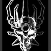
Crunchyn Posted May 12, 2012 Share Posted May 12, 2012 Hey guys, this is my second entry for General Art Contest # 18, the first one can be seen here.Time: 3 hoursMedium: Ink and Soft PastelsThis is an illustration of what if Vezok was able to sic the Staff of Fusion on him and Vezon and it's a battle between Vezok, who wants to fuse back and Vezon who of course does not. Honestly, I thought that I would start on this sooner but I got a lot of painting to do and learning how to animate and it's finals next week and this was the last weekend any way so... yeah My plan into going in this was to have a very Stuart Sayger style, I love his style. I quickly figured out that I can't be as expressive as he is with his drawing and inking. I think that I got that with the coloring though. I was really scared about inking this so I only used a crow quill to do outlines and I use a brush to do a quick wash for the background the Orig. Vezon in the middle. Then I went really crazy with the pastels. Using the Staff of Fusion for the light source, I opted for a green outglow to complement the red eyes of the characters. Thanks for looking! Quote "I could have been a Protector but then I took a stud to the feet." Link to comment Share on other sites More sharing options...
dee.3x3 Posted May 12, 2012 Share Posted May 12, 2012 Wow, looks great! I love the colors and the textures, and the charachters really come out well. Quote Link to comment Share on other sites More sharing options...
Kaleidoscope Tekulo Posted May 14, 2012 Share Posted May 14, 2012 I was hoping for a worthy adversary, but this is a bit much... XDDThis looks great! I really like the ambiance with the dark colors. The image in the center with the staff adds a wonderful bit of emotion and the side images of Vezon and Vezok show the battle element quite nicely.One thing that does catch my attention is how grainy the image looks. It's not inherently bad, but it does catch my eye in a few places and does distract, especially with the detail of their torsos. Also the shape of Vezon's head and mouth seem off. That aside, I really like this piece. I can't say it's better than your first one (which I like even more, actually), but still, best of luck in the contest!Now I'm off to hopefully finish my second entry. WINDFLY! (Sand Twister!) Quote Executive Vice President of Tomato Throwing Link to comment Share on other sites More sharing options...
Aanchir Posted May 15, 2012 Share Posted May 15, 2012 Very neat drawing! However, I don't know if it's quite as good as your other entry. It just doesn't feel as full of detail. I think perhaps this could have been helped by changing the composition slightly-- as it is, I don't think the dark areas on the right and left sides of the image are accomplishing much, and in fact they sort of distract from the image's focal point, that being the "true" figure in the middle and the space between the two warring personalities.I'm also not sure I like the way the "personalities" are drawn, with well-defined lineart but faded, nebulous colors. I think they might have looked better if they had been colored entirely the way you colored Vezok's sword and Vezon's staff. On those, I think the lack of well-defined lineart and the simplified shading gives them a "ghostly" look that would have suited both personalities as a whole. Some parts of the figures do show this type of shading-- it's the faces where I feel the lineart might be a bit too well-defined.Don't get the impression that I don't like this image, though. The place where I think it is most outstanding is the "true" figure in the center. The stark shading, separated into light and dark areas, is stunning, and definitely accomplishes your goal of trying to capture the best parts of Stuart Sayger's illustrative style. This part of the drawing is also well-framed by the two conflicting personalities, although perhaps Vezon's personality could have been scooted a bit further towards the center for greater symmetry. The shading of the background is excellent, with a white glow cast against a greenish-black background, though as I mentioned before it might have helped to have a closer-cropped composition with less empty space around the margins.Overall, I'm sure this will do fairly well in the contest, and it definitely deserves to. But I think the most important thing it accomplishes, through its contrast with your other entry, is demonstrating just how versatile your creative vision of the BIONICLE story can be. Even looking beyond the difference in the aesthetic style, the other drawing, with its firm placement in the reality of the story, sharply contrasts with this one which portrays a symbolic battle representing the psychological state of its subjects. Great work here, and I look forward to seeing much more of your work once this contest is over! Quote Latest MOC: PAIGE (Prototype Artificial Intelligence, Gynoid Expression) Link to comment Share on other sites More sharing options...
Indigogeek Posted May 27, 2012 Share Posted May 27, 2012 It looks great! Idont know much about shading, but Ilike it. Quote Link to comment Share on other sites More sharing options...
<Reverb> Posted May 29, 2012 Share Posted May 29, 2012 Oh I love this.I really like how it captures that very moment of when Vezok confronts Vezon with the Staff of Fusion. Honestly however, the faces of Vezok and Vezon are slightly too blurry. The texture of it is very pleasing to the eye, and the style is of it is very amazing. I overall love this as it captures the moment and will want to see more of your work. ^.^~Gravity Quote Link to comment Share on other sites More sharing options...

Recommended Posts
Join the conversation
You can post now and register later. If you have an account, sign in now to post with your account.
Note: Your post will require moderator approval before it will be visible.