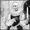
degnish Posted July 23, 2012 Share Posted July 23, 2012 (edited) I told myself I was done with fan art a while ago but then I guess I lied and drew Vakama. Edited July 23, 2012 by degnish Please do not directly display images over 500 KB in filesize. Image linkified. -bones Quote Link to comment Share on other sites More sharing options...
FrozenFlash Posted July 23, 2012 Share Posted July 23, 2012 I really like the "old" appearance and the additional accessories are cool. The details are great especially on the arms and legs. I can't think up of any cons so, nice job on this! Quote Link to comment Share on other sites More sharing options...
GSR Posted July 23, 2012 Share Posted July 23, 2012 Very nice. Like FFIM said, you've done a good job here of portraying him as somewhat elderly through his pose and the details, and the tribal accessories you've provided fit the feel of 2001 rather nicely. Quote Hey: I'm not very active around BZP right now. However, you can always contact me through PM (I have email notifications set up) and I will reply as soon as I can. Useful Topics: The Q&A Compendium | The Official RPG Planning Topic Stories: Fractures | An Aftermath | Three Stories | LSO 2012 Epics: Team Three | The Shadow and the Sea | The Days They Were Needed | Glitches | Transformations | Echoes | The Kaita and the Storyteller | Nui BZPRPG: Komae · Soraya · Bohrei Blog: Defendant Lobby no. 42 Link to comment Share on other sites More sharing options...
The 1st Shadow Posted July 23, 2012 Share Posted July 23, 2012 Oh, wow... I love this! Upon closer examination, I noticed that you included aspects from his Toa Metru form, mainly in the waist and lower legs. Lovely touch, that is. And you managed to capture the aged appearance, as others have noted, as well as the tribal-like details, while managing to keep him true to his set form. Absolutely brilliant work! Quote ~Your friendly, neighborhood Shadow ~Credit for Avatar and Banner goes to NickonAquaMagna~ Link to comment Share on other sites More sharing options...
degnish Posted July 23, 2012 Author Share Posted July 23, 2012 I really like the "old" appearance and the additional accessories are cool. The details are great especially on the arms and legs. I can't think up of any cons so, nice job on this! Believe me there are plenty of things on this I could have done better, but your compliment means a lot nonetheless. Thank you!Very nice. Like FFIM said, you've done a good job here of portraying him as somewhat elderly through his pose and the details, and the tribal accessories you've provided fit the feel of 2001 rather nicely.Thanks! I always liked how lego was able to make the sets look like little hobbly old people, so i wanted to get that same feel. Oh, wow... I love this! Upon closer examination, I noticed that you included aspects from his Toa Metru form, mainly in the waist and lower legs. Lovely touch, that is. And you managed to capture the aged appearance, as others have noted, as well as the tribal-like details, while managing to keep him true to his set form. Absolutely brilliant work! Thanks! Glad you picked up on those details! I was having a pretty hard time figuring out how to make a set with barely 27 pieces look interesting but still resemble the set, so I figured I'd try to portray some of those past incarnations. Thank you for the kind words! Quote Link to comment Share on other sites More sharing options...
InnerRayg Posted July 23, 2012 Share Posted July 23, 2012 I'd just like to say that this is definitely one of my favorite entries - I think you've captured the tribalistic spirit of the early years of Bionicle masterfully. Well done, and good luck. Quote Latest Update: STORM AND SAND Link to comment Share on other sites More sharing options...
Nuparu1995 Posted July 23, 2012 Share Posted July 23, 2012 Looks fantastic! A great rendition of Vakama's original '01 set design! Quote Nuparu1995 92% of teens have moved onto rap.If you are part of the 8% that still listen to real music, copy and paste this into your signature. R.I.P. - 7/20/2012 Link to comment Share on other sites More sharing options...
Terra Nuva Posted July 24, 2012 Share Posted July 24, 2012 You nailed the old man look. And nice coloring too. Quote Link to comment Share on other sites More sharing options...
Uncle K. Posted July 24, 2012 Share Posted July 24, 2012 Oh Chris.This is definitely you, would fit right in with all your other art and it's marvelous. I love how you know exactly what you are doing with the subtle textures and shading. The lines are great here, the quality and consistency with them is a rarity, and highlights, being minimal, blend perfectly without being garish. I've been looking at the mask for a while and it's absolutely awesome. The different ways of shading and highlighting makes this such a breath of fresh air in interpretation. And the constructed texture of the mouth part is stunning. Of course you know I love the necklace; Bohrok teeth, what a novel idea, ( ) and the beads and feather are perfect for adornments on the staff- it prevents it from being boring (if that were possible) and just gives him almost too much personality which is an extremely good thing. I'll jump with the crowd here too, the inclusion of 2004 pieces really tie this together as an entity. It makes sense now that he's the same as the dark red Toa from long ago, and some of the pieces you've drawn look just like old sharp metal, namely the shoulder brackets and ankle guards. I especially like the staff looking like parts scavenged from a flamethrower, as if he can channel only enough power to activate the already-present fire capabilities. Maybe not something you planned, but delicious all the same.My complaints are few, far between, and slightly ridiculous. The size of his feet are okay now that I look at them for a while, it helps with the frailty and feebleness, but the twist in his leg looks a bit unnatural and uncomfortable. Unless it is injured in some way, I don't know how it really fits- it's the only dynamic part in a quite static image, although it does sort of help to ground the horizontal balance of the picture. Also, his pinky finger on the right hand is a bit diminutive and looks like it can't quite reach around the staff. This is not a big deal (obviously) and it's present in most drawings with hands holding objects, so it's not really a detriment to this at all. So you know, no big deal.I love this, man, I love that you're drawing fun things again and not just comics than no one gets to see, but mostly because this is so <3, as you say. Quote Link to comment Share on other sites More sharing options...

Recommended Posts
Join the conversation
You can post now and register later. If you have an account, sign in now to post with your account.
Note: Your post will require moderator approval before it will be visible.