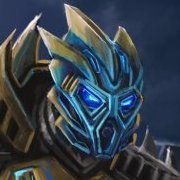
Vezok's Friend Posted February 24, 2013 Share Posted February 24, 2013 Hello there! It's certainly been a while since I last posted a topic here. So, without much ado, I give you the Toa Maru: thoe playing or following the BZPRPG might already know who they are, for those who don't: The RPG follows an alternate timeline where the mata failed to defeat Makuta and fell into darkness. A hundred years later, a prophecy tells of group of chosen Matoran to pick up the mantle of responsibility. Using special Toa-Stones containing the essence of each of the Mata these Matoran became the Toa Maru. From left to right: Oreius, Sulov, Korero, Stannis, Reordin and Leah. This artwork was originally requested by Nuju Metru and I've been sitting on it for days now, under NDA until we finally got to the point where the Maru were fully revealed. About:PS Cs4Wacom Cintiq~12hrs Cheers!-VF Quote Link to comment Share on other sites More sharing options...
Van Hohenheim Posted February 24, 2013 Share Posted February 24, 2013 woah..I mean this drawing is AWESOME. just....woah. reminds me of the toa Metru. one question: can I use one of these as my profile pic? Quote Previously known as Aiwendil. Link to comment Share on other sites More sharing options...
Hitoshura Posted February 24, 2013 Share Posted February 24, 2013 That's amazing. I never RPed on BZPower before, but still it's really cool. I like the details you put into them, especially their bodies and legs and their weapons as well. Quote profiles Link to comment Share on other sites More sharing options...
Click Posted February 26, 2013 Share Posted February 26, 2013 Man, that just about convinces me to join the RPG (although it will inevitably result in either another huge addiction that I don't have time for, or a lot of people getting mad when I don't respond to them for months.). Your style is just awesome, and it looks great. Your take on biomechanical beings looks great, and I wish I could draw like that. I'd have to say Orerius is my favorite. That pose and the details look awesome (love the mask), although Stannis and Leah are both also in awesome poses and look great. One quick question though, what are those masks? Korero looks like he's wearing a Kakama, but I can't be sure. Quote ~ Corpus Rahkshi: Fang | Hoto | Tube | Tear | Canvas | Garrotte | Reda BZPRPG: Azusai | Mitsuri The Scarabax Library | Flickr | Deviantart Link to comment Share on other sites More sharing options...
The Pyro (From TF2) Posted February 26, 2013 Share Posted February 26, 2013 HOLY FLAMING GREEN MUTANT FISH-MUAKA KITTEN PANCREASES!!!! That is awesome!!!! Its appearance totally caught me by surprise when I clicked on this topic. It was like an explosion of... I don't know... something awesome. I love the colors and the glow effects. The Toa's more complete and human-like appearance is very intricate but at the same time simplifying. The background is pretty stunning too. Quote Herro there, person.How are you? Link to comment Share on other sites More sharing options...
Meta-Mind Posted February 27, 2013 Share Posted February 27, 2013 This is great, VF! I like the style you used for biomechanicals: it's simple but detailed, and really captures the "biomechanical" nature of Bionicle characters. Between the halberd and the Kanohi, Stannis just looks amazing.(Also, those ice axes <3)One quick question though, what are those masks? Korero looks like he's wearing a Kakama, but I can't be sure.The masks are all custom Kanohi invented for the Maru, which are described in http://www.bzpower.com/board/index.php?showtopic=113&p=507510]this post[/url]. Quote BZPRPG TIME, where you could have one post talk about dinner, and the next about lunch. Time is beyond relative here.There's no reason not to put lasers in the palms of planet-sized robots. In fact, if I had my own planet-sized robot, palm lasers would be one of my first upgrades.BZPRPG Profiles [outdated] May or may not be back from a multi-year hiatus. We'll see how this works out... Link to comment Share on other sites More sharing options...
Kyla Toa of Peace Posted March 18, 2013 Share Posted March 18, 2013 (edited) Awesomeness. Pure awesomeness. Love it. Long live Bionicle! <3<3<3When commenting, please try to add specific comments and criticism? Why is it awesome? What about it do you love? Just saying something is awesome is spam and adds nothing to the topic. -B6 Love the detail, and how real it looks. I wish I was that talented. My favorite parts of each character are the hands and the torsos. The lining is so smooth, very natural. Keep it up! <3 Edited March 24, 2013 by Kyla Toa of Peace Quote Link to comment Share on other sites More sharing options...
aneroth Posted March 22, 2013 Share Posted March 22, 2013 We have been over this before. I see things in your art that have become bad habits. Link I got tired of scribbling on this, cause honestly i'd be here mainly all day. Things go from 3D to 2D with no rhyme or reason. Nothing is kept with proper alignments. armor designs get forgotten because of that trend. Look, We both know you have skill. A great amount of skill. But you choose to rush the beginning processes and it results in a work that looks good but is inherently nothing but flaws. Your color does do a great deal to hide flaws in this piece. Most eyes wont see them. But my eyes do. You drew the entire thing mainly as a complete 2-Dimensional set. you did not consider or did not care about actually designing anything here as though it was 3-dimensional, and it shows. because of this your figures remain flat and carboard like. as i said already things are not drawn properly because of the trend. and if anyone pays attention it looks as though all the figures are connected. there is no depth. nothing to seperate them. in fact your very feild of view shows us that this is a 2d drawing set in a 3d world in need of help. all the feet are flat, but the ground has perspective. This shows the great flaw of the piece. One that results in the whole thing needed redrawn and no amount of corrections would help it. Quote Link to comment Share on other sites More sharing options...
Reznas Posted March 22, 2013 Share Posted March 22, 2013 I've got to say that this is quite an amazing piece of artwork. I can see your ability written all over it. And I can also see your potential as a successful artist. Personally, what aneroth said seemed a bit harsh to me, but I do partially agree with a few things he said. However, I wouldn't really emphasize them as highly as him. I must agree that the proportions and perspective are a little bit off at times. Not to the degree that they're very noticeable, but viewing them with scrutiny outlines a few disproportions. There are also a few parts that do seem a bit 2-Dimentional as aneroth already stated, but I do think that, for the most part, the piece is pretty 3-D in nature. One piece of criticism that no one has stated yet (as far as I know) is the white outline behind each of the Toa. I understand it’s because of the lighting, but I think deemphasizing the outline a little would help the piece overall. Besides that, I only have praise for your drawing. The background is simply amazing, the characters are beautifully drawn, and the whole piece blends together to create an amazing piece of artwork. Yes, I said amazing two times in a sentence. I just simply can’t adore this piece enough! Keep up the wonderful work you're doing and keep drawing us such intricate pictures! -Rez Quote Link to comment Share on other sites More sharing options...
aneroth Posted March 22, 2013 Share Posted March 22, 2013 (edited) I've got to say that this is quite an amazing piece of artwork. I can see your ability written all over it. And I can also see your potential as a successful artist. Personally, what aneroth said seemed a bit harsh to me, but I do partially agree with a few things he said. However, I wouldn't really emphasize them as highly as him. I must agree that the proportions and perspective are a little bit off at times. Not to the degree that they're very noticeable, but viewing them with scrutiny outlines a few disproportions. There are also a few parts that do seem a bit 2-Dimentional as aneroth already stated, but I do think that, for the most part, the piece is pretty 3-D in nature. One piece of criticism that no one has stated yet (as far as I know) is the white outline behind each of the Toa. I understand it’s because of the lighting, but I think deemphasizing the outline a little would help the piece overall. Besides that, I only have praise for your drawing. The background is simply amazing, the characters are beautifully drawn, and the whole piece blends together to create an amazing piece of artwork. Yes, I said amazing two times in a sentence. I just simply can’t adore this piece enough! Keep up the wonderful work you're doing and keep drawing us such intricate pictures! -RezYou are being fooled by the great coloring. the figures are flat. it is merely the amount of shading on it that makes certain parts appear 3-Dimensional.I felt like adding to my previous edit. Link so as to not waste this post.I am not wrong with what I say, even if You like the piece or find me unpleasant.I mean no harm in my words, I only come across as I do because I have seen vezok's work for years. Similar trends appeared and have stayed for a lack of taking critism / learning / applying the basics to his work. I merely point out what I see and how to improve it.I will admit the shading is good. As I have said it does hide many flaws.But the fact remains the lineart of the piece. the figures alone. No shading. Are very wrong. I have isolated one of the figures linearts to properly show how flawed it isLinkThere is a general lack of direction and orientation from the lines at play.This should all become obvious when the line art stands by itself without the color. Edited March 22, 2013 by aneroth Quote Link to comment Share on other sites More sharing options...
Vezok's Friend Posted April 2, 2013 Author Share Posted April 2, 2013 I've got to say that this is quite an amazing piece of artwork. I can see your ability written all over it. And I can also see your potential as a successful artist. Personally, what aneroth said seemed a bit harsh to me, but I do partially agree with a few things he said. However, I wouldn't really emphasize them as highly as him. I must agree that the proportions and perspective are a little bit off at times. Not to the degree that they're very noticeable, but viewing them with scrutiny outlines a few disproportions. There are also a few parts that do seem a bit 2-Dimentional as aneroth already stated, but I do think that, for the most part, the piece is pretty 3-D in nature. One piece of criticism that no one has stated yet (as far as I know) is the white outline behind each of the Toa. I understand it’s because of the lighting, but I think deemphasizing the outline a little would help the piece overall. Besides that, I only have praise for your drawing. The background is simply amazing, the characters are beautifully drawn, and the whole piece blends together to create an amazing piece of artwork. Yes, I said amazing two times in a sentence. I just simply can’t adore this piece enough! Keep up the wonderful work you're doing and keep drawing us such intricate pictures! -RezYou are being fooled by the great coloring. the figures are flat. it is merely the amount of shading on it that makes certain parts appear 3-Dimensional.I felt like adding to my previous edit. Link so as to not waste this post.I am not wrong with what I say, even if You like the piece or find me unpleasant.I mean no harm in my words, I only come across as I do because I have seen vezok's work for years. Similar trends appeared and have stayed for a lack of taking critism / learning / applying the basics to his work. I merely point out what I see and how to improve it.I will admit the shading is good. As I have said it does hide many flaws.But the fact remains the lineart of the piece. the figures alone. No shading. Are very wrong. I have isolated one of the figures linearts to properly show how flawed it isLinkThere is a general lack of direction and orientation from the lines at play.This should all become obvious when the line art stands by itself without the color. Alright, decided to check back here, time to address this: You do raise some valid points and I see what you mean with most of them. There are a few points that I don't agree on but on the whole I do appreciate the thorough constructive criticism and I'll take most of it to heart. However, I do have an issue with your tone. And yes, such a thing exists in posting. We have been over this before. I see things in your art that have become bad habits.I upload pictures on numerous websites and I tend to read all comments made, but the last time I uploaded something here was quite a while ago, so whatever we 'have been over', I might have forgotten it. Also, 'bad habits' would mean the flaws you are pointing out are in every piece of art I've recently done. That is not the case. But since you seem to know my work so very well, you should be aware that I like to draw Bionicle figures very detailed, with lots of different pieces and so on and so forth, mainly to convey the fact that these beings can move almost like humans and ergo need to be similarly flexible. However, that sort of linedrawing requires a great deal of perspective, as you have so rightly pointed out. And you know what? That takes time. A lot of time in fact. I usually draw one or two characters and then spend about the same amount of time I did on this whole piece on a single one of them. This artwork was created before I was on holidays. And, since you are not aware of my private life (and why should you), here's a little info: I was neck-deep in doing design-work for a 3d project as well as some other things that demanded my attention. And I was glad I managed to find the time to get this artwork done in the first place. The fact that there was a deadline for this didn't help either. I am not as aware of your artistic background as you seem to be of mine, but what you assume to be "bad habits" manifesting is nothing more than a stressed student artist rushing things to meet a deadline. In case you didn't know, those are quite common in the illustration/concept art industry and I had to really focus on the other projects. Which leads me to this: you did not consider or did not care about actually designing anything here as though it was 3-dimensional, and it shows. That, just like that other point above, are assumptions about the way I work that you are simply not qualified to judge. You are not one of my teachers, you don't see me in class, you don't know what I think about when I designed these armour, wether a part of it was supposed to be layered or not (the one you pointed out in your edit was not, btw. it was merely a protruding part of a larger plate.) Because, as it turns out, I do care a whole lot about these things. Once again, I merely lacked the time to make the lineart as correct or detailed as I normally would. The same goes for the shading, where I skipped over a lot of things that I normally would do in order to get everything I had on my plate at the time done. Two to three hours for me at my current skill level is simply not enough time to get everything done perfectly. But I am working on getting better and faster. So, are there flaws? Yes. Indeed there, quite a lot actually and I am aware of them. Are you correct with your assessment of these flaws? Yes, for the most part you are, though I disagree on certain details.The way you say it though, it sounds as if you think of me as some Liefeldian artist that doesn't care about the technical side of the craft at all and just throws flawed pieces out there. And that is simply not the case. Also, things do not always have to be perfect, especially not when it comes to quick side-work in-between more important projects that was done to try out a few interesting colours and provide a quick visual reference in the RPG. It is not a piece I would ever declare as good, nor would I put it in my portfolio. Nobody really likes criticism, but it is necessary and I welcome yours as much as I do the comments from the other people, because ultimately it just helps me to become better at what I do.But don't go and make assumptions about me or the kind of thinking that went into the design-process when you don't know it. So, I'll go and take what you said, commit it to memory and next time I have a big Bionicle artwork, I'll try to apply it. And it would only be fair if you do the same and consider being more considerate in your critiques. Quote Link to comment Share on other sites More sharing options...
Taka Nuvia Posted April 3, 2013 Share Posted April 3, 2013 So... I know it's been up for a while, and I've already wanted to comment earlier... anyway, there's something about this picture that I really, really love and admire. And that's the background. Not only because it's there. It's the atmosphere it creates, with the sky's colours, the general lightning, the waterfalls. It's well-placed and absolutely fitting. And that's something you don't see that often.Also, it's not just a separate background, everything works together, the characters and their surroundings. I guess that's what I like the most about it. Quote My art collection topic - updated! (21/09/2021) Link to comment Share on other sites More sharing options...
Jam Pot Studios Posted April 5, 2013 Share Posted April 5, 2013 I've got to say that this is quite an amazing piece of artwork. I can see your ability written all over it. And I can also see your potential as a successful artist. Personally, what aneroth said seemed a bit harsh to me, but I do partially agree with a few things he said. However, I wouldn't really emphasize them as highly as him. I must agree that the proportions and perspective are a little bit off at times. Not to the degree that they're very noticeable, but viewing them with scrutiny outlines a few disproportions. There are also a few parts that do seem a bit 2-Dimentional as aneroth already stated, but I do think that, for the most part, the piece is pretty 3-D in nature. One piece of criticism that no one has stated yet (as far as I know) is the white outline behind each of the Toa. I understand it’s because of the lighting, but I think deemphasizing the outline a little would help the piece overall. Besides that, I only have praise for your drawing. The background is simply amazing, the characters are beautifully drawn, and the whole piece blends together to create an amazing piece of artwork. Yes, I said amazing two times in a sentence. I just simply can’t adore this piece enough! Keep up the wonderful work you're doing and keep drawing us such intricate pictures! -RezYou are being fooled by the great coloring. the figures are flat. it is merely the amount of shading on it that makes certain parts appear 3-Dimensional.I felt like adding to my previous edit. Link so as to not waste this post.I am not wrong with what I say, even if You like the piece or find me unpleasant.I mean no harm in my words, I only come across as I do because I have seen vezok's work for years. Similar trends appeared and have stayed for a lack of taking critism / learning / applying the basics to his work. I merely point out what I see and how to improve it.I will admit the shading is good. As I have said it does hide many flaws.But the fact remains the lineart of the piece. the figures alone. No shading. Are very wrong. I have isolated one of the figures linearts to properly show how flawed it isLinkThere is a general lack of direction and orientation from the lines at play.This should all become obvious when the line art stands by itself without the color. Lay off a bit. It's fan-art. By a student. For a forum. For fun. Your criticisms may be accurate, but what you don't need to do is grind this guy into the dirt. You certainly don't need to act like Principal Snyder from Buffy. Just step back, take a moment to look at yourself, and relax. This isn't the Tate - it's BZPower. If you have criticism, try to be constructive rather than taking a serious and borderline-offensive tone. No he does not need to redraw the whole thing. So what if some of it's a little flat? He's put up more art on this site than you have - I had a quick browse through your posts and all you've done is attack others' art. You've even gone to the trouble of downloading the images, annotating them, and even isolating certain parts of them. Hasn't the possibility that you're going OTT on this ever crossed your mind? Apparently not. Don't even bother replying to this, mate. There's nothing you can say that will help your case, unless you admit that your tone is too harsh and apologise to Vezok's Friend for being so aggressive. It just isn't how you talk to people. -JP PS For the record VF, I think it's a great piece of art. I've favourited it over at deviantArt. Quote Blog|YouTube|Flickr Making brickfilms since 2007. Check out my latest animations: , , and Avengers Tower! The first episode of Nuva, Magnetic Mania, is now live! Check it out! Link to comment Share on other sites More sharing options...

Recommended Posts
Join the conversation
You can post now and register later. If you have an account, sign in now to post with your account.
Note: Your post will require moderator approval before it will be visible.