

Update on HS01 Main Page Nav

Entry posted by Swert
814 views
I took some opinions I gained from people on my IM, and my limited blog comments, and I created this new revision. The old is just below it.

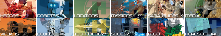
I think I did a better job on this pass, and it looks more cohesive. I'd love it if we can find a better Missions and possible a better Saga Guides image, but I did make some major changes. In addition, I adjusted the lettering spacing so the I looks cleaner. Easier to read. I also negated almost all gray (the LEGO Black icon is staying, it's the best choice.)
Comments are, again, welcome.
2 Comments
Recommended Comments