

Grandmaster Lehvorak
-
Posts
108 -
Joined
-
Last visited
Content Type
Profiles
Forums
Gallery
Events
Blogs
Store
Raffles
Posts posted by Grandmaster Lehvorak
-
-
The style is similar to Avatar, which is pretty neat and the coloring is outstanding. You did a great job on this artwork. The only thing I would say is add shadows next time underneath the characters to give it the effect that they are standing on ground instead of floating. Overall good job!
-Lehvorak
-
I do see some vector art being used for this artwork, is that indent on the top of the mask suppose to be pointy? I also believe some of the areas could have been curved a little more, but overall this is good stuff for flat design!
-Lehvorak -
Interesting, is this a vector art? Because I can see how clean the design is, but I am trying to figure if you rasterized it because it seems very pixelated.
-Lehvorak -
[...]
I'm not sure what made Macku masculine, mainly because I can't see it, it would be nice if you pointed out why. When I was done I was happy with the fact that I didn't need to add eyelashes to differentiate genders.
[...]
I suppose it could be the eyebrows, for in a heavily abstracted style like the one you're using any small detail can make a huge difference; they might be a tad bit "too pronounced" for a feminine appearance. (Saying 'might', because who says all female characters need thin eyebrows to be feminine, seriously.)
Tamaru's head is a tiny bit off-center, I think it should be shifted a bit more to the left side.
Generally, your art style is very nice, and the characters look cute. I'm also very fond of Macku's necklace. :3 Those hints of shading on Hafu's shirt (is it Hafu? I guess so) are well-done, and a cel-shade type of shading like there would work well with the other characters as well.
Also, the variation of nose shapes while staying true to the nature of your art style is impressive, I like them.
Thank you Takanuvia(I can't believe Takanuvia commented on my tiny inferior thread)! Now I see the eyebrows thing and Tamaru's head, I see it more of a shoulder issue though, the shoulder should be moved so his head gets centered, otherwise it will be pretty small I think. That was a really helpful comment, thanks once again!
Hmm about making Macku look more feminine.... Maybe it is the neck size... or could be the body itself that could use some tweaking? Like usually female bodies have that triangle S-curve shape (Hopefully you know what I'm talking about
 ). Overall, I don't believe the eyebrows has no effect on this matter since in anime/manga the character's eyebrows usually gives it more character than making them look male or female. I mean look at Satsuki Kiryuin from Kill La Kill
Reference Link: Satsuki Kiryuin
So hopefully that helps a bit
Continue to play around with it or something, and keep up the good work comrade!EDIT: Had to fix a typo!
-Lehvorak
-
The cross-hatching feel gives it a nice touch to it and It reminds me of a political cartoon drawing. I do like the overall concept of it and feel like seeing the rest of the body, instead of just a close-up on the head.
The direction of the breathing triangle things... don't know what you call it... next to the mouth seem a little out of place compared to the other contours in the sketch. I feel like you could fix that in a way to make it blend with the drawing, because the way it looks like now, it seems like it was just slapped on to the mask compared to how everything else was placed around the mask.
Overall, not bad!
-Lehvorak -
Hey there people/staff of BZP,
It has been a while since I have been here on BZPower, and I am still trying to transition back into here. What are the new signature regulations? Because I remembered you used to have a certain sized banner and you can only have a limited amount of external links that can be linked on your signature.
I was wondering what are the acceptable external links and what are the unacceptable external links (Ex: I noticed Deviantart is an acceptable website and some YouTube videos), because I need a whole rundown or list of what can be linked here or what is not acceptable, because I don't want to break any rules. So, can you help answer my question? Thanks!
-Lehvorak
-
I am trying to figure out if you are trying to make Kopaka float or have him stand on the ground, because right now it appears he is floating in mid-air. If you are trying to ground him, he needs to have a shadow underneath him. Also, I think what would help is having some highlights to your work aside from all darker value. It will give an idea where that light is facing and might help make your work stand out more! Overall, good job!
-Lehvorak
-
This Kanohi mask is really well drawn, you got the shapes right! And the simplicity of it stands out perfectly! My curiosity is since you are starting digital art, have you look into vector graphics because I think having this kanohi in vector graphics would look more appealing instead of rasterized.
-Lehvorak
-
These sketched concepts has some potential! I like how it is turning out from the way it looks, and I can't wait to see the finished final pieces if you plan on doing them. How long do you think you it will take before you get to the final stages?
-Lehvorak
-
 1
1
-
-
This art piece is pretty well made and very appealing, and even capturing the feel of the motion. I really enjoy the color palette you chose for this art piece and the style seems so unique! It would be nice to see more works from you again!
Nice job!-Lehvorak
-
Your monochromatic artwork always amuses me Taka! I have no idea how long has it been since I seen your artwork, but I can see a lot of improvements compared to the last time I seen it. I have to say you really portrayed the view point really well from the top. I can see now why you say you take as much time with your artwork now hahaha! Have you considered having a whole portfolio of your works or actually study illustration before?
-Lehvorak -
This artwork is pretty appealing, especially the way you blended the colors with one another, thus giving the values and a texture on the mask. Even if the lineart is rough, I still like that kind of style because it gives that spray paint graffiti look to it.
I also see you are trying to do a 3/4 body view for your artwork, which the proportions seem slightly off because you can see the chest armor kind of facing almost towards us while the rest of the body is doing the 3/4 view. It's okay, just gotta practice that a little more and you will get it! Plus drawing a view like that while the figure is kind of leaning can be hard.
Overall, you did a splendid job! Can't wait to see more works from you!
-Lehvorak
-
Tahu
in General Art
This sketch has potential! I really like the concept a lot! The details are coming along really well, are you planning on inking this? Also the type-face (The title that says Tahu) could be a little bigger. Overall, nice stuff you got here!
-Lehvorak
-
Holy smokes I look at the front page and everything is all cluttered up
 but it is good to see you are still up and running Gav! It has been a while. I like how your latest comic looks, a lot has improved .
-Lehvorak
-
Hey guys, since it is 2014 already.... Here is the Winter 2014 Anime line-up that will be coming out for this month and so on....
http://i4.minus.com/ibn5CtbX8FeEHT.jpg-Lehvorak
-
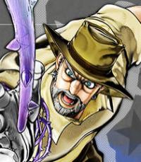
This is actually a more "cartoonish" style of art. For comparison, take a look at my other posts in the art topic such as Syvra, The Angler, Ishi Polzin, or Iraira. Some range into more human complexions, others push for that more robotic look. Shading eluded me this time around, but I'm thinking of taking a second shot at it digitally.
P.S.: Of course I saw Extended Edition.
Looking forward to SAO: Phantom Bullet too. Of course, reading the light novels in Japanese gives away most of the future plots. XDExcellent, if it is "cartoonish," cel shading will come in handy
. Oh yeah, Cel shading is also known as toon shading and it is seen in both manga and marvel/DC comics. This would be excellent to go with your artworks, and very helpful when you start digitally! Oh, it looks like you said you are staring digital? I can't wait to see that, and maybe the cel shading will come in handy !P.S. Oh yes, that's what happens when you read the light novels, hahaha! Lots and lots of spoilers, especially with the new anime that came out 2013: Shingeki no Kyojin or known as Attack on Titan. lol gotta keep up to date with my Japanese media hehehe!
-Lehvorak
-
I used to work with a mouse before I got my tablet and I can understand the pain that you are going through. Maybe I could give a few suggestions that might ease your troubles.
I'm curious what program do you use to color your works, because if that art program you are using has the lasso tool... that might help you a lot, or even the pen tool can make a huge difference. Those tools will come in handy when drawing your artworks, trust me haha!
Just remember that if you put a lot of time and effort onto your artworks, it would shows a lot when you present it than a quickly sketched drawing. This is where you can show the craftsmanship and details put on every single part of your art piece. I'll catch you later on maybe on DA or here!
-Lehvorak
-
This style you have is pretty interesting, all you need now is to add value (highlights and shadows) to your artwork to make it stand out more and giving that 3-dimensional feel to it! You should give it a try! Overall, these are pretty good stuff!
-Lehvorak -
This is an interesting piece of work, and is this usually your art style? I like it, especially how you portrayed the characters, but only if you added value (shadows and highlights) it would have made a wonderful touch on the piece. Overall, well done.
P.S. Also, lol it is nice to see another SAO fan, did you see the extra edition episode yet? I guess I'll catch ya around!
-Lehvorak
-
This is a pretty interesting piece of comic art! I like how you improved the formal piece. Pretty well done, but be careful not to color out of the outlines too much, You can still see small bits of it coming out. Overall, impressive.
-Lehvorak
-
I feel like you could add more texture into the lava because when objects are up close in a landscape painting you see more details when it is up closer. Overall, not bad!
-Lehvorak
-
It has been a while since I visited BZP, and I still see people trying to bring back people here. This has been going on for a long time, but I still don't see anything being done. I would say advertising would bring people here but that cost money for ad campaigns and all.
What I had been doing to keep my bionicle spirit up is by drawing this web comic which involves bionicle, but yeah... It is hard to bring people back here unless there is some sort of reboot of the series like what I am doing with my comic.
-Lehvorak
-
Basically you have to wait a year. That's all.
Lehvorak
-
How do I remember the gold days is by reminencing the things I use to do and being active. I guess being here made me who I am and what I want to profession. Look at me now I am already making websites and other cool stuff! I am glad I partook in the Bionicle craze of 2001 and got so inspired by it. I still have my collection... I don't ever think I'll ever sell them or give them away.
Lehvorak
2001 Bionicle Website
in Bionicle Discussion
Posted
Are the links all broken? I didn't read the rest of the posts here to see, but it led me to a twitter bootstrap-like website with titles still showing things that are still under development along with a disfigured Bionicle logo on the top rleft. I would say the Solismagna website has potential but the typography used seems a little unbionicle-like and needs some fixing there .
.
As for the 2001 website seems like it could be fixed so it won't be stuck on left align.
-Lehvorak