
Search the Community
Showing results for tags 'Coolified Artwork'.
Found 15 results
-
Welcome to the Bones Drawing Guide, ready as promised. This entry is designed to rapidly teach the important basics about how to draw. The first rule is, don't assume you aren't capable of drawing! The art for these lessons was drawn on paper and scanned; it also applies for drawing vector art in Powerpoint along the lines of my previous guides (1, 2). The text was originally handwritten but is also typed below each pagescan in case you can't read my handwriting, plus expanded on a little. It is partly inspired by Bruce Mcintyre's "How to Draw", which is the text I learned to draw from, and I highly recommend. (Here's what the book looks like.) That book has tons of lessons and a system of important elements of drawing. So as not to plagiarize, and because I think his system is a bit incomplete, I've formed my own system that I think is more logical. But if you want a more complete collection of practice lessons, try to get your hands on that book or a similar such book. A very important point he made is that everybody learns how to write, but contradictorily, we aren't properly taught how to draw. If you're one of those people who always utters the cliche "I can't draw/I have no talent/etc.", ask yourself, can you write? You might not have the talent to become a "writer", but you can put a pencil to paper and draw letters that form words. Why? Because you learned how -- and because that helps you communicate. Or same with typing. Likewise, you might not have the talent to become a famous artist or the like, but you ARE capable of learning how to draw, so that you can communicate visual ideas. Or maybe you DO have the talent. You might not even know it yet. To treat this entry as lessons, I recommend spending a day drawing your own stuff based on each rule, then spending a day on each column in the examples category. Both draw the same things I showed and draw your own, with emphasis on your own. Or you can just read it or treat it as reference; I've designed it to be easily referenced. The main thing that you'll find lacking here is huge amounts of lessons -- this IS freeware after all. To those that would say "I was already taught how to draw" -- well, there are many bad methods being taught out there in schools (for example, the wrongway cube method; see below), and there's a lot of different things that I've compressed all into one guide. This also has a Bionicle focus you might find helpful. Even if nothing in this is new to you, it may still be interesting. Contents Rules - the logically organized rules for drawing A: 3D Shape 1: Outer Shape 2: Skeleton 3: Avoid Flat B: Perspective 1: Angle 2: Floor 3: Size 4: Focus 5: Wrapping 6: Overlapping 7: Foreshortening 8: Vanishing Points C: Texture 1: Lines 2: Spots 3: Nicks/Cracks 4: Scales 5: Bumps 6: Indentations 7: Letters 8: Gravity D: Lighting 1: Radiance 2: Direction 3: Shading 4: Surface Shine 5: Cast Shadows 6: Multisources 7: Reflection 8: Metal Shading 9: Refraction Examples - five pages of various examples 1: Wrongway/Rightway cubes and cylinders, foreshortening, and vanishing points. 2: Metallic shading, doughtnut foreshortening, etc. 3: Facial expressions/emotions on a simple Bionicle-esque face, and Human/Toa proportions. 4: More about vanishing points; parabolic fully accurate system, and skyscraper system. 5: Various stuff to close out the guide, especially 3D letters. Rules NOTES: This section presumes that we're not dealing in abstract / heavily stylized art, but in realism. When you get into abstraction these rules can be bent or even ignored at will -- but it helps even there to know to draw in realism first so you know what to bend/ignore. Section also presumes we're drawing the shapes with black lines, either on paper or on the computer, rather than a more photorealistic no-line edge system (as with paint or the computer equivalent). It's the easiest way to draw, though no-line systems are more realistic. For the most part the rules apply regardless of this, just wanted to be clear. On paper, I recommend using something erasable (I prefer Papermate erasable black pens since you don't have to sharpen them unlike pencils). If you use pencil, try to get a real black pencil, not just the silvery gray school pencils, and sharpen it often, preferably with an electric pencil sharpener. On the computer, obviously I would recommend using Powerpoint (see the previous guides as linked above) or another vector program, instead of bitmap/raster programs, because the lines can be edited much more easily with vectors. Finally, I'm not dealing with color at all here. Just one bit of advice for coloring on paper -- I strongly recommending scanning your lineart WITHOUT color, then printing it, and coloring the printout. That way if your particular chosen method of coloring messes it up in your opinion, you can always try again. (And I'd recommend Prismacolor pencils for that.) Aaand without further ado... A: 3D Shape 1: Outer Shape See in your mind the 3D outer shape, or a basic idea of it, before you begin drawing. Be able to rotate it in your mind. Think of drawing as a way to photograph your imagination -- you have a "camera" that lets you draw a picture of the 3D shape inside your head. NOTE that once you begin on paper sometimes you have adjust the 3D shape in your mind as you go as the pen does something different from what you planned, but you should still remember to form a(n updated) 3D shape to guide where your pen goes next. 2: Skeleton Not all shapes have an inner structure, but keep the concept in mind. Organic (and biomechanical) creatures especially have a skeleton & muscles underneath that shows through. NOTE the bone structure of the "Tuskhop mouse" (ignoring that I ran out of room to make him as normalish as I wanted ) -- those are the same basic bone shapes, connection points, and angles that most mammals share. 3: Avoid Flat Real objects are 3D. Keep that in mind as you draw "2D" art -- your paper is 2D, but it is merely a flat window into a 3D world. NOTE: avoid the "wrongway cube" technique that is sadly taught in many public schools (I speak from personal experience >_<) that has you draw a flat square and then magically have the rest of the cube appearing at a ridiculous angle behind it -- such a shape is NOT a cube. You CAN draw a house from the "flat" angle shown above, but the chances of your art "camera" actually aiming at a house from exactly that angle are slim, and it doesn't look realistic. B: Perspective 1: Angle Your "camera" points at the 3D shape you're drawing from an angle. Choose the angle you want. Generally make sure that the angle is the same on all things in a single image. Exceptions are when you're close enough to things (or they're large enough) that the vanishing point system and the like is needed; see later rules on that. Also Ojh and I ran into the situation when making our RPG of a false angle system built into it -- the chipset "ground" tiles are forced into a pure top view, yet you usually see the sides of charset people/objects. So the angle system we used there was to always go with the angle that best showed the object, so in the same area you could have somethings topview, some angled sideview, and some pure sideview. Regardless, a big chunk of the artistry of an image is the angle you choose, so choose wisely. 2: Floor Closer objects look "lower" on a floor. 3: Size Farther = smaller (for two objects of the same size, and also for different parts of a close/big object). 4: Focus Usually, farther objects/parts have less detail or texture density, and are drawn more lightly. Especially distant mountains due to atmospheric blueing. 5: Wrapping Exceptions to the above Focus rule; curved textures look denser on the farther edges, where you're looking at the texture at a greater angle, like the tree bark, leaves, and wireframes above. 6: Overlapping Multiple objects/parts overlapping can be tricky. Try imagining the lines of the shape behind (re: dotted lines). ALSO when drawing on paper, always start with the nearest overlapping objects first, then draw back (on computer generally do the opposite). 7: Foreshortening At angles, circles (as in at the top of cylinders) become ovals, not circles with malformed thicknesses magically appearing. Slightly "football" shaped, too. And foreshortening applies to all shapes. NOTE with the cube that ALL parts of it must be foreshortened. The only way you could realistically draw a perfect un-foreshortened square would be if your "camera angle" was directly perpendicular to the cubeface, and in that case, the thickness would NOT be visible, so all you would draw is a square. Can't emphasize the cube thing enough, as you've probably had gradeschool art teachers that didn't know better. Try looking at an actual physical cube -- you'll see I'm right. 8: Vanishing Points Most accurate way to foreshorten. Use especially for: 1) large objects, 2) closeup objects, 3) room interiors, 4) simple geometric shapes, 5) roads. NOTE especially that this applies to curved and complex objects, NOT just to rectangular ones, though it's usually harder to tell, hence the foreshortened circle inside a vanishing point grid. You may want to skip down to the larger illustration on vanishing points in the Examples section, then come back up here, as it makes this much clearer. C: Texture 1: Lines Easiest way to create depth to objects, and applies to many real things, not just imaginary wireframes. Examples to take note of: pipes/tubes (note the use of this for a Kanohi tube in the Examples section), rocklayers (note in the above example the thicker and thinner varying layers as in real sedimentarily laid-down rock and in volcanic rocks often), and the wood/bark. With the first two of these examples, the lines are perpendicular to the cylindrical direction of the shape, thus curve around it, but with the bark, the lines are parallel with the branches. Also try crisscrossing diagonals and more. More examples: fur; notice how instead of using solid outlines on the two creatures above I made the outlines out of "//////" shapes for the rodentlike creature and interlocking curves for the horselike creature's mane. For things with wiry hair (like a mostly bald guy's forehead :-P) you would go and draw a solid outline and draw the wiry hairs coming off of it, but these things are rare. Also stripes, wrinkles, and on biological creatures especially mammals, underlying structure that shows through the skin and fur such as ribs, other bones, and muscles. 2: Spots Note the infected Hau to show you that spots don't necessarily have to be cheesy polkadots. :-P Be sure to foreshorten. Also note the two dots on the shirt on the right shoulder -- not only must they be foreshortened, but they must also be curved to wrap with the curve of the cloth there. 3: Nicks/Cracks A specific line texture technique that adds age to things, especially metal, stone, wood, plastic etc., while also adding depth. Usually you want to make sure each nick is at a very different angle from the others, so it's not confused with parallel or perpendicular line texture. Also for curved objects (like the biomechanical leg shown above) make the nicks more common on the edges (wrap). 4: Scales In some cases like reptiles or rooves. With scales like the reptile's above (or like fish scales), draw the "frontmost" scales first; the ones that overlap the others behind it. 5: Bumps Convex lines point out from "center" of surface/angle. I put center in quotes because on the bumpy bone-forehead of the reptilian creature above, there isn't an exact circular center. So more properly you could say angling outward perpendicular from the surface. Note also the atom-like bumpy sphere, where the bumps are angling away from a true center. 6: Indentations Yes, I know the numbering is wrong starting with this rule in the image above. I don't have time now to fix. Basically this is the opposite of bumps, using concave lines pointing in towards the "center." Note the sandy ground texture in the lowermost image above, and that the footprints use indentations inside bumps, basically. 7: Letters They must foreshorten and curve around textures. This may very well be the most difficult part of realistic art (on paper), as your muscle memory constantly tries to lure you back into normal 2D writing mode. See the Examples section for much more illustrations of this. 8: Gravity Weight distorts texture, depending on what it is. This rule corresponds to the following things in the above image: the candlewax drips, the footprint impressions and pushed-up-and-out sand around them, and the greater amount of grass at the base of the tree, and the slightly higher ground there. The ways this rule manifests abound. D: Lighting 1: Radiance Remember that light is radiating energy. It comes from a source, and whether that source is "onscreen" or off in the image your "camera" happens to "take", all lighting and shading and cast shadows and the like must take this into account. The paper version above is confusing on this one, so lemme be clear: With lamps and most similar artificial "terrestrial" light sources, the shadows and shading radiate away at many different angles, all radiating from the source. Even the two different sides of the shadow are at least a little angled differently from each other. Note especially the shadow of the lower-left cylinder in the image with the lamp. Also shadows of farther objects are often longer than closer objects (depending on height and yadda). With sunlight, all the light is mostly from one direction at a time, since the sun is so far away (and is bigger than Earth by a ton). 2: Direction The three balls above cannot possibly be in the same image because the light direction differs randomly (barring weird atmospheric bending effects :-P). Choose your lighting directions carefully. By default I usually go with light coming from the upper left corner if I don't wanna bother figuring out where a source is (for when I'm just drawing an object and not its background just to illustrate the object itself etc.). 3: Shading Refers to darkened surfaces of objects, opposite the light sources. Note the gradient fading effect of the shading on curved objects; realistically there is no definite linebreak between light and dark on them, unlike cornered objects. Exceptions can include nighttime shading and especially outer space shading (and simple cartoon styles). (For shading in .ppt I generally use layers of trans-black.) 4: Surface Shine The opposite of shading; refers to lightened surfaces of objects, facing the light sources. On paper, 'tis the abscence of shading. On computer art such as .ppt, I generally use either layers of trans-white, or radial "shine" ovals (or both). 5: Cast Shadows Refers to darkened area cast BY the object onto other objects, the floor, etc. Again, shading refers to the darkened areas of the object itself, which is not the same thing as shadows. In direct sunlight, the edges of shadows are sharp edges; not blurred at all. Shadows cast by lamps generally begin with sharp edges but gradually fade into blurry edges the farther away from the object and lamp they get. Shadows in partial cloudy sunlight are extremely blurry. 6: Multisources In cases of multiple sources of light, there are multiple shadows, and the shading/lighting on the objects themselves are blended between the multiple systems too. When two cast shadows overlap, they are twice as dark (or to put it another way, where they don't overlap, they are only half as dark). I recommend doing all the shading for a single light source first lightly, then doing all of it for the other, then adding extra darkness to the overlapped shadow areas. NOTE that shadow edge blending is technically a case of tons of multisources -- one the original bright source's center, two all diffuse light reflecting off other nearby objects, walls, floor, through clouds, etc., and three the fact that close/large light sources have light coming from all over them, not just their point-centers. Direct sunlight can be treated as a point-center-only light source, as can distant streetlamps or sports stadium floodlights, etc. But a household lamp that is near the object in question has light coming from a wide area, from the top of the lampshade to the bottom, and from the left side to the right. So essentially it's thousands of multisources, times a bazillion when you factor in reflected diffuse light. 7: Reflection Reflected images get complex fast. Basically imagine a dotted line perpendicular to the mirroring surface -- the incoming angles of light with respect to this line equal the outgoing angles. Do this for every point on the mirror inside your imagination's 3D shape, and you can come to a habitual understanding of reflections. Also just try holding various shapes in front of a real mirror and observe the real world. Explanations of the other text in the above cardscan: The image at the top shows the reflection of the tall rectangular box shape in a mirror that's at an angle. If you go to a shoestore, they often have mirrors against benches in this exact position. Study those mirrors and note how wacky the reflection is compared to the real objects. Or, to replicate that scene without going through the dotted line process for every point, you can follow three steps: 1) draw the exact flip of the original object in a mirror at a 45 degree angle to both the object and your "camera", 2) angle the mirror down, and angle the reflection down by the same distance. So the reflection is twice as angled as the mirror, and 3) Move your camera up, and angle the reflection so now you're more up than sideways. The ceiling will generally be partly visible. There's another even easier way to do that image, which I'll get back to. First lemme explain it for a simple puddle. With the cylinder above the puddle, notice two key things. 1) The upside-down base of the reflection is the base of the object, NOT the top of the puddle. Since the puddle begins a ways away, the reflection looks cut off. (Also I showed another cuttoff part of the reflection farther out where the ground rises out of the puddle again; so treat the reflection as if it's "behind" the outline of the ground; as if the ground is overlapping it.) 2) If you flip the image upside down, you're now looking "up" at the pillar in the water, instead of down at the original pillar. The top of the original pillar shows a foreshortened circle, but the top of the reflection does NOT. So back to the angled mirror, another way to draw it (and the way I used incidentally) is to mentally or actually angle the paper so the mirror looks "flat" to you, like the puddle, and then just draw the upside-down-flipped version of everything. If you get good enough you will be able to do this totally mentally without tilting your paper at all. Finally with the mountain lake scene, notice again the bases and the upside-down-flipped aspects. There are three different (basic) bases; the shore earth's base which is right on the edge of the lake, the bases of the trees, and the bases of the mountains. The shore base actually curves and bends, and where the shore juts out to the left, you see what could be considered a fourth base for that portion of the shore. Also, since the shore curves/angles away from the water instead of being perpendicular to it, the reflection is thinner. The tree base is the most complex. The tree trunks go into the earth higher up than the lake. So the reflection base is actually somewhere inside the dirt under the trees, not at the visible base of the trees themselves. So imagine that each tree is actually on top of a pillar of dirt inside the ground, and the base of the pillar is at water level (and that might very well be where the ground water level is). In addition to that, each tree's base is farther away, thus "higher" on the puddle's plane, so less likely to peek over the shore, much less the other trees. So the only trees you see in the reflection are the closest ones. The mountains are the easiest -- they're so far away the horizon line acts like their reflection base. The deviance from that line is too slight to worry about. NOTE that the middle mountain's reflection is actually not done quite right; there should be far less of it visible since it's the farthest of the three mountains judging by overlap. Now, look at that image upside-down (if you can manage that onscreen :-P) and look at the reflection. Doesn't it look as if you're looking up at the mountain scene through a hole in the ground? That's basically what you're doing. 8: Metal Shading Metallic curved surfaces almost always have a bright edge on the farthest side from the light source (reflected light from the ground on their mirror-like surfaces, intensity depending on how reflective the metal is), more extreme contrast (gradient goes to pure white towards the light source and to pure black away from it before the bright-edge), and a leading edge darker area. For flat metal, use many randomly spaced diagonal gradient lines. All on one surface are parallel, but lines on the next surface align differently. This isn't pure realism here, but pure realism often makes it harder to understand as metal at a glance. Another technique for flat metal is to ripple and patchy-ify the lighting based on the slight ripples and bumps in the metal's surface, which I didn't happen to draw, but yeah. 9: Refraction Even trickier than reflection. Usually water is all you need to worry about. It's another case where it's best to imagine the actual light rays. Also taking a college physics course would help. :-P Note most extreme angle does not refect at all but reflects down off the air back into the water. That's basically what fiber optics takes advantage of incidentally. There is a slight foreshortening of the whole shape, which gets more extreme the more extreme the angle of the "camera" is. Examples: This section shows some of the most commonly important concepts in art (with a Bionicle focus). Each of these pages basically goes down columns then up to the next column etc. To start this off, look at the wrongway cube that is sadly often taught in art schools. The two images below that show what that mangled shape would actually look like if you angled it different ways. It's NOT a cube -- it's a parallelogram prism. Note that the first example under Rightway cube started out too short so I gave it a base. The three examples below that show actual cubes, and below that you see the only situation in which you should actually draw a perfect square that isn't foreshortened -- here you're looking directly at one of the cube's six faces, and thus you do NOT see the other faces at all. Then there are some wireframe stacked cubes and such. Back up to the topo' the next column, note the wrongway cylinder, which is actually a... diagonally squished pop can? :-P Then note the rightway, and the top view. Third column shows some examples of foreshortening, under the vanishing point system. First column starts with metallic lighting. There's another example of multisource lighting with a metallic cylinder -- notice the multiple bright lines in the cylinder's gradient. Then some random stuff. Second column starts with a rounded cube. The shading is solid on the flat parts but a gradient on the curved. The doughnut and snakes show what happens when a tubelike shape is foreshortened. And the rattle cobra shows various snake features in one creature for the heck of it. Third column shows various stuff, especially letters. First column is devoted to facial expressions, on a simple Bionicle-esque face, and with VeggieTales faces. At the top of the second column is a geometric basic idea of a Toa Metru ish face, and then all the parts shown seperately. Below that is basic human/Toa proportions. Note that for humans the arms should be a little shorter; Toa arms tend to be longer. Basic idea is to use the head heighth as a measuring unit for the rest of the body. Also some general tips: Try drawing real plastic Kanohi and Bionicle/LEGO pieces, as your eyes actually see them. Try sketching lightly first then adding detail. Also try molding from clay or Sculpy or the like, then drawing that shape. Exact text (mostly), starting with the emotion column: Simple Bionicle-esque example face to show emotion. happy sad, angry scared, grin "that's weird", yawn, annoyed coolguy grin VeggieTales style emotes (satisfied/halfsmile, annoyed glare, "you're crazy" glare, super-scared, coolguy grin, insane, very annoyed, and singing uplook. Example Toa-style head, using simple geometric shapes. Human Proportions NOTE: Average 0nly. Contrary to popular myth, Bionicle characters do not need to be in human proportions, as they're not related to humans and are biomechanical. However, Toa tend to be close; same with similar taller beings. Matoran (and human children, by the way) tend to be more like 4 to 6 times the head, etc. And even adult humans vary. Total height of a proportionate humanoid is 8 times the head. Legs in proportionate humanoid equal half the body height. Arm length may vary in biomechanical/etc. beings. These arms are longer than a human's by about half or 3/4 of a head; about average for a Toa. (Human belly button at 3 times the head (down from top of head).) This page shows the Parabolic 3 Vanishing Point System, and the Skyscraper 2 Vanishing Point System. Note the lower left diagram, which shows that a fully accurate vanishing point system for all objects actually has 5 vanishing points; one for the distant horizon you're facing, two for left and right parts of horizon, and two for up and down. Example: if you look down at a cube or up at a skyscraper, the verticle lines should actually be slightly bent towards the corresponding up/down point. The skyscraper's top here bends in towards the up vanishing point because you are looking up at it. This applies for close/large objects. Small objects you're looking at from a distance don't necessarily need this. The above typed text says what I handwrote on the pagescan, but says it better, so I won't bother typing the exact wording of the handwriting here, except that the random building is shaped like a rocket from top view thus I've dubbed it the "Rocket Hotel". Reasoning being to show off the "knife-edge" style that many modern skyscrapers now have, instead of all 90 degree corners. And finally some various things to finish out this guide. Topleft is a reminder to add "thicknesses" to things like Kanohi masks or windowsills, etc. Only paper actually has no (noteworthy) thickness. That's a randomly coolified Miru there. Below that are four simple steps for drawing a plastic/metal/etc. 8-point star: 1) Draw a foreshortened "paper" square. 2) Divvy it up into four parts by cutting it in half with a line lengthwise and widthwise, and draw a verticle up from the center. 3) Draw a circle within the foreshortened square and halve its sections with lines (giving you eight radiating lines from the center of the circle, all foreshortened automatically), plus another smaller circle inside. 4) Draw the final lines between the points in question -- the center at the top of the verticle line, the outer tips of the star points where the eight radiating lines hit the outer circle, and the eight points on the inner circle exactly between the radiating eight lines. Voila. Then there are various things on writing 3-dimensionally. Here's the text of all that: ART. Practice this way of writing by making all your letters do these kinds of things for a while. Then add the boundaries. Or try writing normally, then tilting the page and drawing what you just wrote. Note the wrongway to tilt your letters; you can't just write at an angle, you must mutate the lines of the letters themselves. Note that in the wrongway, the verticle parts of letters are parallel to the verticle edges of the foreshortened square, and the horizontal lines are angled so they're parallel to the angled "horizontal" edges of the foreshortened square. Write on! Notice how even the parts of the same letter bend down, not just each letter being lower than the other. Notice the oval as the foreshortened letter "o." Avoiding wrong angles (in foreshortened writing) is tricky; may take a lot of practice. Next to last is a bending serrated tube. Note the (|) shape at the point most parallel to the "camera", and the scrunching of the foreshortened bands at the parts most perpendicular to the "camera." Finally, four common LEGO/Bionicle pieces. A'ight, there's the guide. Comments/questions/yadda?
-
Today the Bones Blog brings a walkthrough of tips to consider when drawing vector art with Powerpoint. This is Part 2 of the two-part feature begun here: Vector Art In Powerpoint: Quality, Inexpensive, Easy. That entry focused on the inexpensive and easy aspects. This entry should help with the quality aspect, listing many important concepts I use when I "coolify", though they can be used for original artwork too. I will use an avatar request from Great Being #1 to illustrate these concepts. Enjoy! Note that "quality" here is partly defined in my own tastes, since all I know how to do is my own style. A lot of what I'm talking about is my own definition of "cool", as previously defined by this blog entry: Ruthless Elegance: A Visual Guide to Cool. However, many of these concepts can be modified for other styles, and I will point out some techniques I use that can help with any vector artwork. If you don't see "cool" the same way I do, don't fret. Note also: Images will follow the text of each short section, as many are quite large (but not very wide so hopefully not screenstretching). Lemme know if these take too long to load. (I was too lazy to thumbnailify most of 'em. ) Order is roughly a mix of relevance, and just the order of which subject comes up in order as I drew. Setup Artpad Okay, here you see the "artpad" that I created in the first part of this feature. Below the drawing area, I pasted the quote from GB's PM. That is the guideline I have to keep in mind as I go. To the left I put an image of the Ignika, so I can easily glance at it as I go. Since he's asking for a meld, I could have also pasted in a Miru pic, but I know its shape by heart so I didn't bother. Zoom In! Don't try to draw it at 100% zoom. I go into 300%, usually. Note that you should click the BZP Blue square before zooming so that the new zoom will center screen right on it. Otherwise it just goes into the center of the whole slide and you'd have to scroll around to get to the right spot. Zooming always centers on whatever you have selected. Conceptualize It helps if you imagine what you will probably end up with before you start clicking. In this case, I knew I needed to find similarities between the Miru and the Ignika. There are a lot; they're really the same basic shape except the Miru's nose area bulges out and the cheek areas have those biggrin gaps. I noticed that there's a line on the cheek areas of the Ignika next to those serrations that could have a gap added in, and imagined from there. So before I even clicked once, I knew roughly what the final product had looked like. I also sketched it on paper real fast at one point. That can be helpful if you're proficient at sketching (as I am). Try not to overthink the paper version, though, because you might end up drawing something so cool you'll wish you'd done it on the comp and then get lazy for that step. Note that if you have a scanner, you can also scan a sketch, paste it into Powerpoint, and draw lines directly over it. I have done that for some coolified Kanohi. Spikes Spikes are the key, IMT. What I love about sets like the Piraka or masks like the Ignika itself is spikes. It's a central concept to my style of "cool", and it's also very important for "coolifying". The Ignika has some spikes, but right off the bat, I notice that the four in the mouth area and three at the top could use extending. So I draw them sharper and longer. Serrations Serrations, like on the sides of the official Ignika, are another key to my style of cool. Serrations are basically three or more parallel ridges or the like. As I drew, you can see I originally put some "gap" serrations on the forehead. Dropped 'em later, but that's a type of serration too; long gaps arranged in parallel. Also used on tons of my coolified Kanohi. Serrated rectangular prisms, flat, are used on the sides of the mask later. Mock Curves You might recall I said that in the Edit Points mode, you can make a point on a line into a "curved point". This alters the mathematical formula behind the vector object to make the line literally curved. However, it's tedious when you're manipulating ten thousand points. If you're drawing a company logo, you would use that feature in a professional vector art program. For making an avatar, it's pointless because 64 x 64 is too small to see that kind of detail. Even 100 x 100, my avatar size, is too small. So you can make "mock curves" by simply clicking enough dots in a curve shape to mimic the effect when you zoom out. I never use actual curve points anymore. Too complex for free stuff. Use the Edit points mode to make any slight corrections needed if the result accidentally looks too "cornery" to you. This image goes back in time a little compared to the last one but it illustrates the concept. The dotted red line is a point I was moving when I printscreened: Line Coherence The above looked horrible IMT -- but it was fine for the moment because I got something down on paper (as it were). The beauty of vector art is that you can change anything you drew just moving points around, unlike pixel art. But why did it look horrible? Because there was no "line coherence". Coherence is a fancy term for not being a blob. If you look at a sword, it might have a curved line, but that curve is steady along its width. It doesn't waver wimpily like the goofy cheek area in the above attempt at the mask. The word also strongly implies that different parts of the same mask "line up" in ways that make the whole thing seem like a whole, rather than a conglomeration of different parts. Strong curves, lines, angles, and lining up those things all come together to form "coherence". So I edit points like mad until the whole thing feels "coherent" to me. Notice in the final mask in the banner: the outer edge of the cheek gaps lines up (continuing the curve) with the outer edge of the eyes. The inner edge of the gap next to the eyes lined up with the outer edge of the mask, and the outer edge of that gap lines up with the outer edge of the lower half of the mask. The mouth spikes all line up, and their outer edge forms a rough 90 degree angle with the lower edge of the upper half. A rough curve exists between the points of all the lower end of the spikes. Etc. All of this contributes to the mask's coherence. Strength Speaking of strength, remember that this style is supposed to be "ruthless" elegegance. But as I went, I realized those chin-spikes looked more "dainty" than ruthless. So I thickened them, and made the sharp "blade" point more like the number 7. Later I realized it needed to be even thicker and the thickening of it increased its appearance of strength. Detail vs. Space There are two conflicting ways to go with any given flat surface area. You can add detail, or make it "smooth", making a space with no detail other than maybe a gradient or texture, etc. Both are important. Detail can give a piece of art a greater sense of reality. If I make some details of a coolified Kanohi too small to totally make out in the zoomed out view, it creates the impression of a real object that you could see more of if you zoom in. Compare the final avatar with the banner for this blog entry; you might see a few details in the zoomed-in banner that you can't quite make out in the avatar. Space on the other hand can give the mind a sense of peace. If you just throw a pure wall of detail at someone, especially if most of it is too small to make out clearly, you just confuse them. Might even give 'em a headache. If you zoom out and have to squint at the screen to see your artwork, you need more space. Cut stuff out. This is always the hardest aspect to balance when coolifying, especially with the 64 x 64 avatar limit. I much prefer making avs for 100 x 100, but only staff can use those. As I went, I realized that I was trying to put too much detail on the forehead of this mask. Even after I cut some forehead serrations (that I forgot to printscreen), when I zoomed out, I had to squint. Had to edit several times. Helps to do so when you're very tired and your eyes are getting blurry at night, BTW. Even the final version of this might have too much detail; I'll leave that for GB to judge, heh. Usually these aren't problems with big art though. Set Autoshape Defaults (Color, etc.) Note that as you draw, you can right-click an object and select "Set Autoshape Defaults". If you do this with a green object with a black line, those settings will become the "default" for when you draw a new object. Useful since you want your whole thing to be in some color other than that weird bluegreen Powerpoint has as its default. This way you don't have to keep editing the colors of every new shape you draw. This will reset every time you make a new file. In the example, you'll notice that I had started out with blue, which had been the default for the objects in the last blog entry (I'm using the same file, obviously). GB hadn't given me the color he wanted until this point, so I had to edit them myself once he did. Then, I set the main green as default, and every object I made was this color. Note: still requires modification sometimes with gradients or shading or cast shadow objects, but in general it's easiest. Gaps You can "poke holes" in a mask by simply drawing a gap on top of it. That is, draw a new object in the shape the gap would be, and then just make it the same color as your background. Note that this isn't possible with any kind of gradient, texture, or image in the background, unless the gap is tiny enough that you can recreate the color from that part of the gradient to estimate. In general, use it only for solid color backgrounds like the BZP Blue background in this example. 3D Thickness Remember you're drawing a 3D object. This might be a lot harder to do for a beginner than I can identify with, having been drawing 3D for years now, but basically, pick up a piece of plywood sometime and hold it at an angle. Notice it's not just a 2D piece of paper, it's got thickness. You can draw that sort of thickness into a Kanohi or other similar things with thin polygons drawn on top of gaps' edges. In terms of layers, these "thicknesses" on the eyes are actually above the BZP Blue objects that form the "gaps". Gradient Shading 3D objects with curved surfaces have a gradient "shading" effect (not to be confused with a shadow; shading is on the surface of the object itself). You can mimic this with Powerpoint gradients that start with your main color and blend into a slightly darker version of it. With symmetrical objects, it's easiest if you simply aim the darker side of a gradient fill towards the outer edges of your mask or whatever. In this example, it is as if light is cast onto the green mask from directly in front, so the parts to the sides are dimmer. Be aware of diagonal gradients too. Also, to convey a concave shape, you can flip the gradient so brighter is on the edge and dimmer in the middle. I use that for mouth areas sometimes with Kanohi to convey that the chin is jutting towards the screen. Not used in this example. Cast Shadows Use a transparent black object with no line over parts where a light from slightly above would cast a shadow onto other parts of your artwork. In this case, I wanted to convey that this is half Miru, and Miru has a far-jutting nose area, so I used a cast shadow under that area, transparency about 80%. Be consistent -- if you use cast shadows in one part, pay attention to where else one would realistically be cast. Size Remember the zoom -- and that the size of each part might look big as you draw it, but when you zoom out to the real size (like for a 64 x 64 av), that part might look tiiiiiiiny. Was the case with the mouth area ridges on this mask. When zoomed out, I could barely even see them, so I had to enlarge them by more than double the original size. I did this in this case by Editing points and moving the outer edge points of each spike out even farther. This same concept helped judge "Detail vs. Space"; there was a lot more line detail around the eyes originally, but when zoomed out, I could see that that made the area look too "small". So I cut some of that detail, and it created the impression of larger parts. You're drawing a germ through a microscope. Keep that in mind. Ruthless Revision If a part of your artwork is looking ugly, don't be afraid to change it or cut it completely. Be your own worst critic as you're making it. You should design it to please yourself above all, since that is pretty much the only thing you can be an expert on. So be honest, is something you just made displeasing you? If so, change or cut. I cut almost half of what I drew with this mask, and the final shape is a lot different than what you see in the earlier pics. Maybe a grand total of 20 points are untouched out of the whole 200 (or whatever) since I drew them. Estimating wackily, but you get the idea. Even then I was not yet done, as the below is not the same as what you see in the banner or GB's avatar: "Proofscreening" You write a story, you proofread. You draw something that's designed to be printscreened, you "proofscreen." That is -- by all means, printscreen when you think you're "done", but don't let the ruthless revising stop there. Be honest -- once it's put into the final image, does it really look perfect? If not, is there anything you can still do to improve it? In this case, I again went back to the powerpoint file and widened the mouth parts once more to what they are now, even after I had actually uploaded one version to brickshelf and was about to PM it to GB. It just wasn't right yet. So I widened them, and went through the whole printscreening process again. Might sound tedious, but get it over with while you still have the file up, or you'll probably never go back to it. Don't let the "but I thought I was done!" idea discourage you from putting out your very best. Of course, if it's 11:30 at night and you have homework, like me right now, do call it quits and call it best job possible (for now). But otherwise, fix it. Shouldn't take too much longer. Also, one note about printscreening. It can be hard to get the line thickness juuuuuuust right for the zoom you need. Not to mention getting the zoom exactly right. (Remember the line thickness is not related to the size of the artwork, so if you zoom out, it seems thicker, maybe too thick.) So if you have a good program that can resize images without distorting them too much, feel free to printscreen a little larger than your final size, and shrink it a little. Remember to hold Shift to make sure its width and height stay undistorted. Also, if there's an "Anti-Aliasing" option, make sure it's turned on. (That program that I use for pixel/raster art is iPhotoPlus 4; just a prog that came with an old (now deceased) scanner. It roxors, but as far as I know, few have it, and pretty sure it is no longer available. But there are tons of other programs out there that can do simple resizing, including Microsoft Photo Editor, which, as I mentioned before, sometimes comes with Microsoft Office.) Aaaand, all that done, here's the final mask in two zooms: And here's the actual avatar, background turned transparent and converted to a .gif in Photo Editor, as sent to GB#1 already: You're welcome.
-
Today the Bones Blog presents the method I use to produce quality vector graphics with Powerpoint. I'll organize this by basic tools and concepts you need to understand, using screenshots to illustrate key aspects. Click image thumbnails for full images -- these contain important details too. Also note the cursor is auto-removed in these printscreens, so sorry for any confusion that causes. Part 2 is now available here: Coolifying With Powerpoint Vector Art Powerpoint as a Vector Graphics Program Many people have asked me how I make art such as my "Coolified Stuff" (see bonesiii_topics), and curiousity goes up when I say I used Powerpoint. A lot of people think "Powerpoint" means words in a slideshow designed to bore employees and students to death. If you read any basic description of Powerpoint, you will be hard-pressed to even find a mention of graphics creation. It can actually do a large percentage of what high-end vector graphics systems like Macromedia Freehand or Adobe Illustrator can do. This is great, because those programs are very expensive -- Freehand is listed on its website as 400 US dollars, for example -- but Powerpoint comes automatic with Microsoft Office, which most PCs have standard. It is about as close to free as you can get. Many of you probably already own it. I have used both Freehand and Illustrator, though I cannot afford to own them, and it is certainly true that if you want to get into professional graphic art, Powerpoint ain't gonna cut it. However, the most important tools those programs offer, Powerpoint can replicate easily, so when you buy those, you are paying for many extras you probably will never use, especially if you just want to make an avatar for your BZPower account that will be too small to make out many details anyways. So, do consider those programs, if you have a lot of disposable cash, but otherwise, Powerpoint is far more accessible. Note that this guide will be written for PC use. I hate Macs. Much of what I'm going to show you is a little harder with a Mac, despite what their ads might lead you to believe. Not even sure if Powerpoint comes with these options for Macs. But Mac users can make the best out of this, hopefully, figuring out the closest method to use. (For example, the Macs I've seen have no right mouse button so you have to hold down the CONTROL key on the keyboard to get the rightclick menu. Ugh.) Also note: The banner for this entry shows some of my favorites I made with Powerpoint. Note that the upper left hand image was an old avatar made with a different (raster/pixel) program, that isn't included in this guide as it's a rare program; I used that image for inspiration while making my currect av, which you can see in the center. To the upper right you see half of the new Reference Keeper Team shared account's avatar, and to the lower left you can see the original coolified Rhotuka drawing. One final note: I had planned to use an avatar request from Great Being #1 as the example of this entry, but I've run out of time and space to add it in, and as I went it was clear I could illustrate how to do this easier with simpler things made from scratch. Sorry, man. But there's so much more to the actual coolifying process, I plan on making a second entry focusing on that. When homework lets up again... in the distant future... Polygon/Freeform Tool Powerpoint has a whole range of various graphics tools, most of which you are probably aware of, such as drawing a square or circle. But one tool in particular is the key to vector graphics -- the polygon tool; also called the "Freeform" tool. Click for full image. Here you can see the "lines" toolbar with the freeform tool selected. In the full image, you can see how to get this toolbar; go to Autoshapes, Lines, then click the top part and drag out of the menu to make the toolbar stay in easy access. You can snap it into the bottom of the window with the other buttons or move it anywhere in the work area. I prefer to move it out right next to what I'm working on; easier to grab it. Also note where the zoom control is (the red arrow in the image above). You'll want to zoom in a lot, like 150% to 300% to draw your shape, so that when you zoom out to printscreen when you're done, any jagged edges in mock-curves will look curved, and just so that you can more easily control the mouse as you draw. Pay attention to what the line thickness looks line in the final zoom, the size you want your actual image to be, not the thickness when you're zoomed in. Before Using the Polygon Tool: Two important settings must be fixed before we can continue: Click for full image. Make sure these options are turned off. The grid forces each click into rigid squares that make artistic drawing nearly impossible. By default the first one is on, so you'll have to fix that every time you make a new file. Also, be aware that each time you make something with the tool, you'll have to select the tool again to make a new thing, so you won't accidentally make a new polygon everywhere you click, heh. Four Polygon Abilities There are four main abilities of the polygon tool. 1) Click, release, move mouse, click release again, so you create a polygon. Close the shape by end-clicking where you started, or finish the unclosed line by double clicking. This is what I use most. 2) Hold and drag to draw with a pencil. Only use if your hand-mouse coordination is strong. When you release it generates a polygon roughly in the shape you drew. I never use this. 3) Filled areas -- usually, close the polygon and a fill color comes up automatically. Settings can also create this and manipulate it in some useful ways. I use this with gradient effects to create mock-3D surface lighting effects in my coolified avatars. Double click an object or rightclick and select properties to get to the color options. 4) Edit points (right click on a made object for menu) -- after you've drawn something, you can edit the points of the polygon, even make them curve points, to fix minor mistakes without needing to start over, or even to reshape the shape completely. Sometimes I only put down two starting points and draw totally with this option. Here's an ubercheesy example of all four: Objects (Autoshapes) When you draw a shape with the polygon tool, the square, circle, or any other Autoshape tool, it becomes an object. It is not pixels like in Paint -- that would be raster art, but this is vector. These are mathematical formulas that can always be selected, moved around, modified, even after you draw other shapes. Click an object you've made to select it. It gets eight white dots around it, plus a green dot at the top. Right click it for a menu full of options, the most important being "Format Autoshape." Here are three major things you can do with an object just by selecting it and clicking something: 1) Hold and drag to move it around. Hold Shift to force its movement into straight lines up, down, or to the sides. 2) Drag the white dots to expand or shrink the object. Hold Shift to keep the shape undistorted as you resize it from the corner dots. Side dots stretch/compress it sideways. 3) Drag the green dot to rotate it. Hold Shift to snap its rotation into the major angles like 45 or 90 degree angles. (The result of the above is #4 in the image below) Click for full image. Click on white space or another object to deselect an object. Here are some of the basics of the Format toolbox for objects: 1) Fill Color options. Select from preset colors, mix your own, and more. More on this later. 2) Fill Transparency. This can create cool effects with backgrounds. Note that any lines of objects behind will show through, which sometimes creates problems with complex multi-event objects such as my avatar -- if I made that transparent at all, lines of the skull would show through the mask, which would look weird. But used carefully, this is cool. Also, more on this in the color section later. 3) Note you can also type in an exact transparency. 4) Line color. Similar options as the Fill color, except minus some features since lines are one dimensional. 5) Line thickness. I usually go with the standard 0.75, but sometimes if you're making an exceptionally large artwork, you'll want them thicker. Or thinner for tiny details, etc. Note that the line thickness is relative to the zoom, not to the artwork itself. If you zoom out far enough, the lines look way too thick compared to the artwork itself, as you can see in the second of the following images with my avatar art. More on this in the Printscreen section below. Click for full image. Grouping Multiple objects can be combined into one by grouping them. This makes manipulating a whole group much easier as you can select everything in the group with one click and reduce the chance of mistakes that would move one part of the whole artwork where you don't want it. Here's the details on grouping: 1) Select the objects you want to group. You can click and drag a box over them, as shown in the example. You can also click one object, then hold down Shift as you click each object individually. Sometimes there might be one object in the box range that you don't want to include, so the clicking method can be used to avoid including it. 2) Rightclick, go to Grouping, and click Group. 3) This shows the grouped ubercheesy skull object. 4) Click object inside the group to manipulate only them. Hold Shift to select multiple parts of the group. This option you will use less often, because you can do the same thing without grouping, but it can save time once you've already grouped something and you realize there's more to change about it. 5) The results of manipulating parts of the groups -- a color change, obviously. 6) You can also ungroup by rightclicking, selecting Grouping, and clicking Ungroup. If you want to move parts of the artwork around related to other parts, you'll need them to be ungrouped. Click for full image. Fill Color Options Note that I've drawn a polygon and a circle (with the actual circle tool) for this example. When you doubleclick an object or rightclick it and select "Format", then click the Fill Color menu, you get the following: Click for full image. You can select those colors, or select No Fill to remove the fill. If you click "More Colors..." you get this toolbox with two tabs, "Standard" and "Custom": Click for full image. Controls of those are pretty self explanatory. If you click "Background", whatever color the background of the slide is set to will fill the object you have selected. Not that useful. If you click "Fill Effects", you get this toolbox with four pages. This takes some in-depth explaining. First page has four main uses: Click for full image. 1) Gradient. Most useful one. Gradients are one color fading into another. You can use this to create lighting effects, to an extent. Note that they cannot be curved in Powerpoint polygons, though -- this is the one main weakness Powerpoint has compared to the expensive vector art programs. Used carefully, though, it can still create roughly 3D lighting illusions, as I have shown with my coolified stuff many times. Just depends on where you put the gradients. Somtimes gradient objects with no lines can be effective, placed carefully in radiating formations to create an illusion of a curve. Here's a quickie example: 2) Preset gradient. Try these out; they can sometimes be useful. Most of them contain more than two colors, which is impossible to create on your own with Powerpoint (at least not in one object). 3) One color -- darkness or lightness gradient. Works off of the color you selected. Can be useful in shading effects. 4) Double Transparency. This one is very useful; you can have one color non-transparent, but have the other totally transparent to create all sorts of cool effects. Perhaps the coolest is if you use the "From Center" option in a circle or oval with the edge transparent (trying "From Center" with all other objects gives an awkward squarish effect, but not so with circles/ovals). Can be used to make shining effects too. The second page of the "Fill Effects" toolbox has a selection of textures to choose from. Click for full image. Here's the Full Selection of Default Textures. You can also import other textures. Sometimes I draw my own textures with my other program and import them. The other two pages of "Fill Effects" are self-explanatory so I won't bother screencapping. Patterns are made of just two colors. Not that useful, at least not with "cool" in mind. Picture is useful if you have a photo or other such image you want to use to fill a shape, though I can't recall ever using it. BZP Blue One of the most important colors for BZPower avatar creation is BZP blue, the color that's exactly between the two slight variations of background blue in BZPower posts (for some reason, the two slightly different colors alternate with each new post, though it's hard to tell). This color can be used as a background sqaure for av art in powerpoint, like with the examples you see in the banner for this blog entry. Then you can make it transparent with a gif program later, and all pixel fading on the edges looks natural still when such an av is used on BZPower. BZP Blue's RGB settings are Red 237, Green 244, Blue 252. Symmetry Usually you want both sides of your artwork to look identical, although of course there are exceptions. When making most Kanohi, symmetry is essential. It's virtually impossible to draw symmetrically on your own -- the trick is to draw only one half of the artwork, on a vertical line, then copypaste and flip the half to form the complete shape. For example, when I designed the Kanohi Ehkuata, the mask of Reference, I began with a square (use the square tool) colored BZP blue. Then I put a vertical line (using the line tool and holding Shift as I drew it to make sure it's perfectly vertical). This gives me an artpad on which to work: Then I used the polygon tool to draw the parts of the mask that touch the vertical guideline, clicking on the line to start, and clicking on the line to end. Note that this gave me an unclosed shape, so by default it had no fill, as you can see in the first image below and the second showing it without the guideline. So I had to go into properties and give it a fill -- this can be done without closing the shape. These unclosed parts are essential to the final product, as it makes sure there's not a mysterious black line going down the middle of the final mask. I drew the rest of one half of the Kanohi. Note that from time to time you may want to skip ahead to the copypaste step and then delete the copied side, just to remind yourself of how wide the final product will look. Many times I have drawn what I thought looked reasonable when I was only looking at one half, but when I put the two halves together, it was far wider than I wanted it. Then I select all of one side (being careful not to select or click on the artpad and guideline), group it, and copypaste it. It's very important that you group it before copying and pasting, as you'll see. Note my use of transparency for the visor. Click for full image. So now we've got two overlapping identical halves. To put them together, we have to use a few tools. First, select both by dragging a box over them or by holding Shift and clicking both. Go the "Draw" menu, click "Align or Distribute", and click the bar at the top to drag the menu out to float. Make sure "Relative to Slide" is off, click "Align Left" then "Align Top". Now you've got both halves perfectly overlapped. Click for full image. Click in whitespace to deselect both halves. Then click the top half. Go to The "Draw" menu, select "Rotate or Flip" and click "Flip Horizontal." Hold down Shift and drag to the left until the two halves meet at the vertical guideline. Use the left and right arrow keys on your keyboard for precision once you've got it roughly in place, so that you cannot see the guideline through any crack in the middle. Be careful to use Shift and not to move either half up or down! Then move the guideline to the back, or delete it, and stitch up the errors in overlap in the center (see below for details). Layers Since these are objects, not pixels, each individual object is either on top or below other objects on the powerpoint slide. You can move objects to the "front" or to the "back", or select them and move them forward or backward with relation to other objects to change how objects overlap. For example, you might be drawing something, but realize you want one shape to be behind something you already drew. Simply draw the new shape, and send it back a few layers. The Layer control buttons are found by rightclicking an object, going to "Order", and pulling that menu out. 1) Bring to Front 2) Send to Back 3) Bring Forward 4) Send Backward After I've put both halves together, I usually send the vertical guideline to the back rather than deleting it, so it is behind the BZP blue square, and can be brought forward again in the right spot easily should I need it again. Click for full image. Now, you can see that there are overlap problems. This is because the entire left half-group is totally on top of the entire right half, and when I drew it, I must have been off by a pixel-width or the like. Rather than getting a headache trying to edit points and recopy, simply ungroup everything and rearrange the order as needed. In this example, I select all of the "gaps" in the mask's forehead (really shapes on top filled with BZP blue), and bring them all to the front, then move them left and right with the arrow keys until their fills meet. Make sure you move both sides the same amount towards each other -- count your taps of the arrow keys. Since all of those are now on top, nothing from the mask below will overlap it, and I can also move in the halves of the mask below that are overlapping. I also shift a few other pieces of the mask around and move them forward or back so there are no line-ends sticking out too much. Zooming out to 100%, I have a complete mask! Printscreen it! Zoom out to 100%, or whichever zoom makes the artwork fit the scale you want the actual image to be. Check your line widths again. Then press "Printscreen" on your keyboard, paste the image into Paint or some other image editing program, crop it, make sure it's within av or sig guidelines if that's what it's for, and upload to brickshelf, majhost.com, or another image hosting site. Voila, there's your pic. You can also use gif programs to select BZP Blue as the transparent color. I use Microsoft Photo Editor, which has also come with all my versions of Microsoft Office (though some people who have Office tell me they do not have this; there are free online gif programs too). Whaddya think? Should it be my new avatar? Post comment any questions you may have. And stay tuned, if you're not GB#1, for the guide to coolifying. If you are GB#1, stay tuned for that and your avvie. Edit: Part 2 is now available here: Coolifying With Powerpoint Vector Art
-
Bones CAFE -- Coolified Avs Freeware Emporium bonescafe.webs.com New website devoted to making my freeware powerpoint avs easily available for all! Been working on it a while; still a work in progress, but the most important page is ready NOW. Check out the: | V --> Avatar Buffet <-- ^ | Nearly two hundred .ppt avs available in there. Not every recolor or version of the same face/mask is in there, just the best of the best IMO, but every face/mask that's available for free member use is in there. No sig credit required for any of these. What's unfinished is the topic links on the homepage; the newer topics aren't in there yet, and the .ppt guides and links pages aren't made yet. Those updates shouldn't take much time -- I'm very busy the next couple'a weeks but maybe that will be done soon. Enjoy! Sig banner: [url="http://bonescafe.webs.com/avatarbuffet.htm"][img=http://www.brickshelf.com/gallery/bonesiii/SigStuff/avbuffet.gif][/url]
-
Minor entry today. I made a new avatar for first time in forever. (Now with larger avs, which is a newish staff perk, admins have to handle the sizing every time us staff change avs, and I've just been not bothering 'em. Plus I still love my old av. ) Just decided it was time to make a newer one. I designed it primarily to provoke the response of "You made that in powerpoint?!", and it has worked. Here it is a bit bigger: For anyone who's curious, here's some tidbits on how I did it. Blog banner shows smaller version of this pic of the background and white edge border. For the face, I used mostly the same techniques I've already outlined for coolified Kanohi style faces in my past blog entry guides (See important entries list to the right). Mock curves especially -- if you look closely, you can see that everything is angles instead of actual curves. I also used some of the lighting techniques I mentioned in the guides more than I ever have before. Translucent blacks and whites give metallic-like shading effects, and I added a ropy sort of texture to each bit of shading to make it more interesting. Most important rule I used for this was that it was designed totally for the 100^2 image that would be the end result. So all the above-mentioned tactics are only slightly visible in the small version. This gives it almost a sense of photo-realism, because when you look at bitmapped photographs of real things, it's as if the texture and lighting texture especially are more detailed than you can clearly make out, giving the sense that if you zoomed in you'd see more of it. Yet, I didn't waste time or space with details or accuracy beyond that, so if you zoom in much beyond that, you see that the curves aren't curves, etc. This image shows a much farther zoom even than I drew with. You can see that a lot of it isn't as accurate as you might think just from seeing the avatar. The serrations on the teeth especially -- also, the upper eyelid actually is missing its fill. I liked it better that way in the av-view; made the eye look sunk in a little even though it was lidded, so I didn't "fix" it. Oh, and the lighting overlaps two of the lines on the top on accident. I thought it actually looked better that way so left it alone too. Much about art is made of happy accidents. As for the serrations, the mistakes don't show up small, so not a problem. Another note about metallic lighting -- almost always, you want the dark edge, away from the light source, to have the extreme edge to actually be brighter, not darker. This gives the sense of reflection, and the more such "light texture" you can have, the better, as most locations have multiple light sources and objects, etc. I actually wanted a lot more light texture than I could fit in the av-view. Actual design? I wanted something that looked much less like a human skull this time, more like my blog skull than my old av. Human skulls are good, but what I really enjoy is modifying them into something similar yet alien. And of course, here I'm bringing out the undead-ness in a different way than in the past. Now just for nostalgia and/or progression's sake (), here's all the avs I've had in order: Not a giant list, lol. And I'd list the Bones Blog skull as kinda sorta in that list before the newest one, as it's inspired a lot by the blogskull. My realistic av I always actually liked best of all these. My last one with flashing eyes was distinctive, but I rarely got comments like "wow" from that one. From the realistic one (the third), which is an edit compiled from skull photo, and a different colored real racing helmet pic, I got a lot of such comments. What stood out about that one to me was its "creepy" value. Half the comments were "that av is freaking me out" -- and half were "whoa, that rocks!" To get the second, you need the first, IMO. (Plus half the first kind were saying it as praise anyways -- which I consider high praise. ) So I aimed for more of that in this new av. (And response so far is very similar to the third av. ) I expect I'll do different skulls in future. So anyways. Boring entry by an artist obsessed with explaining his own work is over now. Back to normal entries soon. -----------------This entry brought to you by:-------------------
-
Art-related updates:Be sure to enter the Monster Mystery Powerpoint Art Contest by noon EST on Tuesday, November 25. Love the new art contest (from the forum, not my blog ), and I definately plan on entering. Think I know what I'll do -- and of course it will be done in Powerpoint. I'll try not to worry about winning this one. Just for fun. Two new random example entries in the Monster Mystery contest -- these slapped together in about one hour total. Here's all three example monsters now: Foliage Monster: Bio: This giant mutant Fikou Spider blends in with foliage, thanks to its green fur. Shown here with eyes open, it usually closes its narrow eyes and senses prey by ground vibrations and sound. When its prey comes near, it strikes! As a normal Fikou spider, it was released from the Archives 1000 years ago during the Great Cataclysm. Visorak venom mutated it -- eventually it settled into this form. The venom drove it insane, and it has a paranoid, frantic personality. It was also given Mute power, so its victims' cries for help cannot be heard. Now that the city is being repopulated, its paranoia has driven it to capture Matoran with a vengeance. Its venom renders the prey mute and disoriented -- it usually imprisons them in a deep hole to be eaten later. For now, it has enough Rahi trapped to feed on, but will the Matoran be rescued in time? Nightwindow Monster: Bio: Origins unknown, this monster hides underwater at day, but at night it hovers outside Metru Nui skyscrapers. It sends blue energy tendrils right through window glass, and destroys anything in its path. It eats fish, so its attacks have nothing to do with food. It is an intelligent and evil being who can sense fear. It doesn't feed on fear -- it merely enjoys sensing fear. At all times it tries hard to avoid being identified -- its attacks are sudden, and last mere seconds. It leaves furniture, machines, and inner walls in ruin in its wake. Thus far no serious injuries have happened, but nobody knows when it will go too far. Rhotuka Serpent: Bio: Recently, a Makuta was spotted by Takanuva off Metru Nui's shores. Soon after, bursts of light began attacking Metru Nui's structures, weakening them even as the Matoran tried to rebuild. At first, some worried that Takanuva himself had turned against them, but eventually the bursts were found to come from strange yellow Rhotuka. The spinners were designed differently from normal Rhotuka, allowing them to maneuver fast and quiet through ground plants long distances before flying up to attack their actual targets. This made it nearly impossible to find out where the Rhotuka were coming from. In fact, they came from the Rhotuka Serpent, a new creation of that Makuta. In addition to slowing the rebuilding, the serpent has a connection to the Makuta attacking Karda Nui, draining away some of the light that hits them when a Midak sphere is fired at them. The main benefit to the Makuta is that when the mystery is finally solved, it will only reinforce the idea that the Makuta don't want Mata Nui awakened... which is exactly what they want the Toa to think... What monster will YOU enter? Banner code for my contest: [url="http://www.bzpower.com/forum/index.php?automodule=blog&blogid=39&showentry=47430"][img=http://www.majhost.com/gallery/bonesiii/BonesBlog2/mbnr.gif][/url]
-
Updates:Krakuaofsonics and I have been discussing ideas about a possible reference system for Greg's answers. BS01 already covers the essentials, but what about those common but not-so-essential questions that people keep asking Greg over and over and over and over? The problem is that Greg has to spend Various attempts to fix this problem have been proposed, even tried, but nothing seems to last. Is there a good way to fix this? Or is the OGD as good as we can do, other than of course Greg doing his own blog entry FAQs? What do you guys think? We had a Greg database, but that feel apart because the workload to update was too much. If it was just an official S&T topic, would anybody bother to read it anymore than they don't bother to read the OGD? And would our staff even be able to keep that up do date either? Perhaps some other system? Or what? Or does nobody have a clue lol? I love love love the news related to Mata Nui! Bionicle has been getting so freaky awesome lately, I wasn't sure if it could be topped, but this does. And I was rooting for that whole theory to be accurate -- glad to see it was! Now I'm just worried that 2009 might not be able to top this. Hiding in this entry's banner is an example for the Monster Mystery Powerpoint Art Contest I slapped together in about two hours. Just wanna give some vague, nonbinding () sense of what I have in mind. See if you can make it out in that image, then view the monster with blank background in the spoiler tag, with bio: » Click to show Spoiler - click again to hide... « The Foliage Monster Bio: This giant mutant Fikou Spider blends in with foliage, thanks to its green fur. Shown here with eyes open, it usually closes its narrow eyes and senses prey by ground vibrations and sound. When its prey comes near, it strikes! As a normal Fikou spider, it was released from the Archives 1000 years ago during the Great Cataclysm. Visorak venom mutated it -- eventually it settled into this form. The venom drove it insane, and it has a paranoid, frantic personality. It was also given Mute power, so its victims' cries for help cannot be heard. Now that the city is being repopulated, its paranoia has driven it to capture Matoran with a vengeance. Its venom renders the prey mute and disoriented -- it usually imprisons them in a deep hole to be eaten later. For now, it has enough Rahi trapped to feed on, but will the Matoran be rescued in time? (BTW, you guys can use the spoiler tag if you wish for this purpose in your entries too.) I'm dogsitting right now for a relative, so I haven't had much time to be online. FTR.
-
The time has come to announce the winners of the Powerpoint Faces Contest! This was an awesome contest, with so many great entries that Ojhilom and I agreed we couldn't just judge by the usual percentage of entries, but instead by a par of work, quality, and craftsmanship put into the entries, keeping in mind that avatars were the goal of this. So as long as it looked up to good avatar quality, we accepted it. As such, we ended up choosing seven top winners, eight other winners, and only four entries actually lost. It just seemed right since we didn't get hundreds of entries but the 15 winners obviously put a lot of work into it. Now, the catch here is, there are only seven top winners, and this isn't just a title -- it comes with a surprise bonus prize! With many many thanks to Black Six for approving this, the top seven winners will receive 80x80 avatars! Also, many thanks to Black Six for uploading all of the winning avatars to BZPower's server! You guys now do not have to worry about any outside image hosting site having downtime or going offline -- as long as BZP is running so your posts can be seen, your avatar can be seen too. (Of course, this only applies to these avs.) I'd also like to thank my brother Ojhilom for helping me judge these entries. Wasn't easy to do! And without further ado, here's the winners! 1st Place Member: Ary Avatar Link (to be used ONLY by this member). Any bio info: A picture of Ary. My comments: The top three winners here are all super-super excellent. It was very difficult to decide what order to place them in. Ary gets the first spot because it's the best overall package and the best art in technical terms. It is a "coolified" Bohrok head, but not just with my usual method of coolifying -- it works by exaggerating how large and small certain parts of the Bohrok are, turning the eyes into curved eyes, and showing the whole thing at a very steep angle, making it the Bohrok look very intimidating, similar to one scene that stands out in my mind from the 2002 flash anims where a Bohrok bent its forehead forward like that and gave that well-known growl. The art is perfectly done, and what's more, it looks awesome in avatar size, yet when you zoom in, you keep seeing that Ary filled in more and more detail. You can't even appreciate all of it fully at the zoom shown above. He's got the lighting and shading done perfectly, and the wide empty area also gives it a sense of space that makes it work for avsize despite how detailed it is. There's even a subtle backwards glow effect on the eyes that makes the center look darker rather than traditionally brighter, making it look even more intimidating. This perfectly captures, IMO, why Powerpoint can be used, with skill and work, to produce art virtually up to par with super-expensive equivalent programs -- it deeply impressed me. Sheer awesomeness, Ary! 2nd Place Member: Rangan Mercenus™ Avatar Link (to be used ONLY by this member). Any bio info: Named Firefly (Ta-Miruan). Ancient, powerful, Gukko-esque creatures, with an omnipotent mind and a shrill matoran voice. This Bird is one of the few remaining species, almost on par with species wide extinction, they are in hiding, waiting for the shadow to come... My comments: Rangan entered this before most of the other entries. When I saw it, my jaw literally dropped and I stared in amazement for a few seconds. I'm frankly at a loss to describe how awesome that bird head is. Wow. Until Ary entered I thought it would be impossible to beat. However, though it doesn't show up in avsize, there is an erroneous line in front of the forehead tuft thing, and really those tendrils probably shouldn't be going down only one side of the head there as it appears (the back of the head between the first two tufts, and the forehead, should be lower). They are very minor errors, just enough to push him down to number two. The great parts of this? Dang. Everything else? The color scheme is perfect and creates a very creaturey look, the texturing looks just right of a balance between organic and coolified, the glowing eye makes it distinctively Bionicle -- and these things together make it look worthy of appearing in a Bionicle movie. IMO it's cooler than the MOL Gukko by far. There's a complex lighting system going on that you might not notice at first, that is following the shape in near-perfect 3d mimicking, although it could do with some shading on the lower right side of the head (my right, not its right). One thing you can't see in this that I got to see when he sent me the .ppt file was that the jaw was added seperately, always a good idea, so theoretically it could be animated to work like an actual jaw. Must mention this too -- Rangan also entered an awesome Kanohi of Madness. I really couldn't decide between the two, since that is awesome too. I had to have him choose via PM which of the two he preffered. Rangan, if it's possible, I'd love to include that mask sometime in my fanfics as a "Rah-Kanohi." 3rd Place Member: Thormen Avatar Link (to be used ONLY by this member). Any bio info: It is the Kanohi Krunoch, the legendary Mask of Chaos. It is not just sentient, it is also schizophrenic, wrecking chaos in the mind of whomever dares to wear it. My comments: I heart the Krunoch. There had been some debate going on recently about Chaos working as an element suggestion (which I would definately support for evil element). Thormen's entry here captures the awesomeness of chaos. Purple is the best color choice, definately, for one. The whole thing forms a Vahi-esque mask shape with the eyes being the gaps between some of those spikes at the top (I'm not even sure which spikes, and that's good, considering the theme). Yet there are four other faces stuffed in there. There's great lighting on the whole thing, with an edge effect making the mask looked curved like a bowl with the edges farther from us than the front, and the lighting on the center thing. There's a subtle modification of one of the spikes. The center thing actually forms a sort of sombrero (Hey, I know how to say that in Spanish, can you guess?) over the lower face, which looks like a Pakari. The faces to the right and left look very 2001-ey. Plus there's the simple tiny face stuffed in on the left side of the sombrero. But the best detail doesn't even show up in the av-size; those scratches. Gives the mask a great texturey look and, again, fits the theme. The main flaw is that his use of 3D stops with the lighting; there really oughta be thicknesses in the eye-gaps and the like. Also, for the sake of the avatar size, that sombrero spread so wide the rest of it looks kinda small. Won't be so bad now with 80^2, but it is a problem. Also, it's a shame about the scratches not showing up in avsize, because that is an inventive idea. So Thormen gets third place, but believe me, all three of these are so close to equal it's unbelievable. This worked out great since I promised the top three would get featured directly in a sidebar. Awesome work to you too, Thormen! And BTW, I'd also love for this to be the mask of Chaos in my fanfics if you approve, Thormen -- I've already planned that as a Legendary in there but planned nothing specifically after that. Pwetty pwease? 4th Place Member: Atako Avatar Link (to be used ONLY by this member). Any bio info: N/A My comments: Atako entered three neat ideas. I almost went with his Miru, but Ojh and I finally agreed that this "modified Pakari" was better. The pic above speaks for itself as to why. But I'll say it anyways because I want giant paragraphs that torture you guys horribly upon readifying. *ahem* I have never seen anyone do plastic so perfectly as Atako does here. Notice there are no black lines at all, unlike all of my own work and the top three (and all the other) winning entries. This, combined with incredible attention to lighting, makes a near-photo-quality plastic mask. For that alone this had to be a goldstar winner. Now, look at the curvy serrated gap area. Now, repeat after me: "Wow." I honestly could not tell until I zoomed into 400% (Powerpoint's max standard zoom) that those parts were drawn as vector and not real plastic. Hugo Kudos! Now, it's not one of the top three because there are a number of big errors here. Mainly, just about all of that awesomeness is lost in the av-size, and this was an avatar-related contest from the start. Look closely at the eyes and you'll see it pretty much has to be a single eye, and it doesn't look intended to be a cyclops. There's gray mysteriously behind the eyes, but nowhere else -- where's the rest of the head? These negatives are unfortunately enough to push it down to fourth. But that doesn't negate the awesome, awesome job done with the lighting and texture, so this goes no lower than 4th! And BTW, your other masks were pretty good too, Atako! 5th Place Member: ~~Zarkan~~ Avatar Link (to be used ONLY by this member). Any bio info: The Kanohi Maleka, the Mask of Size. My comments: Judging by his comment when he entered, Zarkan will be surprised he's ranked so highly. And I do have to say, the next three's specific order wasn't worried about too much as Ojh and I thought they ranked about equally. But there are three reasons why this is #5, aside from the fact that I just plain love the shape -- it looks like a turtle, and I heart turtles. First, it's the exact opposite of Atako's mask above -- it doesn't look super amazing zoomed in as big as above, but click the avatar link and look -- it looks awesome in avsize. One of the things I was looking for in this contest was avs that designed well to avatar size, since I announced that beforehand (and 80x80 isn't super larger than normal). Of the entries that work well small, this is IMO the best. Second, he makes use of a shading technique inside the gaps of the mask for the cast shadow on the gray head behind that I hadn't thought of. It's the standard rectangle center gradient effect, but aligned just right for this position. I had always used overlayed trans-black for shading myself, which isn't as cool looking as this. Third, I think this shape is one of the most coherent and striking in the contest. It has a slight resemblance to a Pakari (like #4), but is different enough that it's not super-obviousa and looks like it could work as a Mask of Size rather than strength. The whole shape flows together perfectly yet has plenty of variety. It could be improved by some light-reflecting lighting like Rangan's bird's beak, a glow effect on the eyes, better handling of 3D in the center/mouth area, and a better mock curve on the outermost edges. But these are all cosmetic and weren't enough to push it lower on the winners' list. And Zarkan, I'd love this one to be in the Paracosmos also, if it's okay with you. Was planning a BP mask of size since 2001 but all my previous designs stunk so never worked it in anywhere. 6th Place Member: Zyglakky Yoshi Avatar Link (to be used ONLY by this member). Any bio info: N/A My comments: Zyglakky grabs spot # six in a way I completely didn't expect -- not so much for the single mask itself, but for the overall work he put in. The slightly larger white mask above is the one he chose as the actual winner, and he didn't actually enter anything else -- instead, he recolored the mask in a variety of ways -- some not even shown above -- in Powerpoint. I have never bothered doing recolors in Powerpoint because it is tedious work. If you've never tried it you can't appreciate just from looking at the recolors how complex it can be. And he did it tons of times. I've selected a set of six including the white one above to look like the standard six elements, plus one that looks Bones Bloggish. One of the other reasons he places so high is the inventive use of the target reticle. Makes perfect sense for a vision-esque mask. He actually assumed it wouldn't show up in the av-size and didn't include it in the recolor for his av, but as 80x80 avatar IMO it looks nice, although I admit it still doesn't look as good as the fullsize. 7th Place Member: Mr. Mord Avatar Link (to be used ONLY by this member). Any bio info: The Kanohi Mâhne- The Great Mask of Adaptation. Known wearers- None. Power- Obviously stated. Acts like adaptive armor. Also makes the wearer look like a fool. My comments: Mr. Mord places seventh with what I think is unquestionably the weirdest entry in the contest. It looks very old-school robot, villainesque perhaps. He's using a few good effects here, including 3D serrations, edge-effect lighting, dark-center eyes, and a new effect, slightly lighter lines decorating the surface. The latter makes it look nearly realistic as a metal material and is the main reason he gets the last of the seven 80^2 avs. This could have been improved by a more purposeful eye shape; that would have been enough to place it 6th or even 5th. But even without that, he gets a larger av! 8th Place Member: Bepura Avatar Link (to be used ONLY by this member). Any bio info: Bepura's character's mask, the Bevokai, Great mask of limited invulnerability. My comments: Here we start on the other winners. The level of quality I was looking for here was up to basic par for an avatar that I might actually post in an Artwork topic for people to use if I had made it. I daresay many of my avs are higher quality IMT than some of these entries (), but still, all of the following work perfectly as small avatars and so they claim a spot on the winners' board as well. But yall get stuck with normalsized avs, sorry. Bepura's entry here is a pretty much flawless mask design for a small av. There's only a few hints of details that you see on zooming in, but he makes up for it by filling the rest of it with an oak-leaf style serration collection. Better lighting and 3D thicknesses would have enabled it to place higher, but that doesn't detract from how cool the mask looks IMO. Alas, you can't all win Goldstar level. 9th Place Member: Adventurer Avatar Link (to be used ONLY by this member). Any bio info: N/A My comments: This is one of Adventurer's oldest faces, made back when the original guides were posted. It showcases his very tribal style well, and of the three he entered, it was the best IMT. His entry#1 was pretty good too, but wouldn't have looked good enough in either av-size, IMO. For the record, Adv, I was a little disappointed you didn't enter several of your others, which I would have places higher, namely this and this. Still, this face catches your style just as good as them; it would have been for more technical reasons that the linked concepts would have ranked higher. All of your work is a very unique style compared to most of the entries, just like Atako's entry, and that deserves big kudos alone; you've made .ppt "your own" as TV talent show judges are so fond of saying. 10th Place Member: Toaraga Avatar Link (to be used ONLY by this member). Any bio info: His favorite mask. My comments: Toaraga claims 10th place with a literally last-minute entry (although since he had PMed an earlier version of it to me already I would have accepted it anyways). This is a very set-accurate Matatu (my favorite power from 2001, incidentally), but it takes a very "Paper Mario" twist on it that works well. He was in danger of placing a lot lower from his first draft which was a lot simpler, but this creates a unique look, perfectly done, and manages to present its own style as well. What I would have done to improve this is first, the cast shadow is needed behind the eye gaps too, and then add a sliver of reflected-light along the upper and leftmost edges of the mask itself, sortof coolifying the Paper Mario esqueishness. Adding a gradient effect to the lighting and maybe a shine on the left-upper-most corner is also a trick I would have done. Those additions would have made it more technically correct and at the same time, shown more clearly that the flat look was intentional (I'm not even sure if it was; but I like it anyways ). If it looked striking enough this might have placed goldstar. Note, though, that Toaraga gets a 100x100 av because he's a staffie. Probably worked out best ranking semi-low since 80x80 wouldn't exactly be special for him. 11th Place Member: Toa Talvak Avatar Link (to be used ONLY by this member). Any bio info: N/A My comments: Toa Talvak entered three neat ideas including a caterpillar head thingy and a wolf head; I had to give him his choice of the winner as I couldn't decide. This mask is probably the best choice anyways since it is the most Bionicle-esque. This is a another mistake-free entry that's good for the higher range of other winners, but could have used more lighting and some 3D thicknesses. It's a simple but great entry that looks great as an avatar. BTW, I do have to say that if this hadn't been a "Bionicle-style" contest, the wolf's head would have definately been chosen because it would place higher. It roxorz. And same with the caterpillar thing. However, it IS a Bionicle style contest, so that's why I saw those three as roughly equal and gave him the choice. Good drawing on all three, Toa Talvak! 12th Place Member: Nuju Metru Avatar Link (to be used ONLY by this member). Any bio info: Mask of Life. My comments: Nuju Metru claims 12th place with an Ignika. Now, this one actually disappoints me because at first glance I actually ranked it as a Goldstar winner. Ojhilom warned me that it was out of proportion but I didn't quite see it. I was noticing that it obviously took a fair amount of work and pulled off a great Ignika, that IMO was the clear winner of the three things he entered. Unfortunately, that was just because of my blurry sizing down of his entry image to estimate its size -- when I got the .ppt file, I realized that the line on the upper left serration thing was too light, and the proportion WAS off in the mouth area (compare the right side to the left). What's more, when I ungrouped in an attempt to adjust the line mistake on the forehead, I realized he had apparently been working with text objects instead of normal shapes, so I couldn't click on it -- something else in front was blocking it. To work around that would have been more my work than his, so I couldn't justifiably do it. So this one moved down mainly because those errors show up glaringly with 80x80, but in normal size they're not quite so glaring. So in a weird way, it's a good thing for the entry. Now, these errors ARE kinda small when you consider that it's a very striking Ignika shape overall. So it's definately a job well done -- just for future reference, Nuju Metru, try using the Polygon tool and reading the Symmetry section again in my guides, as those things would have avoided these difficulties. I must also take some of the blame here because if I'd listened to Ojh maybe I could have picked one of his other two entries in time and it could have placed higher. But I ran out of time, I'm afraid. 13th Place Member: Bundalings the Bunny Avatar Link (to be used ONLY by this member). Any bio info: The Mask of Alternate Paths, not to be confused with the Olisi. For instance, you come up to a fork in the road, and you don't know which way to go. Just activate the mask, and you can see what will become of your decision in the near future. You find that one way you'll walk into fog and plunge off a cliff and find yourself in a swamp full of angry Makika toads, and the other way goes to the Matoran village. It is flawed in one aspect however: it can only see a limited way into the future. It may be that if you fell in the swamp, you would defeat the toads and find a cache of Kanohi, so in the end it's a better choice. Making decision while using this mask can be very tricky, and full of regret. Note the Happy/Sad face, modeled after the theater faces. The idea for this mask came from my longing for a mask like this in the story, and perhaps I will include it in one of my fanfics. My comments: Poor Bundalings gets the unlucky number. Unless of course you're an ancient Mayan in which it is a holy number... but then they might eat you alive so yeah no thanks. Anyways, this is a neat mask shape (with a neat bio BTW). Looks similar to something I would draw. It places a little low mainly because of symmetry "sewing" errors (the worst of which I did remove for the art above and for the avatar), and inconsistent use/disuse of 3D thicknesses. But it's a cool shape. Not much more to say here. 14th Place Member: xccj Avatar Link (to be used ONLY by this member). Any bio info: An enemy mask xccj plans to use in an epic. My comments: xccj has shown .ppt works before, and he deserves big kudos for previously making tons and tons of Bionicle characters in Powerpoint. I had to judge based on his actual entries though, and of those, this was unfortunately the only one I thought was up to part to win in this contest. It's a good enemy mask, and like I said earlier, paying attention to working good in av-size is important, which this qualifies for. The gradients on the spikes and the face are the main reason it won; also notice how the standard rectangular lighting works well here by creating a jutting-forward-nose effect. I usually shy away from using the rect-lighting effect because I've never been able to think of a good use for it, but right here is a great use of it, similar to Zarkan's use as mentioned earlier. 15th Place Member: Toa Z Avatar Link (to be used ONLY by this member). Any bio info: N/A My comments: Toa Z claims the 15th place with an ape-like face/mask. Again, not all that much to say, except the use of gradients works well for an avatar size, and this is the second most colorful entry in the contest aside from Rangan's entry (defining color as specific colors, so different shades do count, since you have to do work to put even a single such color in), yet that color doesn't clash but complements. And it's also a cool shape. Special Notes: NOTE to the Goldstar 7 winners: You must PM Black Six after you apply your av to your profile to have him resize it up to 80x80. One member was planning on entering, but failed to meet the deadline. I gave Takua the Wanderer a chance to enter on the weekend (directly after contest closure and since my weekend job eats the whole time anyways), but he chose not to enter for honor reasons. Kudos for that choice though I wouldn't have faulted him had he chose to enter late. For the record, however, if you had entered this mask, TtW, you would have placed as a Goldstar winner. Finally, thanks again to Black Six for allowing the prize-uploading! Enjoy your avs guys! --------------------------------------------- Enter the Second Chances MOC Contest: Beasts! Winning beasts will be featured in Bionicle Paracosmos Epic #4: Twisted Island!
-
Random Cool Monsters <-- Could use replies, and includes two monstrous avs. Also: Tren Krom! Wallpaper, Banners, Avs! Powerpoint Face Contest is now closed. I'm PMing winners to ask them to send me the .ppt files where necessary to make the avatars. Without revealing their names just yet, this contest turned out so well it's been more about deciding who has to lose than who won -- Ojhilom and I decided that we had to judge winners by anybody that's over a certain level of quality, rather than percentage of enterers. Also, there's a surprise in store for some of the winners. Next Bones Blog contest will be the Second Chances MOC Contest as described below. Will launch next week. Also launching next week if all goes as planned -- the S&T Xian Weapons Contest!
-
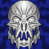
Powerpoint Face Blog Contest -- Design A Bionicle Face Using My Guide!
bonesiii posted a blog entry in blogs_blog_39
The above is the fullsize version of adult version of a Flame -- the first place winning entry in my last blog contest, where members entered descriptions of would-be Pet Peeves, and I designed the images in Powerpoint as the prizes. That's exactly what this contest is NOT. This time around, you guys get the job of artist. Design a Bionicle style face using the methods I outlined in this two-part guide: Powerpoint Art Guides: ● Vector Art In Powerpoint: Quality, Inexpensive, Easy ● Coolifying With Powerpoint Vector Art I'll pick winning entries (and listen to any endorsements you guys make of other enterers). No set number of winners -- will depend on how many entries there are -- and you can enter up to three different faces. Only winning face per member. Winners will get BZPower-uploaded avatars made from their winning face! These can be masks, or just faces. Heads underneath masks, whatever you want. FREE 60-DAY TRIAL For those few who don't have Powerpoint but want to participate, there is a free trial of Office (including Powerpoint) available here. Haven't tried it but hopefully there's a Mac version too... ENTRY PERIOD Contest starts now and entry period ends on Thursday, May 15, probably at midnight. DA IMPORTANT INSTRUCTIONS 1) Design a Bionicle-style face in Powerpoint that could look good as an avatar. 2) Screenshot the face you've created (it can be a largish, zoomed in pic as long as it's not screen-stretching. Don't worry about making the pic small enough for av-size, I'll handle that, but you might want to watch how detailed it gets, keeping in mind much small detail won't show up in an avatar). [EDIT: BTW, keep the Powerpoint file handy, because I might need to ask the winners to email me the actual .ppt document. I can see that sizing some of the entries so far down will mess up the pixelizations of the black lines. Also, making sure the lines are thick in the big images you give me would help too.] 3) Upload the image to an image hosting site. 4) Post the image here. 5) If you want you can describe anything about it you want, though try to keep it kinda short. FANCY-SHMANCY RULES 1) Each member can enter up to three faces. 2) Only one of the three can be a winning pic (you can say which you like best yourself). 3) You can recommend others' entries for winning, and I will take it into consideration. 4) Winners ultimately picked by me. 5) Number of winners is not set in stone. TIP: If you can find tricks/methods I didn't include in my guides, I'm a lot more likely to be impressed. (But it's not necessary to win.) BRIBERY PRIZE I will showcase the winners in a blog entry to be permanently linked to in the important entries list here, and showcase the top three winners in a permanent blog sidebar here. But even better, an avatar version of your image will be uploaded to the BZPower image archive by Black Six, and the link provided to you via PM -- giving you an avatar free of offline hosting sites. If BZPower's server is running for people to view your av, they'll be able to. ADDITIONAL INSRUCTIONS Have fun! -
Enter by midnight EST, Thursday, May 15! *bumping for the final day*
-
So what do you guys think about me running a blog contest where you guys design Bionicle-style faces in Powerpoint, and somehow or another, at least a few winners are picked? Using the methods I explained in these two guides: Powerpoint Art Guides: ● Vector Art In Powerpoint: Quality, Inexpensive, Easy ● Coolifying With Powerpoint Vector Art But what should be the prize? I don't think I can do another sidebar gallery -- I've got enough images over there as is. And last time I made the images as an award -- this would be you guys entering the images. And obviously some rare people don't have Powerpoint so couldn't enter -- if anyone has a better blog contest idea, feel free to suggest. -------------------------------------- In Other News, I totally just now noticed that "In Other News" written as an acronym spells "ion". Ironicles! *ahem* I am hoping to have time soon to run another S&T contest in spring/summer, hopefully the first Expanded Universe one. Whattayall think -- "Design a Xian Weapon"? Winners would hopefully become official weapons from Xia, and all qualifying entries would become part of the EU. Or would yall prefer a character-making contest first, or sommat? (Note that I have another classified S&T contest idea for much later this year, like around Christmas. Can't announce that yet. But I'd like to do one before then too, as it will be very unique and "standalone".)
-
All three Coolified Makuta Phantoka are now available in avatars, banners, and wallpaper, in case you didn't see the Artwork Topic the other day. Those were fun! Note that the avatar pathnames were apparently too long earlier. I've reuploaded in the main folder -- all the avatars are listed below with pathnames that should work. Kanohi: http://www.brickshelf.com/gallery/bonesiii/kul/antmaskav.gif http://www.brickshelf.com/gallery/bonesiii/kul/chavmask.gif http://www.brickshelf.com/gallery/bonesiii/kul/vampmaskav.gif Faces: http://www.brickshelf.com/gallery/bonesiii/kul/antfaceav.gif http://www.brickshelf.com/gallery/bonesiii/kul/chavhead.gif http://www.brickshelf.com/gallery/bonesiii/kul/vampfaceav.gif http://www.brickshelf.com/gallery/bonesiii/kul/makhead.gif http://www.brickshelf.com/gallery/bonesiii/kul/makdark.gif Tridax/Shadow Leeches: http://www.brickshelf.com/gallery/bonesiii/kul/tridax.gif http://www.brickshelf.com/gallery/bonesiii/kul/shadleechav2.gif http://www.brickshelf.com/gallery/bonesiii/kul/shadleechav.gif In other news -- another Survurlode interview is coming soon, this time with one of the Orcas that he's been warring against, probably this week! Topics will include a potential alliance with these fellow enemies of Survurlode, the recent virus attack, the delivery of the Allergenic Weapon, and more! Stayed tuned!
-
I felt like doing this as a warmup for making the Pet Peeve Contest winning creatures -- I'm coolifying the Makuta Phantoka for avs, banners, and wallpaper in Powerpoint. I started with Chirox because he's my fave. Here's the Artwork topic. I'm planning on doing the rest of the Makuta Phantoka and also the Shadow Matoran, if possible.
-
If you know me very well at all, you know I love the "Coolified" style of appearance in Bionicle sets. This style is in many people's eyes the opposite to the 2001 style, yet in my tastes at least it is the best Bionicle can be, and it seems like most fans share my preference in this, though it's certainly OK for others not to (to each hisher own). Because of the majority "Cool" preference, I think Bionicle is at its absolute best, stylewise, when it uses this style to the max in the sets. Both in terms of it's health as a franchise, and, luckily, for my own personal tastes too. [To be clear, not saying other people can't see the word "Cool" differently; this is how I personally define it. ] But what exactly is "Cool"? How can it be defined? I've been asked this before, and it's a little difficult to pin down. It's got variety. It isn't one exact "just so" style. And yet it has rules. It is something I know instantly when I see it, and something I'm dissapointed to miss when I don't see it. I know it is intense, but then some intensity isn't cool--some people who aren't into Cool even find it intimidating, even going too far (though down what road depends on the person). Some who aren't like me even see it as "ugly", because they have different tastes. It is often these people who are confused when I use words like "cool"--what does it mean, they have asked? Overall, the best way I know how to describe it is this: Ruthless Elegance. Cool does not hold back. Cool has well-aligned curves, spikes, spikes, serrations, scales, flares, knife-edges. Cool is made out of exploding gas, biological beings, stone, plastic. It's got texture, it's got form, it's got a pattern, it's got chaos. It's feathers and razor-teeth. Cool is elegant, not cheesy, but not "refined" per se or "classy" or any other terms. It isn't fragile, but it isn't industrially plain. It isn't afraid to be as elegant as it's possible to be. Yet it can contain elements of industrial plainness, or smoothness, or blockiness, even cheesiness! It is intensely powerful. It is also ruthless, because it knows that its intense style is not evil, though it can be scary--it knows it is neutral morally and can be equally expressed by both good and evil, and it is not afraid to express itself. It celebrates and exalts in its expression of elegance. But these are all just words. I know what they mean only because I have the meanings behind the words in my head. A picture, they say, is worth a thousand vocalized sound waves, or in this case, digitized linguistic symbols. So I thought today I would present with you with a Visual Guide to Cool. This guide will feature a selection of the coolest images I know of, picked out of this Gallery. There are gobs of bonus images in the gallery you can browse as well when it is public. Gallery Pages: 1 | 2 | 3 Barraki Something some people don't seem to realize is that "Ruthless Elegance" isn't something invented by Bionicle or any other human being. Ruthless elegance can be found all over in nature. Probably the most obvious example of Bionicle similarities to real world "RE" is the Barraki. Carapice. Eel. Manta Ray. Each of the Barraki features their own unique sort of Cool that has a direct or indirect parallel in the world of nature, especially in undersea creatures. And these are rad cool creatures. You've got Carapar: Ehlek: Mantax: Kalmah: Pridak: And finally, Takadox: Okay, so that's a color edit, lol. Actual image here. Undersea The Barraki represent a whole class of ubercool undersea creatures, but they only scratch the surface. There are Icefish and Lionfish and Sunfish and Starfish (Sea Urchins in that pic too). The Range of Cool Ruthless Elegance isn't just found underwater, though. In the animal realm it also includes things like Egrets: It extends into space in a Solar Flare: Humankind has harnessed the power of Cool to fly in the sky: It exists in the plant world in a Dragon Tree: And it once existed in actual "dragons"; Dinosaurs: Extinct Animals That was the head of a T-Rex--but the Tyrannosaur's feet were cool too. Another really cool dino was Styracosaurus: And who doesn't love good old Sabertooth Tiger? Ancient predators even included giant girds, like the "Terror Bird" in this artistic interpretation. Reptiles There are a lot of "living dinosaurs" in terms of coolness even today, like the late Steve Irwin's favorites, Crocodiles. Isn't it Gorgeous? There are lizards with frills: And turtles with spikes. There's even a miniature version of Styracky. Mammals My brother Ojilom's mascot, the Elephant, is, as it were, Ele[g]ant. Especially its skeleton. Have a look at the skeleton of a Whale. And just as there are mammals in the sea, there are mammals in the air. But we usually think of mammals as being on the land, like the Armadillo: Or being furry, like the Emperor Tamarin. Birds Feathers instead of fur. There's the peacock of course, with its tailfeathers. And it comes in white: There's everything from the Hornbill to the Turkey. Bugs In the insect and arachnid world there's the somewhat familiar Wolf Spider to the unfamiliar Scale. Nui-Rama have their equivalent in Dragonflies: And Kraata have a rough equivalent in Snails. Plants To eat the bugs, there are Venus Flytraps, Sundews, and Pitcher Plants. Other plants range from cool ground foliage to Oak trees; their leaves seen here. Flowers aren't all roses. And don't forget ferns: Sun Those ferns need light--how about a nice star for us all to orbit? The sun can do a good imitation of a Zamor Sphere in certain types of photos. And personally I really like blue. Nebula Who knew. Carapar has his own giant cloud of gas--the Crab Nebula! Ooooh. Ahhhh. Explosions are the answer: It's the BOOMarang Nebula! Look at the Shockwaves. And look--Nebulae even mimic nukes! Manmade Cool We of course have nukes, and other types of Explosions. We've put Ruthless Elegance into everything from Buildings and Boats to Buggies and Biplanes. Bionicle Of course humans have also put coolness into all manner of fiction as well. But that's not my goal for this blog entry--it's to show that all of the above has existed in the real world, for real reasons, and usually without our control. In Bionicle, we've had rocking cool Rahkshi, we've had Kanohi masks, we've had Visorak; the one I think is the coolest being Da Greenie. Only recently though has Bionicle reeeeally gotten into Ruthless Elegance. The Piraka show this off like crazy. Take Thok, for example. The Toa Inika had this up the wazoo, with their rad Zamor multiclips, the Zamor launchers themselves, and their cool armor, feet, and masks. My favorite of the masks is the superior Sanok. But Ruthless Elegance has really taken off this year with the Barraki, and if Toyfair is any indication, the rest of the sets too! Good old Carapar, my favorite. Ehlek, after he "charges up" from the lightstone in the Bionicle.com movie/vision, looks really cool. And Mantax--wow, have all the promo pics of him competely slapped him in the face, as it were. Mantax's head is awesome, but I have never seen an actual image of its full awesomness until the piece was shown in one of the Toyfair playsets. See here. I want Mantax now. Of course each of the Barraki is also cool in a unique way, as we are all well aware. Even Pridak, my least favorite (due to the color scheme), has awesome tools, which I was excited to see in silver with Hydraxon. But the Toa Mahri. Wow. I've got a few complaints, not least of which is the launcher, which in appearance, to me, is decidedly uncool (I hope it's a prototype...). But there's just sooo much else that roxorz my soxorz better than ever before, it is sheer awesomeness incarnate. Hewkii's new mask is just as rad cool, if not more so, as the Sanok. As is Kongu's. And Hahli's mask. And! And. And. And. Hahli has... WINGS!!1!1!! *spamming spree of joy* Yay! Hwoot! *Toa With Wings!* Huzzah! Hooray! *deleting spamming spree of joy* Yahoo! Google! The wings are coolified, even. I like wings. Can ya tell? :-P And the masks of the others are about as cool, as well as most of the tools (though I would like a bit more armor... ). And the titans have so much coolness, just like Axonn, Fenrakkvezon, and Brutaka did last year. You knew this was coming: Wowser Bowser Good Gads Gadunka. What a rad cool Piraka foot! And the face is cool too. All in all, Bionicle is delving into Cool more, and more betterly, than they ever have before. Personally I am very excited about this. Beyond that, though, I strongly suspect that most typical fans are too, and so I would not be surprised to see Bionicle's recent gains keep going up! Well, that's enough for this entry. I hope this guide has helped explain in a couple ten thousand words what "Cool" means to me.