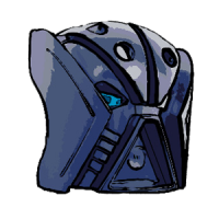
Ballom Nom Nom Posted May 14, 2012 Share Posted May 14, 2012 (edited) Another recent MOC, built shortly before Stoxutu. Unlike Stoxutu, however, this guy is entirely Bionicle, using the slightly greebly aesthetic Bionicle had in abundance instead of the smoother HF aesthetic. May have been partially inspired by the Space Pirates from Metroid Prime. Credit to Shine for the foot design, although his version used Bohrok eyes rather than their teeth. "His mother was right. His face did freeze like that." ^Gallery^ 1 2 3 4 5 6 7 8 9 1011 12 13 14 15 16 17 Given that this is a mech, the head is supposed to be an eternally snarling death's head, rather than a truly functioning one. Hence the quote. Enjoy! ~B~ Edited March 27, 2014 by Ballom Quote Link to comment Share on other sites More sharing options...
dee.3x3 Posted May 14, 2012 Share Posted May 14, 2012 That's awesome!The colors are lovely, the ce blue gives a nice energy vibe going on underneath the armor, and the black adds some nice contrast. The face is great and that body looks nice.One thing that gets to me is the metallic silver technic panels on the torso. But I don't think they come in pearl light gray. Quote Link to comment Share on other sites More sharing options...
Cederak Posted May 15, 2012 Share Posted May 15, 2012 Mechanical terror, indeed. Wow, that things looks deadly. And dangerous. I love the combination of blue and silver here though, it really works well together. Having played Metroid Prime many times in the past, I can see why you mentioned the Space Pirates here (perhaps the ones full of Phazon energies?) because I can see a similarity. Just a tremendously good job, Ballom.-Ced Quote Cederak's Library l Blog: Fair Enough Link to comment Share on other sites More sharing options...
FrozenFlash Posted May 15, 2012 Share Posted May 15, 2012 Now, this is an epic MOC. The colors flow in so smoothly and the head is just awesome. The weapons are cool and I like all of those translucent blue pieces. Quote Link to comment Share on other sites More sharing options...
Ehlekdude Posted May 16, 2012 Share Posted May 16, 2012 Oh, the colour scheme there is just so amazing. The MOC flows perfectly, especially the body is built really well. Amazing work you did here. Quote Link to comment Share on other sites More sharing options...
The Swimming Beard Posted May 17, 2012 Share Posted May 17, 2012 That is really great. The body design is great, and the colors look really good. The head also works out well. Quote "I pitea the fool!" (quote by Chro) 98.7% OF BZPOWER MEMBERS HAVEN'T SEEN MY BUCKET IF YOU ARE ONE OF THE 1.3% THAT HAS SEEN MY BUCKET, COPY THIS AND PASTE IT INTO YOUR SIGNATURE I MISS MY BUCKET Link to comment Share on other sites More sharing options...
Blitzkitteh Posted May 17, 2012 Share Posted May 17, 2012 Those weapons are from Gelu, correct? They work perfectly here, the trans-blue complementing the other trans-blue without being out of place. I love the head, and given that this is a mech, the eternal jaw of silver death is very intimidating. Perhaps it's this or the way the legs are constructed, but it gives off a very "werewolf" vibe to me. Nice work dude!-Longcat is Long! Quote I USED TO BE LONGCAT IS LONG!My Blog. Read it. Nao.My Steam name is [TDC] Blitzkitteh, feel free to add me. Link to comment Share on other sites More sharing options...
Indigogeek Posted May 20, 2012 Share Posted May 20, 2012 The trans blue is great,, and the grey build up of armor on the limbs gives it a mech look, nice job! Quote Link to comment Share on other sites More sharing options...
<Reverb> Posted May 20, 2012 Share Posted May 20, 2012 Wow, first of all I'm a fan of most of your MOCs Ballom. They truly are unique.K, as for the MOC, I'm a fan of the color scheme. The gunmetal and trans-blue scheme is ingenious. The helmet is really an illusion as you make it look as the mouth is opening which is amazing. The legs are nice and bulky and perfect for the body which is sleek yet perfect. The shoulder designs, me like. I also really love the top of the back or Velmorath,Another nice MOC Ballom. :] Quote Link to comment Share on other sites More sharing options...
Obsessionist Posted May 21, 2012 Share Posted May 21, 2012 Most exellent face and feet. The build if fantastic, I love the shape. The Glatorian head hands don't flow with the rest of it, maybe get rid of them. Otherwise fantastic MOC. Quote Link to comment Share on other sites More sharing options...
Ballom Nom Nom Posted May 27, 2012 Author Share Posted May 27, 2012 That's awesome!The colors are lovely, the ce blue gives a nice energy vibe going on underneath the armor, and the black adds some nice contrast. The face is great and that body looks nice.One thing that gets to me is the metallic silver technic panels on the torso. But I don't think they come in pearl light gray.Thank you for the reply. I actually thought those silver panels added to the overall MOC, as they give it the sense of having been polished more in that area, given that the torso is a highly visible section that would naturally receive more attention. Plus, you know, they're shiny. Shiny's always good. Mechanical terror, indeed. Wow, that things looks deadly. And dangerous. I love the combination of blue and silver here though, it really works well together. Having played Metroid Prime many times in the past, I can see why you mentioned the Space Pirates here (perhaps the ones full of Phazon energies?) because I can see a similarity. Just a tremendously good job, Ballom.-CedThanks! I'm pleased with how those colors go together too. In fact, I previously used about the same combo on my Toaraga MOC for a past BBC. And yeah, it was mainly based on Elite Pirates in Metroid Prime, in color scheme and generall appearance, with a little bit of the Trooper pirates thrown in.Now, this is an epic MOC. The colors flow in so smoothly and the head is just awesome. The weapons are cool and I like all of those translucent blue pieces.Those weapons are from Gelu, correct? They work perfectly here, the trans-blue complementing the other trans-blue without being out of place. I love the head, and given that this is a mech, the eternal jaw of silver death is very intimidating. Perhaps it's this or the way the legs are constructed, but it gives off a very "werewolf" vibe to me. Nice work dude!-Longcat is Long!Those weapons are indeed Gelu's.And yes, I think that the eternal jaw of death does add a fair bit to the intimidation of it. I also find it interesting that you think it gives a werewolf vibe. Certainly, it does look predatory, but I hadn't really associated the MOC with any creature in particular, really.Wow, first of all I'm a fan of most of your MOCs Ballom. They truly are unique.K, as for the MOC, I'm a fan of the color scheme. The gunmetal and trans-blue scheme is ingenious. The helmet is really an illusion as you make it look as the mouth is opening which is amazing. The legs are nice and bulky and perfect for the body which is sleek yet perfect. The shoulder designs, me like. I also really love the top of the back or Velmorath,Another nice MOC Ballom. :]Ah, thank you very much. Glad the MOC looks appealing to you overall. Although I must say, I don't recall you replying to many other topics of mine in the past. Oh, and the color scheme is actually just silver and trans-blue, not gunmetal. Most exellent face and feet. The build if fantastic, I love the shape. The Glatorian head hands don't flow with the rest of it, maybe get rid of them. Otherwise fantastic MOC.Thanks for the suggestions. However, what would you suggest instead of the Glatorian heads? I'm not sure what I would substitute for them.~B~ Quote Link to comment Share on other sites More sharing options...
Obsessionist Posted May 27, 2012 Share Posted May 27, 2012 You're right, of course, you can't do much else on that ball joint. I keep thinking that the blades look as if they should be more built into the arm, instead of having that wrist joint. Maybe have the first three studs or so of the blade integrated into the arm. You'd have to redo the entire lower arm. Quote Link to comment Share on other sites More sharing options...
xeneus Posted May 28, 2012 Share Posted May 28, 2012 Awesome, really awesome. All I can say. Only thing that is a bit of a con (but just a slight one) is that the blades don't match the rest of the blue.(I know there's nothing you can do about it) Quote Link to comment Share on other sites More sharing options...
Zorrakh Posted May 28, 2012 Share Posted May 28, 2012 (edited) Yeah, I can see the Space Pirate inspiration, especially in the legs. The torso looks EDIT: good (yay for formatting ); I really like the silver dragon head on the back and how the tubes connect to it. The tubing, more specifically where it goes through the Technic plates, looks a little thin, but it still looks fine. The system plate on the front, however, seems a little out of place because it's flat, compared to all the angles on the rest of the MOC. I also think that the torso could use a little more trans blue on the front to balance it out.I think my favorite parts are the arms; the visors look very cool and create nice shoulder armor, even though it does look like they stifle some articulation in the arms. Do the shoulders have much movement? The silver Inika shoulder armor pieces work well, too, and the Mahri plating on the back of the Vahki leg piece looks good. I really like the use of the Glatorian heads for "hands."The legs look good for the most part. The lower legs and feet have a nice thickness to them, as well as a good color balance. The upper legs, especially where the legs connect to the torso, seem a little thin, and the silver Piraka armor looks like it's too high up, making the trans blue leg connector sparse. But otherwise, the legs look good.Now, for the head. The crest reminds me of Megabyte from Reboot, so that brings back memories for me. I like the fixed position of the mouth, but I'm curious to see what it'd look like closed. Also, it doesn't look like there's much articulation in the neck, which somehow reminds me of the Juggernaut from X-Men: Evolution, but that lack of articulation kind of detracts from the MOC. I do really like the use of the Silver Crast, and I really can't tell if the eyes are trans blue or trans dark blue, but it looks good.Overall, great job. There's just a couple of things I have a problem with, but they are only minor things. Thanks for posting this. Edited June 6, 2012 by Zorrakh Quote Link to comment Share on other sites More sharing options...
Ballom Nom Nom Posted June 4, 2012 Author Share Posted June 4, 2012 You're right, of course, you can't do much else on that ball joint. I keep thinking that the blades look as if they should be more built into the arm, instead of having that wrist joint. Maybe have the first three studs or so of the blade integrated into the arm. You'd have to redo the entire lower arm.Hm, well that is an interesting idea. And while in the end that probably would look better, I am rather fond of the lower arm construction as it is, so I'm not sure if I'll reMOC that section. Still, thanks for the insightful comments. Awesome, really awesome. All I can say. Only thing that is a bit of a con (but just a slight one) is that the blades don't match the rest of the blue.(I know there's nothing you can do about it)Yeah, I know, it does irk me a tiny bit. Also, the light blue Barraki eye and some of the Bohrok eyes are slightly mismatched as well. However, I'd still say it looks alright overall, despite that.Yeah, I can see the Space Pirate inspiration, especially in the legs. The torso looks; I really like the silver dragon head on the back and how the tubes connect to it. The tubing, more specifically where it goes through the Technic plates, looks a little thin, but it still looks fine. The system plate on the front, however, seems a little out of place because it's flat, compared to all the angles on the rest of the MOC. I also think that the torso could use a little more trans blue on the front to balance it out.I think my favorite parts are the arms; the visors look very cool and create nice shoulder armor, even though it does look like they stifle some articulation in the arms. Do the shoulders have much movement? The silver Inika shoulder armor pieces work well, too, and the Mahri plating on the back of the Vahki leg piece looks good. I really like the use of the Glatorian heads for "hands."The legs look good for the most part. The lower legs and feet have a nice thickness to them, as well as a good color balance. The upper legs, especially where the legs connect to the torso, seem a little thin, and the silver Piraka armor looks like it's too high up, making the trans blue leg connector sparse. But otherwise, the legs look good.Now, for the head. The crest reminds me of Megabyte from Reboot, so that brings back memories for me. I like the fixed position of the mouth, but I'm curious to see what it'd look like closed. Also, it doesn't look like there's much articulation in the neck, which somehow reminds me of the Juggernaut from X-Men: Evolution, but that lack of articulation kind of detracts from the MOC. I do really like the use of the Silver Crast, and I really can't tell if the eyes are trans blue or trans dark blue, but it looks good.Overall, great job. There's just a couple of things I have a problem with, but they are only minor things. Thanks for posting this. Zorrakh, glad to receive a review from you! :)Anyway, as for your review, to begin with I'm a bit purplexed by your phrase "the torso looks." Presumably you meant to add another word there? Anyway, I admit that those System panels do look a bit thin. Ideally, I'd probably use a cheese slope or something for the top one, and a sloped System panel on the bottom. However, my System supplies aren't the greatest, so I really didn't have the best parts to work with there. As for trans blue on the torso, given that it's meant to represent the inner energy type stuff (nice precise terminology there, eh?), I think it is a bit justified that less shows on the chest armor.No, alas, the shoulders can barely move. But it's better to look good than to feel good, right? :PAs for your other comments, the silver Piraka thigh armor admittedly does look a bit strange as well. Mainly, it looks weak from the side, which is unfortunate, but given the armor I'm not sure how to best approach fixing it. No, the head has no articulation at all, being boxed in by the Mahri tubes and the shoulders. But again, it's not meant to, as this fellow would presumably have sensors around him, as well as already having good vision due to eyes on each side of the head. And the eyes are dark blue, the standard Barraki color.Well, thanks very much for the detailed review! It certainly made me rethink some of the areas of the MOC, which I may eventually revise. ~B~ Quote Link to comment Share on other sites More sharing options...
P~M Posted June 5, 2012 Share Posted June 5, 2012 (edited) Wow, this is truly one of the best MOCs I've seen today. The silver and ice blue work very well together, and the unique body design is very good. It really does remind me of a Space Pirate. Partially shmartially. :POne problem I see, though, is the feet; specifically, the toes. The Bohrok teeth look a little odd pointing up instead of curving down or laying flat. It just seems odd. Although I guess it's not an Earth creature/robot, so I can't really complain. :biggrin:10.2/11 Edited June 9, 2012 by Totally Not P~M Quote Link to comment Share on other sites More sharing options...
Zorrakh Posted June 6, 2012 Share Posted June 6, 2012 Ballom:No problem. Thanks for catching my incomplete sentence; formatting is a little weird for me on the new forums. I like the idea of the energy being encased in the armour. That makes even more sense than it just being one of the colors and I can see it now that you've mentioned it. Again, great job. Quote Link to comment Share on other sites More sharing options...
Ballom Nom Nom Posted June 8, 2012 Author Share Posted June 8, 2012 Wow, this is truly one of the pest MOCs I've seen today. The silver and ice blue work very well together, and the unique body design is very good. It really does remind me of a Space Pirate. Partially shmartially. :POne problem I see, though, is the feet; specifically, the toes. The Bohrok teeth look a little odd pointing up instead of curving down or laying flat. It just seems odd. Although I guess it's not an Earth creature/robot, so I can't really complain. :biggrin:10.2/11Err . . . I'm guessing you meant to say best in your first sentence? Anyway, thanks for the reply and comments. I do agree that the toes look rather strange. And if I could have, I really would have tried to make the toes go downward. However, this would have put too much pressure on the little claw ends of the Bohrok teeth, and would also have upset the overall MOC's balance quite a bit. So, I went with the slightly less aesthetically pleasing design, for stability.Ballom:No problem. Thanks for catching my incomplete sentence; formatting is a little weird for me on the new forums. I like the idea of the energy being encased in the armour. That makes even more sense than it just being one of the colors and I can see it now that you've mentioned it. Again, great job.Yeah, no problem. And I'm glad the MOC's design makes a little bit more sense after my explanation. ~B~ Quote Link to comment Share on other sites More sharing options...
P~M Posted June 9, 2012 Share Posted June 9, 2012 Wow, this is truly one of the pest MOCs I've seen today. The silver and ice blue work very well together, and the unique body design is very good. It really does remind me of a Space Pirate. Partially shmartially. :POne problem I see, though, is the feet; specifically, the toes. The Bohrok teeth look a little odd pointing up instead of curving down or laying flat. It just seems odd. Although I guess it's not an Earth creature/robot, so I can't really complain. :biggrin:10.2/11Err . . . I'm guessing you meant to say best in your first sentence? Anyway, thanks for the reply and comments. I do agree that the toes look rather strange. And if I could have, I really would have tried to make the toes go downward. However, this would have put too much pressure on the little claw ends of the Bohrok teeth, and would also have upset the overall MOC's balance quite a bit. So, I went with the slightly less aesthetically pleasing design, for stability.~B~Yes, that's what I meant. :PI understand what you mean about the toes. It's a shame, really. Quote Link to comment Share on other sites More sharing options...
Axilus Prime Posted June 9, 2012 Share Posted June 9, 2012 This is such an awesome MOC. It's that rare canister-size MOC that still looks great. Creative use of many pieces, especially those visors. I love the silver Krika head going with the blue eyes. The body looks solid but intricate, a combination missing in far too many sets and MOC's. Overall this is the most awesome thing I've seen in a while.10/10. Quote Link to comment Share on other sites More sharing options...
Ballom Nom Nom Posted June 10, 2012 Author Share Posted June 10, 2012 This is such an awesome MOC. It's that rare canister-size MOC that still looks great. Creative use of many pieces, especially those visors. I love the silver Krika head going with the blue eyes. The body looks solid but intricate, a combination missing in far too many sets and MOC's. Overall this is the most awesome thing I've seen in a while.10/10.Thanks for the praise; I'm glad you like the construction of the torso. However, I think you should look at some more MOCs now, as there are definitely many made recently that outclass Velmorath here. ~B~ Quote Link to comment Share on other sites More sharing options...

Recommended Posts
Join the conversation
You can post now and register later. If you have an account, sign in now to post with your account.
Note: Your post will require moderator approval before it will be visible.