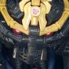
VampireBohrok Posted March 5, 2012 Share Posted March 5, 2012 (edited) [1] [2] [3] [4] [5] [6] [7] [8] [9] [10] [11]Entry for Comics Contest 1. I'm aware of how bad the captions look, I should've done them by hand to begin with.(but the real mystery is how I managed to finish the thing)Any comments/constructive critisism is appreciated.Thank you so much, those of you who supported my entry in the contest! Edited April 7, 2012 by VampireBohrok Quote Link to comment Share on other sites More sharing options...
Tenebrae Invictus Posted March 5, 2012 Share Posted March 5, 2012 I really enjoyed this comic. I think the fact that it wasn't colored really suited it well. There were some issues however, and the one which is probably obvious to you is perspective - for example, when the perspective looks down... Cantai? I think that's the name. Anyways, great comic. Quote Up, down, turn around, please don't let me hit the ground Link to comment Share on other sites More sharing options...
VampireBohrok Posted March 7, 2012 Author Share Posted March 7, 2012 Yeah, perspective went haywire at me at a number of occasions. I'm sure I could've done abetter job overall, but as usual I ended up procrastinating the whole thing and I had to rush the inking.I think that may be a contributing factor to odd-looking perspective and bent shapes. I don't think thecross-line shading reached its full potential effect at all times, either.Either way, thanks a lot for the comment. Quote Link to comment Share on other sites More sharing options...
Zerothemaster Posted March 8, 2012 Share Posted March 8, 2012 I posted most of my thoughts in the poll, but here's the tl;dr version:This is the best story in the contesthands downno contestand has amazing atmosphere, actually making me really care what happenedalso Gorast X3and Krika :3There you goYou had better win imo. Quote The Drawing Room (Comic) ~ Mata Nui Adventures (Comic)Lost Forgotten Souls (Comedy) ~ Bad Images (Comic) ~ Reality (Comic) Link to comment Share on other sites More sharing options...
Ballom Nom Nom Posted March 13, 2012 Share Posted March 13, 2012 How does this not have more replies? I confess I hadn't followed this contest much, and I read your comic in the Winners topic, but it was an extremely well-written and drawn comic. The plot was engaging, with the suspense it managed to build until the end. In addition, the variety of angles used in the various panels was very impressive, as was the attention to detail in the panels. Krika in particular perfectly captured the character persona I'm assuming you aimed for, of the quietly threatening gangster boss. Also, for some reason Gorast's cigarette holder amused me.But yes, in all this is an amazing entry, which certainly deserved the win. Congrats, dude! ~B~ Quote Link to comment Share on other sites More sharing options...
~kh Posted March 20, 2012 Share Posted March 20, 2012 I must say, I read this and thoroughly enjoyed it from beginning to end. It's not just the superb artwork and the dramatic storyline style, it's the one thing that no other comic in the contest ever really got down: atmosphere. This comic is just full of atmosphere, reminding me a bit of Frank Millar's Sin City and just had a heavy old-school noir feel to it. The heavy blacks and the moody lighting just reek of that atmosphere, and I loved and relished every single bit of it.Amazing job. Quote Link to comment Share on other sites More sharing options...
Soran Posted March 29, 2012 Share Posted March 29, 2012 The art is really impressive and the story is astounding. I'm glad this won, as I feel it was time well spent for a fantastic entry. great job. Quote Link to comment Share on other sites More sharing options...
BenLuke Posted April 1, 2012 Share Posted April 1, 2012 Wait. People actually post non-sprite comics here. I should check the Comics forum more often. . .Anyway, this is pretty cool. The rough-ish art style really added to the atmosphere. The lettering for much of the dialog, on the other hand, was a bit incongruous with the art. Personally, I think using a slightly smaller font would have fixed that problem. I did like the way the speech-balloons were designed; a grey blob with a tail indicating which character is speaking. Quote BZPRPG Profiles Link to comment Share on other sites More sharing options...
Lord Kini Hawkeye Posted April 1, 2012 Share Posted April 1, 2012 I just realized that i never came on here and posted how much i truely loved this Comic, and how happy I am that it won.While i'm not going to do a real review, i'm actually popping in to tell you, if you weren't aware, that we in The Three Virtues Podcast did a coverage on the contest and ended up talking about City of Wretches (and kings =P). So if you havn't checked it out, go do so =D Quote I've been searchin' for the daughter of the Devil Himself,I've been searchin' for an Angel in White,I've been lookin for a woman who's a little of both,and I can sense her but she's nowhere in sight,Cause I can't find a banner ;_; Link to comment Share on other sites More sharing options...
VampireBohrok Posted April 7, 2012 Author Share Posted April 7, 2012 Okay, I figure it's about time I respond here :UHow does this not have more replies? I confess I hadn't followed this contest much, and I read your comic in the Winners topic, but it was an extremely well-written and drawn comic. The plot was engaging, with the suspense it managed to build until the end. In addition, the variety of angles used in the various panels was very impressive, as was the attention to detail in the panels. Krika in particular perfectly captured the character persona I'm assuming you aimed for, of the quietly threatening gangster boss. Also, for some reason Gorast's cigarette holder amused me.But yes, in all this is an amazing entry, which certainly deserved the win. Congrats, dude! ~B~I honestly didn't think much about atmosphere/suspense/whatever when making the comic. I'm happy that people feel that there is one anyway, lol.Also, Gorast's appearance/characteristic was loosely based upon that of Snowman from Homestuck, cigarette holder and all.I must say, I read this and thoroughly enjoyed it from beginning to end. It's not just the superb artwork and the dramatic storyline style, it's the one thing that no other comic in the contest ever really got down: atmosphere. This comic is just full of atmosphere, reminding me a bit of Frank Millar's Sin City and just had a heavy old-school noir feel to it. The heavy blacks and the moody lighting just reek of that atmosphere, and I loved and relished every single bit of it.Amazing job.Yeah, the classic noir style was exactly what I aimed for. I'm glad to hear that it worked, too. I was actually wondering whether people would like that theme at all, but I suppose they did!Wait. People actually post non-sprite comics here. I should check the Comics forum more often. . .Anyway, this is pretty cool. The rough-ish art style really added to the atmosphere. The lettering for much of the dialog, on the other hand, was a bit incongruous with the art. Personally, I think using a slightly smaller font would have fixed that problem. I did like the way the speech-balloons were designed; a grey blob with a tail indicating which character is speaking.Lol yeah, they're rare, but they do exist.The lettering in general was probably one of my biggest mistakes with this comic... In hindsight, I really should'vedone them by hand. A lesson learned for the next time I'm making a comic, I guess.I just realized that i never came on here and posted how much i truely loved this Comic, and how happy I am that it won.While i'm not going to do a real review, i'm actually popping in to tell you, if you weren't aware, that we in The Three Virtues Podcast did a coverage on the contest and ended up talking about City of Wretches (and kings =P). So if you havn't checked it out, go do so =DI listened to that the other day. I don't think I've been that flattered in my entire life, lol. Finally, instead of saying it over and over: Thank you all so much for your comments, I truly appreciate each and every one of them. Quote Link to comment Share on other sites More sharing options...

Recommended Posts
Join the conversation
You can post now and register later. If you have an account, sign in now to post with your account.
Note: Your post will require moderator approval before it will be visible.