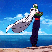
sunflower Posted January 28, 2013 Share Posted January 28, 2013 And I'm back with another BZPRPG character. This time it's Kal Grochi (Otter)'s character Raxa; master assassin sharpshootin' Toa of Crystal. Being the awesome friend that I am, I sorta kinda managed to get this done slightly a bit late... sorta... Yeah. Well, I was busy removing the crystal shards from my back after he shot me. Anyway, this is actually an older sketch that I finally got around to coloring. As such, the style is a bit different from my more recent works, but I'm very pleased with how this came out. Like. I'm seriously loving my own art. Is that a bad thing? Anyway, clickable thumbnail... (Warning: over 9 mb file size) I seriously had fun drawing this, and I only dislike the shadow, which I couldn't quite get right. Comments and criticism greatly appreciated. Quote - BZPRPG - Link to comment Share on other sites More sharing options...
otter Posted January 28, 2013 Share Posted January 28, 2013 er mah gerd it's finally done er mah gerd i remember this uncoloured er mah gerd it's raxa. er mah gerd those colours er mah gerd the slightly derpy looking left foot but who cares because er mah ge-- Wait There's a crossbow missing in there! xP Quote profiles i guess i'm a south american giant otter now Link to comment Share on other sites More sharing options...
sunflower Posted January 28, 2013 Author Share Posted January 28, 2013 er mah gerd it's finally done er mah gerd i remember this uncoloured er mah gerd it's raxa. er mah gerd those colours er mah gerd the slightly derpy looking left foot but who cares because er mah ge-- Wait There's a crossbow missing in there! xP ... ... ... ... ... welp *goes to find wall to slam head against* Anyway... Yeah, forgot the crossbow. It er... fell into a black hole, as such, it got sucked from the drawing and- Okay, I forgot it. Another thing, this drawing was a bit of an experiment with different techniques I learned from searching around the interwebz. Yo, that's some col artwork man. Wish I can do that. All it takes is practice. Ha, at times, I shudder while flipping through some of my earlier works. But then again, they show how far I've come since. Just like anything else, the more you do it, the better you get at it. Quote - BZPRPG - Link to comment Share on other sites More sharing options...
Makuta of Time Posted January 28, 2013 Share Posted January 28, 2013 Yeah, like when I draw some of the Kanohi, they seem to get better and better. (Except for the Kakama.) Quote Link to comment Share on other sites More sharing options...
AuRon the champion Posted January 28, 2013 Share Posted January 28, 2013 So that's what this is for! It's a shame they don't make that color in lego... (PS, add me as a contact on Flickr!) Quote BZPRPG Characters Link to comment Share on other sites More sharing options...
Grandmaster Lehvorak Posted February 4, 2013 Share Posted February 4, 2013 The drawing is pretty cool and I like the style, but there is a problem! The Toa that is leaning on the wall looks like he is floating, it would be nice if you added some kind of shading on the wall he is leaning on to give it some depth and then add some darker value on the Toa. After you do that, you can show the differences in the values and it will give it more depth. So far, I believe you are on the right step! Keep up the good work and continue on being an artist! Lehvorak Quote << LEHVORAK ZONE >> Web Design - Graphic Design - Illustration Find out more on: _ Link to comment Share on other sites More sharing options...
sunflower Posted February 4, 2013 Author Share Posted February 4, 2013 The drawing is pretty cool and I like the style, but there is a problem! The Toa that is leaning on the wall looks like he is floating, it would be nice if you added some kind of shading on the wall he is leaning on to give it some depth and then add some darker value on the Toa. After you do that, you can show the differences in the values and it will give it more depth. So far, I believe you are on the right step! Keep up the good work and continue on being an artist! Lehvorak This is exactly what my problem with the shading was. I wasn't able to get both the shadow and value consistant, and after a few hours spent on the computer, I really wasn't up for going back and deleting that layer. Given that this was also one of my earlier sketches, the perspective is a bit funky, adding to that "floating" effect a bit. Hopefully, in some of my more recent works, I can correct these mistakes. Thanks for the comment! Every little bit helps. Quote - BZPRPG - Link to comment Share on other sites More sharing options...
aneroth Posted February 27, 2013 Share Posted February 27, 2013 My Thoughts hopefully they serve you well for learning and improving in the future. Quote Link to comment Share on other sites More sharing options...
sunflower Posted February 27, 2013 Author Share Posted February 27, 2013 My Thoughts hopefully they serve you well for learning and improving in the future. I'm absolutely certain they will. Thanks [a bunch!] for taking the time to review my work, it's really not every day that I get such an indepth critique, and I'm definitely going to use them in future works. Again, I can't thank you enough for taking the time to do this. Quote - BZPRPG - Link to comment Share on other sites More sharing options...
aneroth Posted February 27, 2013 Share Posted February 27, 2013 My Thoughts hopefully they serve you well for learning and improving in the future. I'm absolutely certain they will. Thanks [a bunch!] for taking the time to review my work, it's really not every day that I get such an indepth critique, and I'm definitely going to use them in future works. Again, I can't thank you enough for taking the time to do this.It is what I do. So do not even mention it. Quote Link to comment Share on other sites More sharing options...
Hitoshura Posted February 28, 2013 Share Posted February 28, 2013 Nice drawing. I especially like the details on the body. Th mask looks a bit too small, and so does the feet, but that is still a good drawing. Quote profiles Link to comment Share on other sites More sharing options...
sunflower Posted February 28, 2013 Author Share Posted February 28, 2013 Nice drawing. I especially like the details on the body. Th mask looks a bit too small, and so does the feet, but that is still a good drawing. Thanks for the reply! I tried to use more human-like proportions in this drawing, as I always thought that the sets had gigantic feet and big heads. (As well as gorilla arms, but that's another thing.) Quote - BZPRPG - Link to comment Share on other sites More sharing options...
Van Hohenheim Posted February 28, 2013 Share Posted February 28, 2013 Nice drawing. I especially like the details on the body. Th mask looks a bit too small, and so does the feet, but that is still a good drawing. Thanks for the reply! I tried to use more human-like proportions in this drawing, as I always thought that the sets had gigantic feet and big heads. (As well as gorilla arms, but that's another thing.)so i'm not the only one Nice drawing, I can see the twin suns in the corner, and...that color Quote Previously known as Aiwendil. Link to comment Share on other sites More sharing options...

Recommended Posts
Join the conversation
You can post now and register later. If you have an account, sign in now to post with your account.
Note: Your post will require moderator approval before it will be visible.