


Entry posted by Jean Valjean
495 views
This is probably the first time that the main draw for a superhero film (if you can call Logan such) has been its cinematography. For those of you who saw the one-time-only black-and-white showing of Logan, congratulations; you saw something truly beautiful. For the rest of you who missed out, too bad, but at least it will be available on blue ray.
Before I go into Logan itself, the subject of quality black and white cinematography demands some address of color photography. They require two completely different mindsets. It isn't simply a matter of one having color and one not having color. They completely alter the way that a film is made. They each require unique talents from a cinematographer. When you compare amazing color cinematography to black and white cinematography, it's comparing apples to oranges. To me, they are two distinct art forms.
Invidentally, only a week and a half before Logan Noir was released, Marverl released Guardians of the Galaxy Vol. 2. This movie had many strong points that I must praise it on, and when I began writing a review on it, the very first thing that I had to mention was its cinematography. I have nothing but praise for its cinematography. It's a miracle, because this was not something to be expected from an MCU movie. The MCU is notorious among cinematography nerds for being an ugly franchise. The colors are bland and uninteresting, and there are rarely ever any solid black values onscreen. It's still a step up from DC's Man of Steel, which went out of its way to put a lifeless filter on it, but it's still uninspired. Basically, the MCU embodies every bad stereotype of digital cinematography. While they take great care in their special effects department, they severely overlook their regular effects department, that is, making sure that every shot looks special regardless of whether or not there's an effect in it. That doesn't really come naturally, because you have to carefully light the scenes, and then adjust your cameras accordingly. You also have to make sure that all of the colors in the scene are just right.
And you have to have those black values. The camera must pick up actual contrast, and this must include shaded areas that are nearly completely black. Especially if you're creating a comic book movie. The DCU, for all its faults, figured this out after Man of Steel and didn't make that mistake again. Batman v Superman looked like an actual comic-book movies, with actual shadows and contrasts that looked hand-crafted. It was also shot on film, which helped. Marvel, meanwhile, continued to shoot on Red cameras, which have some absolutely amazing capabilities, but they didn't seem to know what to do with them, and they basically used the Red series like they were any other digital camera, only with a higher pixel count. Fans of cinematography had reason to be disappointed, because they know the potential that a superhero gives cinematographers.
Then Marvel finally released Guardians of the Galaxy Vol. 2, and something changed. The first Guardians film indicated what it could be, but its sequel took it to the extreme. Vol. 2 is an example of a film that understands color photography down to its core. Every single shot felt vibrant. It used color to its fullest advantage, and without feeling like there was a filter. Yes, there probably was a filter, but the beauty is that I didn't notice it. It felt to me that the world simply was more colorful, and was alive. It also balanced colors with great black values to guide your attention to the form of the colorful things. Director James Gunn not only made sure that the cinematographer did his job right, but ensured that the production value matched this cinematographic vision, and that there was plenty of on-set color to work with. It was everything that I wanted in a Marvel film, in glorious 8K.
I have a great deal more to say on Vol. 2's cinematography that goes beyond just the color, but the point I wish to emphasize is that it had the best cinematography I had ever seen of any superhero film.
Which means that I've been having a really good couple of weeks with cinematography. A great year if you count all those times I watched La La Land in January and February, which is another amazing example of what can be accomplished with color photography, but that's a tangent. I've been having a good week because right after watching Guardians of the Galaxy Vol. 2, the comic book film with the greatest cinematography thus far, I drove down to the only Alamo Drafthouse theatre in the Midwest to watch an exclusive showing of Logan Noir, which then immediately replaced Vol. 2's spot at the top. I have never seen cinematography this beautiful in a comic book movie.
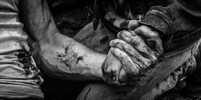
First, I should say that you will not get the same experience that I did merely by turning down the color balance on your television set. Director James Mangold publicly explained why that didn't work, because all that does is turn the film gray. That's okay if you want a gray film, but if you want a black and white film, you need to see the version that Mangold and his crew carefully crafted. They had to edit it frame by frame to ensure that they had the contrast in the scene exactly where they wanted it, to give it as classy of a look as possible, and to ensure the maximum emotional impact. Every single frame of this film is a work of art. When watching this movie, I wished I was capable of pausing after every third shot and taking a screenshot so that I could make what I saw onscreen my desktop background. Logan looks that good in black and white.
In order for you to understand my appreciation of this, I'm familiar with what the film looks like in color. The shapes and the features of the characters' faces didn't stand out at much, or carry as much weight. I can easily imagine how bland that would have looked if one had merely converted this film to black and white by removing the color. It would have been just as bland, just blander. On many occasions, I have taken a color photograph and dropped it into basic photo editing software, where I proceeded to take out the color, add some contrast, and then sometimes apply a filter. The results usually aren't as amazing and as striking as I'd like. In order to get what I want, I literally recreate the photograph in a lifelike charcoal drawing. I used to use graphite, but have since found charcoal ten times superior. Only after all that messy charcoaling, which takes hours and hours of labor over the course of a month, do I finally get a black-and-white picture that really does the subject matter justice. No filter can match the results of that kind of work.
That's how I feel looking at this film. I'm reminded of those times that I've created charcoal drawings. It's amazing. No filter, no formula, was used in order to get these results. The visual editors had to labor in love to create a custom-made frame each time that would deliver the maximum effect. They do all of this while hardly being recognized, because in the end it all looks quite naturally like it was the image picked up by the camera, and that the scenes were originally lit this way.
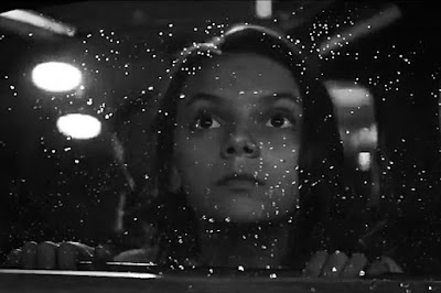
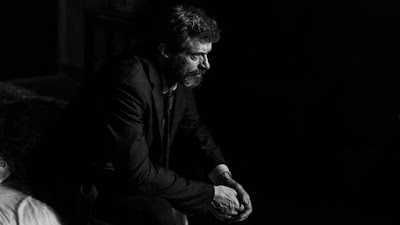
There are many moments in the film's original release that don't look particularly visually stimulating, but after their Noir conversion, captivate the eyes. One of them is of Daphne Keene looking out the window while its drizzling. Other times, people are simply indoors, but the light hits their faces in such a way that you completely see their character. Just about every shot of Patrick Stewart's aging countenance, and the deep lines running across it, speaks volumes. When tears well up in his eyes, it looks so surreal. In so many instances, Logan sits alone in the darkness, and you feel that you know what the character is all about. Sometimes light will hit them in ways that give them a halo. Sometimes the characters verge on becoming silhouettes. Daphne Keene's simple features stand out the least of anyone's, but her smooth dark hair takes on a whole new texture when in black and white.
Again, as the film went on, there were so many moments that made me think "I wish I could take a screenshot and do a charcoal drawing of this!"
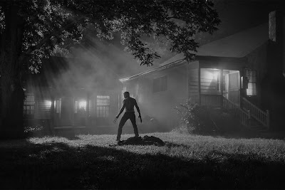
One thing that I noticed right away about Logan Noir, is that there's almost always somewhere in the shot that is nearly all-black. In many indoor scenes, a lot of areas in the background are black, drawing your attention to the character. It doesn't feel unnatural in the slightest, or that any visual tricks are being performed, but the trained eye notices it and appreciates it. Good black values do something that many people usually try to accomplish through film editing. Filmmakers often use editing to draw the audience's attention to something, to help set up a narrative. I think that good black values often do that, but in an even subtler way, and often in an even more emotional way.
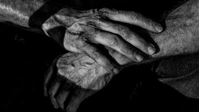
Perhaps where this conversion is at its weakest is when the characters are in the wide open, in broad daylight. In those moments, briefly, there are no solid black values. It isn't as visually expressive. When I do charcoal drawings, I almost always choose a subject matter with dark values, such as hands playing on piano keys, or an ocean reflecting the Milky Way, or a woman casting a shadow as she's walking across the desert. No matter what, I find a way to have fun with contrast. However, while the scenes that I'm alluding to don't have these shadows, there's still a beauty to them. Sometimes it's the scenery, and other times it's the context of the scene itself that makes it beautiful, without the help of black values whatsoever.
Many people went to Logan Noir for this reason, because the story enhanced the black and white images. They might not have even been connoisseurs of black and white, or have even known the amount of artistry that went into this conversion, but went anyway because they thought that the story of Logan was well-suited for black and white. The very fact that it was black and white, even if it hadn't been the best quality, seemed an appropriate and emotionally pleasing way of presenting the movie. It made it more adult. I concur. This was an amazing decision that caught be serendipitously. If there is one hero film that can pull off black and white, it's this one. And I'll say it right here, that the black and white version of Logan is definitely the preferred one. If you haven't seen the movie yet, but plan on buying it on Blu-ray, make sure to buy a version that has Noir on it, and watch that one. James Mangold said that there is a preferred version, because he shot it in color and then retroactively made a black and white version after encouragement from the fans. Perhaps due to his baises he can't come down and admit just how amazing Noir is, but I'll say it for him. I'm free from the sentimental connection of having it shot in color first: black and white is the version to watch. Not only is it beautiful, but it is truly befitting in Hugh Jackman's heartfelt and vulnerable sendoff for this beloved character.
In spite of my love of the color in La La Land and Guardians of the Galaxy Vol. 2, this was the real treat for me. By now, the reader will have learned that I love black and white art, and almost by default choose to express reality through it. It's one of my loves. I love it so much that I'd rather have the option between seeing a movie in color and monochrome instead of seeing it in 2D and 3D. This should be a more regular thing. Perhaps, just maybe, Logan will win Best Cinematography, and directors will begin to seriously consider shooting films in both color and monochrome in the future. The chances are small, but nothing would make me happier. I can always hope that this art form which is so near to my heart will be rediscovered and resurrected.
24601
0 Comments
Recommended Comments
There are no comments to display.