


Entry posted by Jean Valjean
1,521 views
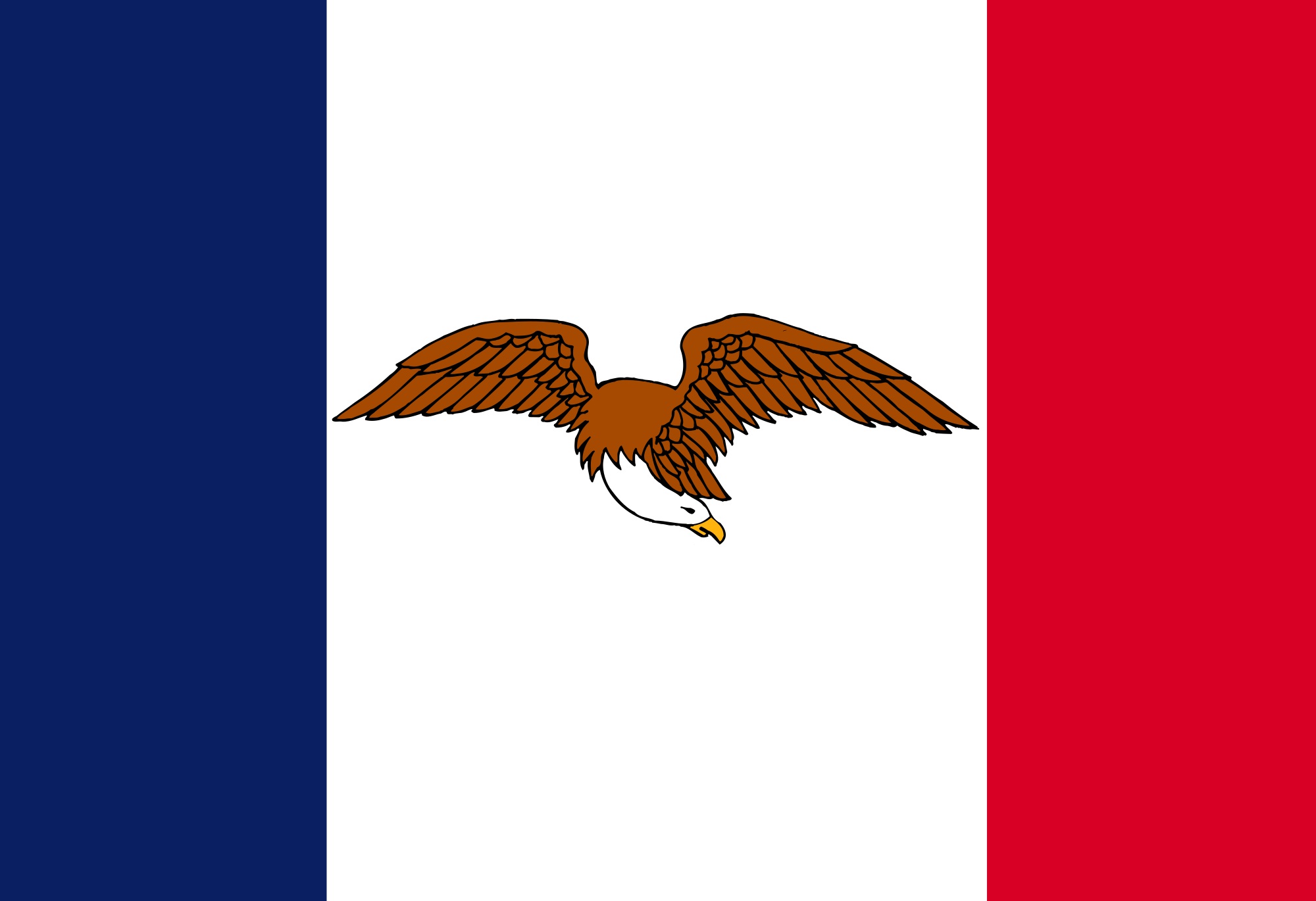
 The original design has the basic elements that could make for a good flag: a tricolor, and a bald eagle. I mean seriously guys, a bald eagle. Is there anything on Earth that's cooler than that? Okay, I guess that there's a legitimate case to be made for wallabies. Speaking of which, I checked, and it's legal to own one of those as a pet in Iowa, which is awesome, so maybe the flag needs a wallaby on it. But really, the bald eagle isn't so bad. You don't just look at it and think "America;" you look at it and think "'Murica!" No other state has a bald eagle so prominently featured in its flag, which makes Iowa the most 'Murican of all states. There's something awesome about seeing Old Glory flying on the flagstaff and, right underneath it, the flag of Iowa. Anyone who flies those flags must surely bleed red.
Still, the flag had "Iowa" tackily written on it in big red letters, which is inconceivably stupid. Why would it need that? A bad eagle and the French tricolor are enough to distinguish the Iowa flag from all of the other state flags, and they're mostly the only things that people remember about the flag anyway. So I did the Iowan flag a favor, and removed all writing, even that awesome motto, "Our liberties we prize and our rights we will maintain."
There are some downsides to this redesign. As awesome-sauce as the eagle is, it's still complicated to draw. It isn't as complicated as it could be, because I've seen other flags and know just how complicated that it could get, but I'm seriously not interested in trying to get each and every one of its feathers right. Furthermore, the eagle on its own doesn't take up the space of the central stripe quite as well without the writing.
24601
3 Comments
Recommended Comments