

The Pohatu That Might Have Been...

Entry posted by Aanchir
368 views
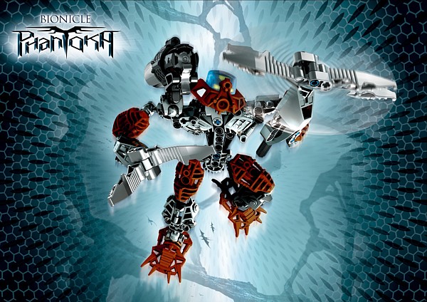
I discovered today that it's really easy to make a clean edit from the posters in the "Downloads" section on BIONICLE.com. I discovered it rather fortuitously, having copypasted some hi-res Mistika and Phantoka pics from there with the intention of making some generally simple edits. You know, a quick negative and then a complete hue reversal, which in essence kept the colors the same but swapped the light and dark areas of the original image.
The point to this, of course, was to sort of get a glimpse of how the Toa Nuva might have been had they all been Mistika/Phantoka. The Mistika, after all, consistently use silver as a base and a Metru-tone primary, just as the Phantoka have vivid primary colors on a dark gray base. By reversing the light and dark areas and making a few subtle adjustments of color saturation, I would get a vague look at how such color schemes might have been arranged had they been applied to the opposite sets of Toa Nuva.
Thus today, in an attempt to take a more in-depth look at that effect, I discovered how easy it was to select a piece neatly around its edges for recoloring. Naturally I took the initiative of doing this with the whole primary color, then the whole base color. And behold, the Pohatu I have long advocated as a middle ground between the classic brown and the vibrant orange.

Dark orange is a hard color to replicate; I fear I have done a dismal job here. But note that I also attempted to change the bley to silver, in hopes of maintaining contrast. Contrast is a key to any viable color scheme at this simple, canister-set scale. Hence my appreciation of both the Mistika and Phantoka sets in their depiction of the Toa Nuva.
It is natural that I would make some errors in formulating the color of dark orange, and I happened upon one incorrect color which I felt was worth pursuing. I imagine this is probably what you came for, so I will delay no longer in showing you this picture (again with the Mistika-style silver base color).
This one certainly turned out beautiful, and as much as I prefer the vibrant orange tone in conjunction with the vibrant colors of the other five elemental tribes, I felt that this was worth sharing with the world. Who knows? An orange canister and a can or two of spray paint might be all that separate you from this alternative!
Have a nice day. 
With all due respect,
 Aanchir: Rachira of Time
0 Comments
Recommended Comments
There are no comments to display.