-
Posts
42 -
Joined
-
Last visited
Content Type
Profiles
Forums
Gallery
Events
Blogs
Store
Raffles
Posts posted by black3467
-
-
It has been a long time since I posted here... Anyways.
Hey form visitors! I wanted to give you guys a preview, and hopefully get some feedback, on the yet untitled comic I am working on. Rest assured it's far less horrifying, visually anyways, than the series I posted back on Artwork III. *shudders*
So pretty much what I'm working on right now is a retelling of the early story. Think in the vein of "The Rise and Fall of The Toa," or "Kanohi of Comedy." Though both of those are actually fairly old at this point. Now without further delay let me present some images:
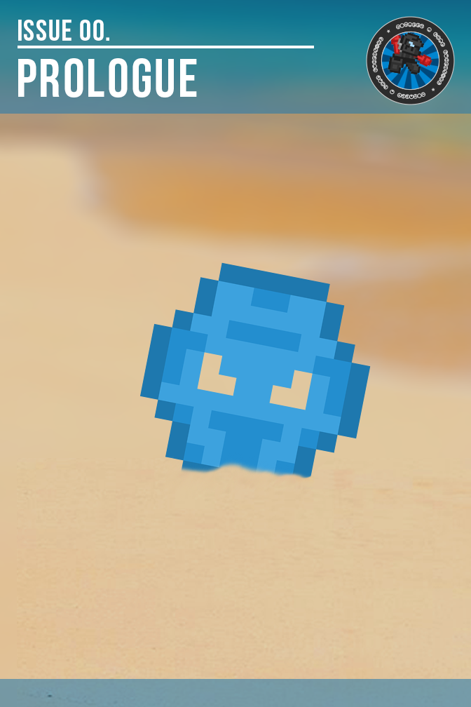
The first image here is the cover of the first issue.

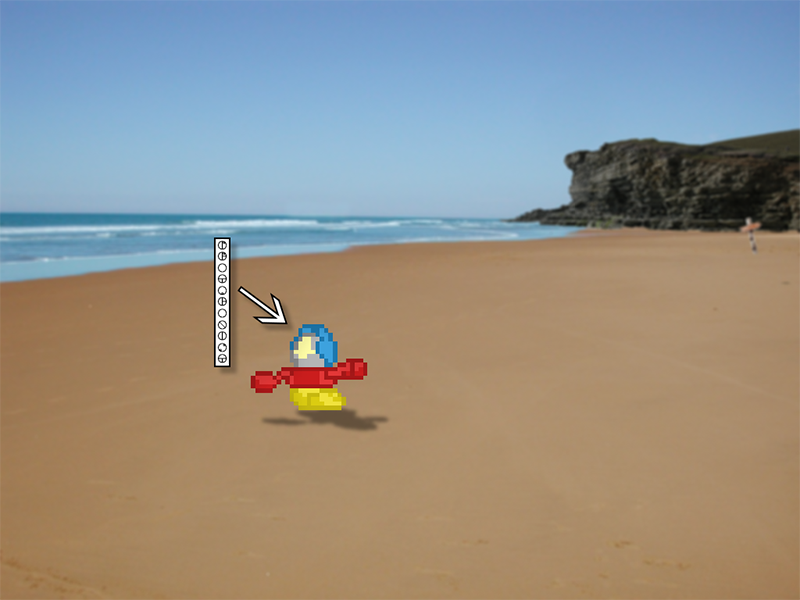
And this second one is the artwork style I'm planning on following, we'll see how that turns out.

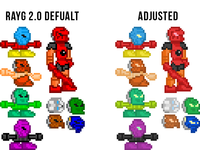
I'm going to be a recolored version of the Rayg 2.0 kit (InnerRayg). I've always really enjoyed how the Rayg kit looks and it's pretty much tradition to use it for this style of comic. Below is a comparison between the two different color pallets.

Feel free to post any thoughts or criticisms you may have! I really just want to get some feedback on this before I run too far down this path.
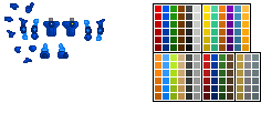
Edit: Replaced the example image to correct for laziness.
-
 1
1
-
-
*Returns runic pixels to bag*
"The summoning is complete, he has arrived."
I didn't realize I'd bring forth a member from the glory days, I feel honored. Anyways... I actually modeled the kit after Alpha, I liked the design but wanted something different. The deal with the colors is I always hated the shininess that six shade brought, so I made something a little more muted.
I'm glad theta wasn't taken already, mainly because my backup name was "Chimoru Futon."
-
I wasn't originally planning on messing with this kit, but issued a temporary patch for the leg oddness.
I say temporary becuase I plan on adjusting the legs later.

It honestly looks weird either way.
-
Disclaimer: I am well aware of the many "flavors" of Chimoru that exist, I am okay with another. Hopefully I managed to pick an unused name.
This is a kit I designed years ago and it's been sitting around in my drive collecting dustbytes. So now give unto you, the surprisingly underwhelming, Chimoru Theta.

The style was modeled after alpha with a bit of twist.
Credit of course goes to Dark709 and Gerlicky (six shade) the numerous contributors after them.
-
I must say, this is a rather stunning figure; however, I feel that the usage of the "shield" pieces on the torso stand out a little too much. They're contor doesn't line up well with the main chest piece. It may look better if the color was more silver or black, or swapping for some the wide armor pieces you used on the knees. Aside from that this is a truly lovely moc.
Thanks. As for the torso armor, I don't see what's wrong with it. I think I did a fairly good job of making the shields fit with the front armor.
Sorry, didn't mean to insult your construction style there. What I meant was that while the shields do fit rather well, something about them stands out, I think it's just the color contrast. It's not a huge issue, just an opinion. I just had to pick a detail to expand upon for the comments sake.
-
I must say, this is a rather stunning figure; however, I feel that the usage of the "shield" pieces on the torso stand out a little too much. They're contor doesn't line up well with the main chest piece. It may look better if the color was more silver or black, or swapping for some the wide armor pieces you used on the knees. Aside from that this is a truly lovely moc.
-
Woot Woot! I never noticed this thing was back, it's good to know that the kit is still "alive."
On a sub-note I think I have a few items for this kit lying around (like a new color pallet).
-
Hey long time no vist, I like what you've got laid out for season 2. Keep up the good work. The organization is so secrect I didn't even know about it!P.S. I might be able to help you make some backgrounds if I can get photoshop to work (and stop being lazy).
-
We are not weird, WE ARE EPIC! Because we having flying boats.

-
-
-
"Your office is in front of mine, I tought thats what that implied." That was my favorite line, but like always great comic.
-
-
Great comic, interesting plot twist too. Also the last comic was really funny.
-
Well if you want to make one you can make one two, I might not get mine done for awhile.
Oh, I guess I won't make a santa then, since I haven't actually started, I mainly just want this topic to not die
No one looks here is the thing, and about the santa sprite I was already planing on making a santa709 style one/ finishing the old sprite that I only made the hat for.I plan to make a Santa sprite for this kit soon because it's almost Christmas and almost nothing has been added in a long time
-
No one looks here is the thing, and about the santa sprite I was already planing on making a santa709 style one/ finishing the old sprite that I only made the hat for.I plan to make a Santa sprite for this kit soon because it's almost Christmas and almost nothing has been added in a long time
-
Man antonist boards buildings up fast
 , anyway great comic.
 -
-
Very funny.
 I'm glad I never go into rants like that.* (sarcasm indented; or not?)
 -
Interesting, wait then who is blue? Also my guess is that the fine print was added after their first run in with kahi.
It* isn't, Glowificationishness is actually a highly radioactive energy coming in three different types bearing the three scientific primary colors (red, green, blue) that became infused in the heroes' blood and their cones (and released through the ice cream within the cones) at the moment they were simultaneously chosen and will burn anything other than the chosen hero of its color (due to their infused blood making them a part of it), ordinarily it simply lies dormant in all SMIC ice cream and gives it a flavor boost (as is engraved in fine print on each cone to avoid lawsuit) and therefor the infinite amount of pure Glowificationishness produced by the hero cones is unfathomably delicious when it doesn't burn your tongue off (just as the saying goes what doesn't kill you tastes good).*everything beyond this I just made up after reading your post but I will consider it canonGlowing ice cream, that doesn't seem healthy.P.S. Why don't the PGS get intros?

Ah I see, make sense.P.S. Do like the "A Reistance" banner?As to your question each the PGSes aren't my characters so I have some trouble describing them as well as Resprite, Antonist, etc. So Ithink that their PGS intro comics will suffice.
-
Glowing ice cream, that doesn't seem healthy.P.S. Why don't the PGS get intros?
-
I agree, this kit could be far more amazing than it is. If only I stopped being lazy and posted some stuff, and more people helped.I've been trying to work on this, in terms of angles for legs and arms. This kit could one of the best kits if more people (including myself) worked on it.
-
Your quite welcome.Thank you all :)And thanks Black3467 for answering (I was very busy and didn't check the topic).Yes, Kopaka is in his Nuva form, the Toa Nuva are my favourite team.
You should try using his orginal eye color for the glowing on the armour (not sure about its official name) and perhapes throw things off (but this might kill the whole theme) and use white instead of black.
But first I want to finish Takanuva, I can't decide about the colors...Will you try Classic Tron next?
-
Wow this is awesome, this is really cool piece of artwork.
To answer your question (,this is just a guess though,) I believe this is ment to be is his nuva form as If you look he has nuva armour and the mask is alos the nuva version.Fell Free to correct me if I'm wrong.Is he a Nuva or a Mata?


Preview of Upcoming Comic
in Comics
Posted · Edited by black3467
Hey!
Firstly, thank for the complements and the criticisms! I really appreciate it.
I was actually a little concerned about using photos as backgrounds myself. I was able to stitch together everything for something like the Ta-wahi beach, but I'm still concerned about what to do with Ta-koro, that's going to be a bit of a challenge. I was actually hopping someone here might have a bit of a suggestion as an alternative to picture backgrounds. So if you have any idea's that might fit with this style better please let me know.
Sorry about the sprite blurring, I got lazy and whipped up the comparison in paint really fast. I'll upload a less distorted version as soon as I get a chance.
Almost forgot scheduling! I don't have a plan for regular releases since the pages will take a while. I'm debating to wait and release complete issues, or treat them as chapters and put out pages as I get them done.
Anyways, thanks a bunch!