

Kosdan
-
Posts
25 -
Joined
-
Last visited
Content Type
Profiles
Forums
Gallery
Events
Blogs
Store
Raffles
Posts posted by Kosdan
-
-
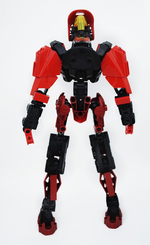
The blue makes me think of the very hot part of a flame. As an accent color, though, it isn't prevalent enough to pull that off; you'd either need to add more or get rid of it.I think his legs could stand to be one more stud apart, and the uppers could be filled in some more. Same goes for the upper arms, especially between the T connector that attaches to the elbow and that black quarter circle piece.The upper part of of his back could use some armor, it looks like to me. Maybe you could try finding something to attach to the angled pieces you have where his shoulder blades would be.As the rest of him is pretty much human-proportioned, I think his feet look pretty disproportionate with how far they extend behind the ankle.
-
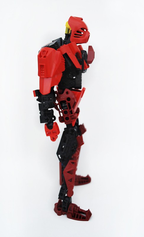
I really like the flames on the spine. It looks like a shell, but instead of being a hard material, it's made of flames, which is pretty cool. I also like the idea of the black on his head representing a place where he has been scorched, and I think you should try implementing the same idea elsewhere in the MOC, for example, making parts of one of his arms black to represent more battle damage.I feel like the armor on the upper legs is too chunky and mismatched. You have some HF armor, with hard angles, and then round, bulbous Nuva shoulders. I think trying to find a single piece to cover the top would look better.I like how the flamethrower has a kind of handguard thing going on, but I think it is too short and stubby, which could possibly be fixed by elongating the barrels a bit.
-
I was going to make some suggestions on the first version, but then I saw your second version, and you fixed some of them, like making the feet silver and adding more tubes to make the hair better. I have a few other comments though:I think you should remove the bushings in the shoulders, and move the arms closer to the body. Females usually have slimmer shoulders then males, and I think if you move them in it would help distinguish.On her groin, I would switch the piece you have for a Throwbot/Slizer foot, which has some slopes and would have a better shape in my opinion.Like I said, I like that you added more hair, but maybe you could organize it a little bit and have it all go down her back.For her weapons, I would replace those angled axle connectors for T connectors.Finally, for colors, I expected more blue for a Toa of Water, and I don't think her new red blades match that profile very well either.
-
Since everyone seemed to comment about the Throwbot foot: the only picture i think it looks bad in is the final one, and that's because his head is turned so much that it make the gap look bigger. I was going for the look of something that came up over the from of his neck, similar to this: http://l2vault.ign.com/C3_Review/115_Hum1_dcrys_majes.jpg (I have no idea what that pic is from, I just did a quick google search, lol). Anyway, I think it adds to the armored look I was going for.
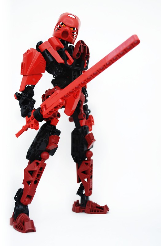
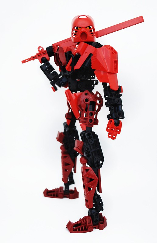
Hey, I had something in the works, so I figured I'd give it a whirl. About the knees, I see what you mean. I tried using one of the 3 length curved slope pieces, but they were just too long. I might try a different configuration if I ever use that design again.I didn't expect you to make anything Kosdan Pretty cool MOC, The torso looks very well done, but my main problem with it would be the slizer foot. It seems to stick out just a bit too much. The legs are pretty cool, although it might have looked better if the knee area didn't seem a bit blocky, but I don't really see a way around it. I like the sword, simple yet effective. Great job using the touches of dark red with the normal red. Overall it's a great MOC, good luck in the contest!
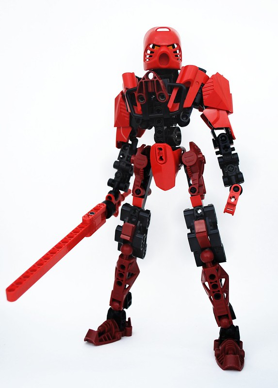
True, they are bit skinny, but I feel the porportions are still within reason overall.Of the various entries into the contest, I like this contender the best. It isn't dominated by a single color (the split between Mata and Metry red and the Black is very well done), and looks to have a good solid build. The torso makes the arms and legs look a bit lanky, but my entry is itself quite lanky, so I have no room to talk Good luck!
What exactly don't you like about the feet? I feel like the Metru foot fits in well with the design/porportion of the rest of the leg.Wow, awesome MoC!The design is great, very hero-ish.The only thing i'm not that crazy about are the bottom legs and feet.Just minor issues, though^^Good luck on the contest!
By "bottom part of the torso," do you meant the area between the HF armor and the Throwbot foot? Well I would agree with you there, and I realize now that I might have some liftarms that might fit well there.Cool! The armoring is really nice and the torso is really cool. The bottom legs look a bit thin and the bottom part of the torso doesn't look like it's covered up well but it's still a great MOC.
If I turned it over it would not server the purpose that I stated above, and then there would also be a gap behind it because of the way the piece it is attached to curves back.This might be the best entry I've seen so far! Surprisingly, the Mata and Metru red actually look nice together. If anyone's beating me, it's you. The only thing that I think needs to be fixed is the dark red triangular thing on his ches, it would look better turned the other way. Good luck!
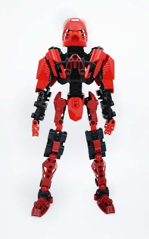
Thanks, I actually bought Captian America specifically for that armor.I really like the torso, and the legs are nicely armored. I als olike the use of the shoulder armour. My only complaint is that the chest sticks out a little far.
Thanks!Great! Lovely shape and flow, I really like the look of this. Yeah, that chest part sticks out a bit, but nothing too serious. Good luck in the contest, I'm pretty sure you'll go far!
On the arms: I was originally going to use a HF limb, but with the HF armor attached it was too bulky, and without it, too skinny. I feel the design I used is the best combination of the appropriate length and thickness.On the sword: If Lego made a straight, plain blade of this length, I would have used it in a heartbeat. But none of the Bionicle blades are like that.On the pictures: I used a piece of posterboard curved into the back of a clear, plastic storage tote. I sat this in a shadowy place outside, which prevented any shadows of the MOC itself. My camera was just on Auto mode (no flash!), and I made a few adjustments with the image editor GIMP on my computer, but nothing like photoshoping out the background. Adjusting the "Curves" setting really helped make the colors pop a lot.Great MOC you've made here. The groin is phenomenal, as are the shoulders. However, the lower arms seem very jagged compared to the rest of MOC, and the Slizer foot looks out of place. The sword, while very cool, seems a little to blocky. In this case, I think a Bionicle blade-piece would have worked better.Overall, really great creation, and good luck in the contest.Also, how do you photograph your creations? -
I voted for #2. It represents the theme pretty well.
-
Since the top two entries from each poll get into the semis, I voted for #1, since #4 is almost guarenteed.
-
I voted for #2.
-
I voted for myself, #6 Hollow Flame. Good luck to everyone!
-
-
Entry Name: Hollow FlameEntry Pic URL: http://farm9.staticflickr.com/8012/7382970190_80c1dc9714_c.jpgTopic URL: http://www.bzpower.com/board/index.php?showtopic=5422
Toa Synchro
in Bionicle-Based Creations
Posted
The disks for wheels is very unique, and I think it looks good. I also like the idea behind his weapon. I'm just wondering why you used a different hand on each arm.I think the Hero Force piece on his midsection sticks out to far from the torso. If you could move it back or find a different piece that was flatter, I think it would flow a little better. The top of his back looks a little sparse, and could use some armoring up.The connection between his hip and leg is very skinny. You have the perfect connection already set up with the system stud on the metal detector piece. I would try and use that to add some bulk.