

Hakann-The Bully
-
Posts
90 -
Joined
-
Last visited
Content Type
Profiles
Forums
Gallery
Events
Blogs
Store
Raffles
Posts posted by Hakann-The Bully
-
-
Hahaha I got Onua - sleeping is a hobby I suppose xD But yes, I agree with Haxorus - there's no bias in actively picking the option that sounds like your favourite Toa

-
Aw man the nostalgia! Love the videos as always SPIRIT! Oh and... are you going to grace us with another one of your parody songs soon xD?
-
Hahaha, these were pretty fun to watch - though what happened to the Protector of Earth's Mask? It looks chrome at the end of the video when Onua rebuilt them?
On a side note, I wonder if the spinning mask display stand will be available in the future XD?
-
Astonishing work - my first Bionicles were the Rahkshi and it's incredible being able to see that you've recreated all FOURTY TWO O_O!!!
Could you by any chance take some photos of how you made the custom spines?
-
Hahaha, awesome trailer for Season 22! ...but isn't Hammond a bit too tall
 ?
? -
Congrats Roa! An amazing build that thoroughly deserved the win!
-
Thanks for the great review! If I had to take a stab at what the weapons are, perhaps they're some form of tonfas (Admittedly, they're still awkward...)?
-
TLG: "The sets look awesome, don't they?"
Fans: "Yeah!"
TLG: "You probably have some money set aside for the return of countless childhoods, aren't you?"
Fans: "Yeah!"
TLG: "I hope you saved a lot because Tahu, Kopaka, and Onua will cost most than three Ferraris put together! Eat that!"
Fans: "Darn!"
I'm pretty much gonna buy at least one Toa and that's it. I can't cope with these prices.
find me these $6.66 Ferarris so I may purchase one
I think the Shell Promotion is still going on in the Netherlands, so go for it ;D
Anyways, a 'quick' review of the new sets, minus the masks - you can read my verdict on the new masks here
TOA
1. Gali
Despite the much more feminine appearance of her mask, her body remains, like in the old days, rather masculine when compared to her fellow heroes - perhaps it would be a good idea to create more 'petite' armor pieces for the female characters, otherwise everyone just ends up looking like body-builders... Her flippers and trident being able to combine into a double-sided pole-arm is rather cool, though the yellow connector pieces are a bit of an eyesore :/ (this is minor). Colour-wise, the trans-blue, solid-blue and greys blend together well to give the look of an aggressive water-based warrior: It's very shark-esque.
2. Kopaka
Ahh Kopaka, with those thunder-thighs and well defined calves, he's definitely the type who never misses leg-day. Jokes aside, I really like the look of Kopaka - here the trans-blue definitely gives off an icy feel when layered with the white, while the gold armour gives him an honour guard feel without looking gaudy. The spear is nice, though the little ice-bolt/energy-bolt looks a bit tacked on... The shield on the other hand is massive and looks like it will be able to take quite a lot abuse in combat, and the skis (they're not really skates, since the blade sits flat) look like a lot of fun, especially since he'll be able to spear people while he's skiing now!
3. Lewa
I'm sure those that have read my review of Lewa's new Miru know I'm not too fond of it, and sadly I'm not too fond of the actual build either... It just looks... messy to me. Let's start with the colours: The overuse of grey and splashes orange do not suit the theme of a Jungle master at all - I was hoping for 2-3 shades of green, with perhaps some colour blending, like we saw with Gresh's mask and Jungle shield. Minor grey accents would have been alright, but having both limbs and armor (especially that chest piece) in grey looks inorganic and dull. The axes, however, are a nice throwback to his Mata years, but I feel they would look better if the axe-heads were swapped around so it slopes downwards.
4. Onua
If Kopaka never misses leg-day, then everyday is chest-day for Onua. Although the website claims Pohatu is the toughest of all the Toa, I'm not so sure - just LOOK at the pecs that Onua has. Surely they have a thing or two to say about that description? Onua's build screams
Pakaristrength, and the purple accents enhance the black on his body. The gold, however, doesn't fit - it's just too contrasting. Black and gold works. Black and purple works. But black, gold AND purple DOESN'T work. As a result, I feel replacing the gold armor pieces with silver, black or grey is potentially a good idea. Weapon-wise, I remember a member posting that this was the first hammer weapon ever given to a Toa. That being said, the handle is a bit sad - a bit too skinny for that massive mallet head. The claw form, however simple, is rather nice though.5. Pohatu
Pohatu is an interesting case. At first I thought the blend of brown and grey(?) didn't feel synergistic or gaudy, just... dull. But after looking at the set photos from NYCC, the glossy/shiny feel of the brown actually looks pretty good against the silver armor pieces, but I must comment that the trans-yellow joints on the right arm feels rather out of place. The boomerangs? are interesting weapons, but look a bit goofy in terms of size and how Pohatu holds them (though this can't be helped). That being said, Pohatu has always wielded rather interesting weapons: from his 'Feet Additions' in Mata and Nuva forms to the Twin Propellers in Phantoka form, Pohatu's weapons were always rather unique, and thus it's rather interesting that his rebooted form follows this trend.
6. Tahu
Again, if we look at Tahu's lower limbs, we can assume he goes gymming with Kopaka, with the philosophy of never missing leg day. The trans-orange, flat red and gold complement each other and vibrantly depicts our favourite Toa of fire. The silver feet are a bit odd, since gold seems to be the armor colour of choice, but I can live with that. In terms of his armaments, his Fire Swords/Lavaboard are lovingly redesigned and the translucent fire accent in the middle certainly make them look more aggressive. The two small gold swords look a little small in hand but look excellent as fins when stored on Tahu's back. I wonder how Tahu looks when dual-wielding a Fire Sword with a small sword in his off hand; I reckon he could looks pretty cool if posed using it like a wakizashi! I will now call them... Heat Wakizashi.
Overall, the only gripe I have is the fact that the Hero Factory armor pieces make the Toa look like they spend their spare time in the gym - they all have massive pecs (I'm looking at you Onua), muscular calves (Tahu and Kopaka) and six-packs (Everyone). Bleh, I'll live with it, and will probably get used to it in time

That's all for now - I'll update the post with verdicts on the Protectors after further examination hahaha
-
I'll admit it - at first I was a little devastated that this was going to be a reboot - I was rather enthusiastic about seeing old faces, especially characters like Vezon and his new Olmak and the mysterious 'Golden Being' or Skakdi fusion... (Man I'd love a set of the Skakdi Fusion...)
But then I watched the video and thought a bit more, and I've decided that I don't mind this being a reboot. Although I'd PREFER a continuation, a reboot isn't the end of the world xD""" The new story looks interesting enough, with Ekimu and Makuta being the two new, I guess, "legendary" characters; on the other hand the "Mask of Ultimate Powerrrrrrrrrrrrr" sounds rather silly though >>. I'm guessing "Makuta" is no longer a species in this series (sadface), but we'll see how it goes.
Now. The Toa. As previous members have stated, I too, wish they don't go overboard with their bios traits - I want my cold, calculating and precise Kopaka back D:! In terms of looks they're not bad, but something feels wrong about giving them the beefy pectorals and six-packs via the Hero-factory armor pieces...
...That being said, I'm digging the rebooted masks (most of them...). Although the names of the masks aren't confirmed, I'll use the original names, so bear with me here.
1. Gali's new Kaukau is lovely and, for me anyway, preferable over her odd Mistika, Adaptive Armour mask with the compound eye and silver winglets. It kind of reminds me of her Mask of Light Kaukau Nuva rendition, being much more feminine, face-hugging with prominent fins. It's very streamlined and seems to be shaped using the dark art of aerodynamics. Actually, I reckon this might even be the best 'Kaukau' we've seen yet!.
2. Kopaka's Akaku is instantly recognisable. Interestingly enough, the extra/telescopic optics on this one are on the right side again, as they were in the Mata and Nuva renditions, as opposed to the left placement in his Phantoka, Adaptive Armour form. Overall, a very cool mask
3. Lewa's Miru.......................... I'm sorry it just doesn't work for me. It just feels... wrong. It was as though he had nicer armour on top of his face and then he used his axes to hack it off, leaving the odd, multi-layered thing that we see here.
4.
OnyaI mean Onua's mask is an excellent update of his original Pakari. I'm liking this new Pakari - It's muscular, tough and rugged whilst staying true to its ancestor from 2001.5. Just like Onua, Pohatu's new Kakama is an excellent update of his mask in 2001, having new cheek vents whilst still giving that image of speed and thus I'm digging it!
6. Tahu's new Hau is a swooshy and elegant evolution of his Mata and Nuva masks, retaining the round mouth part and having new cheek vents. Everything feels more futuristic, but it maintains the flow as it did back in the old days.
Anyway, it's getting late for me, so I might end it here for now:
Here's to TEN MORE YEARS!-
 2
2
-
-
Is that first build (4th picture) ... an Acguy o.O?
-
Goodness, this is an AMAZING rendition of the Bohrok - My favourite parts are how you positioned the Krana and recreated the face. Very menacing.
-
Goodness.... how long has it been? I suspect many veterans of Bzpower (like me .___."""") have gradually turned into lurkers instead of active posters, but I've still been checking for the past few years' for reviews, MOCs and the like. But yes, I've enjoyed the welcoming and accepting forum Bzpower was, and has always been for the few years I've been here, so I hope it stays like this! And with that, I guess I've returned XD
-
1
-
-
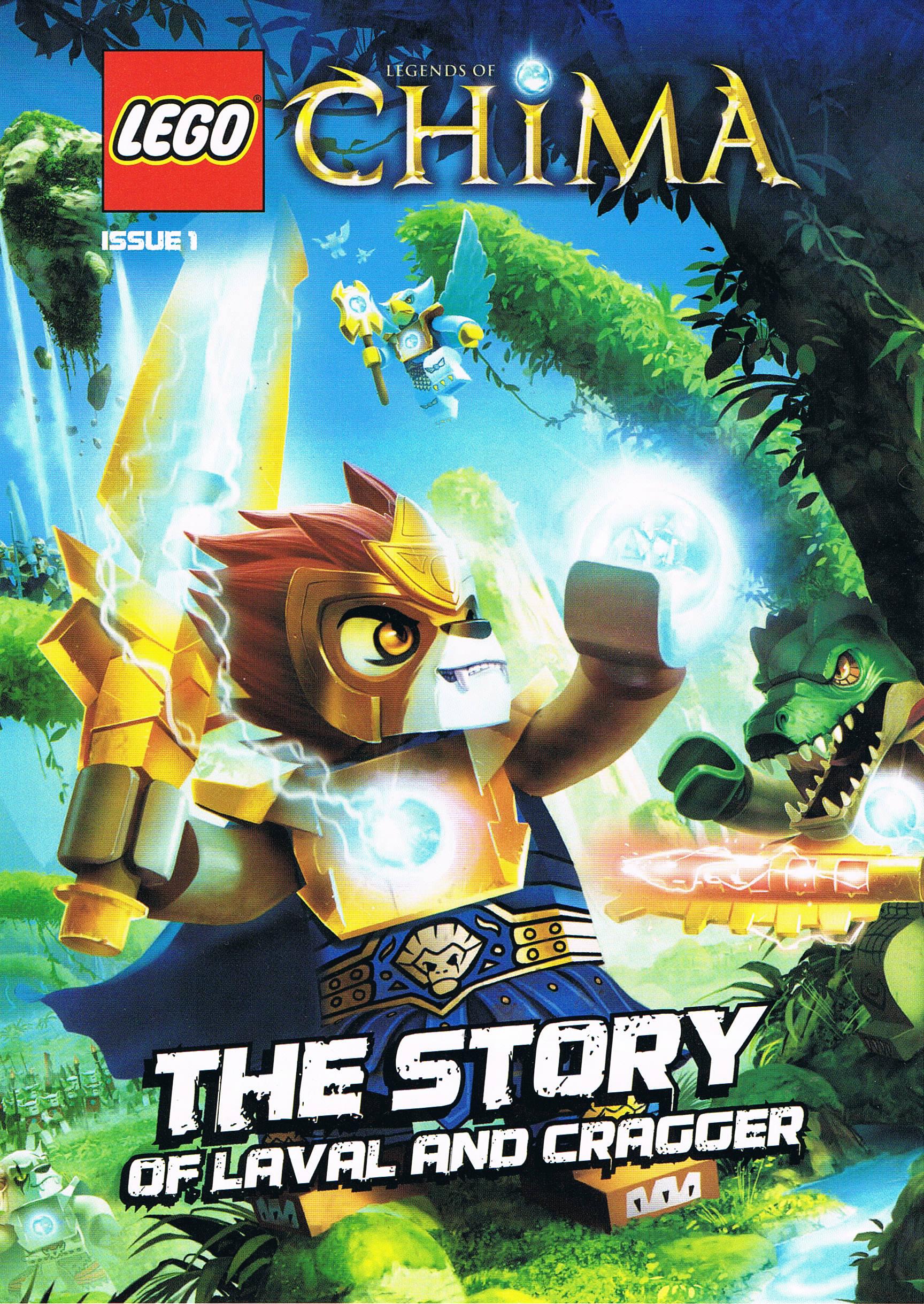
Wow, I didn't realize the LEGO magazines had so much differences between countries. The comic isn't even the same. Thanks for sharing! If you have a scanner, it would be much appreciated if you could scan the magazine cover and the pages of the comic. It would also be much appreciated if you could write an article describing the plot of the comic on The Chima Wiki.

Hahaha sure, I'll get to it :)What does the magazine you have look like o.o?
The magazine cover is actually the only thing that is the same, except the one I got has a fold-out cover with a panorama inside. What's different is the comic, and that in the US version we got a large poster included in the package.
Bummer the comic doesn't include actual illustrations. The comic we got had them, even though it didn't give credits, so I don't know who illustrated it, or who wrote it for that matter.
Wow the merchandise/contents are really different...o-o! I thought they'd just distribute roughly the same magazine everywhere...
-
Wow, I didn't realize the LEGO magazines had so much differences between countries. The comic isn't even the same. Thanks for sharing! If you have a scanner, it would be much appreciated if you could scan the magazine cover and the pages of the comic. It would also be much appreciated if you could write an article describing the plot of the comic on The Chima Wiki.
Hahaha sure, I'll get to it :)What does the magazine you have look like o.o?
-
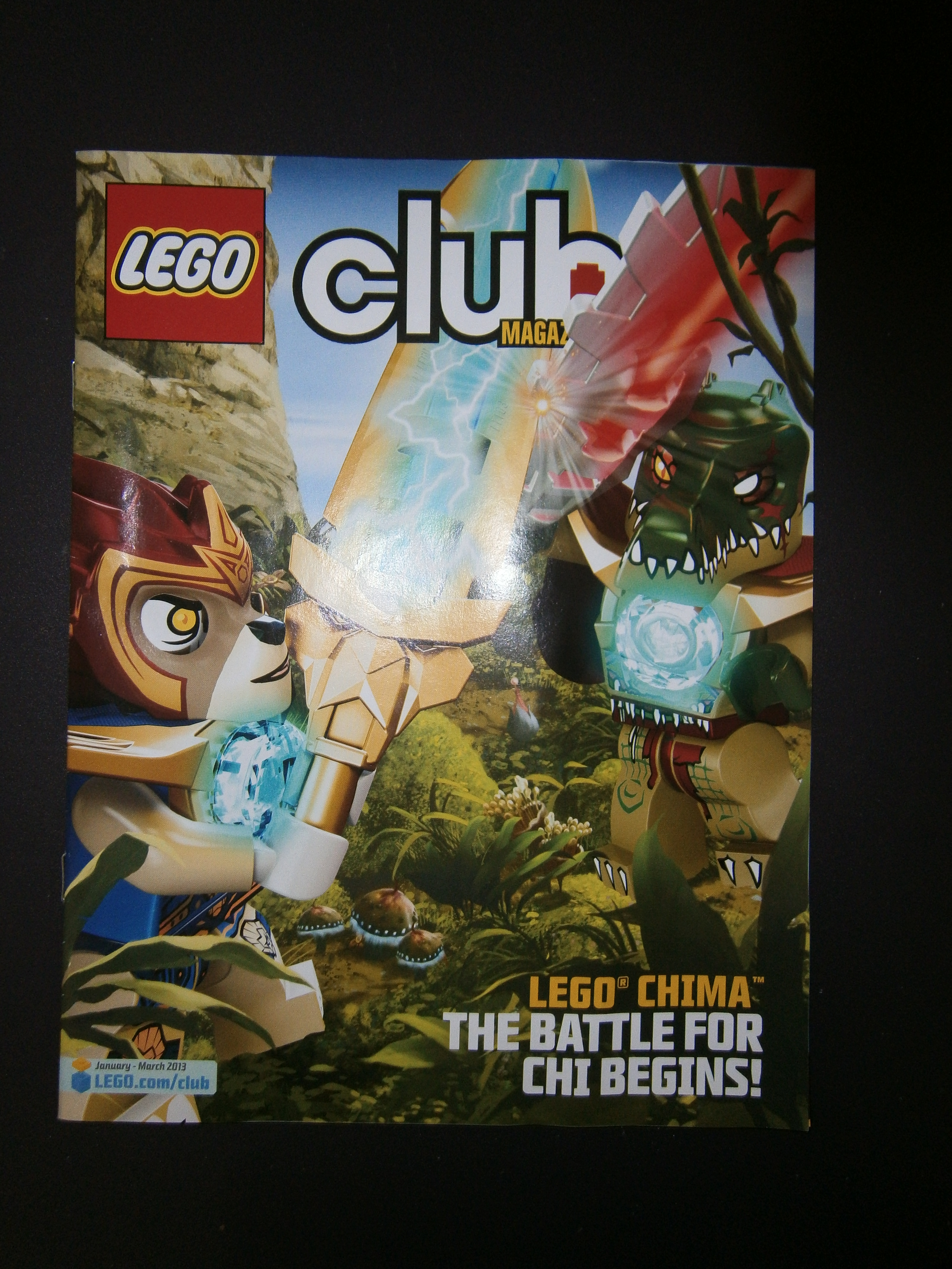
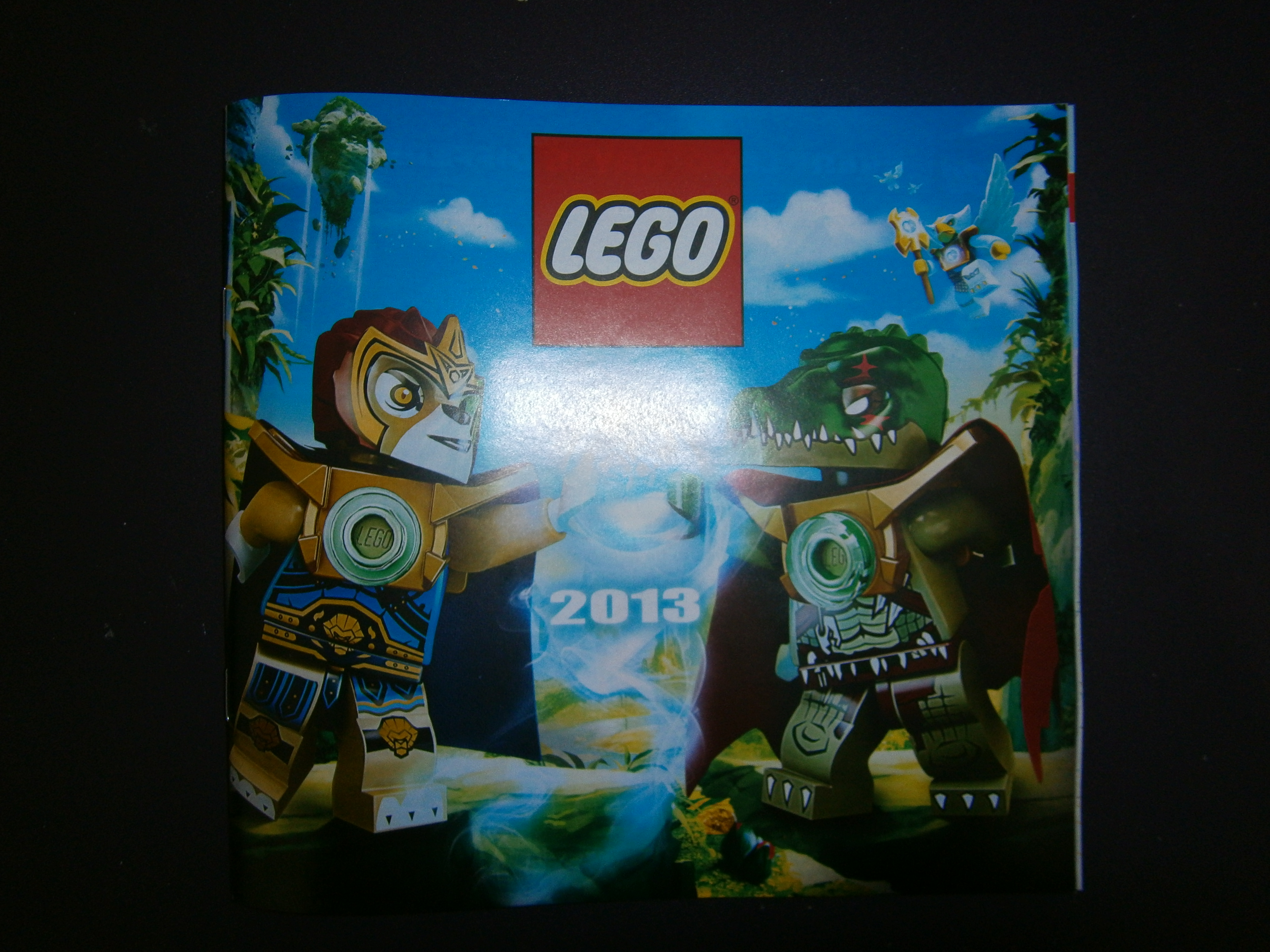
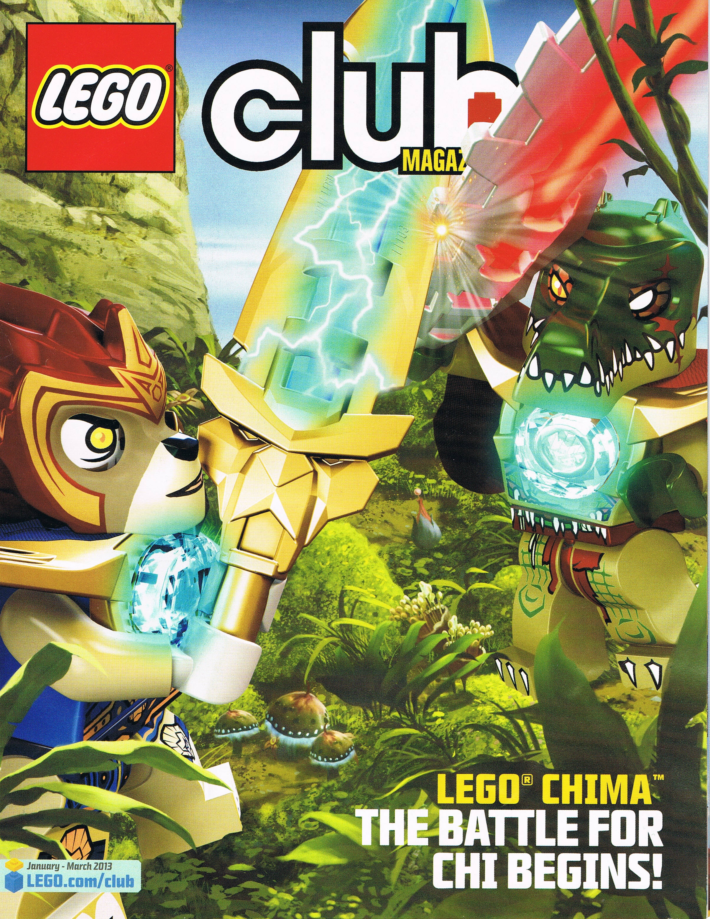
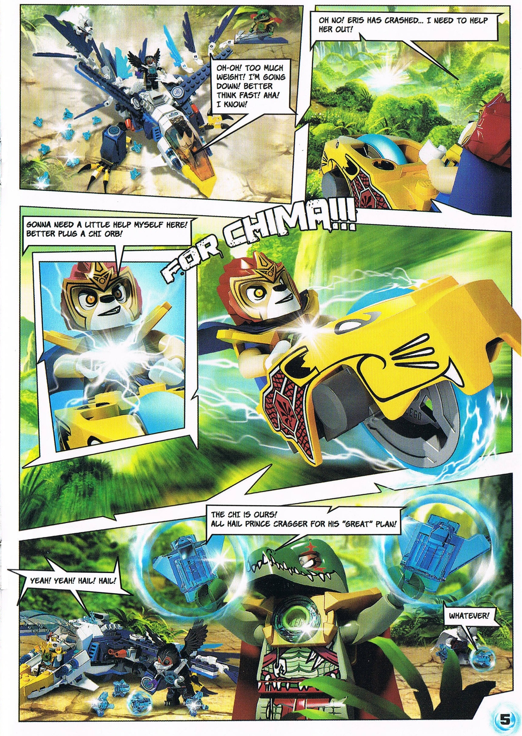
I don't normally make topics, but I got some cool Lego loot in the mail today: The first issue of the magazine for 2013

So I guess I'll make an exception xD
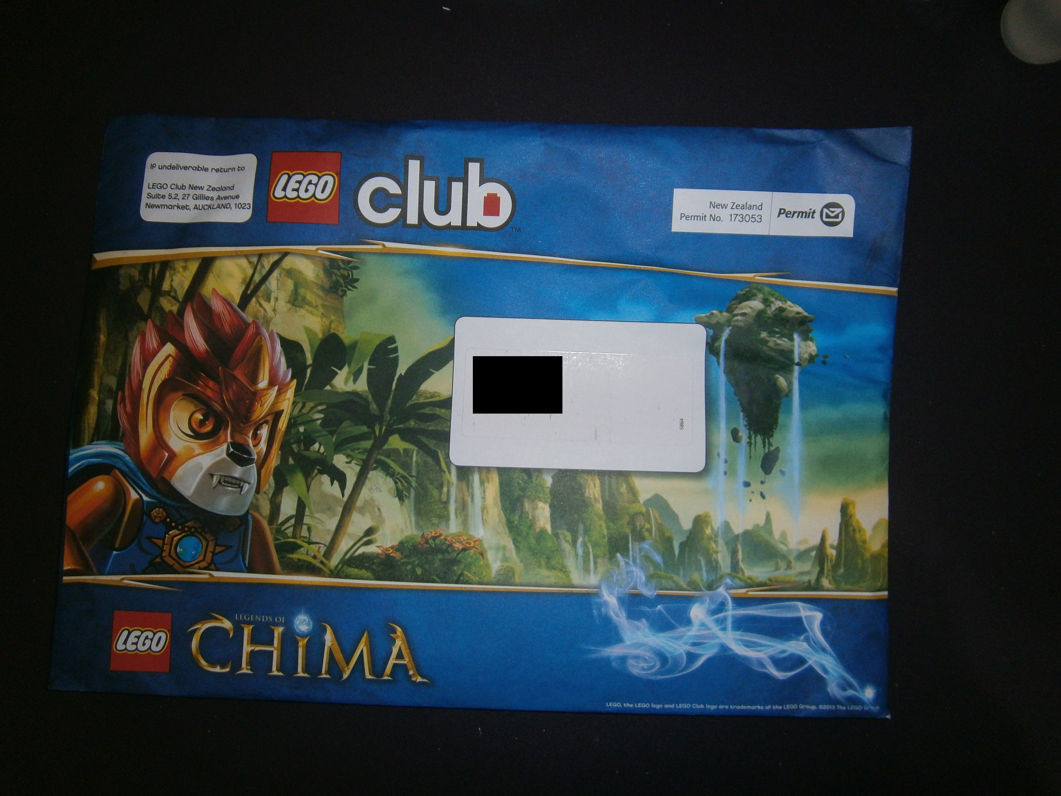
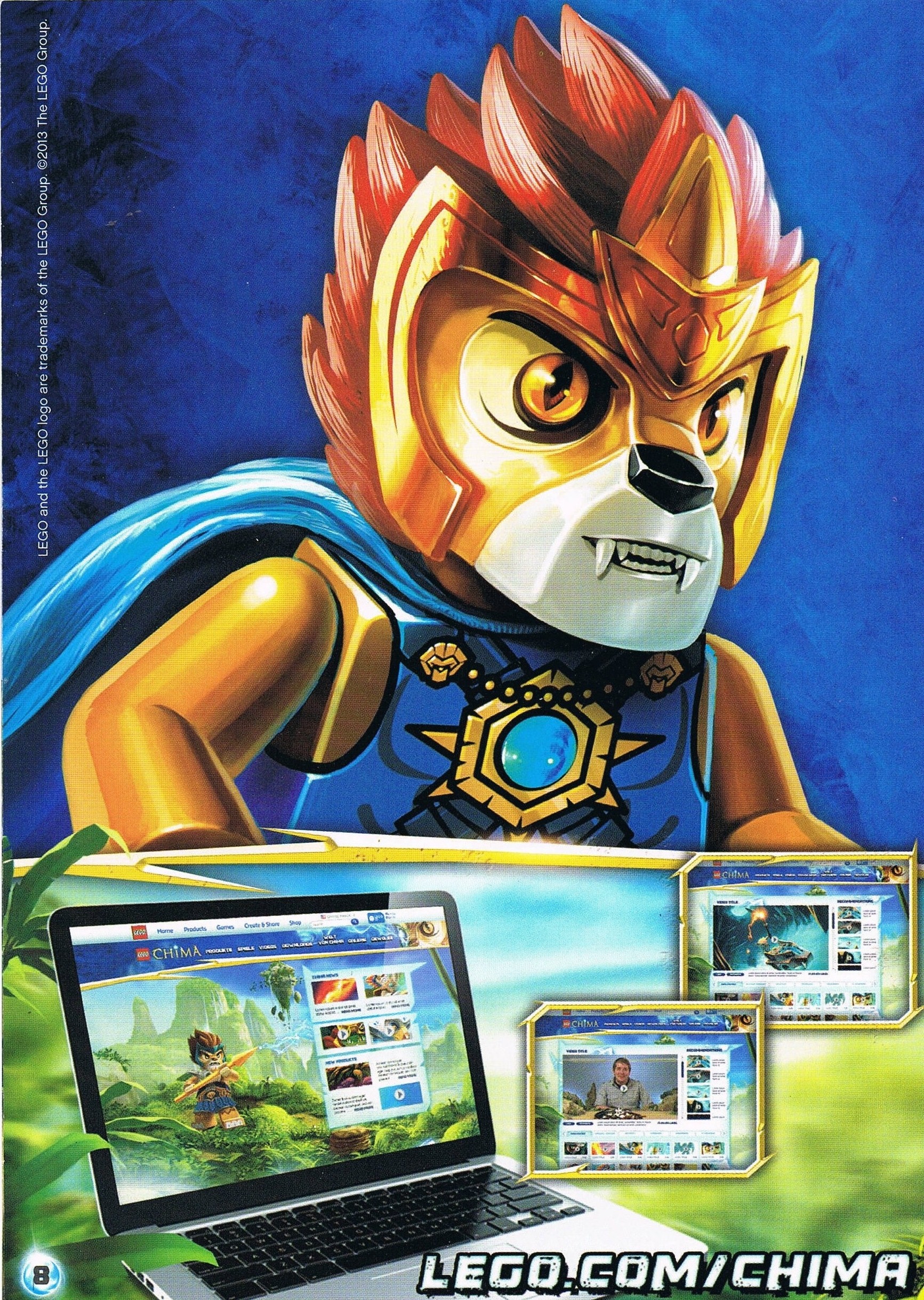
This time, the magazine is primarily promoting Chima, and so the envelope has a picture of Laval staring at the reader, with an exotic setting in the background.
Inside the envelope we of course have the Lego Magazine, showcasing Laval and Cragger locked in fierce combat.
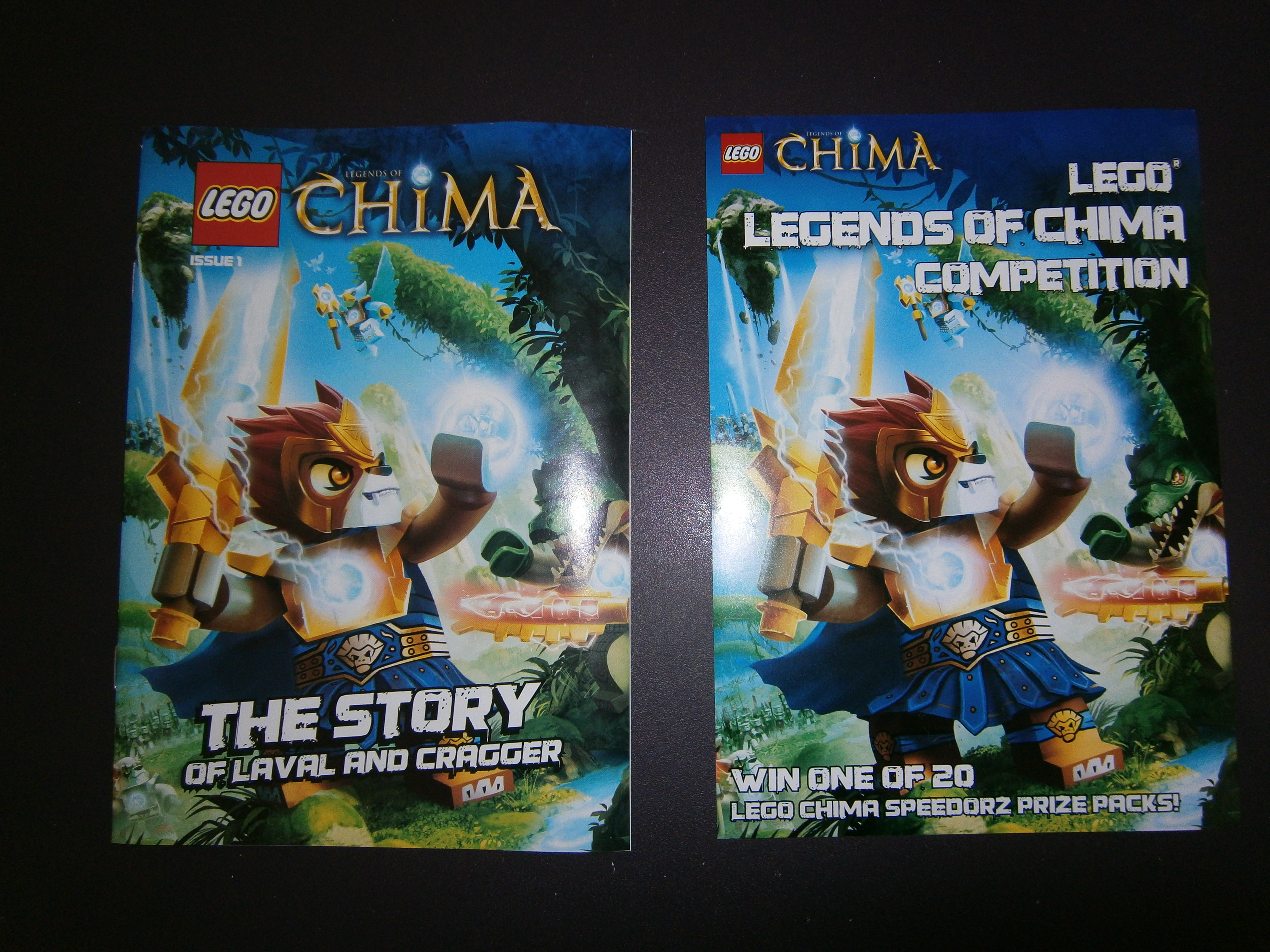
Then we have a Chima comic and competition for winning the new Speedorz
Also included is the Lego catalogue for the first half of 2013.
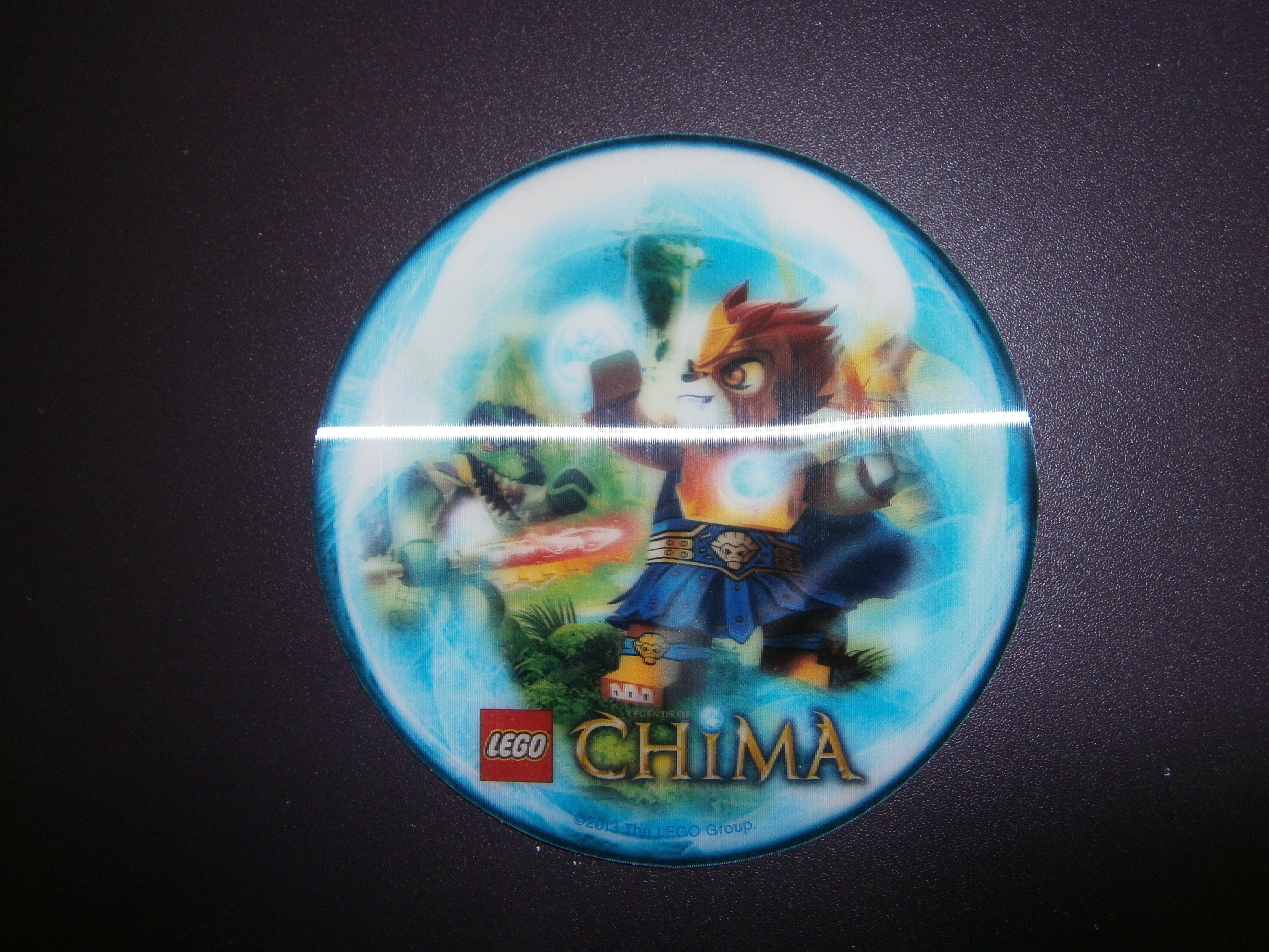
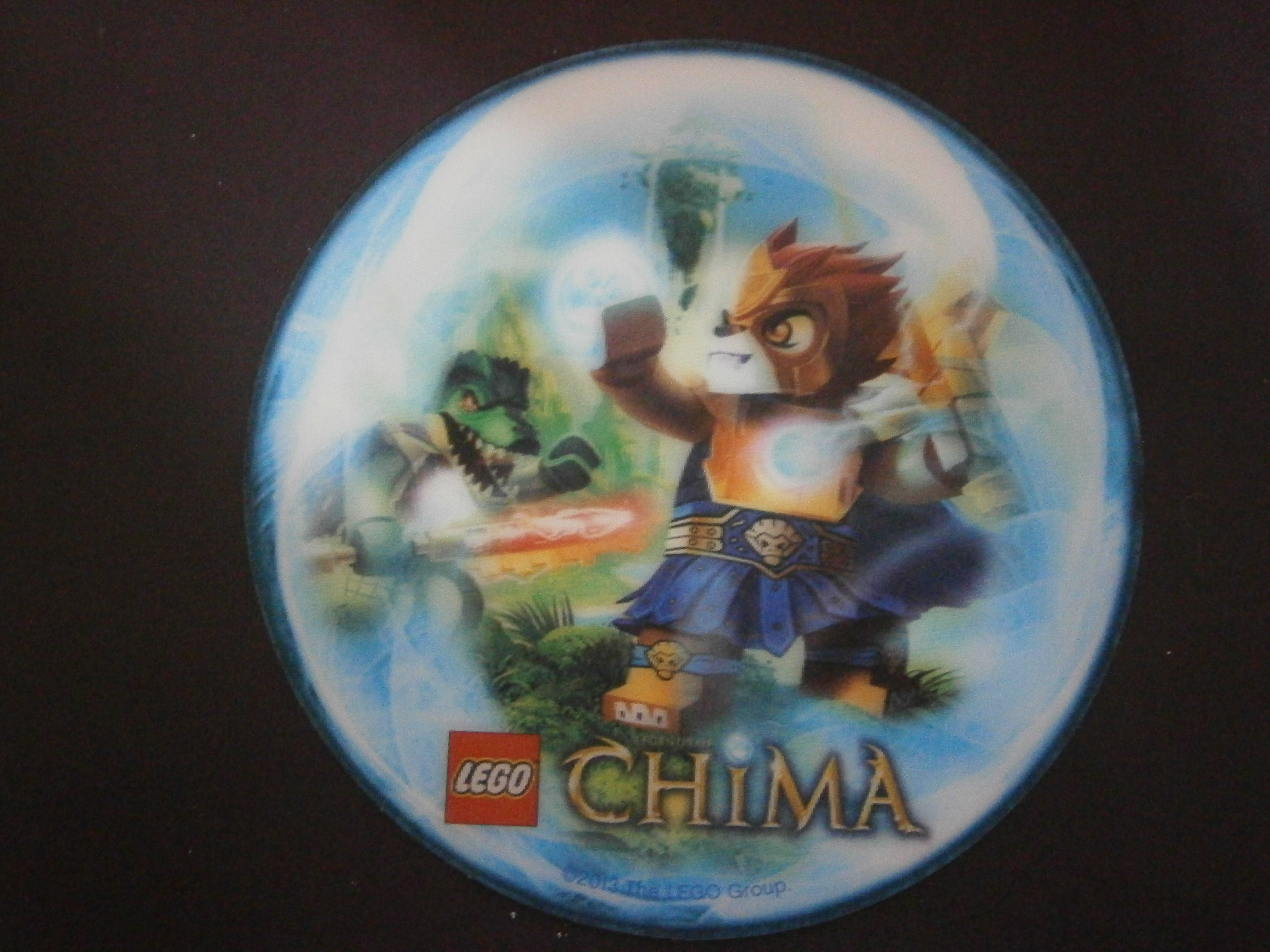
And then we have an interesting holographic card for Chima, with Laval posing heroically as Cragger charges towards him with that wicked double-saber!
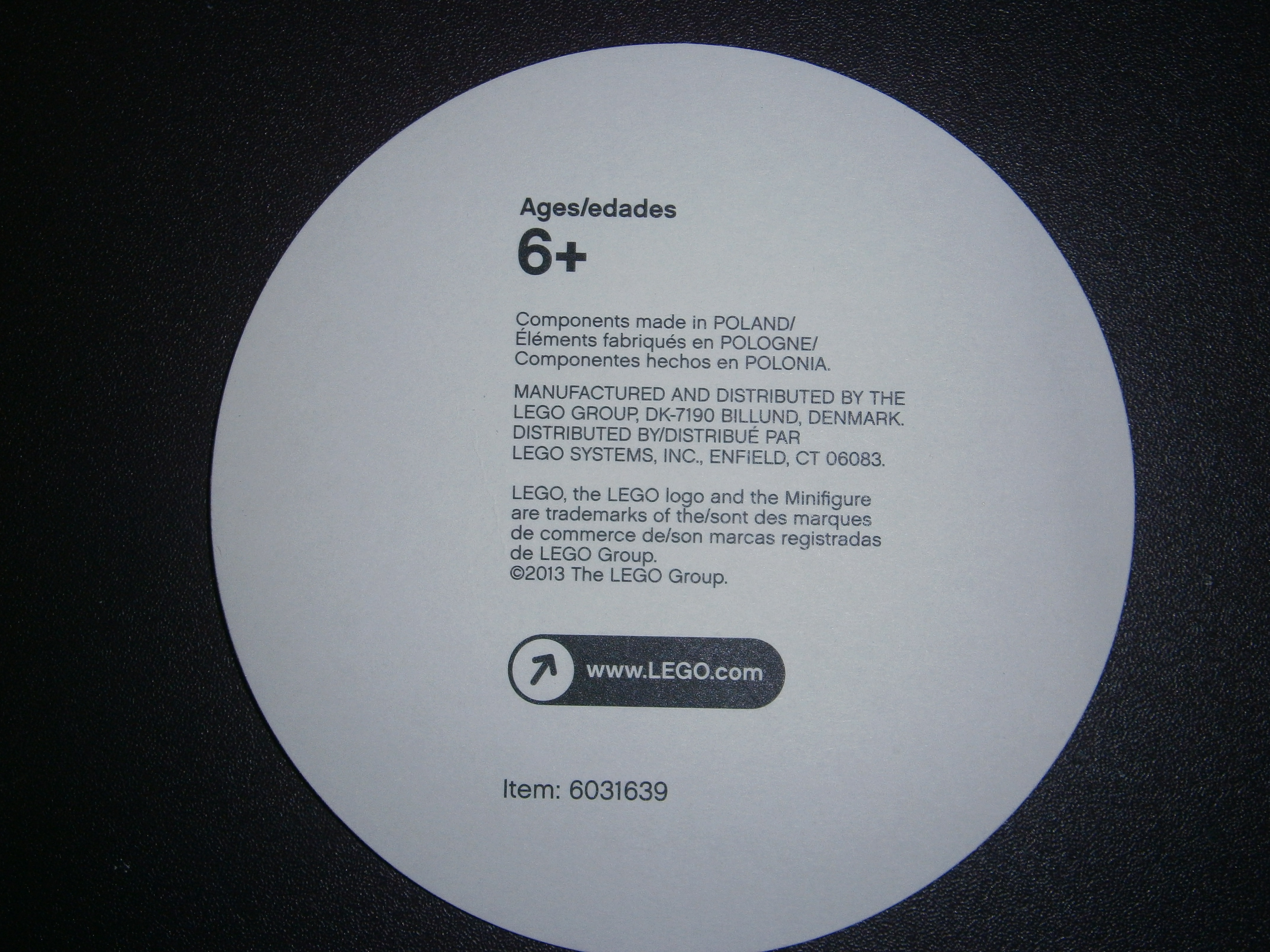
The card is also made in Poland, as it says on the back.
If you guys want anymore pictures, just post or PM me
Scans
Gallery (when public)
Magazine
Comic
EDIT: Included Scans
-
Ahhh I love watching videos of Akiyuki's contraptions! This one is no less epic than his previous works
The hours he must have spent building these...Hmm I wonder what AS-L40A means... AS is obviously "Axle Sorter", but the L40A...
-
Oh wow this is AMAZING O_O It looks good enough to be advertised as a potential Honeymoon location XD
-
The Hobbit: An Unexpected Build
?Anyways, lame jokes aside, it's a really nice build, and I'm always amazed by the mini-figs built out of Lego bricks (I wish I could get a close up...)
-
That's actually pretty cool
! The sets were pretty good, so I'm looking forward to what TLG comes up with next xD An aquatic theme for the ninjas perhaps? -
Goodness, this is amazing! I've certainly been "Sarge'd" by this build
I'm curious about the MJOLNIR visor piece... what exactly is it o-o? And could we get a close up of the Magnum xD?
-
Nice review, I'll might even consider buying it now XDD (Oh, and I like how they give you 3 "One Rings"
) -
Hmm I guess I'll try it out
-
Hey, this actually looks pretty cool... looks a lot more fun than heroes was in terms of what your character could do o-o
-
Thanks Black Six! Though I have to agree with the iffiness of the bare seating section, it just makes the ATV a bit too skinny.And for that reason I like the 7241 Fire Car from a while ago a bit better
(Sadly, it does not have an exclusive licence plate though D: )
Set Review: 71010 Monster Collectible Minifigures
in BZPower.com News Discussion
Posted
Thanks for the review Xccj! Your tips helped me pick up a banshee - she's a great looking fig!