


The Commodore
-
Posts
22 -
Joined
-
Last visited
Content Type
Profiles
Forums
Gallery
Events
Blogs
Store
Raffles
Posts posted by The Commodore
-
-
Simply amazing, another masterpiece, but this one seems to flow better moreso than your previous large mocs. However, my only qualm is tha on the neck some grey axels stick out, but I'm sure that it can be fixed.
-
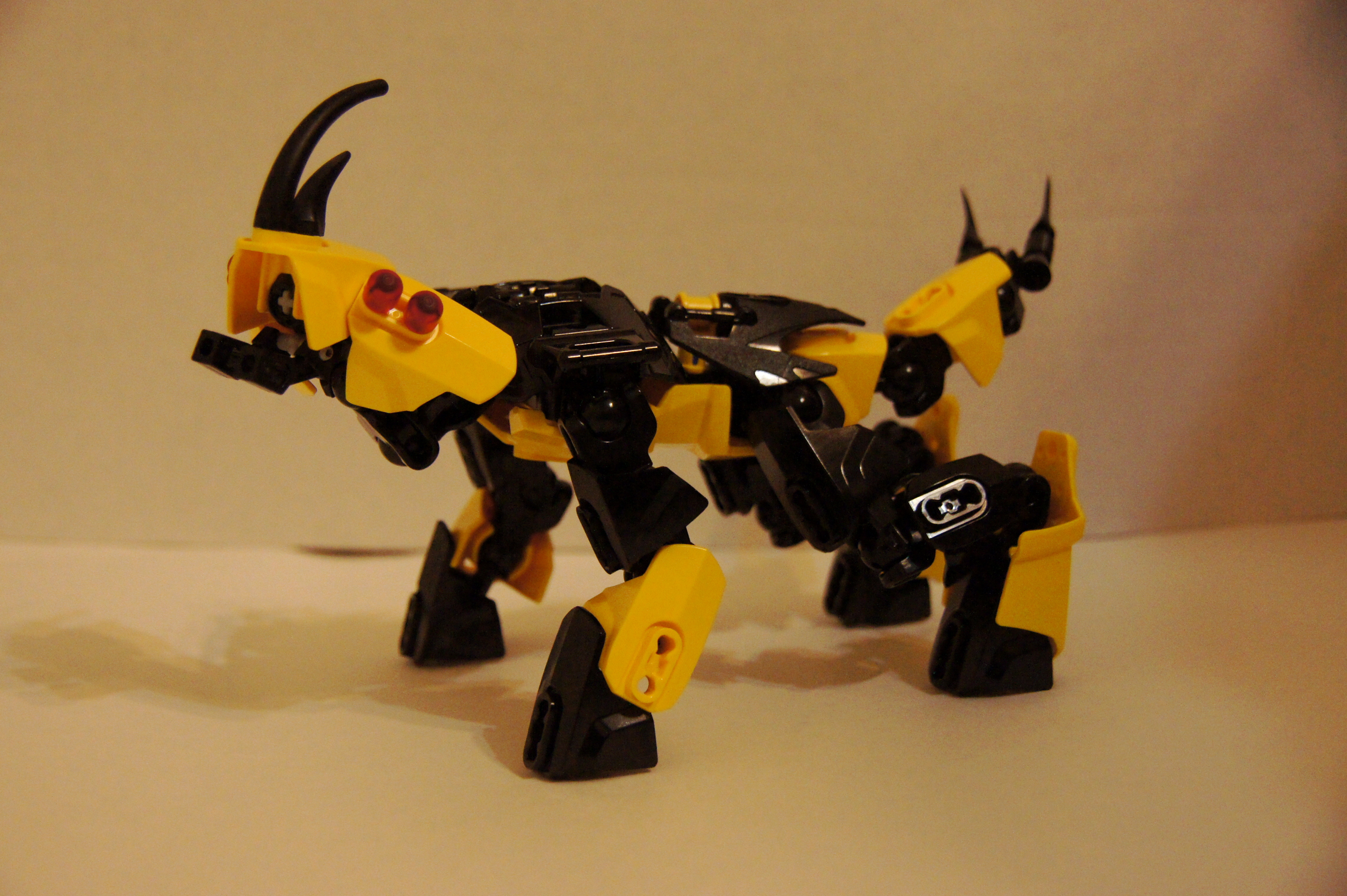
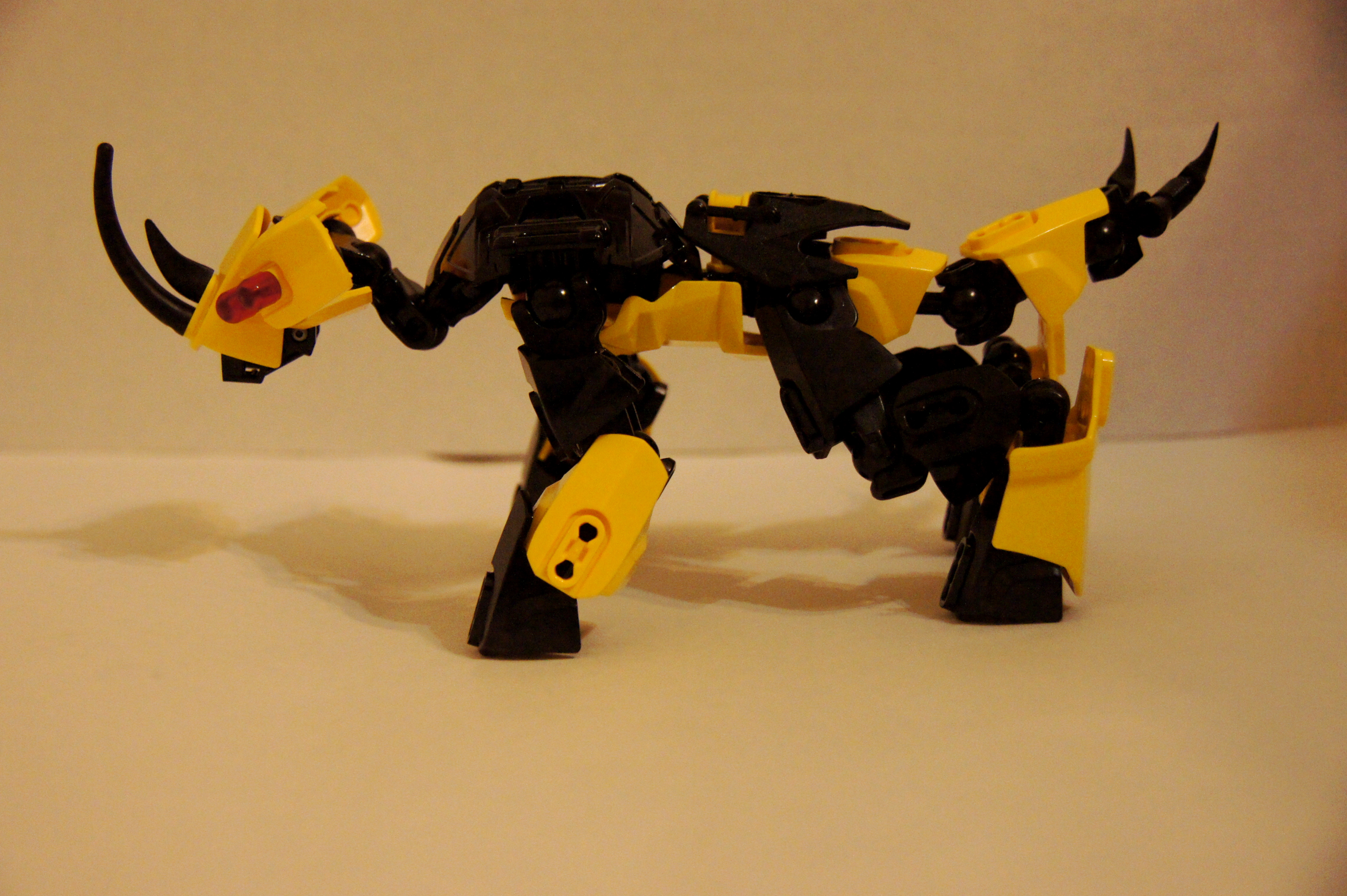
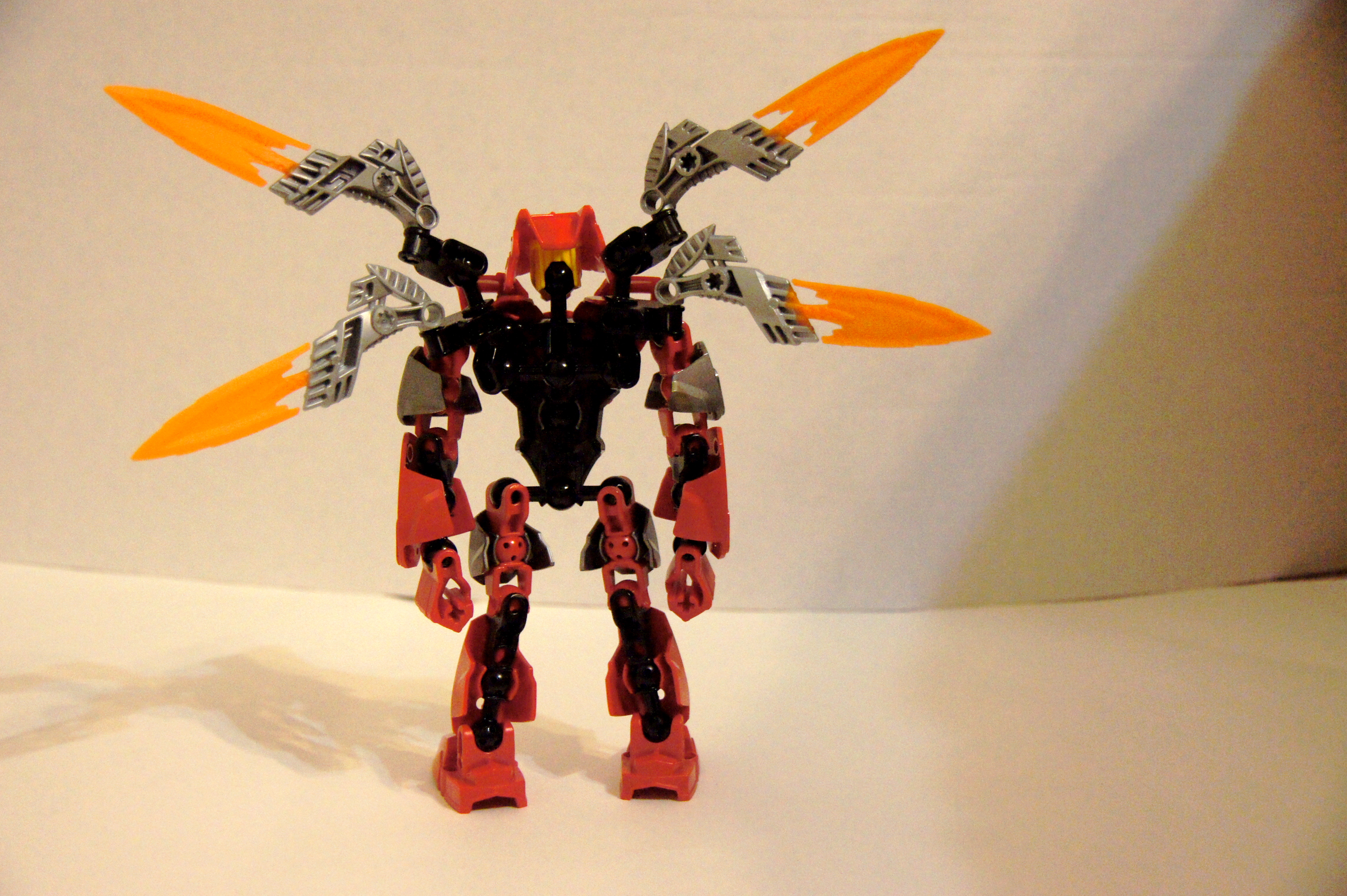
Overall, this a great usage of parts, good job. But I have to agree, it does look like a crab.
-
Rocka looks a bit better, and XLR8R just looks superb overall.
-
Thank you, and I chose orange for the head color because it contrasted really well with the blue and white.I love quanton. His color scheme is incredibly consistent, plus his head/eyes are really cool. Logan Clawd looks cool except for the head color, I probably would have gone gunmetal for the secondary color instead of white. Right now the orange kinda clashes, and I think a more mute color would have brought out the complementaryness of blue and orange. I can imagine someone going crazy with the wings idea, and having like six on each wing. Cool mocs and ideas.
Thanks, and yes, the eyes do stick out a bit, I agree, but it was the best option that I found. Logan's name is in fact a reference to Wolverines first name, Logan.Nice job, especially on the Furno wings. Logan Clawd was very well done and I like the Wolverine style claws, but the orange does clash a bit on his design, but other than that, very very well done on him. I was interested to see that Witch doesn't have eyes normally, which is good to know, but the only thing I did't quite like was how the eyes stuck out a bit, but Its not too bad, and yet again, good job. Quanton was enjoyable to. my score for them all: 9 out of 10, good job
Yeah, I tried other designs, but the current result was the best and went with the body, thanks.Quanton's a pretty cool beast-looking thing. The colors are great, and the use of HF parts on the head is great.
-
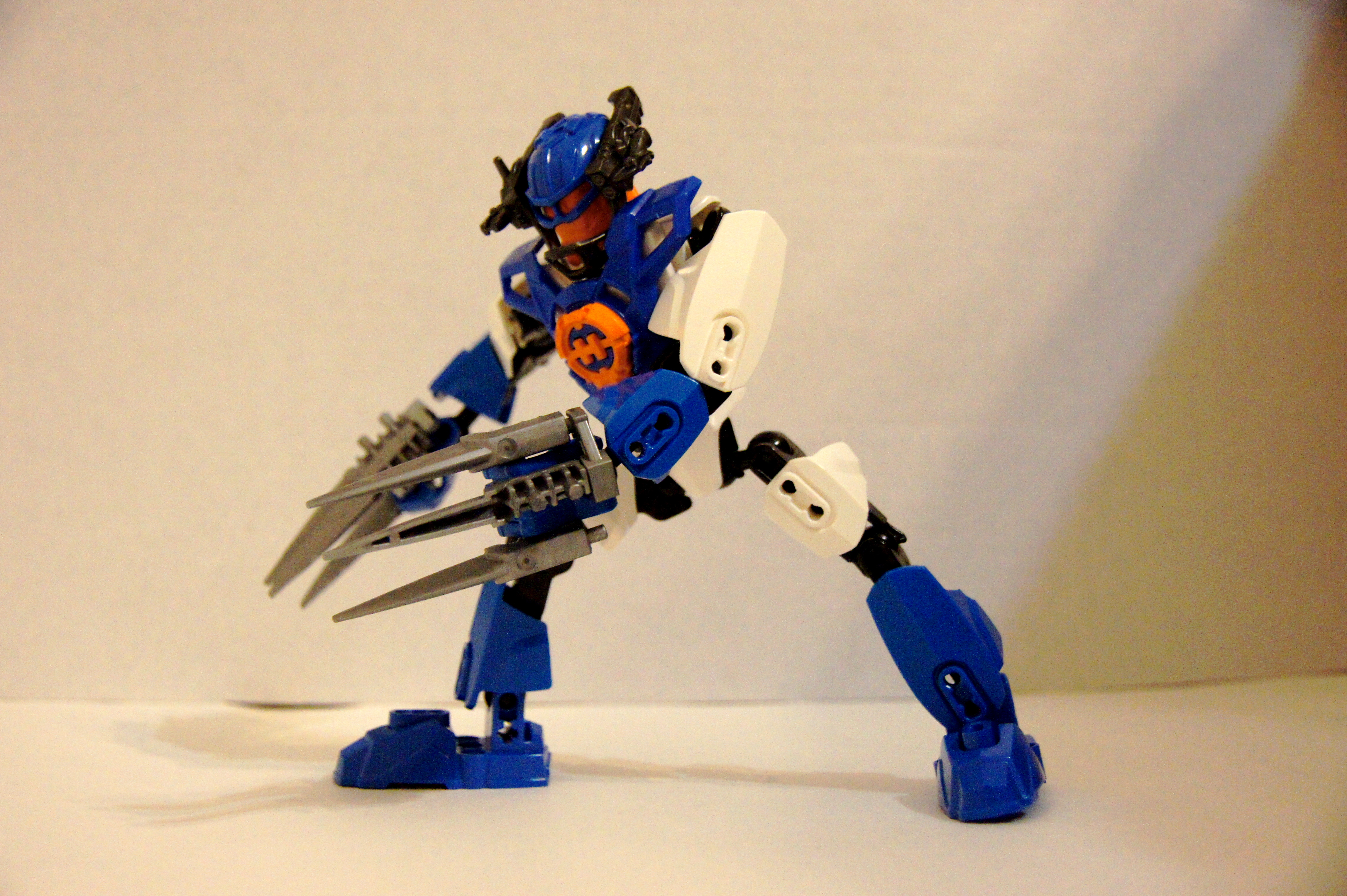
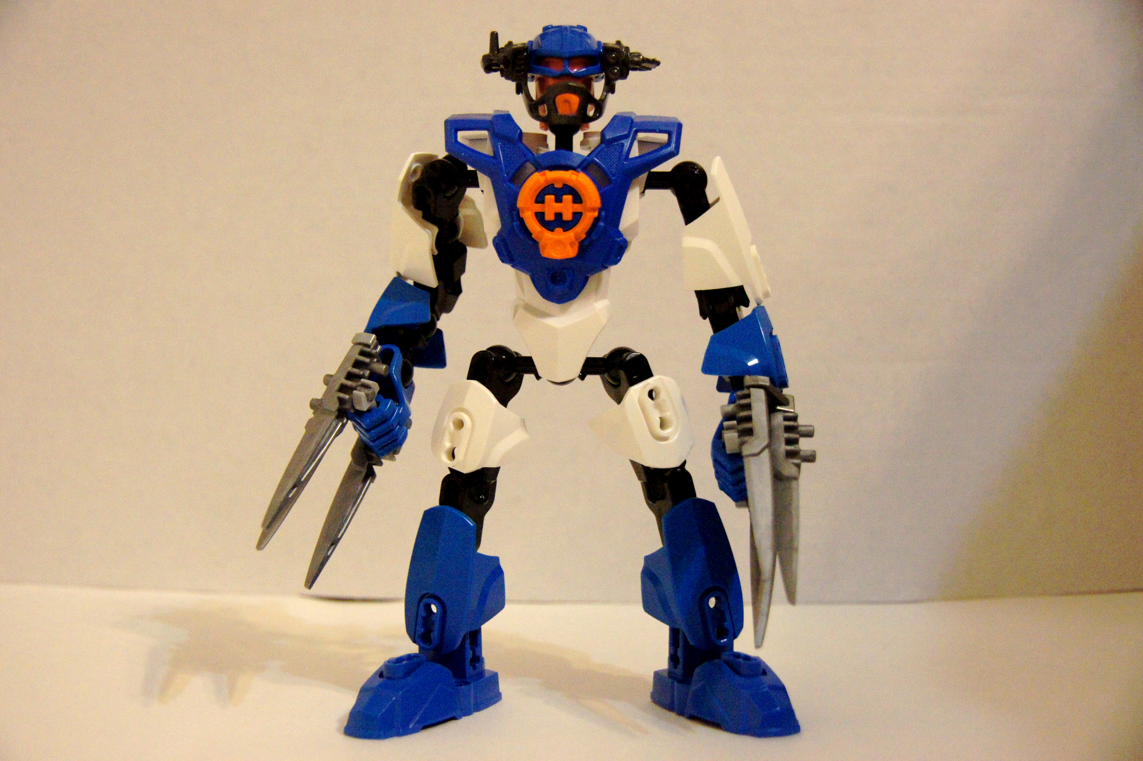
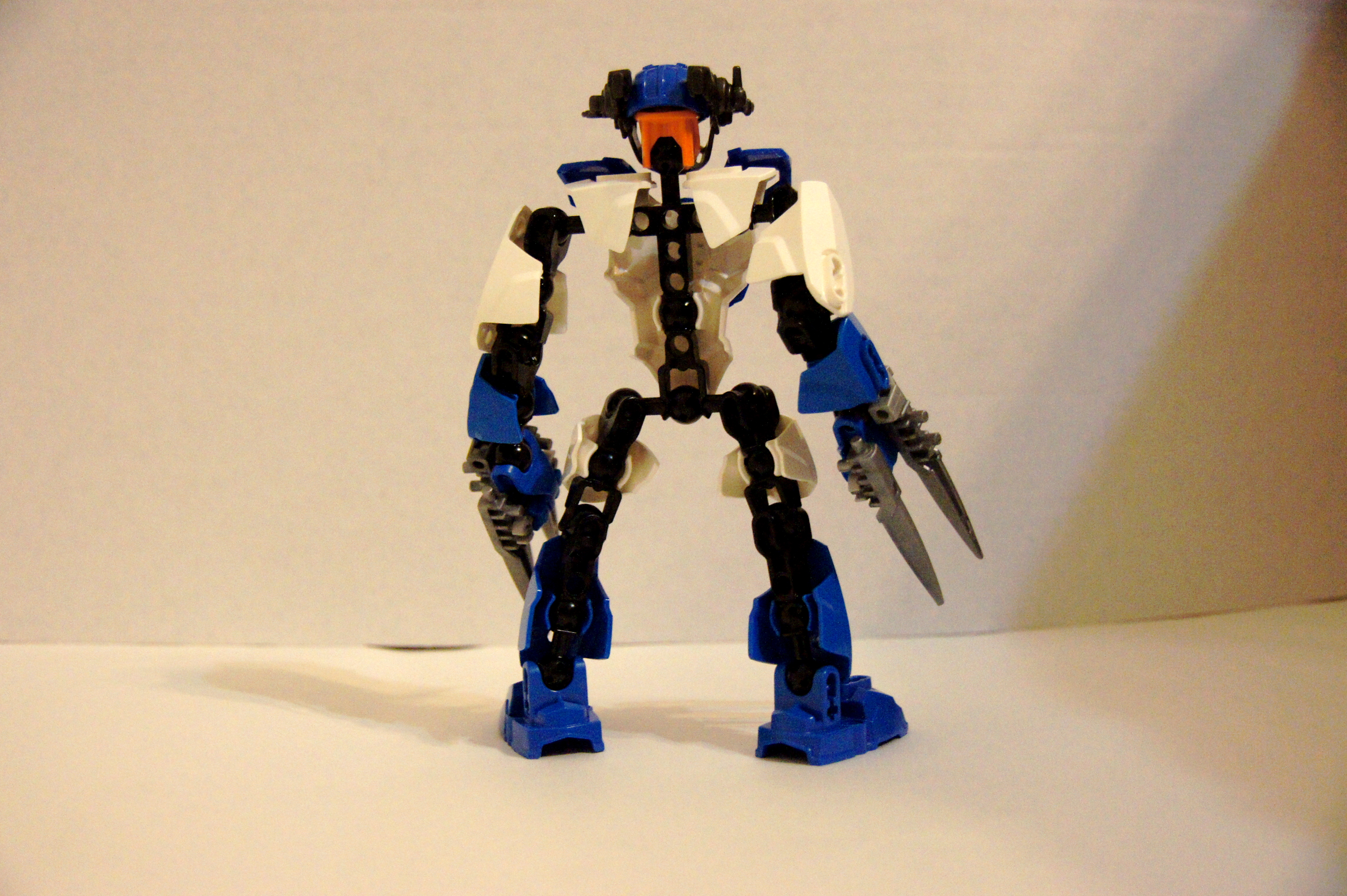
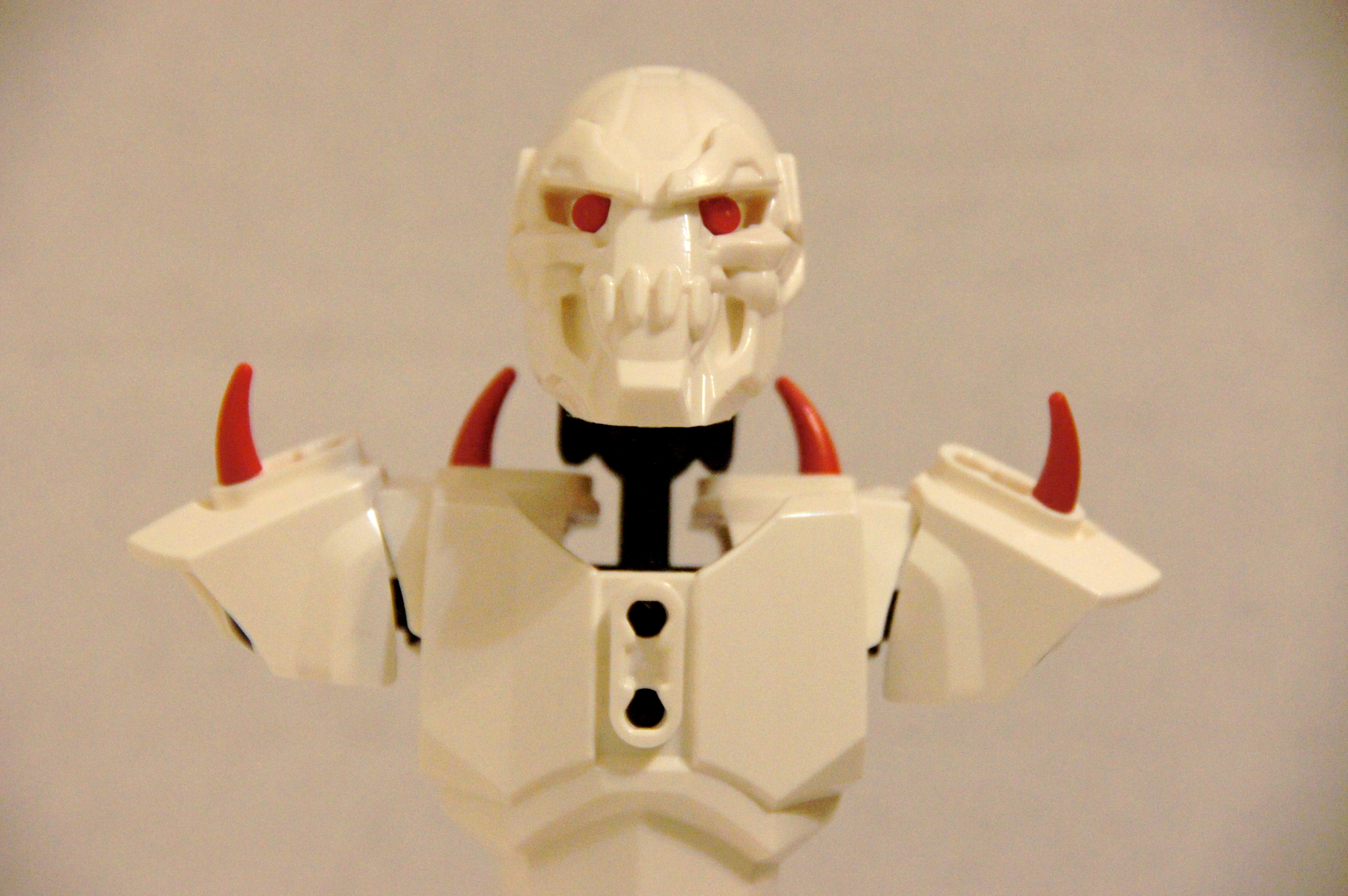
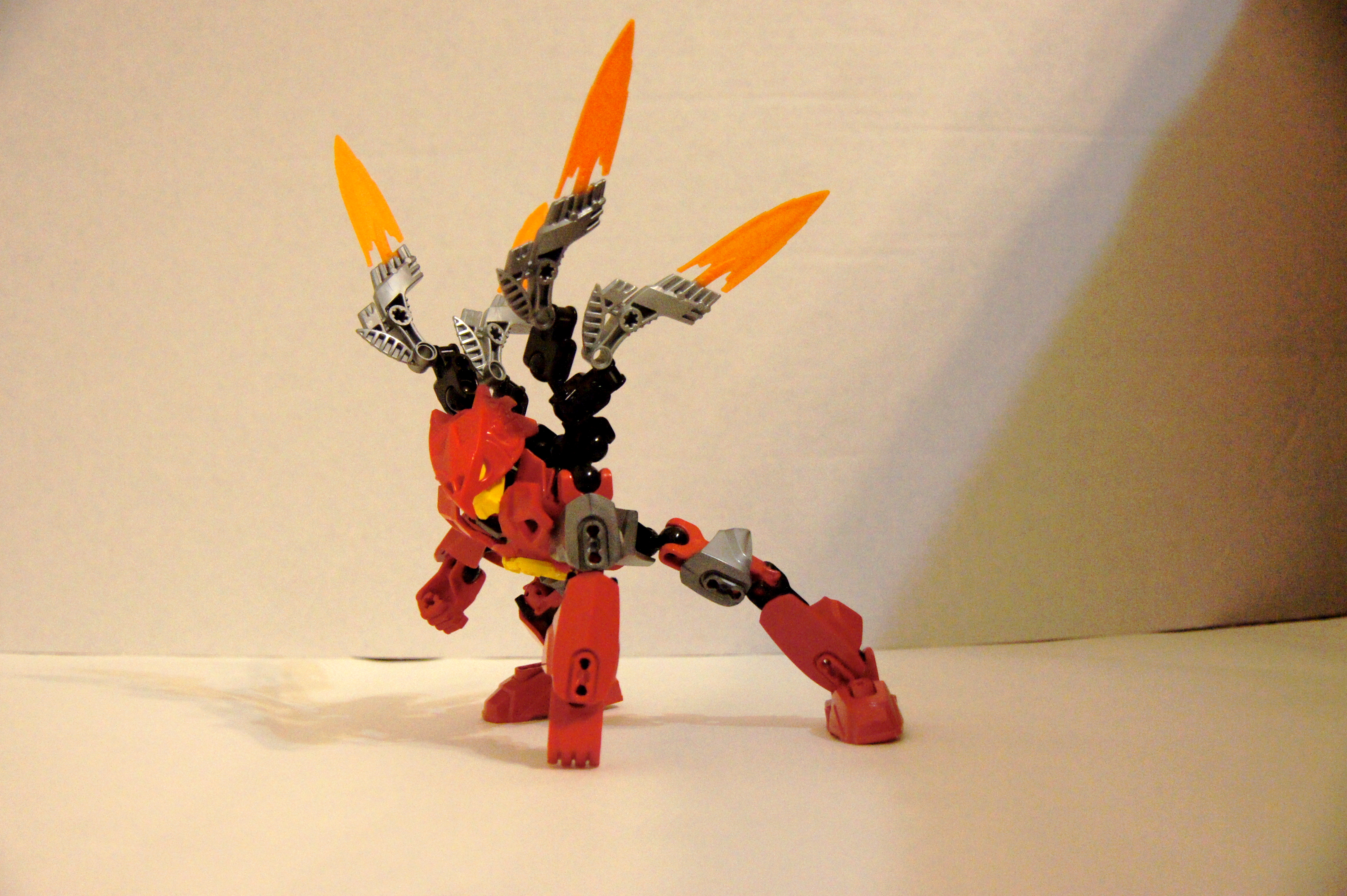
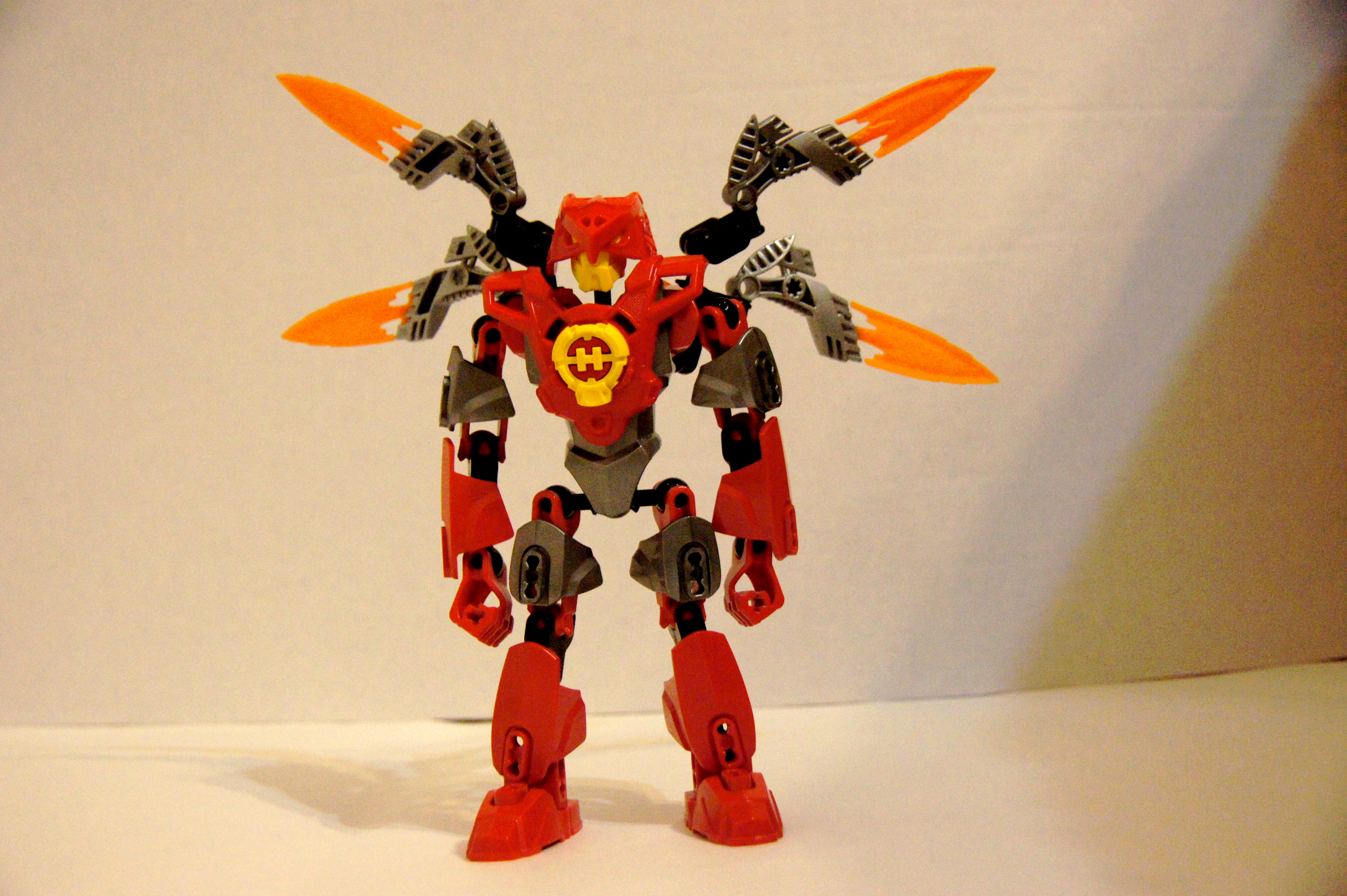
Just some MOCs and Mods that I made, I will keep this topic updated as I make new things.I apologize for large and or blurry pictures in advance.
MOCS----------
-----
Mods----------
-
This looks like a pretty solid MOC,.except for the flaws that you already pointed out. What I really like about this creation is that it looks like steampunk combined with a futuristic feel, and that makes it look pretty unique.
-
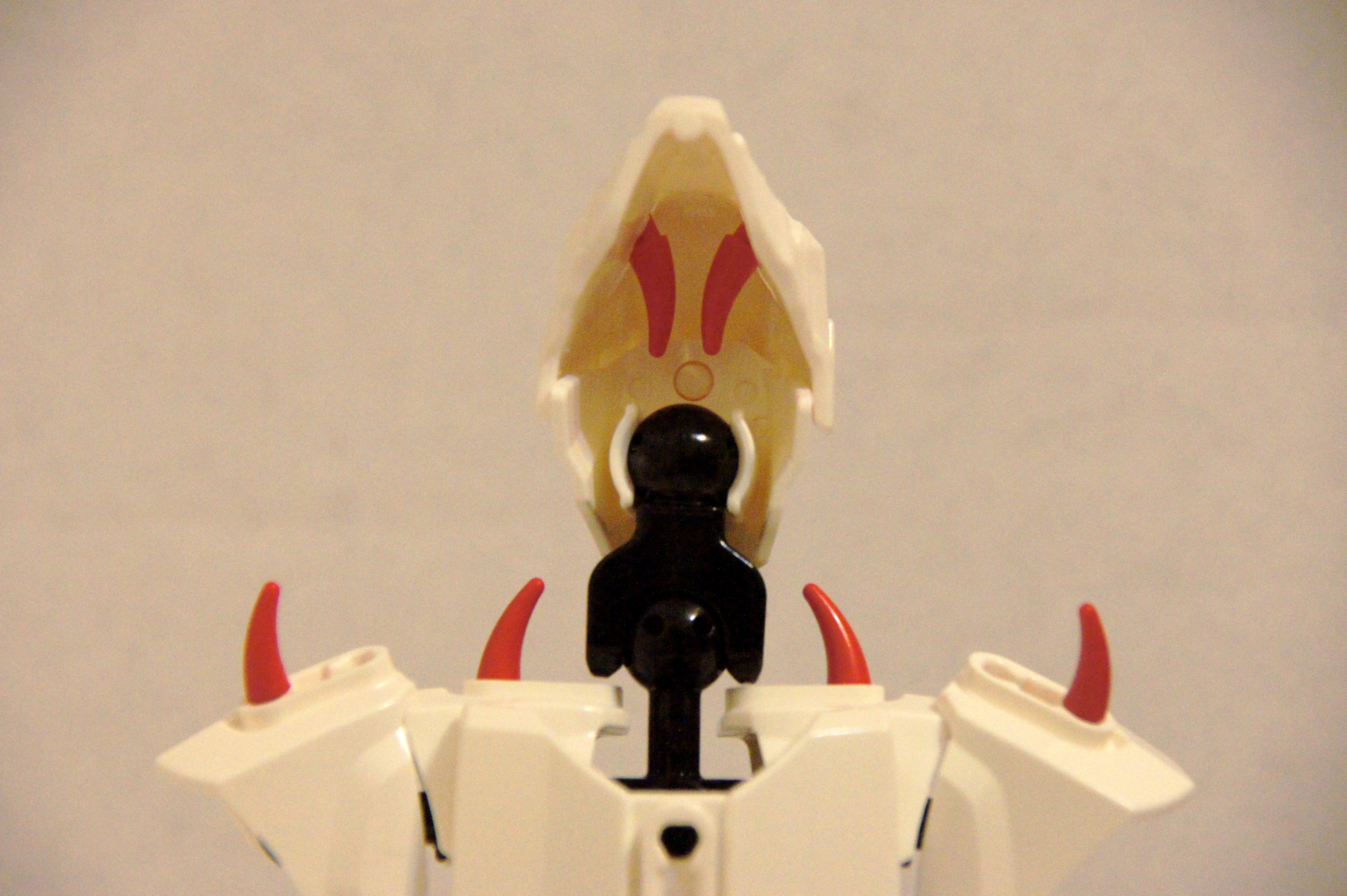
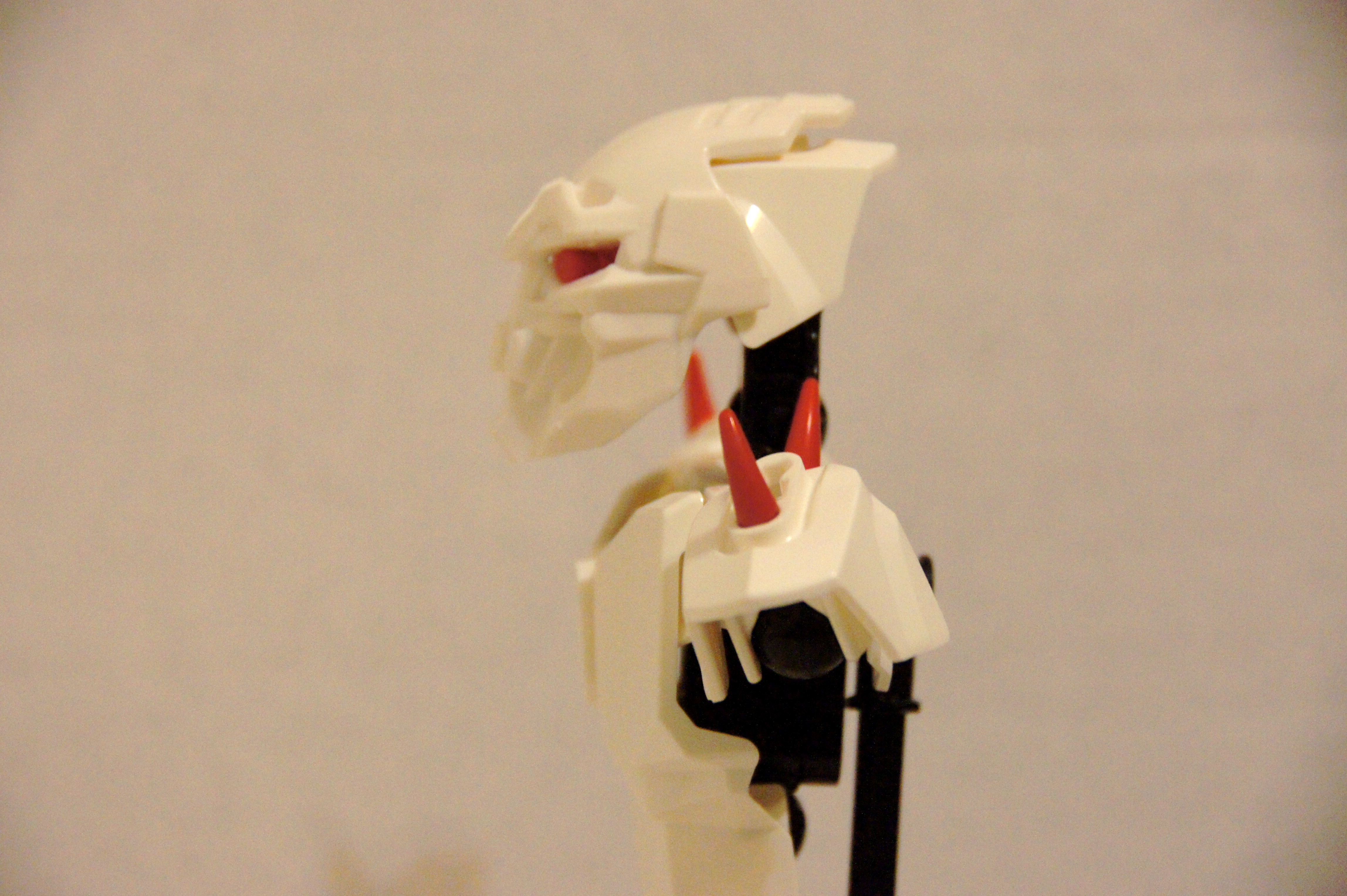
This creation really looks good overall, and is pretty creative, but as alot of people have said before, the trans orange around the eyes, and assorted cores of differing colors really detract from the MOC. If the aforementioned peices were either removed and replaced with prices that matched in color to the rest of the MOC it would really help to improve the MOC.
-
It is amazing how much accuracy that this MOC portrays, despite being relatively small, well done sir.
-
While indeed everything flows, it doesn't seem to look like a samurai.
Furno Vs Behemoth
in Bionicle-Based Creations
Posted
Both mocs are good, but I have to say, Behemoth takes the cake, it is just a good use of hero factory parts overall.