

The Color Of Stone

Entry posted by ToM Dracone
2,689 views
If you're wondering about the title ... I shall be discussing it in a review of Hewkii, followed by thoughts on Carapar.
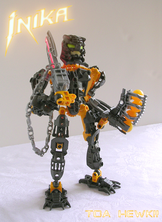
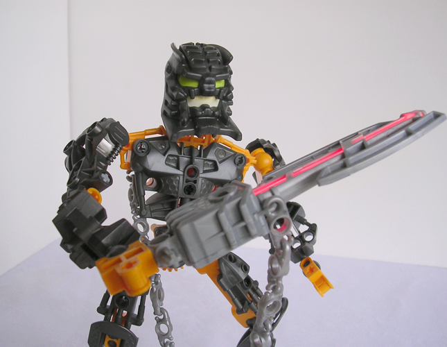
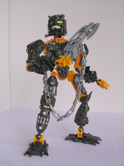
The first thing everyone noticed about Hewkii was his color. He's not dark orange; he's not tan; he's not even brown – he's iron grey and yellow-orange. I accepted the other Inika's color schemes – dark red and bright gold aren't far from red and yellow; white and ice blue are ideal for a Toa of Ice, although I miss sand blue; Hahli's swirled pieces look great; and Nuparu and Kongu are at least still some shade of grey and green. But Hewkii isn't anywhere close to his old self. No shade of grey has been in a Stone set other than as a uniform secondary color. Yellow-orange is an extreme stretch from dark orange and tan and doesn't even slightly resemble brown.
It's a reasonable argument to boost sales by changing the worst-selling set color, but ... you don't do it when you're using an old character everyone knows by his color scheme! Hafu isn't a logical choice for Jaller's team of Matoran, but black to iron grey isn't very far. All the other Inika use a standard color for their element, but Hewkii isn't so much as brown.
And yet at the same time ... I do love both colors Hewkii uses. A plethora of iron grey is awesome, even if I prefer it on Jovan to Hewkii. Additional yellow-orange is nothing to scoff at either, as with Oohnorak, Keetongu, Balta, and Umbra (a cheaper source for some from the Battle for Metru Nui) there's now enough to make an MOC using the color well. They just aren't Hewkii.
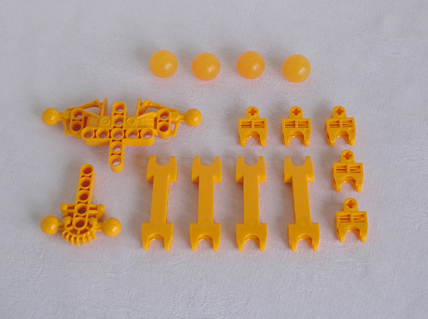
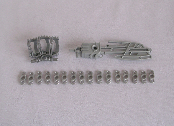
Aside from Technic pins and axles, Hewkii has exactly six pieces not new to the Inika: five sockets and a new ball piece. I'm not objecting, though – the stock of iron grey is great, with the notable new coloration of iron grey Vahki legs. His chain was also a large part of what made me get him. I still loathe the Sanok, but it would be very effective as shoulder armor. And I still wish his Zamor were red. The CGI pictures show them as bright red! His axe lights up red! Although they look good with the rest of his color scheme, they really should have been colored as advertised. Now they look like they're filled with orange juice ...
Identity aside, his negative points are the same as Matoro's: his arms are too long, shoulders far too wide, and his chest armor is still terrible. It's far too flat, and also too square. It doesn't flow at all, which it would if Lego hadn't put the pistons on either side ... I still wonder why they did that; it doesn't work in the slightest ... And I maintain that clawed feet belong on the Hordika, not the Inika.
Overall ... I like the set. Iron grey and yellow-orange are both great colors, and the chain complements the set well. But the chest armor is too wide, the Sanok looks like a tire tread, and it most definitely does not look like Hewkii in any way. It's a good set, especially in the iron grey; they just chose the wrong character for it to be.
 ::
::  ::
:: 
And now to the title of this entry: the color of stone. Specifically the Stone-element sets. You just don't go and change one of the six principal colors of the storyline. Stone and its corresponding villains have always been brown. Stone comes in many colors, but in Bionicle its elemental color is assigned to be brown. Back in 2001, the principal colors were brown and tan, colors that matched the deserts of Po-Wahi and the village of Po-Koro. All of the characters matched their environments: although Air has no color, Lewa, Matau, and the Le-Koronans were bright green and teal like the forest they lived in. Tahu, Vakama, and Jala were red, orange, and yellow like fire, but some Ta-Matoran had black like volcanic rock. The Onu- and Po-Koronans shared some colors because Earth and Stone went hand-in-hand. The CGI animations of the Toa augmented this, as their colors surrounded them.
When Metru Nui came around, the colors still made sense. Darker blue, green, and red in an industrious city, accompanied by the bluish grey of metal. The more earthen, lighter brown of Po-Metru worked well, alongside silver like the Silver Sea and the solid protodermis that made up the city.
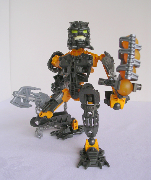
But now ... brown has been changed to yellow-orange. Velika was brown. So was Avak. Yet Hewkii has a secondary color of yellow-orange with no brown present, and Carapar uses yellow-orange as a main color. I've gotten used to Hewkii, but Carapar's canister picture made him look brown – and he looked great. Spiky, thick armor in a ... natural color for a shelled sea creature. Brown goes well with grey, which Carapar uses in his arms, shins, and feet – I loved how he looked; he just looked hard, as well as hard to defeat.
But yesterday he was revealed to be yellow, the new replacement color for the ever-faithful brown of Po-Wahi. Yellow-orange doesn't work unless it's all the main color (like Keetongu) or all the secondary color (Hewkii and Oohnorak). But Carapar is half yellow-orange and half grey, a very awkward combination. Brown, being darker than grey, would have still looked great in that combination, but yellow is lighter than grey, and so it would only have worked were Carapar yellow-orange all the way through. He would have been totally awesome in brown, like my first reaction, but his armor looks odd in yellow-orange. Since brown is a much ... harder, more warriorlike color than yellow-orange, it fits the warlord (and impenetrable) nature of Carapar.
And finally, one thing that's always been aesthetically pleasing about Bionicle was that the main colors all worked together and balanced out. There were six main colors, with secondary and tertiary colors to fit the element and setting. No one color drew attention to itself, partly because all the Toa had black hips and shoulders with grey gears and heads. But now there's no uniform color that works well with everything like those, and yellow-orange as a main color just stands out, particularly against the darkness of most of the other Barraki.
It worked well on Oohnorak because all the Visorak had vibrant secondary colors, and it was even good with Hewkii's color scheme because it was contrasted by his armor. But it's just too bright as a main color on the Barraki, dark creatures from the deeps of the sea ... where the darker brown would have made much more sense.
Yellow-orange isn't a bad color ... but brown is the established color of stone. Yellow-orange is just too bright to join the array of red, green, blue, black, and white ... especially not to replace brown.
– ToM
5 Comments
Recommended Comments