

Onepu the Protector
-
Posts
53 -
Joined
-
Last visited
Content Type
Profiles
Forums
Gallery
Events
Blogs
Store
Raffles
Posts posted by Onepu the Protector
-
-

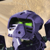
The Guurahk's Staff (or Pohatu's Dagger ) I made with help from my friend (Mekrani).
-
And while we're at it...
- Mata Blue looks way too dark. I know it's supposed to be darker and more purplish than Dark Azure, but it should never be that dark.
- Medium Blue should be paler and more bluish.
- Metru Red, Metru Brown, tan, light grey and purple don't have enough contrast between each shade.
As for the masks:
- Pakari would look better if the mouth was moved one pixel up.
- I know it's because of the 3/4 view but Noble Huna's eye-holes look a bit uneven.
- Most of the Toa Mahri Kanohi look fine as they are in original Chimoru Omega and I'm surprised the only one you have used in your sprite kit is Faxon.
- Miru Mata, Hau Mistika, Noble Komau and Ruru Metru have some unnecessary pixels here and there. The picture is from a great tutorial about pixel art and I think you should take a look at it.
Chimoru R is still a great kit and I hope my criticism won't offend you.
-
 1
1
-
I love the shapes and details of this sprite kit and I'd like to use it in my comic series but I extremely dislike sixshade kits and it doesn't feature all the species I need. Would you mind if I modified it to be twoshade and used it alongside original Chimoru Omega sprites?
Chimoru R Kit
in Comics
Posted
I made the handle of the Guurahk's Staff a bit longer. There's also the Lerahk's Staff I've just made.