


Uncle K.
-
Posts
331 -
Joined
-
Days Won
1
Content Type
Profiles
Forums
Gallery
Events
Blogs
Store
Raffles
Posts posted by Uncle K.
-
-
Done in 20ish minute segments over a couple months. I just wanted something fun, so it's loose and sketchy.
I do fanart for breaks during job hours; it wasn't done in time for my 12 year spinny but that's ok.
Since I'm modeling electronic parts for advertisements I guess I'll blow off some frustration with a good ol classic soon.-
 13
13
-
-
- Popular Post
- Popular Post
Hello again. I painted this because it was on my desk.
It's a long form warmup while I work on another picture of Lewa.
I thought you would like it.
Picture linked to marginally bigger version for some reason.-
22
-
In my defense, Drew Struzan and the example Star Wars poster were my influences. Most of my favorite film posters before the millennium were illustrated. But I also think Crunchy is one of the most artistically mature members here so I'm enjoying this ridiculously close poll.
-
-
6
-
-
hey guys. just for the record I'm still entering. finishing up thumbnails and greyscale now, hope to have it done by tomorrow evening!
I finally finished my outlines so at least you're truckin along...
-
I think after years and years I'll return and attempt to see what I can conjure for a good old BZP art contest!!
Ditto... I always seem to check back here when there's a contest going on.
-
1
-
-
Wow thank you again everybody. I finally get around to replying to a few posts here...
Rock onLewa is my spirit animal
I agree completely. One of the problems to committing to the shading style was omitting light/dark extremes. I hope that the arc of both arms and color distribution help a little.Hey, this is really cool! Loving all the mechanical detail.
The one thing that jumps out at me as a problem is that his right arm kind of blends into the detailing of his legs. I'd try enhancing the shadow beneath the arm to create a more visible separation.
Eh eh eh eh eeh eee eeeeeeeI love the artwork! I really hope you make the rest of the toa mata meeting their newer counterparts!
I give most of the mata feet the little toes because I think they need them for balance. I think the Okoto Lewa has them because I was imagining one of those Hero Factory feet pieces that has the giant square toes.This is a great piece of art. I really like all the details you were able to draw on both Lewa's. I also like the color scheme on both of them. Its a beautiful green that I like a lot.
This may sound weird, but I like the little edges you put on Lewa Mata'a feet. They also look like pointed toes, if you will. They aren't on the set, but I still think they are neat in that they would helpful for Lewa Mata to have when he would move through the trees. Just though I would point that out.
I don't have any nitpicks with this. Great job making this artwork!

Eh eh eh ehThis is truly amazing - I really, really like it. The detail on both versions of Lewa is very impressive, and I like the crossover idea in play here (although I really hope it never happens officially). It would be awesome to see similar scenes for the other members of the team, but for now I shall be just fine admiring this piece of art.
I know it won't happen for real... but Lewa is the first Toa we plan on getting and he's going right next to his original version.
Alas, I can't change the official mask, and I tried to stick as close to it as possible with the exception of a few extra face "segments." And thanks, I did try to keep it light and happy without severe textures or lighting. :-)Something about the new Lewa mask seems... very Michael Bay Bumblebee face... but I do like the coloring style reminds me of story book art.
-
Ah still kicking I see.
I like your cleaner and thicker line art the most, though these are good for character concepts and the concept itself is the obvious star. Very much Darksiders, Roly. The tribal look always suited your chunky lovable Toa so I'm still a fan, especially with the personality on these chubs. The shaping on your armor and especially masks is great as always, and Gali's kaukau sticks out on the picture of her and Lewa because it's so well done. I can't see her without a blacksmith's apron though, but I have no problem with that either.
I remember back to our Pchat escapades and I wish you'd draw Bohrok and more obese Matoran..
-
Wow thanks for all the kind comments everybody.
Here's a long post for the comments I had better responses to than "thanks"
to everyone else... thanks.
although he does seem to be nearly falling off the branch, but maybe those robo-toes are stronger than they look.
I would hope so! I imagine the bulk of his weight is in his torso and hips so his center of balance isn't too far from the branch. Maybe his control over plants made the moss animate to life and their little grabby hands are holding him in place?
The pistons, the gears, the little tubes, and pretty much how you've managed to take the implied connections and movement for the otherwise static armor pieces and give them a functionality that's believable.
That's the hardest part, and moreso with the relatively simplistic cladding they use now, but I can make do. I figured since the old Bionicle sets were canonically generally more detailed than the sets (no organs, etc) these guys have a lot more under their armor and between the skeletons than visible. Also I just like to buff them up with a function/form battle: like those dark gray clips around the shoulder ball. I assumed they would be good to catch the arm from moving around too randomly (like if he fell badly on the ground) but they could have looked a lot different, I went with "does it look good" for them. Lewa Mata's armpit is a different example of just modifying the original to function without taking away or adding much to the aesthetic.
Ayup, that is the insane amount of detail we know and love from you. Because overkill is underrated. =)
Such a cool idea for a sketch. Great idea using the vines to tie the Katana to his back and the little spiders are a very nice touch!I guess that's the idea, haha. The bigger they get, the more complex they have to get... all the way up until the Mata Nui robot which looks like something we used to order off the back of magazines that would grow when put in a cup of water.
The two little details were the most fun parts, I thought the spiders too cute not to (and to further change up the size dynamics) and I've always wanted Toa to utilize their elements in more domestic/everyday situations.
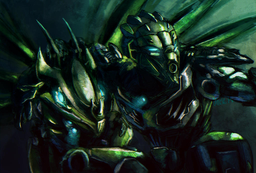
Well well, look who it is! Alright everyone, you can go home, Bionicle 2015 is official now. Unkle K has drawn it.
I won't be the first or the last to say it: my goodness, the details. All the little rivets and screws and joints, though what really gets me are those little green sections at the finger joints. I mean, come on, that's just going overboard.Lol I've done separated finger joints before, though I have been refining how I assimilate Bionicle parts aesthetic with real world functions and physics.
I find the way you've handled the yellow lower legs, and the feet, interesting. Maybe it's just the colour, but it sort of reminds me of construction equipment, like something you'd see on an excavator, from the future. Not in a bad way, mind, it might be a look worth exploring further.
That was definitely the intention. The new Toa take so much ancestry from Hero Factory that I feel they would incorporate more modern mechanics in their appearance. (Ironic then, that the knees are the most illogical part when it comes to realistic physics, without some wacky sliding action his kneecaps will have a hard time making room for the straightened leg. Like "what does that middle spring do? How much torque is in a hinge joint??" Get around that by just imagining Lewa never stands up straight)
I find it kind of funny that you consider this sketchy, considering it involved a basic shape sketch, a cleaned lineart layer, flat colours, and shading (including the process image was a nice touch, by the way). I guess it goes to show how much work you put in to the pieces you consider to be full, polished illustrations.
Well I did each step quite quickly. There's a reason I work large; when you zoom out you can't see nearly how messy my lines are (my hands have been permanently shaking since I was seven or so, it takes a few tries per line for the most part, but I am quick and my other fingers are locked onto the undo hotkeys.) Most of my real work (when I'm not taking classes) is boring and stuff I'm not allowed to put on social media but eventually when projects are done some of it might get to my DA page. It's not exciting or anything though!
Though, otoko-lewa's left arm sort of bugs me; it feels like it should point away from the viewer more, and the lower arm shouldn't be at a right angle to the viewer, or perhaps it shouldn't be parallel to the top of the page. But, that's fairly minor, I'm pretty sure it's perfectly anatomically feasible, it just comes off as a bit flat. Still, liking the concept here, and it's cool to see the first sets of both bionicle lines in one image.
Oh, and it took me ten minutes, but I found that uncoloured leaf!I viewed it as taking the left shoulder and raising it above 90o and making the back of the hand point to the right. It works, but it was a dumb choice to have it aligned perfectly with the top border. I got lazy and had to skimp somewhere! Also see: uncolored leaf
Wow. Love the detail you added into this "sketch". Your interpretation of the new armor pieces are really smooth and they look highly functional. Lewa '15 is definitely more bulked up than his set counterpart, and looks great that way.
Lewa Mata still feels more organic to me, might just be the amount of machinery you rammed into Lewa '15. It looks like Lewa Mata could use Lewa '15 as an Exo-Toa unit, so you got the size down (or would it be better to say, you got the size up?).
And man, I would not want to come across the Jungle Master with those wicked blades. Great idea using the vines to secure them (and his prisoner).
All in all, super fantastic work. Great banner for your signature, too.I like that idea. Too bad in real life it is not really feasible, but it's fun to imagine! If I ever do another Toa set or something that could be funny to incorporate. And yes, I'm pleased with the banner but I didn't plan on doing one so the eye line is just kind of dumb when cropped like that. Without the rest of the negative space they are just staring at each other's chins.
Again thank you all, unfortunately it will probably be a while until I have time for more art, probably after the actual sets come out.... ugh. Back into the woodwork because I have little else to contribute haha. haha hahaha -
- Popular Post
- Popular Post

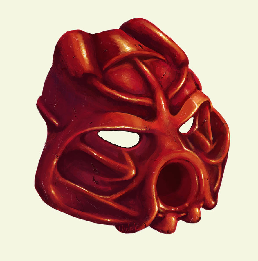
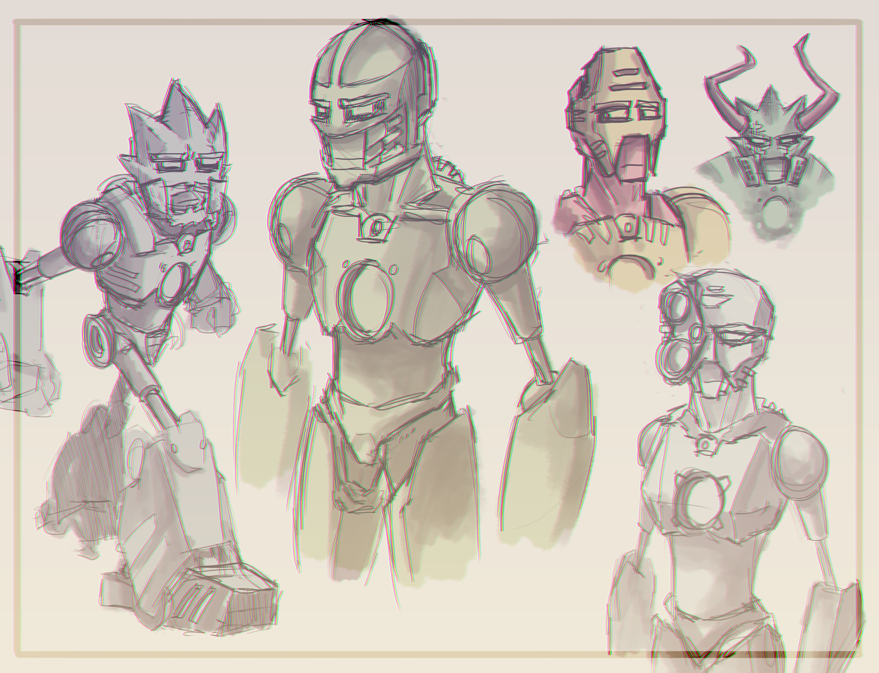
LEGACY
Initial impressions of the 2015 Toa had me thinking they were at least twice the size of the Toa Mata. Obviously that isn't true, but
since Lewa 2015 looks more like a Mayan Statue or jungle protector than Lewa I thought it would be funny to see him reprimanding
his former self for romping around the jungle and uprooting plants. This was a pretty quick drawing, I wanted to do something sketchy
that was more relaxing than taxing. (I also had to keep it secret from my daughter since I do plan on surprising her with some Toa for
her birthday so she no longer needs to put her mitts on mine!) I missed coloring one of the leaves, but it's water off my back now!
uk
-
60
-
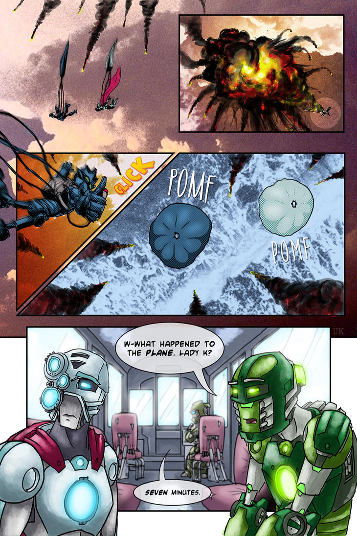
Are those shaped boxes on the brickjournal list or what is going on there? Front opens by tab? Am I just reading into a bad photoshop job? Canister-sized (or whatever) Toa in boxes would be beautiful, I've dreamed of it since 2002.
I think I'm the most excited for that little black and trans-purple "protector" with the gun for a chest. I'm not much of a fan for the Toa's masks but the spiders' body is great, and while the top of the mask of creation is pretty obviously uninspired (or should I say directly inspired..?) the bottom half is so shapely, I love it. Looking forward to the "full" Vahi someday.
It's going to be nice to retire the 2001 team to the highest shelf though, now that my daughter can have her own childhood instead of leeching off remnants of mine, muahaha! I can only hope, since she loves what she understands of the old saga (not much....sigh), that this will be just as magical and enduring for her as it was for me.
-
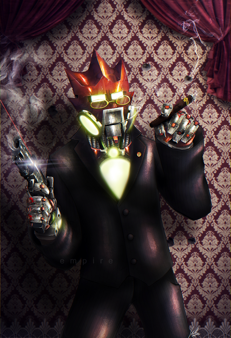
HEEEeeeyyyyyy I love this!
You have some beautiful gradients going on with the slate blue and red, and that subtraction method is utilized here so well. I like your forms and the suggestion of detail, good technique here. Loving the silver forearms, you should keep those. The sword instead of fire is a wonderful way to "cool down" a Toa of Fire and along with the pose, gives it some maturity and weight that is difficult to achieve. Your Matoran emerging from the suit contains more movement and contrast, which helps demonstrate that you know what you are doing. I would like to see the same kind of attention to anatomy on Lewa however, his torso is pretty much a trunk (where Tahu's is layered and shaped in all three) and the humpback makes little sense in connotation with his character or function- rather like someone like Onua or Pohatu who in comparison with Lewa, would probably have to be enormous! If these suits are indeed grown from hosts maybe their actual form should differ more radically as well? Tahu's bulk at his neck gives him power while Lewa's just stunts his proportions which, while correct enough, look wrong due to the hump.
I love that you've made a new world out of this concept, much cooler than just "new tahu suit."
With perhaps a hint of highlighting or refocusing the light and adding details in more strategic places you'd have professional tier work and so far with what you have it totally shows that already. I saw on DA you said to someone you were using Alchemy, I think it would be cool to see you push that into some of your Bionicle work and give it some of these textures and shapes you used. Well you got me out of the woodwork... now to disappear forever... again.
-
2
-
-
The normal wink emote is totally different than the psychotwitch....
I hardly ever use them but if they go away it would be pretty devastating. I just got really alarmed at the possibility they get deleted. Who can forget the ever popular
 ? A lot of them are almost too inane, (
  ) but also well imprinted into our hearts and memories.
-
1
-
-
Similar to above, it was all the hype of the promos, as well as the infected Hau fading into the island of Mata Nui, since my first set after all was a mask pack.

-
5
-
-
Heeeeyyyyy why haven't I seen this??
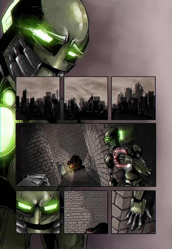
I think I read the first two pages long ago or something, since they seem really familiar, but beyond that... it was great reading through the pages you have. I love this comic. The organic approach to their faces, how they seem to change and move like human skin and bones rather than a robot's lends itself well to your tightly-reigned plot- a relationship between friends so far. I do really miss the loose and sketchy art that just kind of drops out by page 8 of chapter 1. It gave it a very fluid and natural feel, like the pages were just effortless, and while I do love a produced look, it makes me miss the very early page style. That said, your backgrounds have grown incredible; I love the energy and care of pages 9 and 11.
Your panels are a bit stale, on the unfortunate side: either too clinical and uniform or not controlled enough (some panel shapes and locations have nothing in common with the rest of the flow, mainly size and margin alignment stuff) when they could lend more dynamic movement through the pages. The action in the latest page's panels reflect this but not the actual page setup. If you wanted to go the extra mile to really make the motions explode you could look into a style that can support quiet stable moments and also action beats as well and reads with a logical flow that keeps the viewer moving when and where you want.
And your covers are absolutely great- they have this wonderfully deep inky texture and the font is pretty inspired. Normally that type of font comes across as too kitschy but somehow you just added to the depths of the story and style; it makes me want to see how it fits into the story, wonderful.
Your Toa of water is gross, it's awesome to see an atypical character like that (though the framing of the bottom panel in page 10 raises some questions) and I'm just as excited to see what happens as I was to read the dynamic between Seth and Traqq.
-
1
-
-
Your "old" art may be "old" but even in 2011 you had a better grasp on design and impeccable anatomy than so many professional artists. Even your most frenetic lines have a livelihood to them that informs the characters, your subtraction methods are mostly quite subtle but speak volumes of restraint (skill). Your line quality has steadily improved, I'm jealous.
I'll always remember you for your Bionicle art, even when you become a world-renown concept artist because you and Nikira inspired my own the most. While I may not always have the same ideas for the humanized versions, I have to admit they are still amazing and without personal preferences which don't really interfere with the quality of the art or concept at all, I can hardly every find fault with these. Not that I try, haha.
Some of these characters (and others on DA) have a sense of timelessness about them, which is great. The first two years worth of Bionicle characters had that feeling and you've formed your own independent timeless looks as well.
I'm glad you're getting back into it, I would love to see your designs for Turaga, Bohrok, or some of the later characters from 06-08.
-
5
-
-
Woah you are just a sensible personI ship Hewkii and Macku like any sensible person. I also ship Gali and Kopaka (which is a far better pairing than Tahu and Gali) and I ship Krahka and Onewa by popular demand.
Krahka and Onewa's very brief moments were the highlights of a very watery, dull book series at any rate. (Kopaka was far too obsessed with trying to one-up Tahu to have eyes for Gali as well) Bionicle may have been a kid's toy... but then again what is Barbie and Ken? (Not to mention the story was a different entity and occasionally tackled complex "issues" etc) I guess that might be why the rare romance that rears its head seems like a big deal to those that want it and not a big deal to anyone else, which probably did a better job than most options for the story.
After playing through the MNOLG with my daughter, I will say her favorite part was Huki and Maku's innocent flirting + plushies, and yet she couldn't care less about any of the relationships in the Mask of Light. I guess she's just discerning.
-
Oh hello
- broken links gone -
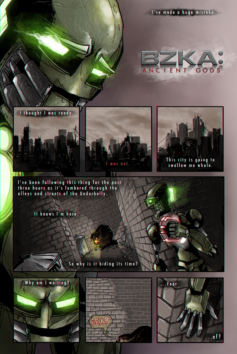
I finally got off my booty (meaning "had five minutes a day of free time") and worked on this some more. I pooped these out fairly quickly tbh. I have other projects at the moment so doing these makes be feel a bit guilty for using that precious time. Ah well.
Here the style changes for a flashback, which will also contain multiple parts... just maybe not all right away.I finally have some of the stories mapped out in my noggin but time will tell (and lots of it) if it goes as planned. Page 2 of Ancient Gods is over half finished but I misjudged how much painting I had to do so it will be a while before I stop hating that page and can finish it. ...Anyway this is too much writing so I hope the ones who read this enjoy.Thanks everyone
-
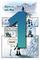
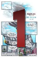
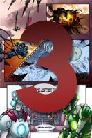
Page One of
BZKA: ANCIENT GODS
has been added to the beef.
What the heck?
(1 / ?? Pages In Progress)
This is a new spin-off mini-series that takes
place during the original BZKA. Will be running
at the same time as the main series, but updating
EVEN SLOWER. I hope to get some good pages
done in the next few weeks.
-------------------------
In case you just want to look at the new art style
that photobucket completely crushed:
-
1
-
-
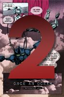
Update:
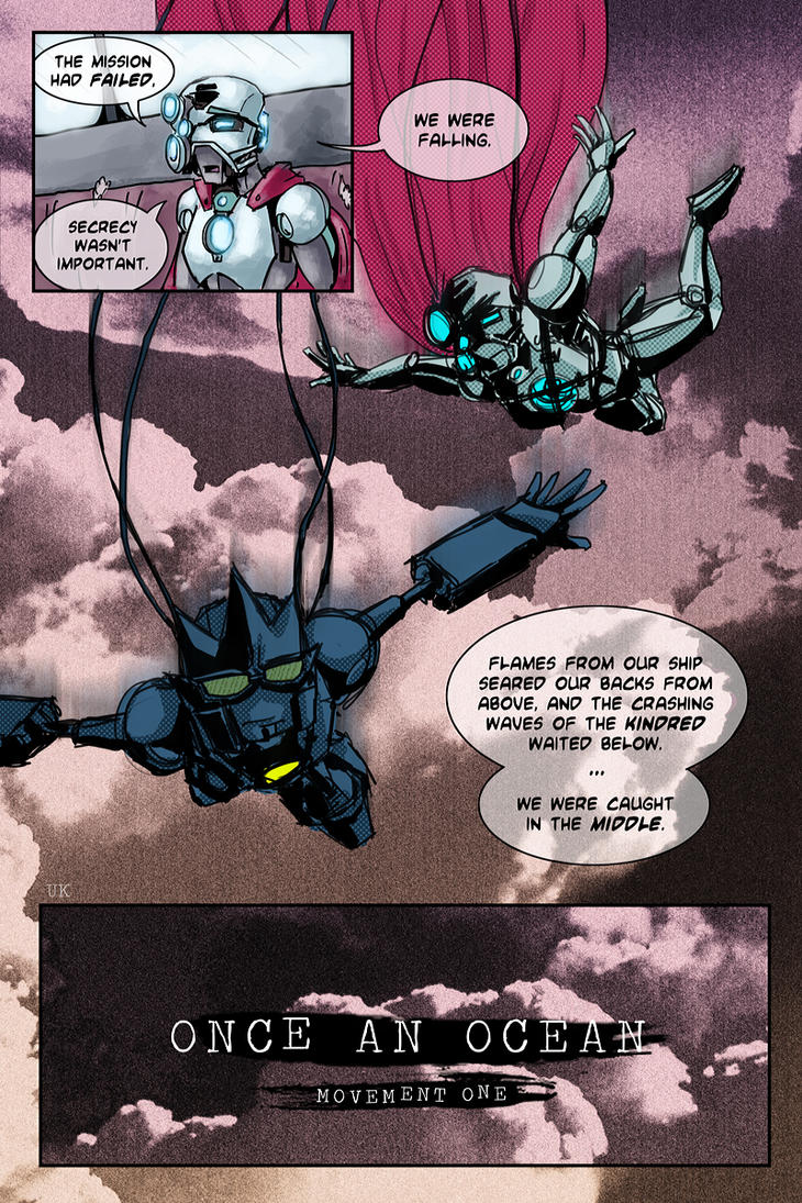
Since I don't write these out in full before I start working on each page, I didn't know how I wanted to progress with the second comic. That, and this winter's been pretty poopy. I finally figured out what direction I want to to take this as it slowly happens during my miniscule free time. Once An Ocean was always going to mostly take place in a flashback, but I'm going to use that as a "miniseries" so I can write two eras of the BZKA whenever I feel bored with the other. I have lots of little fun ideas that aren't really worth the time it takes to draw them out so I have to pick the best stories that I feel everyone will love, and Once An Ocean finally got that inspiration.
I'm sorry.
So here's the prelim poster

-
1
-
-

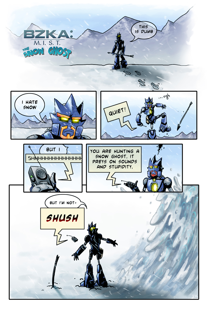
For every mini comic that's completed I will
also put up an exclusive wallpaper here!
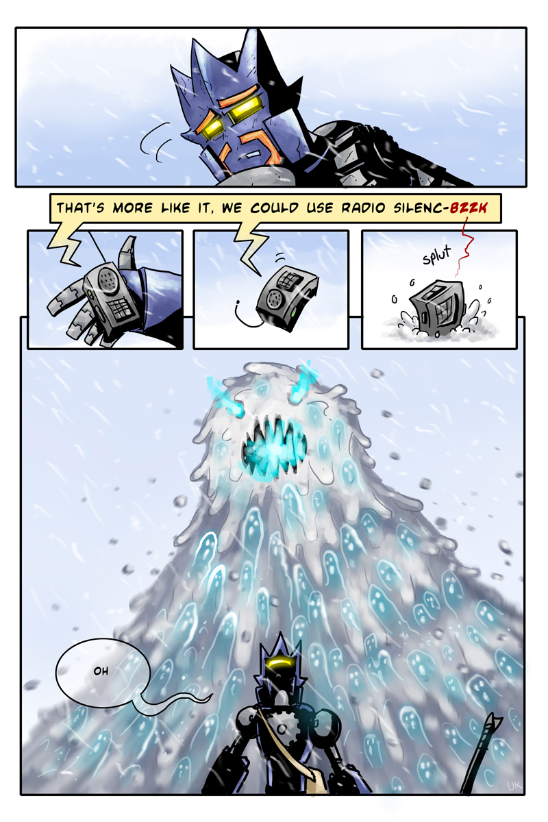
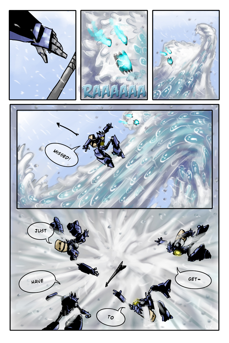
Right now "Snow Ghosts" is finished so the
first wallpaper is available for download.
Let me know what you think!

MEANWHILE
If anyone knows of a good free image host that can handle wallpapers
(1600x1200 for example) let me know so I can link to different sizes.
uk
-
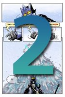
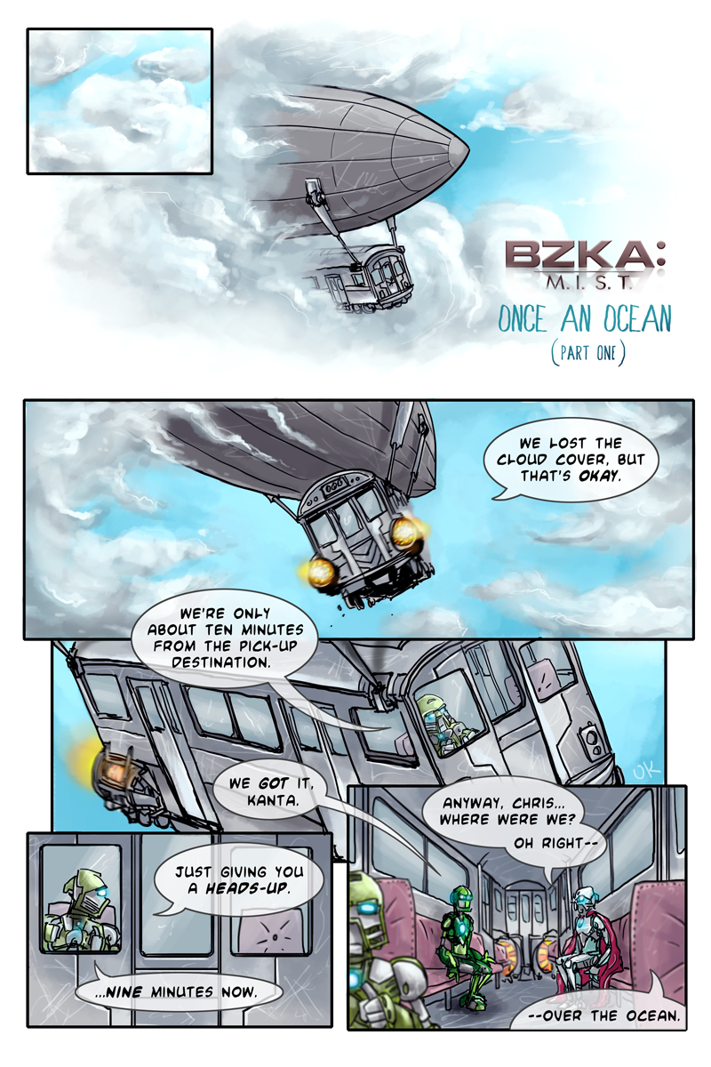
Page One of Once An Ocean has been added to the the beef.
I've been kind of uninspired to keep working on this, but here you go.
Thanks for the kind words.
Does the Toa (presumably) in the first comic have a name?

Yes, we'll get everyone's name as they come up in the story.
Whoah. This is some stellar artwork, and The Snow Ghost was pretty hilarious. Can't wait for Once an Ocean!
Thank you; my aim was to make a scary monster that was still amusing.
Are we going to find out why he released the ghosts?
Yes, we haven't seen the last of the ghosts (though we have seen the last of the Snow Ghost form).
Watch this topic! You never know when another page will go up! (And neither do I, haha)
-
Status: Once an Ocean pages 4-5 in progress

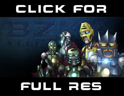
THE WHAT
The BZKA (as if anyone remembers) is getting a small reboot in the form of a few one-off comics, released inchunks as they are created, which can sometimes take... months. I'm busy and this is not a job.
Check back
semi-regularly.I think I covered it all in the first sentence, off with you
THE BEEF
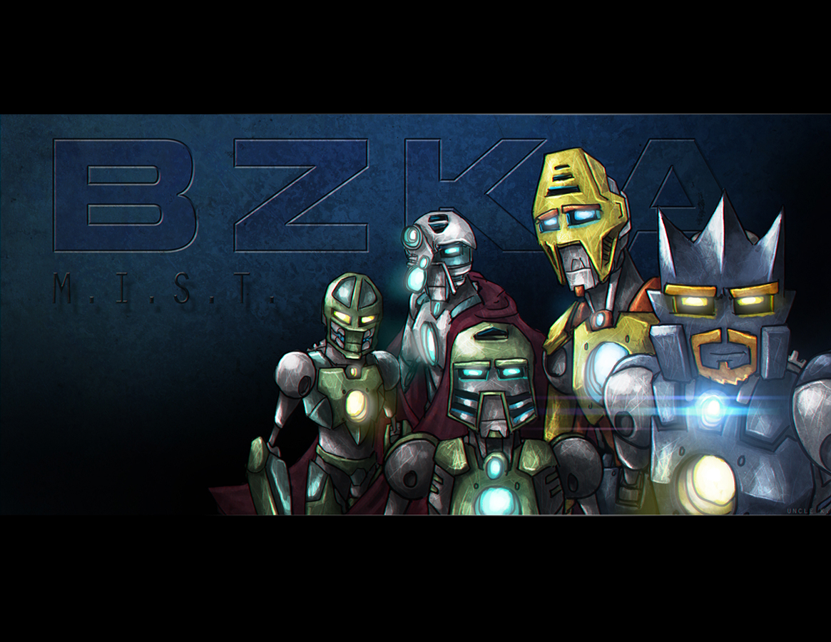
BZKA: M.I.S.T.
The Snow Ghost
(4 pages - Complete)
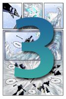
PART ONE
(3 / ? Pages) - New
BZKA: ANCIENT GODS
Spin-off Mini-series
(1 / ?? Pages In Progress)
-------------------------
THE BONUS
ok bye
-
2
-
-
Thanks those who made comments.
It probably doesn't even have enough juice left to warm up, let alone smoke or spark. It may be gas powered but there's absolutely nothing left after this fight... though one might be tempted to ask what's that glow far in the horizon. I always go overboard with effects and such so this time I did away with anything I felt was superficial and Tahu already has enough visual weight on the right side. Thanks for the suggestion though, I love comments like that. If you like this vote for it, that would be niceA tiny detail that might have been nice to add is to have the fire sword smoking a bit, since the blade is currently "off", but the giant bleeding titan makes that not necessary.


The Legend Continues Art Final
in The Legend Continues Voting
Posted
I hate 'defending' art but I do want to be clear it does adhere to the contest theme.