


Uncle K.
-
Posts
331 -
Joined
-
Days Won
1
Content Type
Profiles
Forums
Gallery
Events
Blogs
Store
Raffles
Posts posted by Uncle K.
-
-
Oh how I've missed the RPGs on here.
Time to write. Time to get back in. If I can't write an entry in time maybe I'll join one again.
-
I changed the rotation of the logos because it just seemed weird to me the other way and I've seen some volumes with logos like that (I could easily print out another book jacket if I want.)
I think normally they will be sideways if it's a longer logo, like DC's Vertigo, if it's a press, or the spine is really thin. DC would also most likely flip the locations of Lego's logo and theirs, since it's standard practice for the DC logo to go at the bottom of the spine.
The horizontal and vertical centering on both of them seem too close on the bottom, but again, it's your book. If you're happy with it then it turned out right. "Compendium" also is not centered under Bionicle, but when standing up it gives it more gravitational visual weight, so /whatev, you know?
-
Better than my collection, they're just in sleeves and tucked away in a Staples box. =C
Do you have all the issues or just starting after #13 or #14? Just saw the construction gallery.
And if you do, did you include some of the extras like the McDonald's "Challenge of the Rahi?" or the Metru Nui lunchable promotions? I'm also curious as to how you dealt with some of the mini comics like #10 or #12 and how you can justify cutting up D'anda and Sayger's. (He gave me a free print at ComicCon, bless him)
I hope for your sake you aren't bothered by the double misspelling of Compendium on the book (not the dust jacket though) and the fact that bottom of the Lego and DC logos should be aligned with the bottom of the book when it's standing upright.
I love the unique presentation of each set of comics, but I can't say I wouldn't love to a nicely fat volume like this as a lovely coffee table edition to compliment them.
-
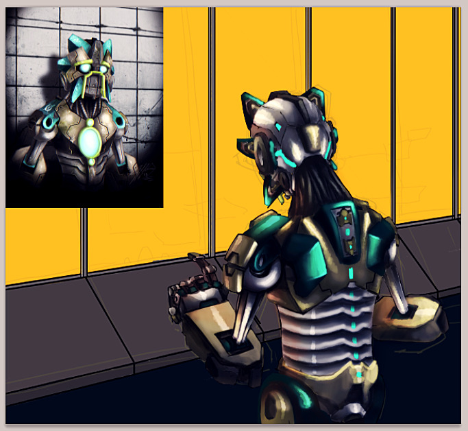
I forgot about this topic... keeping it just barely alive, lol.
Working on some more featuring "Matoran With No Name" who isn't a Matoran and actually does have a name by now.
Thumbnail in the corner is being used for reference since I haven't actually done a front and back for his full body like the others.
Wow. BZP is still alive? Huh.
I suppose "alive" is relative... not like 'way back when'
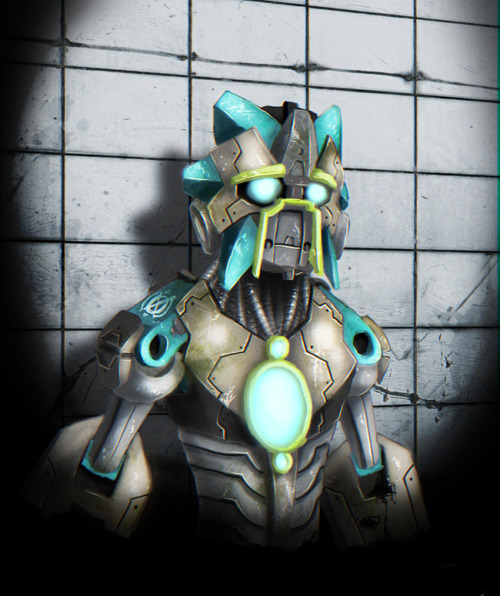
....the body looks a bit too bent, but the detail and textures are amazing!What do you use to make these?
He's a little asymmetrical, it's really only evident on his face and waist though. Factory error.Just photoshop, as always.
Man, It's real cool to see your stuff again. Your style still has the same look, just even more developed. Really digging the multiple heartlight thing you've got going on. I also like how it's not necessarily Bionicle-y, but can still be recognized as such. It's a neat sort of in between. Good work, dude.
Thanks. Pulse irritant isn't a Bionicle related project anymore, but since I originally drew my first four portraits as Bionicle-interchangeable characters the lines are a little blurred. I'm probably going to go back and redraw overtly Toa/Matoran aspects from some of them at a later date. I figure most of the designs are stylistically evolved and used in generic Sci-Fi anyway, which is something I plan on playing on with the story... hopefully successfully.
I know! It totally looks CGI, doesn't it? I thought so, too. But if you look closely you can tell that it is not. I'm sure he used a computer program for at least some parts of it, though, the shadows and the background.O...M...G! This is amazing! I love the scratches on the mask and body, showing that he has been through a lot over the years. Love the detail, and it looks just absolutely stunning! Is this all hand drawn on a canvas or is it CG, 'cause this is... wow. It's so awesome, words can't even begin to describe it. Keep up the amazing work. Love it!
It's all done on Photoshop, though I might put some of my traditional stuff up some time if I ever finish. Sorry if I ever confused anyone. Hand drawn in this instance will always mean it's drawn from a blank canvas, just using photoshop's built in (and sometimes a few downloaded) brushes. If/when I do some traditional paintings/drawings I'll specify the exact medium. Didn't mean to cause any confusion.
Love it, absolutely awesome. The textures and details are amazing, and the colors stand out very well. One question, though: what's with the operator/slender man symbol on his right shoulder.
Rats, I thought I uploaded the newer one a long time ago. I added some bits to it:
-
Is that a Slender Man symbol?
Oops.. well it wasn't supposed to be. I've since changed it but too lazy to upload and update it here.
The mask and the overall color scheme is interesting... may I ask what element you had in mind? I'm imagining Sonics or Ice, due to the turquoise, but maybe Light is also an option?Didn't have an element in mind. If any of my characters for PI have elements, it would lazily be "city" or "robot"
By the way, what happened to the rest of Project Pi? I tried looking for them, but I just found your poster for Pulse Irritant 2.It changed and mutated, and is no longer really Bionicle related. Some of the characters (like this guy) and ones I posted long ago have enough in common that I could mutate or edit them enough to separate my story from the sets. I still get told they look like Bionicles, so I guess I haven't been too successful?
My only complaint is that his lower arms are so big. Maybe they would make sense if I could see all of the Matoran, but given the skinny waist, it doesn't look quite right there to me.Oh, yeah, since he has no name, can I call him Jimmy? He looks like a Jimmy to me.

All my Tohunga/Matoran related pictures have large chunky forearms and skinny biceps. Same with the legs [generally.] It's an aesthetic choice I will always have a spot for in my mushy heart.
If he ever gets a name it would probably be something simple and akin to 'Chopper' or 'Copper.' But in the meantime, then, I shall just affectionately refer to him as Jimmy.
-
Hello 2013!If any of you remember my old 'pi' project, just know... it was never dead
 Mask is an amalgamation of Cinnamon's unknown and unnamed mask and a Miru Nuva.This was about an hour and a half, with the advent of carpal tunnel (I think?) work goes on slowly.Pretend it's my eight year celebration... it's sometime this month I think.
 -
Just because life can be harsh and blunt does not mean you should always jump at the chance to do so as well. Shouldn't we nurture any chance we can of a willing participant in the field of arts? If he wants to why shun him? You don't have to mollycoddle anyone, but you can also encourage them while critiquing. Even if you're giving advice and saying what to do and when to do it, it will be much more well received when you're doing it out of an act of kindness- not rudeness or disdain. Does it matter if this is the first time or the seventh time? I see someone who's testing the waters, trying to find something interesting to stick to, and who is willing to do unorthodox things. Maybe "Tent" has a story he wants to tell primarily with words but still arranged in a visual manner? Maybe he has started many times because he's still feeling out for a good story that will entertain himself long enough to be able to entertain others.They way you talk sounds like it is his moral obligation to write comics for the site. That is so far from the truth that it is ridiculous. He has the freedom to do so, and he has the opportunity- does not mean he has to. This is not an elite club of amazing comic artists, despite anyone's belief, it's a group of amateurs doing fan comics for fun, so don't delude yourself into thinking that there are requirements and expectations. Anyone can do any type of comic here, and if maybe you want to shoot someone down who you think isn't as good as you are, you might discourage someone from having the same kind of fun you are. On what basis can you be fed up? Is there some unseen threshold that measures just how much artistic freedom is allowed? Good grief, think before spewing.I'd also like to point out that most introduction comics on this forum are glorified sentences anyway, maybe with a sprite or two talking, but hardly straying far from the same format Tent is using. :/I'm going to say a few things to some standout posts here because I would hate to see this same behavior echoed elsewhere.Sure, people can be more gentle, but we're pretty fed up. If we were all gonna be nice and kind at this point, then we'd get a lot angrier later. Life isn't gonna be all nice and happy, so I don't see a problem here.
Reading over what has been said to him in this topic alone, do you think he's going to willingly show anything that could be considered weakness to you? Would you use that same argument against a typical schoolyard bully? "Well the victims don't stand up for themselves so it's alright." A lot of this topic is very close to cyber bullying, and just because it's done with pseudonyms and avatars doesn't make it any less personal sometimes on the receiving end.Also, Tent hasn't shown any anger toward it, and has posted a preview. So this argument is pointless.
I just wanted to quote this so you'd read it again. What makes anyone here the judge, jury, and executioner? There is no standard on which comics must be made. Did any of you begin making these with decent quality right from the start? Did any of you have more than one try at making them? He can spend his time however he wants, it's not yours to manage.Bottom line, tent163phantoka, I honestly can't believe you haven't caught on. I was going to be lenient, but is seems you aren't even bothering to take in criticism because apparently, you think your comics will always end up perfect. That's not how life works, tent163phantoka. If this is how you want to spend your time here, hen fine by me, just dot expect us to care and waste our time with rants like this.
What if you have the choice between telling them the truth bluntly, lying to them, or telling them the truth kindly?The only problem is that there's nothing to be constructive about. If I have the choice between telling somebody how bad their work is and lying to them, I will do the former.
That is complete opinion. If I may not find sprite comics "real" comics I am not going to have the audacity to profess that opinion as truth. As fun as it is to try to define art, this is a visual story defined in panels: it's quite traditional and very obviously, still just as much a comic as your sprites in boxes.Look, the point is that, in this forum, you should criticize a comic constructively. However, I wouldn't even call this a 'comic'.
Please ask yourself where you have the right to say any of this? The only insults in this topic are the snippy replies that for some reason took this far more personally than reasonably. You are in no permission to reprimand someone for perceived grievances that were imagined. Absolutely nothing he has done has harmed or wronged you in any way. You do not HAVE to do anything. If you find this somehow degrading than I hope it's because you realized the stupidity of these accusations. There are going to be different kinds of artists no matter where you are. The existence of one form of art is no measure of another. If you feel like Tent's comic's style/voice is an affront to sprite comics everywhere then you need to wake up from your dream world. I really don't think that this was meant to be a social commentary on fan-forum kit-based comics.So, with all that said, this is for Tent:I get the feeling that the comic will be based on text based techniques and suggestions, and the "normal" type of sprite comic will be used as examples. While I suppose it could be more streamlined, (maybe having the text in a big box before the comic, but still in the same image) it's an interesting idea. It did catch my eye right away. You normally don't have big expectations for an intro page, so there are only a few things I think that will help in the long run, and a lot of them have been said before. Your font is not generally a good font to use, people complain about it a lot. In order to satiate their demanding appetites, try looking for something unique. You might not want to stick with traditional comic fonts (which are only used to emulate old lettering done by hand anyway and are usually just as 'distasteful" as comic sans.) and try something that pertains to journalism a bit more. You could find a font theme that looks like it was done on a typewriter, for instance. If you find something unique (and easily readable) then your comic will be more of a standout at an immediate glance.I'd also proofread your words before writing them in the panels- you have a few fragments, a missing letter in a contraction, and several sentences that were written kind of incompletely like they are missing a word or two. I'd recommend running all the type through a program that looks for grammatical and spelling errors- it will catch a lot, but ultimately it comes down to proof-reading right before finalization (or even prior.)I don't mind the left-aligned text, but you should play around and try to find something possibly more refined if you do continue with heavy text portions. It's always nice to have the same space around each block of text, and some of the panels don't have similar spacing. Also watch out for overlap, it can look somewhat sloppy but if you keep it consistent it will be that much more visually pleasing... as well as making the panels the same size or making them obviously different. If you don't want to keep them the same size, you could somewhat exaggerate the proportions, like have a skinner box contain one of the shorter sentences, a longer box with two or three, or even switch it around for an interesting effect- as long as it looks purposeful and design-oriented it should work.I would invest in a logo, some kind of title that is always in a different font or slightly different design. It can generate associations in viewers so they remember the comic, or serve as iconography that will identify your comic among the vast sea of others. I'd recommend something eye-catching yet leaning towards the simplistic. As long as it isn't messy or radically different than the rest of the comic's visual style anything really goes. If you stick with just normal text, then that can work too, though it can be lost in the total design or lose some visual weight- meaning people can glance over it and not give it a second thought. That's usually not too much of a risk for BZP comics since they had to enter the topic anyway so most members should know what series they are looking at.I do look forward to where you'll take this. It sounds interesting and I would love for you to continue.I think it's important for everyone to exercise and flex their creative wings, and you end up finding out that there's always someone who has a good story to tell.I'm aware that we don't have to criticize something, but when it's this eye-catching, insulting, and time-wasting, I'm sorry, we have to identify this. This is not the first time tent163phantoka has done this, and so far, he hasn't learned much, if anything. He keeps repeating the same mistakes again and again, blaming US for criticizing him, constantly putting out practically the same thing over and over again, and we HAVE to identify with this guy. It's frankly degrading to people that actually work hard on our comics, and I feel personally astounded that this is even possible.What do you have to say, tent163phantoka? -
It was not meant to be a wonderful piece of art- it was meant to be humorous and it definitely achieved that goal. Lime's entry made me laugh quite loudly when I first saw it, and despite what you might call technical flaws (or just personal preferences- something that would best be left out here) it is highly imaginative and obviously enough people enjoyed it for it to deserve its placement.BTW, I think mustaches are completely sexy and hot, so speak for yourself.Congratulations everyone... except one of you. I mean, seriously? That Moustache Tahu honestly did not deserve to get a third place. I have seen a lot of bad art this year, or all my life, but that is hoenstly one of the worst ones. I won't say this without giving any constructive critiscm about it though, since that would be immoral of me, and any others, I think: well, the colors are way too bright and saturated, and usually, Tahu's eyes and backhead-piece are not green. His eyes are meant to red, his backhead-piece likewise, or dark in color if you wish to go with a look that is further away from a set-accurate Tahu. It's overall a little too simple too, and I cannot see how that moustache makes him any sexy and hot...? The black sphere on his chest looks too much like a lump of dark hair... I just don't think it should have landed as a winner. Otherwise, it's a pretty neat drawing still, really. -
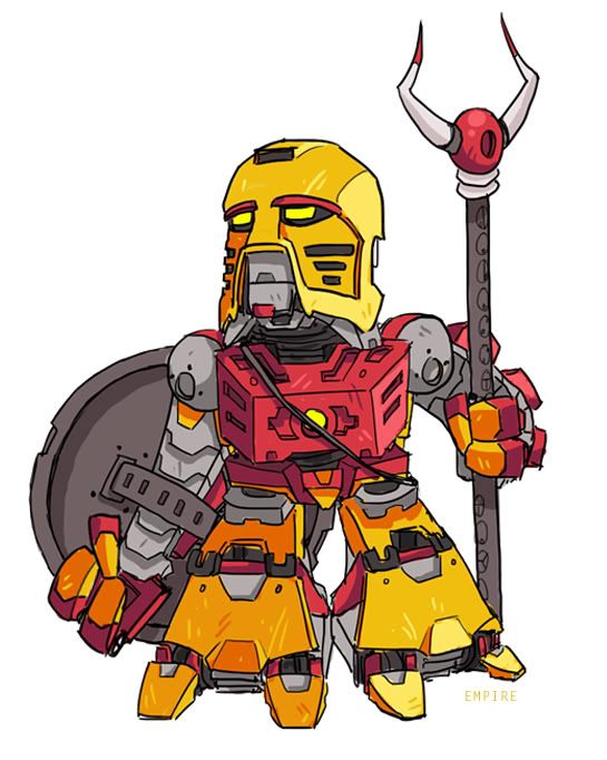
Oh Chris.This is definitely you, would fit right in with all your other art and it's marvelous. I love how you know exactly what you are doing with the subtle textures and shading. The lines are great here, the quality and consistency with them is a rarity, and highlights, being minimal, blend perfectly without being garish. I've been looking at the mask for a while and it's absolutely awesome. The different ways of shading and highlighting makes this such a breath of fresh air in interpretation. And the constructed texture of the mouth part is stunning. Of course you know I love the necklace; Bohrok teeth, what a novel idea, (
) and the beads and feather are perfect for adornments on the staff- it prevents it from being boring (if that were possible) and just gives him almost too much personality which is an extremely good thing. I'll jump with the crowd here too, the inclusion of 2004 pieces really tie this together as an entity. It makes sense now that he's the same as the dark red Toa from long ago, and some of the pieces you've drawn look just like old sharp metal, namely the shoulder brackets and ankle guards. I especially like the staff looking like parts scavenged from a flamethrower, as if he can channel only enough power to activate the already-present fire capabilities. Maybe not something you planned, but delicious all the same.My complaints are few, far between, and slightly ridiculous. The size of his feet are okay now that I look at them for a while, it helps with the frailty and feebleness, but the twist in his leg looks a bit unnatural and uncomfortable. Unless it is injured in some way, I don't know how it really fits- it's the only dynamic part in a quite static image, although it does sort of help to ground the horizontal balance of the picture. Also, his pinky finger on the right hand is a bit diminutive and looks like it can't quite reach around the staff. This is not a big deal (obviously) and it's present in most drawings with hands holding objects, so it's not really a detriment to this at all. So you know, no big deal.I love this, man, I love that you're drawing fun things again and not just comics than no one gets to see, but mostly because this is so <3, as you say. -
I really liked eleven, partly because it was drawn the best and mostly because of <3
-
Oh man, thanks. I guess I'll address nitpicks, and anyway thanks lots for the comment.-I wanted to give him more of an austere posture, but while his left leg is fine, I will admit his left should be bent slightly. Chalk it up to Kanta finally getting in my head.-I minimized the whole lower part of that arm to take away some focus, as well as keep the size of the fingers and the gap between them reasonable. Honestly, the set proportions are just awful, I hadn't realized how big their heads were, and so yes, he got much more humanized hands.- I did want to keep them clunky like the sets, but they were rushed so yeah, I didn't really get to flesh out making them look as usable as the rest of them.Nitpicks:-Tahu's pose seems slightly stiff, mostly because the legs are completely straight. Now, 2-3 hours is a rather short time for something this detailed, but it did catch my eye. If I turn that pose to a sideview in my mind, it seems like there is a straight line running from the ankles up to where the upper torso start, which is bent forward slightly. Even for a biomechnical being, a slight bend in the knees would definitely make him look a little more relaxed and make the pose more natural.-Tahu's Off-hand is a bit too small, considering you stuck quite a bit with the set-proportions on both him and Jaller. You've got the whole big lower legs going, Jaller's big feet, Tahu's broad shoulders, just that left hand is a little on the small side (relatively speaking). Maybe you wanted to go with the normal rule of thumb and keep the hand the size of one half of the face, or maybe you just dropped into the workflow and just drew it that way without making a specific choice. Anyway, I'm just nitpicking -Jaller's Feet. Again, I see you went with the set-proportions, but while I can definitely see that working for Tahu, for Jaller the huge feet look like he can't walk or run too well with those.
You wish.PS: Argonians rule
I will agree that Jala's chest is not really attached to anything in a logical matter, and was constructed with questionable angles.My only complaints stem from aspects of Jaller's design. His feet seem disproportionate to his body, but since you were going for some set-accuracy, it works. Something about his torso also seems a bit wack, but that's the set accuracy again. Other than that, not much else bugs me.
What is really wrong with his hand and the missing sword? I understand it's not your personal preference to have a lot of gray, but it was an artistic decision early on to emphasize that these guys were functional robots and the color was just personality.Definitely among the best Tahus I've seen as of yet. My only complaints are the sword hand, the abundance of silver, and the lack of a sword. Otherwise, Tahu is outstanding. Jaller is great too, although he still shares the silver issue with Tahu. I mean, the silver's not necessarily a bad thing and it adds more detail, but I'm just used to seeing pure red and orange versions of Tahu Mata. Definitely one of the best I've seen, though. Keep up the good work.
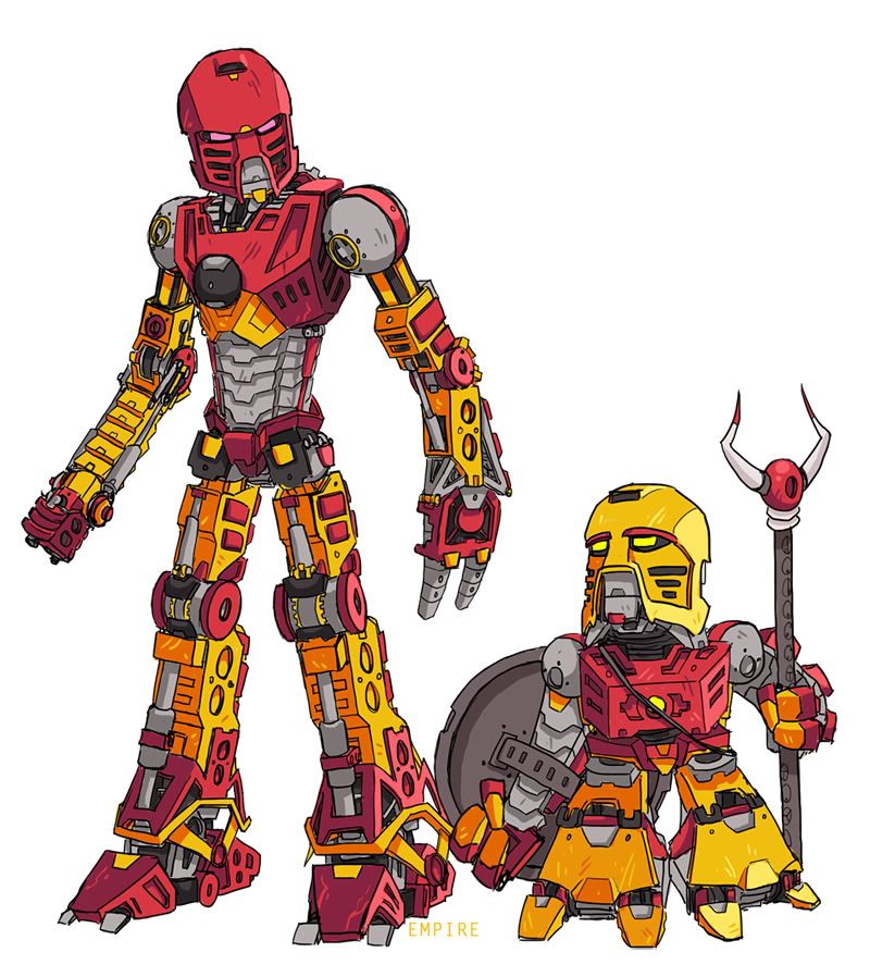
Oh, I didn't know who you were for a while, but the mask helped when I finally got it.Yeah, the legs are quite boxy, and I now realize Kanta rubbed off a lot more on me than I thought.And honestly, I love to see more of a set design spectrum in movies, perhaps with a healthy medium between the way I portrayed these two however. I like some interpretations on parts and such, but only for functionality and realism's sake. I had perhaps a bit too much fun with them this time- namely the flaps on his hips that resemble socket joints and Jala's segmented torso... The characters in the first two movies (I never saw the third, so I won't make an opinion) were just off putting to me. If I ever become interested enough to watch the Legend Reborn I'll probably enjoy it a lot for that sake, though I can't remember what the characters looked like off the top of my head.Thanks everyone. People have already gone into detail about the detailed details. So I'll do the sane thing and instead of commenting on them all, I'm just going to stand back and admire them. I mean, this is a great demonstration of imaginative thinking, and I like how you realized it with digital painting, which really enhances this. The look really reminds me of a combination between Iron Man and, due to the feet, Optimus Prime. There's some art I can kick butt on, but this lies outside of my talent.Due to art like this, I would have rather seen a Bionicle TLR that wasn't too literally based on the sets.Merida
 -
Tahu: 2-3 hours
Jala: 2ish hours
Legs took the longest, but they both got toes.
Coincidentally, they are looking at each other
since I decided not to do Turaga Vakama.
Just glad to be done.
-
Just these two, I don't feel like doing any more. I hope it's okay to put them in the same post.Edit: Added topic linkMember name: Empire (Uncle K.)Entry Category: ToaEntry URL: LinkThumbnail URL:
 Topic: Link-----Member name: Empire (Uncle K.)Entry Category: MatoranEntry URL: LinkThumbnail URL:
 Topic: Link
 -
Urg, I guess I have to enter this now. Is there an upper limit on DPI? I usually go for 200-300 but I know that can be too much for some printers.
-
Arson
in General Art
Posted Pohatu, hooray, and thanks everyone again
How am I supposed to respond to thisLove the art but hate the name. Might have lost my home to an arsonist in Colorado Springs.
Pistons that can adjust their gaps for ventilation, for use in the upper reaches of the atmosphere, though I'm not sure if it should be part of the Miru, Lewa, or just manifest when Lewa accesses the Miru. Pohatu also got a similar ventilation system, but his is just for filtering dust at 50 mph or higher, and it's only on his Kakama.wow i'm glad you did lewa too. I like how near the mouth area of the mask there are what seems to be pipes or tubes running from the side of the head to the mouth area.So i'm wondering what those are suppose to be?I also like how you included some wear and tear on his armor.
Yep, compared to the axle used for the Toa's heads his is really too small!I like how Lewa looks, particularly his mask. The details on his shoulders are good too. I only have one minor nitpick, and that is that his neck looks kind of big compared to the rest of his body. But that doesn't make this any less awesome.
hee hee ha haha ho ha maybeAre you going to draw the other Toa Mata too? -
There is a lot of freedom to be had with editing. Some people may be too shortsighted to see it, but there is much more application that can be explored and discovered. He's already forming skills of construction and uniformity. It's a lot like a collage at this point, and it's promising.There are still things yet to be developed and nurtured skill-wise, but I would severely frown upon someone trying to discourage another artist's direction. If he wants to "find out the hard way" in your eyes, let him. If he wants to organically grow in a different yet influenced direction: let him. Everything can still be practice, and you can dab or immerse your feet in as much and as many different pools and still be able to grow.> Toa of Geek, I don't need an advertisement for Pnet, but I'll keep it in mind for suggestions and ease of workflow at the very least- I did do a bit of searching, and there is a user-created plugin pack by BoltBait (which among other things, includes feathering and transparency) which you might be interested in. I honestly have experience with paint.net as I don't use Windows, but it looks like it might offer some new tools to use at your disposal if you don't already have it installed.I know from experience that trying to edit pictures of this sort convincingly is hard, and these days I'd hardly even consider trying, since such an endeavor would usually offer lackluster results. You clearly put forth a valiant effort, and experience will help you to improve on some of the areas where the editing is somewhat sloppy, like where parts are cropped badly or sized incorrectly. However, even with experience, this type of editing will always present some unavoidable obstacles since your source material is inherently limited. It's up to you whether you want to continue to refine this photo-editing skill or perhaps turn to different media like drawing or painting where you have more freedom available to you. -
I can't receive anything in the post anyway, so I'm content. I've come to accept I'll never win one of these, and admittedly I thought #2 was somewhat amusing.
-
I don't get what was funny, they seem promising to me. The biggest thing here, since obviously the bulk of work is spent attaching a different head and coloring, is proportions. The biggest thing to make sure you're lining up the neck and the body, not just the head. If the neck does not seem to attach to the head properly our eyes immediately jump to the part that seems off. This takes a bit of imagination as most of the masks you used do not have an immediate clear spot where the neck goes if you aren't used to thinking that way, so you have to imagine it for yourself and judge where it would properly be located on the character's anatomy. Also, with the exception of Tahu and possibly Gali, the heads are quite undersized. You have to find the perfect medium between staying true to the original Toa (who had huge masks compared to the rest of their body) and the movies, so I understand. It can be very difficult. You might want to match the colors (mostly noticeable on Lewa and Kopaka) a bit better, Kopaka's though I can see being pretty hard if you don't know exactly what to do, so I don't mind that nearly as much. Just curious, what did you use to make these? I think if you softened the edge pixels and got rid of the residue around the masks they would look a lot cleaner. One last thing- I found your Pohatu (orange one) to be the best of the bunch, as you made a unique take on it with an ingenious solution. The mask of time works pretty well, and the choice of Onewa's body was a good one. The torso's colors could have been changed, but otherwise it's pretty good.
-
Wizardry!I laughed a bit at the end 'stair' but the rest of it baffled me as to what was going on. That's to be expected, but I feel like it would make more sense if I knew what it was about.If I do recall, having LEGO characters wasn't against the rules. Not to mention the comics with LEGO people actually made a bit of sense. Also, the comic I made has Bionicles, so there must be some other reason why the BAC entry is getting all the votes...-Rez -
-
Arson
in General Art
...Goodness Gracious, I knew there had to be a reason why suddenly this topic was exploding. Thank you for the news bit, I had no idea and it had been baffling me for a while. Day was made.
Lewa has been added to the top, and the other Toa will come along shortly I guess?Do more. Please. Hey, you've admitted this type of thing is NOT time consuming for ya...so crank some more out! You've got a most willing audience for ya right here on BZP! *nods*And, thanks to Micah for the link in the news...that's what led me here today. It was a worthwhile choice.~Shioi
I sort of liked the compound-type flare, it made it a bit more interesting, at least to me. But not to worry, I kept a typical one for Lewa because it fit a lot more.And yeah, I'm not too happy with his shoulder. I didn't want to do a sprocket kind of thing, so the Buzz-Lightyear approach sufficed once more! Probably does't work too well with Lewa (and I have no idea how I'll get to Pohatu's) but at least I paid attention this time and didn't just blob lights all over.However, upon glancing at it for a few minutes, I noticed the line going through the lens flare, which I felt could have been erased. I also felt that the armor plate on his left shoulder was a bit washed out by the highlighting.Still, great job. Definitely deserves the news recognition. -
Arson
in General Art
First, an extreme thank you to everyone who has responded, I was not expecting the royal treatment at all, I just feel like I still have old ties to this place and I like posting once in a while. So thanks again. I can't respond to everyone, since I don't have much time, but I'll try to address specifics.
Though are you a speed drawer? Because 3 minutes is an awfully short time to draw and color something to this detail
I'm slowly getting back to doing art and I've started with short 2-5 minute sketches every day, normally I just draw people or animals to expand my techniques, but since I've been drawing Tahu for the past 12 years I got a lot in before the normal time guideline I implemented was up.> Gatanui, maybe I will, it sounds like fun. I haven't had a project of sorts in ages.Three minutes? You sure you weren´t just so immersed into your work that you simply lost all notion of time? Because this looks amazing, I love this style. Great job! Think you could do these for the other Toa? 
I wanted to show that the mouth was a seperate section and not part of the mask, so I made it a different color to resemble his actual face.One minor complaint I have about this is that I think his mouth would look better if it were red like his Kanohi, but that's just me. I still think this is a great drawing. Good job!
I actually didn't try to replicate metal, textures weren't my focus, I feel as if I've got steel and iron sort of covered, not to toot my own horn. I wanted a powerful bright light to give the sense that the character was illuminated but the background wasn't. I do agree though, colored highlights are something I've only really recently implemented, and I have a long way to go before I'm able to do everything I'm supposed to. So thank you for your razor sharp eye, I appreciate it tremendously.If you like playing with color theory you should try doing something with those bright white highlights. They're making the whole thing really plastic-y right now, which is great if it's supposed to be the toy but I think you were going for something more metallic. Personally I'm seeing a bit more yellow, it'd make a beautiful contrast with that purple. Nice job.
I purposely shied away from a background to keep all the focus on Tahu, and because this was just a short piece to kind of warm up with as I get back to drawing. And do not worry, if I do make the other Toa it wont cost a cent.I'm no art critic professional but i give it a 9/10. the only thing i think that could make it better is maybe a volcano with lava flowing down the volcano. I hope one day you might do kopaka in this style because heck i would be willing to pay for a kopaka version.
These three pieces [dead links] are all "full length" pieces I did about a year ago, coincidentally for the same project.Awesome; it looks great! I wonder what it would look like if you spent longer than three minutes...
After 12 years, you become quite used to drawing a certain hot headed dude.How? How do you accomplish such a feat, good sir?
-
Arson
in General Art
Thanks to the other members who replied.
Thanks, this was one of my daily sketches I've start started doing to get back into drawing and improve my linework. A lot of color theory goes into them as well, because that's something I love playing around in.You've created more mood in 3 minutes than others who put 20 hours or more into a piece.
I based it off the one I used to have, as that's the clearest memory I have of a Hau, since I don't actually have anything I could use for reference. And no, life's been steadily getting better and better-- I'm even becoming more domesticated every day, and I love it.Always like seeing your work, the damaged Hau is definitely a nice touch! Hope RL isn't causing you too much trouble ^^ -
Well, you always did kill us with your art.Hurm. I'll try to say things not already said here. There's things I love, there's things I don't so much. This isn't my favorite piece from you (nothing beats the Dragonborn) but it's definately a rare one in that it's fun to look at for great lengths of time. There's always something to draw my eye away from what I was looking at and entertain me further with some little surprise or whatnot.The texturing, and by extension rendering, is top notch. The different layering was done very well. From the tree, to the different types of armor, the spikes in the pit, even the foliage. The walls of the pit are exeptional, great to look at with the light and shadow creating that kind of webby texture. The actual painting itself is phenomenal, the brushed graphite look and soft angles on the main character are probably the highlights of this peice. While not too realistic, there's a kind of asthetic about it that is just complete. I think someone above mentioned Batman, and yes, it does look a lot like Batman's suit from 05 and 08. However, it has its own flow and integration with the form, blending into actual body parts and armor- it's great. Especially the shiny bits. The collar bone (salivate) is the perfect accent, breaking up the black and drawing more attention to the head that the neck chords lead in even further- this is probably the best compositioning in here, even if it wasn't thought out, it is severely appreciated.The armor shaping also, I can see you're evolving and testing new things- who doesn't love innovation? I can see parts of your standard fallbacks getting refined into a kind of natural style. Little bits stick out, like Kapura's closer upper arm, the leuitenant's thighs and waist, etc etc. The thighs are actually probably the best part of the armor design, plated, yet flowy and functional, though I would have loved to see some textural reference to their leaf pattern maybe on the shoulder parts right above the collar, as it's evident in the waist, but his top half is relatively smooth and simpler.I do like how you didn't go overboard on the eyes and lights, the Rahkshi's light up the side plating beautifully but everything else is kind of low key and natural. Some people tend to overboard with that, and it's nice you exercised contraint- though I'll admit, you normally don't have issues with it...Your composition looks to be accidentally spot-on. It doesn't follow traditional rules of alignment or focus areas, but somehow it still flows quite nicely. From the Rahkshi all by himself getting more "face time" versus the one in the cramped, shadowy position, to the main character's position relative to Kapura and the viewer, it's all quite organic, natural, and I can easily envision the scene as if I had chosen an ill-suited hiding spot to participate in some voyeuristic scheme, or had even fallen in the pit as well and it's just not my turn for an interrogation yet- basically your choice for positioning the character, 'camera' and world is a very strong aspect of the picture.There are a few things that are iffy I guess, but again, and as always, pay little heed to them as they pale in comparison to the grand scheme of things- that scheme being how good your art is.I get what you're trying to do with the grain, integration and variation mostly, right? While yes, it unifies most of the elements in the picture, it also stands out to me, I can easily tell it's a nearly universal application of screen fuzz, the noise just detracts from parts of the picture that should be a lot clearer- mainly the orange Rahkshi and Kapura's eyes/hands (though most of that can be attributed to the shadow that I assume is acting as handcuffs(?) that excessively darkens that part.) And while it does help create more intrinsic colors and depth, it would be better suited to only be as severe as it is on the background, like the walls of the pit and the greenery, as those naturally are going to have more variations in tone than metallic armor.The orange Rahkshi's top hand is too wide where the fingers are- hands are relatively square, not trapezoidal or triangular. It would be as simple as moving the fingers closer together for him, since there are only three and it's not so hard to fit them all in, but you did it very successfully with Heuani's hand, and I applaud you for that. (There's also no shame in hiding the other one, it didn't need to be in the picture so it wasn't, perfectly fine and reasonable.) As you know I jump immediately to the hands, as those are some of the harder things to draw and it shows better who can draw verses just rendering in tones/details.Those spikes seem to come out of nowhere- am I correct in thinking they are wooden? Because they seem to grow out of the ground, with only a tiny fraction of earth to lodge them in to stay, or even create any kind of threat/obstacle. But, who cares I guess. I overthought that a little too much I suppose.Also, Kapura looks to be a bit pudgy... actually quite a bit wide in the middle. His uniformly/flat plating looks wide and strong, but then his hip attaches too far out and mades it look like he is a lot 'bigger' than intended. I don't know, you can tell how big he is supposed to be, so it's probably not nearly as big (lol?) an issue I made it out to be. I digress.One last thing, you're foliage is great. The smaller leaves on the left side are painted well, and the fact that you did not shy away from them anywhere else speaks loads to your skill and work ethic.so um Good job 7/10 bro?NO! Just kidding. I love it. It makes me want to do more paintings of robots (I've mostly stopped, dunno why) and also join the RPG. I have time now I guess.But keep on trucking, it's obvious you've learned a lot and are always growing, and that's one of the best signs of an artist you can ever find.
 Entry topic: Pending!
The Definitive Pulse
in General Art
Posted · Edited by Funcle K.
The Big Three + Ghost
click the thumbs and links below for full images
Why?
Cinnamon, Faust, and Triton have all undergone several more layers of painting that reflect my new understanding of the fictional metal alloy they are created with and its relationship with light. About 1-2 additional hours went into the already 15-25hour pieces for this re-envisioning.
How?
As always, made with Photoshop and a Wacom Intuos tablet.(But if you can't draw it on paper, technology won't make it better.) Quite a lot of effort goes into making one of these, and the process itself is quite arduous. Sometimes it takes several attempts.
What?
These originally began debuting as individual posters to help raise awareness for a comic series I was starting to work on. The project has since evolved and mutated into something completely different. It is currently being written as an art book/dossier owned by one of the characters in the story that I will use as part of a pitch along with a screenplay to attempt a film treatment. (Meaning that these characters, Cinnamon, Faust, and Triton, who all retain their Bionicle genetics will eventually get a complete overhaul.) This is the last place they will be posted to be seen. Think of this as a nice little sendoff for these guys that I poured quite a lot of love into. I hope you enjoy them as well.
wow, photobucket really hates me
EMPIRE