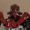
Makuta Miras Posted October 27, 2014 Share Posted October 27, 2014 (edited) A pair of dark green eyes loomed out of the darkness at the Master of Fire's face. "You and your team are not the only controllers of the elements, Tahu. There is us as well. We are the elements, Toa. We embody them. I am the Lord of Fire. Kneel."...Anyway, this is my second BFTGM entry, the evil Lord of Fire! On Okoto, there exist six Lords of the Elements, who control their elements with a skill that the Toa could never hope to match. The idea behind them was (Accidentally) inspired by the Element Lords, and at some point I might make the other five. Comment, criticise and post! Front (With background): http://www.brickshelf.com/gallery/Makuta-Miras/LordofFire/lordoffirefront.jpgI cannibalised the arms and legs of this from an MOC I made ages ago, and the torso was mostly based off of my self-MOC, which I've also entered into BFTGM. With this one, I also attempted to cut out the background using Gimp, so although it looks a bit scruffy, I'm pleased with it. Without background: http://postimg.org/image/t6iyhsdht/ Edited October 27, 2014 by Makuta Miras Quote Link to comment Share on other sites More sharing options...
The Meta Knight Posted October 27, 2014 Share Posted October 27, 2014 The color scheme really stands out to me. I think it's very nicely done indeed. I know people tend to complain about black and gray parts, but I don't see what the big deal is. I think it's perfectly balanced in terms of color. I do, however, think the legs are a to short and thin. I think they need to be either longer, or thicker. If you were going for short legs, then I'd say at least make them thicker. If you weren't, then I'd do both. Nicely done though. I'm also a bit skeptical about the foot piece for a head. It certainly is creative, but it doesn't look too appealing to me. But I don't think the judges would discredit it, though. Quote Stay vigilant, my friends. Link to comment Share on other sites More sharing options...
Mysterious Minifig Posted October 30, 2014 Share Posted October 30, 2014 The foot piece as part of the head is certainly striking. I'm not really sure how I feel about it though. I don't have a problem with the legs, but it seems like the torso might be a little bit too long. I suppose that could be corrected by making the legs longer and thicker. The color scheme is okay. You do a good balancing everything there, but it feels like it's just a little busier then it should be. I think it's an interesting moc and the head definitely makes it stand. Thank you for sharing. Quote Link to comment Share on other sites More sharing options...
Banana Gunz Posted October 30, 2014 Share Posted October 30, 2014 Oh, very interesting. I especially like the torso build. I would recommend making the arms and legs (which also look nice) a bit more in proportion with the torso; they seem a little small in comparison. But I quite like it! Quote tumblr: it's a lovely place to be if you've gone madflickr: mah yummy gross pics mmmPew Pew Pew Pew Pew Link to comment Share on other sites More sharing options...

Recommended Posts
Join the conversation
You can post now and register later. If you have an account, sign in now to post with your account.
Note: Your post will require moderator approval before it will be visible.