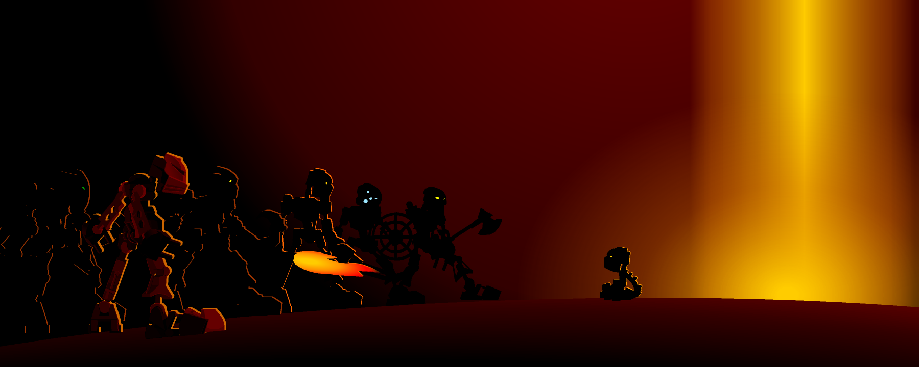
Lewa Mata Banner Art/graphics Entry posted by Bambi April 10, 2011 359 views Share More sharing options... Followers 0 Thoughts?
xon Posted April 11, 2011 This is one of your best banners, Brawl! Chols is right-- you're getting much better. I love the idea of it, too. =D Quote Link to comment
Chunky! Posted April 11, 2011 I really like this. You've definitely improved. The glow around the text seems too strong and a bit iffy. Regardless, it looks great. Quote Link to comment
Chols Posted April 11, 2011 I really like this. You've definitely improved. The glow around the text seems too strong and a bit iffy. Regardless, it looks great. Yeah that did look a little rigid to me. I thought it might have just been the way my screen stretches... Sometimes it helps to make text and borders in hi-resolution, then resize them as you wish. That usually give the boarder a cleaner look. Quote Link to comment


8 Comments
Recommended Comments