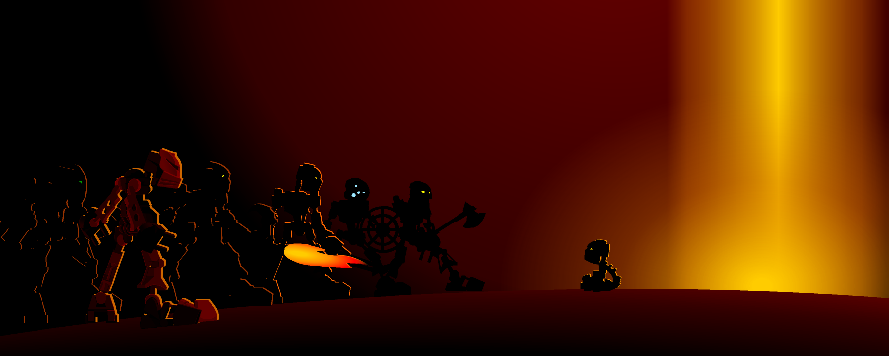
New Banner ponies Entry posted by Bambi February 17, 2012 244 views Share More sharing options... Followers 1 Like y/n?Eesh, the background color is awful.
Sumiki Posted February 17, 2012 That would look better at about 50% translucency, I think. Quote Link to comment
Chols Posted February 18, 2012 The background is a good color for dating do, but the fact that it's solid makes it look bland. Perhaps adding a subtle gradient in the background would make it more visually appealing without having to change the composition much. Quote Link to comment


3 Comments
Recommended Comments