

Dragonfly the Luminescent
-
Posts
551 -
Joined
-
Last visited
Content Type
Profiles
Forums
Gallery
Events
Blogs
Store
Raffles
Blog Comments posted by Dragonfly the Luminescent
-
-

I find writing really fun.

Unless, of course, I'm writing something for college. But then again, my English teacher is fun, so I don't mind writing things for her.

-
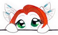
Very, very nice! I see you also changed which foot was held in the air. The colors and shines in her iris look very crisp, and her eye is nicely done.
I like the glow around her cutie mark.
-
You could reverse her on the computer after you finish her. That's what I did with my pony Dragonfly.
-
So that's Angel Beat, then huh? She looks very nice and feminine! What's her cutie mark?
If I may point out two details about her legs.
They look just fine, don't get me wrong, so if you see this after you finished it, just ignore me.
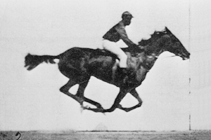
Her "wrist" in her higher leg is placed just a bit too low compared to what we see as the "knee joint" in horses (which is actually a high wrist joint in comparison to other skeletons, human or animal), although I've seen plenty of MLP ponies use their legs as arms like a human beings. This gif should help you understand what I'm talking about.
Also, on the hind leg, I noticed that most female ponies have a very thin joint, which is literally an ankle joint in horses. The lines should point to it on the top, and then point away as they go down to the hoof. I made a simple diagram to show what I mean in case my words didn't come out right.
But in all honesty, it really depends on the pony, the artist and what angle it is to determine how thin the ankle joint is or what joints the front legs have. We've all seen Pinkie Pie do strange things.
-

I'm even excited, and I just discovered your blog today.
I should have figured you'd have one though. Ya'know, you being a Blog Assistant and all ...
-
I'm still trying to find how the pictures are relevant to the Black Ops classes.
Although I do have to say that my favorite picture is Nyx.
-

Agreed ...

-
Amazing, seeing as your brother is addicted, so I would assume you would have associated the title with a bit more ...
Maybe even associate it with your brother.
-
Wow. Everywhere I've lived it dies at the first sign of winter. It also dies immediately when the sun pops up in summer.

-
It's still green?? Not dead tan???
O_o
-
Do cookies count?
-
Happy Christmas and Merry New Year!

-
That's very nice! I always love how the vectors turn out so smooth. Just one thing I noticed: his body color doesn't touch his outline in his jaw line, but I only could see that when I enlarged it.
*looks at pretty colors link*
I give up. I'm not learning to vector. Looks too scary.
-
Your pegasister friend's drawing is really, really cute.
-
Yay! You used your blog!
I really would be thinking of getting a Zelda game, but I have just an Xbox 360. They really should make 360 Zelda games ... I can't play games with a mouse and keyboard to save my life. Spore gets confusing sometimes, and that's an amazingly simple game.
-
 So, here's something I've wanted to know.Approximately how long does it take you to finish a pony in this way. From start to finish. (Not counting breaks and such.)
Not couting breaks or those pauses where I stop to inspect/admire my current work? Obviously the simpler the pony, the shorter it takes, but I would guess around one hour to sketch it before I darken the lines, and maybe another hour or two to find the right markers and pencils to outline it and color it in. Then it takes a total of about five to ten minutes to scan it when the scanner wants to cooperate, fix the colors in Photoshop, upload it and post it in my Boutique.
But like with Skarloth's pony, it took another day to get it scanned, because my scanner hated me yesterday. I even flattered it, and it didn't work!
All in all, I would guess around three hours to start from the beginning to getting it uploaded.
-
Whenever I can, I'm going to go premier for lifetime.

-
Oh, and TSG has a pony, too. I didn't actually know he was on the list.
-
-
I'm just a night owl. I'm on LATE when EVERYBODY is sleeping, even in Australia!
-
How would that work, though... Alan was obsessed with horses, so what would his pony equivalent have?
Obesessed with humans?
(assuming Alan is a human being, because I'm not sure who you're talking about) -
Oh, I feel like that all the time.
-
Dragon fly, Dragaen Flai, Draginfli, etc. etc.
Personally, I think that's slightly more feminine than "Toa Mata Nubie," and I think a change in sprite wouldn't hurt either. Your colors are fine, unless you want to orient them with your ponidentity. The mask is the biggest thing, really. I'm not trying to stereotype and suggest you wear a KauKau, I just think it's fairly masculine.
Name: A name change would be good, since the term "Nubie" can be viewed as slightly derogatory nowadays.
You must have seen that I use "Draginfli" for my username in majhost. I use that name in many other places, and I'd be really surprised if your suggestion's spelling was just a coincidence.
The colors are one of my favorite color schemes, and my "ponidentity" is my real self ponified. I thought about making the colors the same (with the red/orange hair being the colors of the mask), but I like blue better, and a mint blue/white body with a red/orange mask would look doofy
I don't really like most of the masks that Toa or Matoran of water use, and I appreciate your comment on that, but I really like the Ignika. The "horns" remind me of insect antennas, too
. Not to mention it still keeps some of my "TMN self" in my new sprite. Maybe I could try to do something to make the eyes a bit more feminine ... I might change their color to a darker green, since it is a bit difficult to see against the miny-colored mask.Thanks for all your comments and suggestions, guys
-
I fixed something I missed (it was the border on one or two bodies), and I added a sniper rifle and changed the pulse blasts into a muzzle blast and a bullet.
My New Year's Eve
in blogs_blog_1762
A blog by ~Allegretto~ in General
Posted
Ask Sonu and Pinkie Pie.