

BioCry
-
Posts
206 -
Joined
-
Last visited
Content Type
Profiles
Forums
Gallery
Events
Blogs
Store
Raffles
Posts posted by BioCry
-
-
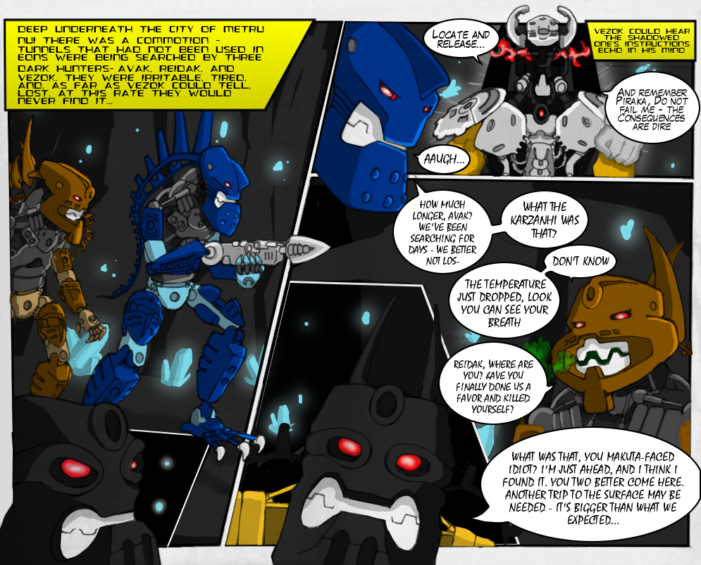
I see Vezon, instead of Vezok which is in that yellow box with The Shadowed One.
*facepalm*
I always get those two mixed up.
-


-
-
I agree, I might try to make a guide for hand-drawn comics (yes I make them, but don't post them here because they're not bionicle-related).
I would love to help out with making this.
-
-
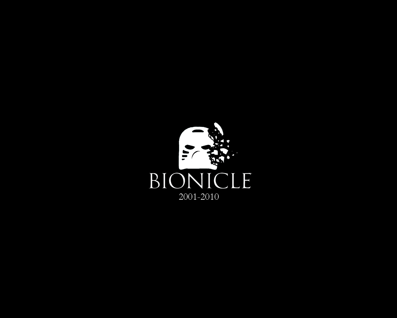
I actually like the black-and-white version a lot; it's simple, yet very effective. Particularly the shattering part of the mask. It gets the point across without being overly dramatic.
Of course, whether the all-white is really suitable as a desktop wallpaper, that's not sure. As an artwork that says "Remember", it absolutely works, though.

Thanks!
Also, I have a preview of the inverted version for anyone who'd like to see it.

-
-
Here is an example I created to show you how to spice the image up a little without lots of work:
(image)
All I did was invert the colors so that the background was black rather than white. Then I took the mask and the bottom text and turned them red, considering Tahu is red himself (I also edited the mask a little so that the edges weren't so hard). After that, I added in the original Bionicle Logo, which, in my opinion, looks much better than typing it out in white/black text.
When it comes to my criticism of the artwork, there is really not that much to critique. Most of the criticism I have is the plainness of it, and TheSkeletonMan and I have already covered that. One other thing would be, again, try to work on the hard edges a bit. The easiest way to deal with it is to add a very slight Gaussian Blur, or some other kind of blur, which will smooth out the edges a bit without losing very much quality of the actual image. Besides that, it's actually a very nice wallpaper. Keep up the great work you're already doing!
-Rez
Sweet. Thanks.
I made an inverted version of my first one that looks a lot better. I'll be posting it soon.
-
-
Am I the only one who watched this about 20 times? XP
...and noticed a severe lack of Marvel Minifigs? o_e
-
-
It'd probably be better if there were something in the background. Just a color, even.
No one likes a white desktop.
But I like the breaking Hau.
Hm.
Good point.
The problem is I have no idea which color would look good with the black Hau and text. :/
-
-

This is just something I whipped up after feeling depressed about the BIONICLE sites being taken down.
Hope you guys like it!
Other Downloads:
(If you can't find the image that corresponds to your screen's dimensions, let me know and I'll make one that does.)
-
-
 1
1
-
-
Reading this brings a question to mind.
Seeing as he's technically no longer a "Nuva", Would Tahu turn into a Turaga "Nuva" as well, or simply turn into a regular turaga?
-
-
Unless there's an invisible set that I didn't know about (or that I bought it, for that matter), I'd have to say that there is not a single BIONICLE on my desk at the moment.
(I do, however have a Galaxy Squad mech defending my art desk at the moment. :3)
-
-
I'm sorry, boston100, but the General Discussion forum is for BZPower-related topics only. (If I'm also correct, I don't think you're aloud to advertise either.)
-
-
Dangit, I just cleared my caches... ._.
Someone better make copies of the sites, or I'll be very depressed...

(Then again, the Bionicle Stars have been "new" for a pretty long time, so maybe It is time after all... T_T)
Long Live Bionicle.
-
-
I've decided the Vahi on your face is actually a beard. You have achieved manliness.
Puberty FTW
-

-
New Comic:
Welp, that was a nice break. :3
Let's be honest here, how could I ever actually leave you guys?
Unfortunately, due to a lot of things that have happened in real life, things will not be the same as they used to be. I won't be uploading comics as frequently and stuff like that. I'll do my best in my free time, though.
I hope you guys enjoy the comics!

-
-
Oh with such an awesome MOC it does really hurt for me to say, but Centaurs are to animalish to enter the contest I'm really sorryThat's cool but the guidelines for the contest says it has to be humanoid (upright body, with arms and/or legs).
AJSVIUGVFUKGAVSOUVFDUOBVSFUOYOUDSVDTY
It seems I always miss something when it comes to contest guidelines. DX
Oh well, I hope you guys enjoy the MOC!
Hopefully the next time another contest comes around, I won't screw up like I always do. XP
-
-
-
Great comic Bio! So far, these two who have been away from making comic for a while seem to still be able to make 'em great! That face at the end was priceless!

Thanks! I hope everyone will enjoy the story I'm working on this year!
Hey Kahi, could you put the link to the comics below the calender aswell please because when i'm clicking on the opened slots it just shows the picture of the opened slot.
A lot of people of been having the same problem.
If that happens, you have to right-click on the image and click "Open Link in New Tab".
-
-
And so it begins...
...With a very nice comic from Utah, I must say!
Can't wait to see what everybody does this year!
-
-
It's mainly just a chat for planning. There usually aren't any skype calls.-Is the skype call organization going to happen more than once? I didn't see this until today...
-
Kahi informed me that he will indeed be running it again this year.-
-
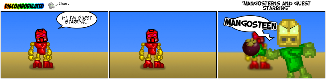 -Mangosteens and Guest StarringI was gonna have Eljay be a little more explicit about his love of Mangosteens, but I wasn't sure what he would say would have broken the BZP rules or not. XP-
 -
-
-
This, here, is one pretty sweet MOC.I really like the colors, although I'm not sure if they would truly represent black holes. (I'm thinking more black and blue here. Still very cool, though.
)-

Kanohi Dragon
in Comics
Posted
Perhaps I could indeed... ;D
-


