


PooZy
-
Posts
159 -
Joined
-
Last visited
Content Type
Profiles
Forums
Gallery
Events
Blogs
Store
Raffles
Posts posted by PooZy
-
-
Super fantastic work. Krika is one of my favourite villians. You did this with just a mouse? Mindblowing. I could not have the patience for that. At all.
Original design too, I liked how you took the major points of the set and bended it to give him a creepily surreal look, but is still easily recognizable as Krika. It takes a lot of creative thinking to have such a neat design represented.
Love the atmopshere as well. Eerie and love the sort of soft painterly style. Glad you also focused on the silhouette on him, makes it a stronger composition. Helps the 'ghost' theme going on. With the very cool colours/black and white in front, I also enjoy the aurora-akin colours for the background, helps him pop out a bit. The red on his face is a good topping on the cake.
You got a great understanding of colours, values, and simply you're pretty talented from what I can tell. Would love to see more art from you. Thanks for sharing.
almost everything I've ever made is in my now-abandoned flickr account: https://www.flickr.com/photos/87782389@N04/
although I think the stuff in there goes back years o_0. Thanks for the kind words.
Horrifying. I get the feeling that a caricature of this will be haunting my dreams tonight. The blend of gears and mechanics and organics solidifies the feeling of being a mutation. I'm seeing a bit of similarity with this image and Bane, from Dota 2. Any correlation, or just a funny coincidence?
Sadly no, I've practically no knowledge of dota 2. That character looks stunning, though!
-
I've been a long-time fan of bionicle, but the character design that really stood out for me was Krika.
Here's my take on the character. *portrait incoming*

Fullsize link: http://www.majhost.com/gallery/morkney/Newerart/bion.png
I recoloured him a little, added a tail and switched his launcher for a hand (I mean, he's got to have a hand somewhere, so that he can interact with the environment...?).
I kept the swampy environment and such.
Image was produced in GIMP using a standard mouse.
Anyway I'd love to hear your thoughts, and thanks for viewing!
-
 13
13
-
-
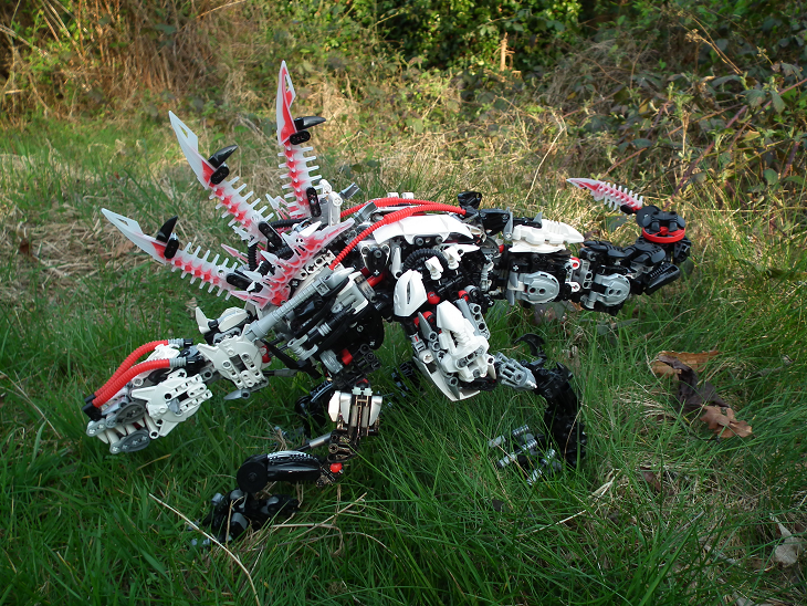
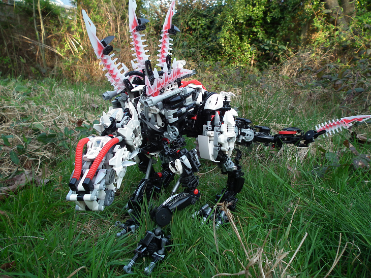
It's very solid and VERY sturdy. To test this thing out I literally stood it up and kicked it several times, it stands the test. The hip joint alone has TEN pop joints in it. No really, ten per hip. Some of them are hidden within but they're all there. One of the pop joints is geared up to give extra friction.I enjoy this. Can't really find flaws. The huge back spines work great, and it looks solid and sturdy (right?).It not only reminds me of a dinosaur, but something from Spawn, given the extreme biomechanical design and menacing look.
Thanks for the in depth review! A few people have mentioned the lower back legs so I think I'll go and beef them up after all. The head doesn't have eyes, Radon is blind.edit: forgot to say, both legs can move in all 3 dimensions just like a normal socket joint could. It's sturdy AND flexible. Also I'll use this opportunity to mention that the brickshelf gallery is (finally) up, so you can look at any other photos I didn't post in the main thread.Holy crud that is astounding.The fact that you managed to make such an enormous MOC and not get messy with it is great by itself. The colors are just wow, too.Let me start getting more specific: I love the body design a lot, especially the back connecting to the legs and the tail. Those large, white pieces (what are they) are perfect for hip guards. The Krika spikes in the front are amazing, and I like how you filled up the holes with those 2-axle-holding black parts.The legs: Again, really great work here. The front legs kind of look like something from out of a movie. The claws are epic. In fact, the way the front legs connect to the body is done very well. I assume they can move in many directions. Now, onto the back legs. The back legs are good, but nothing more. The thighs are great, though, and don't need any more work. The lower part, however, not so much. Excluding the claws, they don't look like they fit on such a large MOC. Perhaps you could beef them up a little.The tail: Not really much here. It's a good, solid structure, and the individual links are good.The head: I saved the best for last. The head in itself is a masterpiece The use of 2.0 shields and the red tubing is brilliant. The mouth is simply epic, too. It's large and just flawless. But where are the eyes on this huge rahi? Are they those silver Bohrok teeth on the white shields? If so, they could be a different color.My score: 95/100
-
Yea the gallery should have already been up. When I originally published the gallery it took about 3 days just for Brickshelf to refresh it's most recent, and when it eventually did my folder didn't get published. If this continues I'll just deeplink every image in a list. Anyhow thanks for the reply!I've really been waiting for the gallery to go public, but in the meantime, I want to say that your MOC is so intricate and well-built. It clearly took a great degree of ingenuity to come up with the final design, and it reminds me of something straight out of a Final Fantasy game. I'll have more to say when the gallery is up and I can analyze your MOC more carefully.
 -Ced
-Ced -
Cute! The glow in the dark gadunka head piece is perfect as a shell. The only thing I can suggest is firstly get some better photos of it, and secondly the legs are a bit odd looking. I would prefer if they were dark blue like the rest of the turtle. Anyways cool little rahi
-
Thanks for the bootiful reply :3The colour scheme is a work in progress. As I come across correctly colour pieces I replace the ones on the model, it's been going like that for a few months. Truth is I would love to have a better colour scheme but the pieces are hard to come by. The reason there is red ball joints everywhere is because I bought witch doctor (which had a billion red ball joints). Even those were not enough which is why there are a few grey ball joints and black ball joints in there too, I think 90% of my ball joints are in this model o_o.Also Radon is supposed to be blind, he sees by reflected radiation rather than standard vision. <3 roa mctoa guuurff i love them so muchDemz big!
 Ah yes, I've been meaning to reply to this behemoth's topic for a while. It's nice to see that you're posting him in BBC, since you have quite a few MOCs on your Maj folder that could make a good living in this forum.First of all, I am impressed that you've managed to create a Rahi this large that even has a few power functions, namely the opening mouth and flipping guns. Also, his hunched proportions and powerful build suggest a powerful predator, which is awesome. To top things off, his tail seems sufficiently heavy enough to balance his head and not make him tip forward. Kudos to you for that; my giant Rahi MOCs have been plagued with that many a time.One thing I will point out, as others have done before me, is that you might consider giving him a simpler color scheme -- perhaps black overall, with white armor and red Krika blade highlights. I could be wrong, but it seems as though many of his exterior armor pieces that you used in silver or red also exist in black or white, such as tubes and ball joints. Alternatively, you could keep the silver in his "guts" and just cover it up with black, then white. I understand that it's hard to keep a coherent color scheme with a lot of parts, though. But if you are going to have black as his basic skin color, I would highly recommend removing the black tips from the Krika blades on his back -- they just seem a tad out of place up there, if you're going for a black skin look.As far as his head is concerned, I'm digging his ferocious toothy jaws, tiny ears, and tube-covered forehead. But if those silver Bohrok eyes are supposed to be what he sees with, might I suggest replacing them with a brighter color, say, dark trans-red? That would make them pop out more and really strike fear into the hearts of topic viewers.Still, excellent job on making an intimidating giant Rahi with power functions. Roa McToa would be most impressed.~B~
 -
Noticed this had 0 replies, that's not fair :{ so I am making one nowWell first of all I went to your brickshelf and looked at your other mocs, you were telling the truth about this one being different. It's got a completely different build philosophy, I imagine that in itself was quite challenging. The design looks quite apt for a recon drone, it's thin and spindly, much more like a creepy eavesdropper than a fighter. That brings me to the first thing I don't get about this MOC, why is one of its arms a gun? I can understand the need for recon to have a self defence weapon, but I imagine that any such weapon would be small like a knife. If one of its arms is a gun then how is it going to navigate freely around terrain? The other thing I don't like is the feet. They seem a bit heavy for a robot designed to sneak, try replacing them with some smaller feet.Apart from those two small problems this model is good. The head especially is a stroke of genius, not just the actual design but the way it is jutting out from the torso. Really gives it some character. There's also a lot of custom going on which is a must-have considering this is a light-weight moc.
-
Hello :}Gawp, gold and black, can't go wrong with that. I don't see a single blemish to the colours (apart from the orange eyes of course). I like the hammer too, it suits the Toa's heavier frame. If I was going to criticise I'd say that the chest armour looks out of place. However, I can't really think of what you can do instead. Lego never really made enough gold pieces :
-
Not at all, If I didn't want criticism I wouldn't have posted here. I appreciate what you're saying about colour layering, I kind of tried to keep the white sections centred on the head, back and thighs whilst keeping the lower tail and lower limbs black. I kept the grey in partly because I don't have enough black and white pieces for the entire model but also because I wanted the rahi to maintain a mechanical style rather than looking too organic and clean.Oh heck yeah!You've really got the shape and proportions down-pact. The spines on its back are just amazing, and the head ain't too bad either.While I really do appreciate the shape of it and its 'filled-in-ness', I've gotta say that it does look cluttered. Having a colour-scheme is one thing, but colour layering is the real key to appealing aesthetics. What I'd like to see on this is having black as the skin layer, white as the 'armour' layer and red as the accents. I'd try and kick out the light grey and silver altogether, as they don't really seem to add anything to the MOC.I've really gotta commend you though. I've never been able to MOC on this scale, and you've just proven that you have a bit of a nack for it. Sorry if my C&C seems overly critical, I'm just offering advice
-FtC
Thanks, I have to admit the colours were one of the most difficult parts because the model uses a lot of pieces.Awesome creation! Great build and playability. Design does look good, altough there is some small issues with the colors(as mentioned above). Well, it could be claner-looking,but I like the exposed technic bits, adds some charm. Anyway, I'm just nitpicking, this creation is really great!
-
*points and laughs*It's kind of like a tree made from an octopus. Nice colours though. Kind of looks like something TLG would come up with.
-
Hi :}This looks a bit like what fire lord wanted to be. Dark, menacing and over powering. I like the arms also, those really long spiked fingers... wauurgh..., amazing. Maybe the torso should be a bit taller (or the kilt-thing be a bit lower) to balance out the top half and the bottom half.Anyway this definitely embodies the horseman himself, very war..ish, perfect colour choices and the spiked head / kilt thing suit it too.
-
The only theme I was genuinely sad to see go was Bionicle.As I got older I started to find the story too young for me so maybe it was for the better that it stopped where I can print my own designs onto the story and fondly remember the actual story. I still think I would've preferred it to continue, even more so if its attitude matured with me.Hopefully it will be revived in 10 years along with a blockbuster movie like transformers, only hopefully not as disappointing.
-
Hi :}First of all these models make good use of the new hero factory parts. Sometimes I see hero factory mocs and they use so many plate armours that they look saggy, but both of these models here look dynamic so I can tell you know what you're doing. Wasp is the best in my opinion! I like how the sets of arms use inverted colour combinations, very smart. I was going to complain about the lack of wings but then realised it has some, they're just virtually invisible thanks to camera witch craft. Scorpion is good too but I don't think he looks like a scorpion, the tail lies flat behind him and he has a neck. On his own accord he looks perfectly fine but as a scorpion he looks a bit weird. You should try tearing off his head and curling his tail up over his back. As with wasp the colours are great and he looks very striking, the repetition with the spikes down his back and tail looks awesome by the way!
-
well u might not give two fruitcakes about this but it certainly deserves ... those.. fruitcakes... o_0It's really good! Reminds me a little of a spider with the sack on the back. One thing some people might not like is that the back of the model uses a different shade of blue but this doesn't particularly bother me because you kept it consistent and in any case I'm sure TLG never made a bright blue bohrok head.
-
Thanks for the reply :3. I like the legs how they are, I didn't want to make them too bulky because I was kind of going for skeletalThe color scheme sort of works out. However, I think the legs should be bulkier since it's so big.
Thankyou <3. I think of it as a dog tooThis is amazing. Reminds me a lot of a dog, probably mostly because of the size and the outdoor photos. The colour scheme works well, and I love the functions, especially the guns. The use of so many pieces made it detailed, but the lower legs could use some beefing up in my opinion. Still, for the sheer size and impressivness, 10/10. Most impressive.
Also thanks. The legs are thin but they have a ###### of a lot of support. Every joint has a tonne of ball joints and friction pins to keep it stable, it can comfortably stand on just 3 legs.I've just realised the pics are a little small since a staff member has resized them so here's a couple of hard linked images:http://www.brickshelf.com/gallery/morkney/Bionicles/Radon/radon3.pnghttp://www.brickshelf.com/gallery/morkney/Bionicles/Radon/radon996.pngMATA NUI...I love huge MOCs that don't look messy. This is well armored up and smooth (for a Bionicle), a blend that is difficult to MOC in my experience. The legs seem like they can't support it, but the picture says otherwise. I can only imagine how hard it was to get those legs just right. The head looks mutated, which is good for a radioactive creature. But the KRIKA BLADES. Those are excellent pieces, very skeletal, making them perfect for...well, skeletal purposes. Like the spines. 10/10.
-
The waist is articulated, it can stretch out quite a lot but I prefer it hunched. There are some other pics but ofc the brickshelf page isn't available yet *rolleyes*The lower legs and lower tail actually have no white on them, this is on purpose though, just a styling choice.2 Weeks! That's all it took you?! This moc is one of the better mocs on this forum right now! Anyway, on to the critiques:The mix of white, black, and some red is good, but it seems cluttered in some places, especially on the hind legs and lower back/tailThe Moc seems a little hunched up. Is this intentional?Those are the main problems with this moc. Otherwise, it's exceptional. The color scheme is good, and the face and feet are awesome. Also, the functions add to the moc drastically. I would buy this if it was available to buy. Thank you for posting this moc!-Bane
-
Thanks for viewing :}Here are some of my arts from a school project - that's why they're all of similar theme.http://www.majhost.com/gallery/morkney/aaawipbio/herron2.pnghttp://www.majhost.com/gallery/morkney/aaawipbio/goat.pnghttp://www.majhost.com/gallery/morkney/aaawipbio/swan.pnghttp://www.majhost.com/gallery/morkney/aaawipbio/squirrel.pnghttp://www.majhost.com/gallery/morkney/aaa/dscf5506.pngDo not post images greater than 500 kB. -B6
-
Thanks for coming <3This MOC is called Radon, Rahi of Radiation.
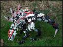


 Brickshelf gallery (this is public now):http://www.brickshel...ry.cgi?f=500336The MOC features several functions. Firstly the mouth opens and closes when you pull a lever that is located under the torso. You can see the guts of this function in this WIP picture:http://www.brickshel...es/WIP/wip4.pngThanks to some nice technic pieces the neck maintains full articulation!The other function is that guns on the side of the moc flip out when you pull down the third spine. You can see this in the fourth image I posted ^. Both guns work and can fire small technic bolts. These technic bolts can be stored on the left front leg but I took them out for most of the photos encase I lost them (they have rare glow in the dark tips).Lastly there is a spinner on one of the tail segments.Not counting toes or other minor parts there are 22 points of articulation, however the MOC is very sturdy because I have doubled up or reinforced every joint that needs it. For example the waist has two friction pins.I have not measured or weighed the moc but it is very dense and very big (which you can probably tell). It took me about 2 weeks to design and construct him, then it has been months of little changes before I was finally happy.I look forward to your comments!Edit: Images thumbnailed due to file size. Please keep posted images in BBC to 100 kB.Click on the thumbnails to view the original images.-Wind-
 -
Thanks for the review! As to your questions:Tarau and Po-rah are supposed to be different species of matoran, yes. Tarau treats Po-rah badly because he gets on his nerves but at the same time Po-rah is the only person he has so in a way he's stuck with him. I wanted to make it clear that the two matoran didn't naturally get along.They're supposed to be on a vast desert on spherus magna, makuta has been inhabiting the body of rahi for hundreds of years because those are the only living creatures he has ever come across which is why he's so pleased with a new body. Tarau sides with makuta so easily because makuta hypnotised him, I tried to make this apparent but I probably should've made it more obvious.edit: urh, slithers, that's an embarrassing one D:
-
Voted takadox all the way through and added mantax to the good designs at the end.mantax's design was especially good, nothing like what we'd seen before and that made me squiggly-happy. Takadox was my favourite though, I just really liked his personality and I've always liked mantises.
-
Tarau is supposed to like Po-rah and only lets him tag along because he needs the friendship, although he masks this with hostilitythanks for the post <3
-
Clicked that link, ignored all the other mocs and went straight for 'tamer'.Amazing design! Apart from those blue pins and the greenish parts on his shoulder blades (which you can't really help) it's a really good model. It looks dynamic and has a really good flow to it
-
All of the original six masks (and those of the turaga too) were by far the best designs. they were simple and actually looked like masks rather than head pieces (which lots of the later masks looked like imo).I like this one though:
 It's so ugly - but that's what makes it cool.
 -
Oasis by PooZyA review would keep me entertained :3 Thanks for reading.


Makuta Krika fan art
in General Art
Posted
Thanks <3
I didn't take any cues from anywhere with the design, just the original model. I'm afraid I'm not really knowledgeable about what Tyranids are :\ A lot of this popular culture seems to have slipped me by.