


CeziuM
-
Posts
56 -
Joined
-
Last visited
-
Days Won
1
Content Type
Profiles
Forums
Gallery
Events
Blogs
Store
Raffles
Posts posted by CeziuM
-
-
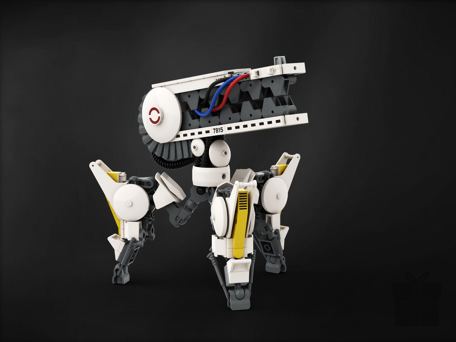
AKA: H-301 Autonomous Reconnaisance Unit
Although designed for scouting missions, H-301 units are often deployed on the battlefield front lines acting as forward observers and relaying information to units stationed in the rear. Thermal imaging and night vision ensures consistent efficacy in locating enemy troops.

My part of the collab with Jayfa and Red for the 2019 Space Jam. We decided on military animals as the running theme.
-
 4
4
-
-
Had some free time for Christmas and this thing happened. Secret Santa gift for JakTheMad, he likes using Rhotuka parts in his builds so it felt appropriate to use them as a seed part.
-
2
-
-
"Warlord from an age long forgotten, legends say that only a blade of pure glass may lay him to rest. Unfortunately, glass proves to be quite ineffective against steel armor."

Wanted to get one more MOC in before the year is up. Been working on this thing for quite a while, it's finally gotten to the point where I can say that I'm satisfied with how it turned out.
-
2
-
-
I'm just curious as to how you managed to take photos of them together like that. Was there some clever photo-editing involved or did you have one of you ship out his entry to the other for collective photo-taking?
Both MOCs were built in LDD, these are just very good renders.We actually live not too far from each other, so we just got together for a beer and took pics.
-
 1
1
-
-
Vahki were one of my favorite villains in G1, so I figured I'd give one of them a makeover. Not gonna lie, I was partially inspired by the Doom aesthetic for this one, hence the color choice and exhaust thingies on the chest. Been wanting to use those plates for a long time now, and a forge-dwelling robot seemed fitting. Tried something new with this one by deliberately staying away from smooth shells for the first time in a while, since I wanted to emphasize the "function over form" thing the Vahki had going on.
Obligatory spider function:
That's it from me, don't forget to support our boys in blue (well, red) and vote in the contest poll!
-
8
-
-
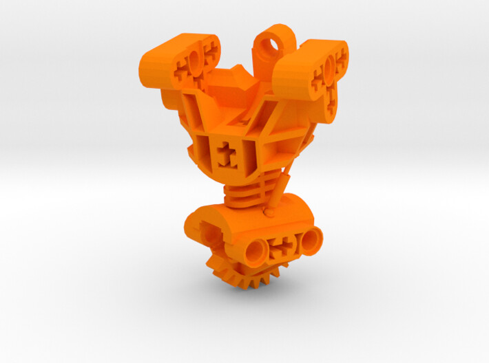
Sweet! I wish I had a 3D printer to test this out with... aaaugh. Is the joint at the waist a ball joint or just a swivel one? And what's the other point of articulation?
Thanks! The main torso is divided into 3 pieces with a balljoint-socket connection between each (lower torso, midsection, upper torso), so that's two points, not counting the pistons

-
Made another 3D thing, this time it's a Toa Mata torso with 2 points of articulation and working pistons. You can get it here: http://shpws.me/OlNb
-
5
-
-
Oh wow didn't realize this god featured and stuff. Thanks for the comments everyone, I truly appreciate it!
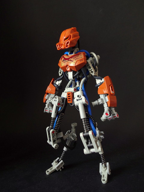
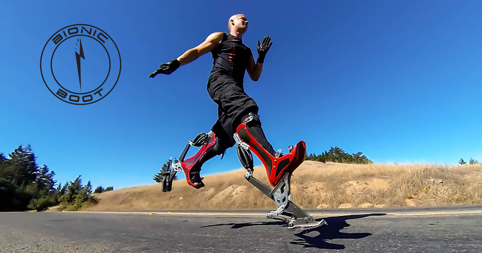
Since most of the comments are about the legs, allow me to clarify why I opted for this type of design. From a physics standpoint, it is much faster and more energy efficient to have this type of design when the machine is supposed to run fast or just have agility all in all. Basically, the less weight is thrown around when the feet move, the faster you can move them due to a lower angular momentum (Trust me, I study this stuff). This principle was used by companies like Boston Dynamics for their robots, or for these things: http://www.bionicboot.com/wp-content/uploads/2013/07/keahi-bionic-v2-950x500.jpg (I'll admit, these might've been part of the inspiration for the MOC). I can understand why some people might not like this approach due to the original Pohatu being really bottom-heavy with legs that were made for stomping, but this was supposed to be a sort of experiment to see what Pohatu -could've- possibly looked like. And honestly, this was partly an excuse for me to use up as much technic suspension as possible, so there's that :v
Great work! Overall shape is great and really resonates with Pohatu's theme of speed. Only nitpicks I have is that there are some exposed axles in the chest cavity and the circular plates you used (little rusty, but I'm pretty sure its this piece?). Is it possible to use some shorter axles in the chest cavity? Or, if you have to keep the longer axles, is it possible to put some 1/2 bushings on them? As for the circular plates, I think if you swap them with some 2x2 turntable tops it would look a little sleeker (again, particular to that piece so maybe I'm a bit biased).
All in all, awesome creation!
P
The only reason I didn't use the turntable slopes was simply because I couldn't find enough of them. I do agree that the legs would've looked better with them, but i figured it didn't make that much of a difference in the end. As for the bushings, will do! Didn't realize the open axle was that noticeable when I was taking the pictures, mainly because I was looking at it top-down. Thanks for the C&C, I appreciate it!
Once again, thanks guys! I've been kinda on a hiatus recently, hopefully I'll be able to finish something over the holidays.-
2
-
-
This is a neat experiment! It's clear that you've got building skills and much thought went into this, however it is pretty apparent that you came up with the idea for the function first, and then tried to wrap a character around it. I do love the extremely mechanical feel this has going for it, and am impressed that you managed to fit pneumatic functions into a Toa-sized MOC without making it super bulky and poorly balanced.
That said, the color scheme could use some work. The blue pipes are jarring, and burned orange doesn't really work well with light grey if you ask me, but that's just my opinion. I also see you put effort into retaining some Pohatu-esque characteristics beyond the colors, mask and printed chest piece, but overall this doesn't "feel" like Pohatu. Honestly, if you would have gone for an original character, or not even something in Bionicle lore, the MOC would have fared better, as you would not be restricted to burned orange as a color. If you would have gone for blue instead, matching the pipes, the whole thing would look more coherent and pleasing.
All that said, this is a wonderful MOC, and a very interesting way of integrating functions!

Thanks for the comment! Like I said in the Flickr post, this was a quick thing where the main goal was to fiddle with those technic pieces. I did try out multiple versions of this, including something more "original" than just Pohatu, but I've ended up liking this version the most, partly because I didn't have much time to do anything more refined. I do agree that the colorscheme seems a bit jarring in the pictures, although that might be due to my light setup (or rather, lack of it, again because of time constraints). As for the blue pipes, I don't really see what's wrong with them, considering the outer armor layer was supposed to contrast the internal mechanical structure. This wasn't really a "serious" build so I'm not too bothered if it has some issues, but still, thanks for the thorough C&C, I really appreciate it!
-
1
-
-
- Popular Post
- Popular Post
Wanted to experiment with pneumatics a bit, ended up with this. More details (including functions) on Flickr: https://www.flickr.com/photos/cezium/29883221761/
-
26
-
Thanks guys!
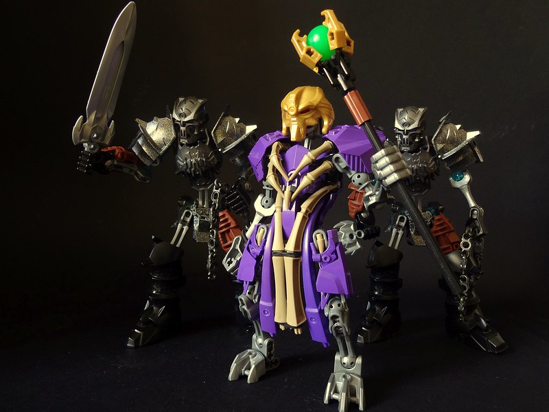
I have been wanting to see the awesome armor pieces from Knight's Kingdom used more. And you have made great use of them indeed.
On the first pic, the skinny neck of the main shaman looking guy is a bit distracting. Not a huge issue, but maybe add a tire pieces there? or is that too cheap a building trick?
Thanks! A tire wouldn't really fit there, since the black color would look out of place. I don't mind the bare neck too much tbh, since he's a skeleton under those robes after all.
-
1
-
-
This actually looks better than a lot of the big edgy things people entered the contest with. I've always been a fan of average sized MOCs since they often have more cohesive designs and I think you did a really good job with Makuta's design here.
Thanks! I'm not a fan of larger MOCs either, mainly because the smaller details get lost in big builds.
Wow this is fantastic. Matooki is so incredibly faahionable and royal looking with that sweet robe and his spooky comrades look like theyre about to drop the hottest evil revolution since gen 1. I love how you gave them some brown flesh like parts!
Thanks! The brown was actually supposed to be a sort of leather armor, but I guess it works as flesh as well xP
-
Thanks everyone!
Very cool, the unique colour scheme with bones and the large amount of detailing on a not so big build are great. I like this one a lot. It's a build that probably wont win but should win.
Thanks. Honestly, I'm not really expecting to win anything, there are a lot of great entries in the contest after all.
-
Well this is unexpected.
An interesting take on Makuta, I like that CCBS robe he's wearing, together with the staff/sceptre gives him a priest vibe - I guess that's what you were aiming for.
The skelebros use Knights Kingdom parts. Nuff said. They're awesome.
Thanks! And yeah, the idea behind the Makuta was to have a sort of necromancer/priest look going on.
-
My entry to the Makuta contest on rebrick, didn't really feel like building a big edgy thing so I went with this instead. Don't forget to check out the Rebrick page.
-
18
-
-
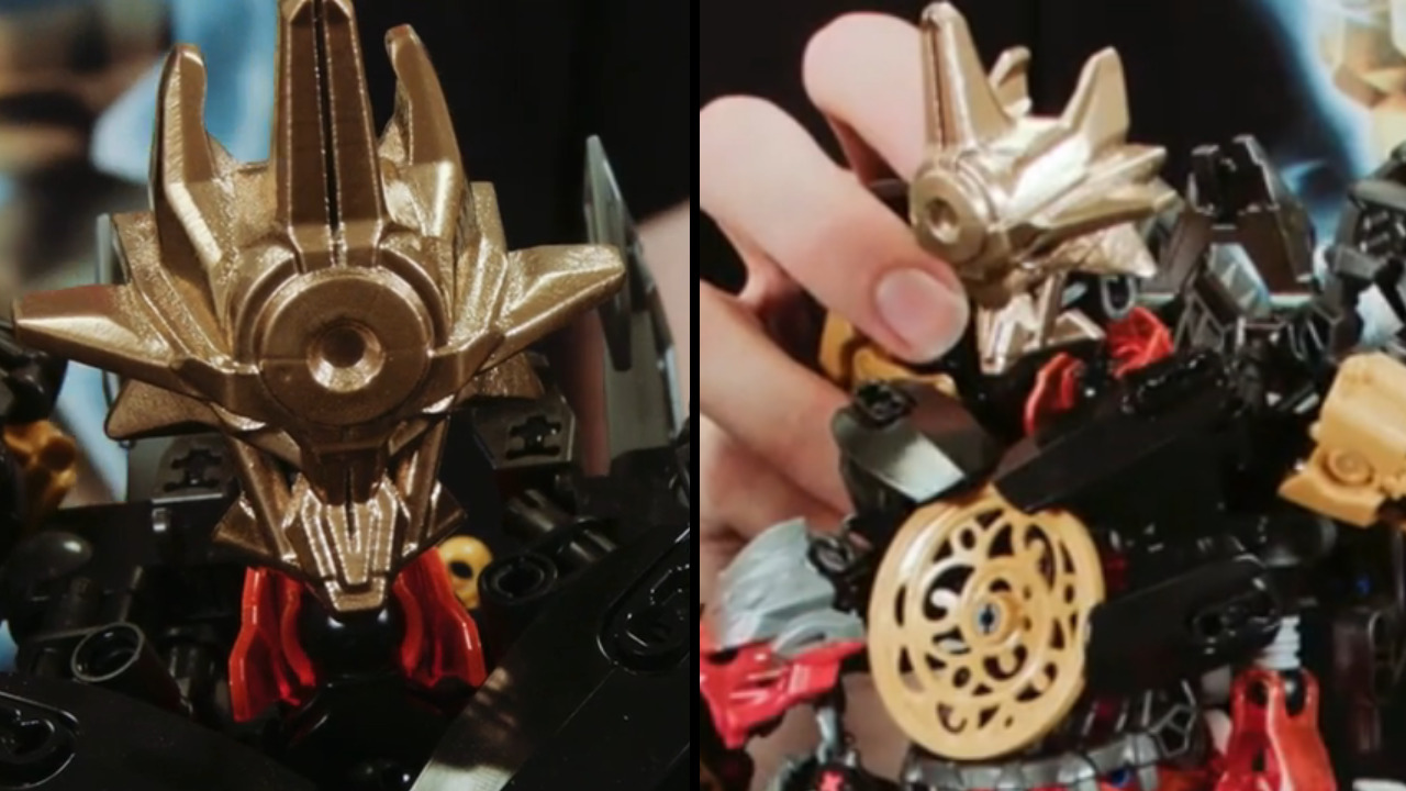
Turns out the mask of shadows in the video is a fake, they 3d print it themselves.

I don't think lego would make it look like an airplane
I wouldn't necessarily call it a fake, since it's alresdy been used in the JtO videos. Considering it's already been 3D-printed, it's most likely a prototype which would've changed a bit with the set release. The decision to cancel Bionicle didn't come overnight, so that's probably why they decided to use the prototype mask along with a combiner model for the JtO videos.
-
Let me first say that I absolutely love how you did the mask of clairvoyance and the mask of growth, they look really good.
I'm not too keen on the mask of emulation, mainly because of the large eye opening and the sheer bulk of the lower part.
As for the mask of rahi control, the front of it is kinda flat, which makes the entire thing look pretty blocky imo. Although I really like all the intricate details going on, especially the area around the scope.
All in all great job, looking forward to seeing more from you! -
Here are some more pictures of the mask I found on tumblr, hope these help for v2.
Many thanks! Any pictures of the mask that people send me are of great help, since that means I have more material to work with, so I truly appreciate all the help!
-
Pretty good, Certainly could've used a lot more polygons, but I get that you wanted to put this out there quickly
Ehh, I wouldn't exactly say the model is low-poly. It might appear that way because shapeways tends to simplify models in previews for easier processing (the printing process is done without simplification though). I can't deny the fact I rushed this a bit, but that's mostly since I'm going on a short vacation and wanted to get the mask done before I leave. I've also purposely made the edges as sharp as they are, since they turn out much rounder than the render during the print process, so I figured there was no need to smooth the really sharp ones (like the spikes). Here's a wireframe view if you'd like to look at the polygons on the original file: https://c1.staticflickr.com/9/8772/28671137605_6c7085d16a_o.png
Thanks though, and I do have plans to release a v2 once I've received feedback from the community about improvements that can be made (and hopefully TLG will give us some better views of the MoUP by then).
-
This looks absolutely amazing, but I would like to know how well it fits on the head before I try to order a couple (black and gold if that second ones an option otherwise I have spray paint).
Do you have any plans to make the g2 mask of time? I think that is the only other thing we are missing.
https://66.media.tumblr.com/9b704115f01d6cc45d25f11f7d04a1d2/tumblr_o694nidm1B1r3r5p7o1_500.jpg
Thank you so much.
Eyy, thanks! I don't think shapeways offers golden models (unless it's actual 14k gold) so you'll probs have to spraypaint. I'd recommend getting the one you plan to modify in white, since that's the cheapest option.
Honestly I completely forgot the mask of time made a canon appearance in G2, so I was planning to do a completely custom version based off the other legendary G2 masks. I might whip up a model of the canon version as well sometime soon.
Sounds good, thanks.
tourmalinex is also making the MOUP, but isn't making a version with a g2 connection because he says the material isn't flexible enough for the connection. Have you encountered this problem with your mask?
It is flexible however there is an issue with the pieces that clip on when trying to make a gen 2 masks and testing it, without reinforcing the clip on parts they might crack and reinforcing it too much might also make it crack. I also just fond this a working clip system , so it seems possible to make them.
If your clip system works I would be open to sharing my gen 1 models with you so that they could be converted into gen 2 masks!
I can't really confirm nor deny whether my design works since it has just been released. I'm not expecting a perfect fit right off the bat, but I'm hoping that it'll at least be able to stay on the g2 heads without problems. The "strong and flexible" materials from shapeways are incredibly durable. Only thing I've tested personally is my custom CCBS torso shell, and even though the version I have is a bit of a tight fit, it works fine and hasn't cracked even a bit. I'll probably have to make some adjustments to the mask later on when the first versions have been printed, but for now I'm optimistic.
-
This looks absolutely amazing, but I would like to know how well it fits on the head before I try to order a couple (black and gold if that second ones an option otherwise I have spray paint).
Do you have any plans to make the g2 mask of time? I think that is the only other thing we are missing.
https://66.media.tumblr.com/9b704115f01d6cc45d25f11f7d04a1d2/tumblr_o694nidm1B1r3r5p7o1_500.jpg
Thank you so much.
Eyy, thanks! I don't think shapeways offers golden models (unless it's actual 14k gold) so you'll probs have to spraypaint. I'd recommend getting the one you plan to modify in white, since that's the cheapest option.
Honestly I completely forgot the mask of time made a canon appearance in G2, so I was planning to do a completely custom version based off the other legendary G2 masks. I might whip up a model of the canon version as well sometime soon.
-
Yes, you read that right. Mask of Ultimate Power.
TLG's way of ending BIONICLE without releasing the MoUP felt wrong, so I decided to fix that. Consider this my way of giving BIONICLE a proper send-off.You can get your own mask here: http://shpws.me/MuFX
-
2
-
-
As always, thanks for the input everybody.
This thing is amazing.
Pros
- Managing to keep the ball folding ability is great
- Definitely captures the bohrok feel as a whole while not using any old pieces except for headplates
- Skull Spider as a brain is clever
Cons
- The silver weapons is a big setoff in contrast to black, but still very minor
Overall: 9.9/10
How about trying for a Tahnok with a blue skull spider brain next (if you think can do it)
Didn't really have a better alternative xP Besides, if the entire thing was black it'd look kinda bland. I'd go for a different element, but unfortunately I don't have bohrok shields in other colors.
That is a incredible moc but i have to ask HOW DO YOU MAKE SUCH CREATION ON CCBS!!!! i mean it looks awesome.
1. Take a piece.
2. Take another piece.
3. Stick 'em together
4. Repeat until MOC is finished

Incredible work, here. I really enjoy the eyes. I do wish, however, that the jaw could be made wider, or that the outer teeth could be turned inward a bit. Something about the angle at which they're positioned vis-à-vis the rest of the face seems off to me.
Oh, and you picked perfect pieces for the handshields.
Ey, thanks. The outer teeth were sort of an afterthought, I figured having tusks would give the otherwise insectoid bohrok a more alien appearance.
-
Thanks everybody.
That's very nice and sleek; just what a hover-ship needs to be. It greatly reminds me of the many vehicles used throughout the WipEout franchise. Did that play as an influencing factor for this creation, CeziuM?
That's very nice and sleek; just what a hover-ship needs to be. It greatly reminds me of the many vehicles used throughout the WipEout franchise. Did that play as an influencing factor for this creation, CeziuM?
Hah, I was going to say that too! Really takes me back to my childhood PS1 days. It's sleek but it has a lot of character, and overall I really like the balance between yellow and purple, with the grey machinery-looking parts helping with the hover-ship aesthetic and the green sticking out quite nicely. Nice job!
I can't say it did. I was going for a sort of alien/punk racer look and ended up with this, didn't really draw inspiration from anything specific.

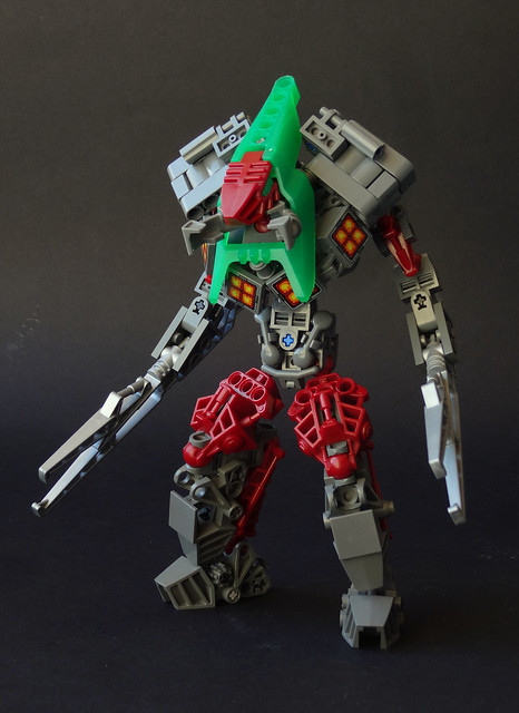
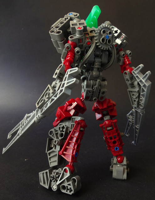
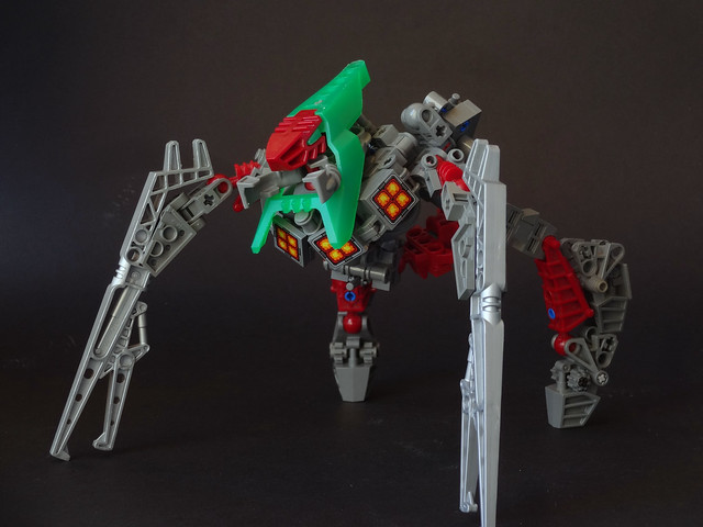
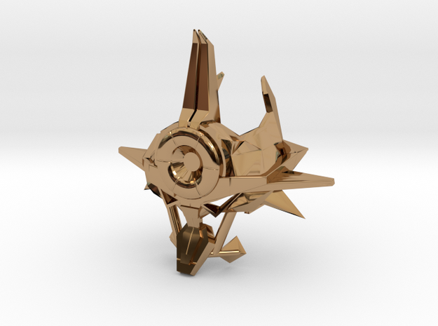
Movorak
in Bionicle-Based Creations
Posted
A reimagining of the prototype Visorak as a part of a collab. Click the image to be taken to the Flickr post, where the other builds are linked.