


aneroth
-
Posts
25 -
Joined
-
Last visited
Content Type
Profiles
Forums
Gallery
Events
Blogs
Store
Raffles
Posts posted by aneroth
-
-
I've got to say that this is quite an amazing piece of artwork. I can see your ability written all over it. And I can also see your potential as a successful artist. Personally, what aneroth said seemed a bit harsh to me, but I do partially agree with a few things he said. However, I wouldn't really emphasize them as highly as him. I must agree that the proportions and perspective are a little bit off at times. Not to the degree that they're very noticeable, but viewing them with scrutiny outlines a few disproportions. There are also a few parts that do seem a bit 2-Dimentional as aneroth already stated, but I do think that, for the most part, the piece is pretty 3-D in nature. One piece of criticism that no one has stated yet (as far as I know) is the white outline behind each of the Toa. I understand it’s because of the lighting, but I think deemphasizing the outline a little would help the piece overall. Besides that, I only have praise for your drawing. The background is simply amazing, the characters are beautifully drawn, and the whole piece blends together to create an amazing piece of artwork. Yes, I said amazing two times in a sentence. I just simply can’t adore this piece enough! Keep up the wonderful work you're doing and keep drawing us such intricate pictures!
-Rez
You are being fooled by the great coloring. the figures are flat. it is merely the amount of shading on it that makes certain parts appear 3-Dimensional.
I felt like adding to my previous edit. Link so as to not waste this post.
I am not wrong with what I say, even if You like the piece or find me unpleasant.
I mean no harm in my words, I only come across as I do because I have seen vezok's work for years. Similar trends appeared and have stayed for a lack of taking critism / learning / applying the basics to his work.
I merely point out what I see and how to improve it.
I will admit the shading is good. As I have said it does hide many flaws.
But the fact remains the lineart of the piece. the figures alone. No shading. Are very wrong.
I have isolated one of the figures linearts to properly show how flawed it is
There is a general lack of direction and orientation from the lines at play.
This should all become obvious when the line art stands by itself without the color.
-
Considering it was done in MS paint, its understandable.Speaking of which how did you that? Is it like some sort of program?And yeah, the fighting stance could have been done a lot better, I will admit it, but I will try to make a new version of that with the information you have given me so I thank you for that.
I use photoshop and my mouse. nothing more special than that.
I am familiar with paint though, and its abilities. It takes time to make good art in it, but it does not mean it is impossible by any means.
Keep at it though, Fixing mistakes now will make you better in the future.
-
We have been over this before. I see things in your art that have become bad habits.
I got tired of scribbling on this, cause honestly i'd be here mainly all day. Things go from 3D to 2D with no rhyme or reason. Nothing is kept with proper alignments. armor designs get forgotten because of that trend. Look, We both know you have skill. A great amount of skill. But you choose to rush the beginning processes and it results in a work that looks good but is inherently nothing but flaws. Your color does do a great deal to hide flaws in this piece. Most eyes wont see them. But my eyes do. You drew the entire thing mainly as a complete 2-Dimensional set. you did not consider or did not care about actually designing anything here as though it was 3-dimensional, and it shows. because of this your figures remain flat and carboard like. as i said already things are not drawn properly because of the trend. and if anyone pays attention it looks as though all the figures are connected. there is no depth. nothing to seperate them. in fact your very feild of view shows us that this is a 2d drawing set in a 3d world in need of help. all the feet are flat, but the ground has perspective. This shows the great flaw of the piece. One that results in the whole thing needed redrawn and no amount of corrections would help it.
-
This sums up my thoughts
There is a great deal wrong with the initial body design. and from there stems more problems than i can shake a stick at.
try to focus on improving basic things and then the rest shall fall better into place.
-
so some things.
-lights on the head are no where near symetrical.
-centerlines are slightly off resulting in...
-misplaced/mishaped body
-certain areas do need a 3-dimensional look
Now where the sketchy style can be good, these drawings of yours are too sketchy to make out much of anything, thus it makes it very hard to help with corrections. I do see talent here, but it is talent that needs some restraint and some patience to make good things happen. And I also note that you know something about photoshop, which ultimately raises my expectations of what you can do. If you can edit in a background like that, you can also clean up your art to match it.
All I can say for now. Keep at it.
-
I'm absolutely certain they will. Thanks [a bunch!] for taking the time to review my work, it's really not every day that I get such an indepth critique, and I'm definitely going to use them in future works. Again, I can't thank you enough for taking the time to do this.
It is what I do. So do not even mention it.
-
You are now a cartoon drawing of an Elven Biomancer.
Have fun with that.
I wish for 1 million dollars.
-
-
I would giev you c&c but there is not much to say
the chibi's proportions seem fine enough and the coloring is good as well.
About all I can say is keep it up.
-
Cute picture, wonderful shading.
all minor errors I will let slide this time.
but i am sure you know the knees are the problem anyways
Wonderful work though
Keep it up.
-
I see some nice art.poses could use some creativity but its all goodand away I go
The Queen of Spiders
in General Art
Posted
I know it has already been said but what the hey, I will say it with a picture
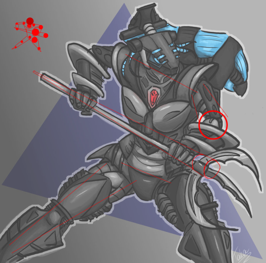
Little stickman there sums it up nicely, just add more emphasis on the closer arm and it would look nicer.
Not that is doesn't look nice.