

Ballom Nom Nom
-
Posts
4,667 -
Joined
-
Last visited
-
Days Won
2
Content Type
Profiles
Forums
Gallery
Events
Blogs
Store
Raffles
Posts posted by Ballom Nom Nom
-
-
Um ... hasn't Black Six confirmed that Destiny Fulfilled isn't actually the final title? That would make this topic kinda moot...
-
Thanks for that long insightful post, GSR. As someone who's never joined any social media beyond parts of Flickr's Lego segment (and maybe that counts after a fashion), I didn't really have any idea how social media was affecting forums like BZP, and I really appreciate the extra insight you gave there.
Would recruiting more staff be something that would help, in your opinion? You mention the skillsets of current staff as seeming to be a limiting factor.
Alice and Bob as placeholder names? We've found the computer scientist!If Alice is posting less, her friend Bob is gonna be less inclined to post, and if neither of them are around Charlie might wander off... you see what I mean.
-
 1
1
-
-
After all those years on the job, the staff needed something to slim down those spare tires, eh?Also keep in mind that the staff structure recently changed to eliminate forum assignments, making the staff thinner and more efficient.
I actually hadn't realized that the staff was so small now. I suppose all of the retirements slowly added up, and there haven't been any new staff additions in a while. Still, I wouldn't worry; our revered IPB Admin can handle anything.
-
I think the abundance of new slopes and other smooth pieces make them look much more streamlined and cool (especially apparent when comparing the TIE fighter iterations), but I'm still very partial to the two older ones I own, the AT-ST and the Imperial Class Star Destroyer.
-
Happy birthday, BZPower! Here's to many more!
-
A bit odd to have a poll with so few options.
I went with 2015, due to the nostalgia of the return of the Toa and Matoran-like sets.
-
1
-
-
I still await the triumphant rise of spinsmile as the one spinny to rule them all. Perhaps the 20 year anniversary is a more appropriate time for this momentous occasion.

-
6
-
-
Saw these a few days ago on Flickr and was really impressed. The quality of these just keeps going up!
My favorite of this batch is that toothy Kulta mask. It's just begging to be used in a Gen 2 styled Piraka!
-
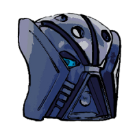
I recognize that the conceit of the story had the Great Spirit Robot come first, but I still prefer the story without it. The way it was done seemed ham-fisted and unnecessary to me.G1 doesn't really feel right to me without Mata Nui being a giant robot. I mean, that was literally the one thing the writers based the entire story around.
Hm? Oh, the MoC. I like it! The head proportion is a bit wonky and the legs need a bit of work, but the torso is incredibly inventive, and you use the 2006 Kanohi in really cool ways.
I do admit that the legs are a bit lacking, yes. I somewhat rushed them at the last minute because I wanted to be done with the MOC.
The Olmaks aren't supposed to be the shoulder still, but armor on top of them. If you look at where the shoulder joints are, his shoulder width isn't as gargantuan.The head seems really disproportionate with the body, especially the shoulders. Also, those hips are... Peculiar. I don't think I've seen front leg muscles bulge before.
Nicely done, anyways. It seems I'm gonna lose this contest for sure.

Those aren't bulging front leg muscles; they're bulging thigh armor. He is in full armor after all.
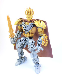
That was far from my intention, but I'll nod sagely here and pretend I make decisions like that.I like it a lot. He looks really kingly. I also like how you used both of the 2006 Titan Kanohi to imply power. A great design choice.
Eh, I though the crown fit in well among the projections at the Mask of Creation's top. It also makes the head a bit more proportionate to the body.I'm iffy on the post Bionicle pieces, but I guess beyond the mask they all fit in with original Bionicle. I like the colour scheme and the way you divided up the gold and silver with a brown cape. The crown seems redundant, but the use of exo force arms on the shield and torso are downright inspiring. I reckon you have a bery good shot at winning the competition.
I appreciate the sentiments about the contest, but alas, this entry was annihilated in the first poll. Oh well.
I had envisioned the shield as having a small core due to being used for a larger energy shield of magical-ness or something, but a buckler definitely fits in much better with the knightly air he has. I think I'll go with that then.Love how you used exo-force torso's as base for the fingers. That's really clever! The buckler is also cleverly made, having horns form the outer ring, an Atlantis triangle forming the base, it's really nice!
He also gives me Knight's Kingdom vibes, you know with the cape 'n crown 'n all. Guess it's not the theme of the contest, but nostalgic nevertheless.
I was definitely thinking of knights when I made him, so evoking the Knights Kingdom theme means I managed to succeed there. Hooray!
Is that a good sort of interesting or a bad sort of interesting?An interesting reimagining of Ekimu to be sure.
Thanks for the replies, all!
-
Self-voted for Ekimu. That Manas is going to dominate the poll, though. As it should! It's a great entry.
-
The beach attack has a lot going for it, with a bunch of creative designs that evoke Gen 1, so it got my vote.
-
Numbers two and eight are definitely the top choices here. Of those that pair, I went with 8.
-
-
The ancient deity Ekimu, revered by the Matoran as their creator, though his name has long been lost to history, and the Matoran know him only by his title. For countless millennia Ekimu remained withdrawn from the dimensions of mortal perception, invisibly guiding the universe. When the treachery of Makuta cast him into slumber, and later into death, only the energies of the Mask of Life could reach him in his distant abode. With his resurrection by the Toa Mahri and subsequent awakening by the Toa Nuva, Ekimu has returned in splendor to aright his mistakes. Wielding the very powers of Creation, he prepares to strike down Makuta once and for all in the ultimate duel...
There have been a lot of Gen 1 characters in Gen 2 style, but what about the reverse?
In fitting with the theme of BBCC 73, Ekimu uses only four pieces from Hero Factory / Bionicle Gen 2: the mask, a piece of unity, and the two HF feet; and I'd consider the former two to be about as detailed as Gen 1 pieces anyway. I also made sure to use some of the most characteristically large and over-detailed Gen 1 pieces, such as the Olmak (everyone's favorite mask amirite?).
The above intro is also basically my headcanon of how Bionicle Gen 1 ended. No Bara Magna, no giant robots.-
5
-
-
I still feel like it's such a shame that archive got deleted. The archive was a look into a better time for BZPower.
Part of me is kind of glad its gone because it means I'll never have to see any of the cringy stuff I may have done back then ever again. :v
Don't worry, the Wayback Machine should have saved most of your cringeworthy material anyway!
-
Hm, what's the most obviously old-school MOC that one can make? One with a shelf chest? Maybe a riotflea? Hard to say...
~B~
-
Some pretty weird looking anatomy on this guy, I have to say. Still, from the front he still looks pretty decent. I'm glad that those heads seem to work alright, and don't have issues with the weight on the face (given they connect just like the other new masks with only friction).
It's too bad to get some dark blue shells we need to buy such a big set too. I'll definitely BrickLink those if I want any of them.
~B~
-
I had to go with #4, Nitrui, for this one. A MOC that was later reincarnated as Vegeta on Flickr is pretty hard to beat. Who knows, maybe it will get over 9,000 votes?
~B~
-
Naturally, since there are check boxes and not radio buttons, we have trolls picking all ages. Ah well.
I'm currently 21, although like half the time I somehow feel a couple years older. Maybe I should see a doctor about that.
~B~
-
I'm a bit disappointed that the launcher was shoehorned onto the ion cannon; it looks a lot less interesting as a result. Rather than it properly tapering to a tip it's instead a sphere with a rectangular part jutting out.
~B~
-
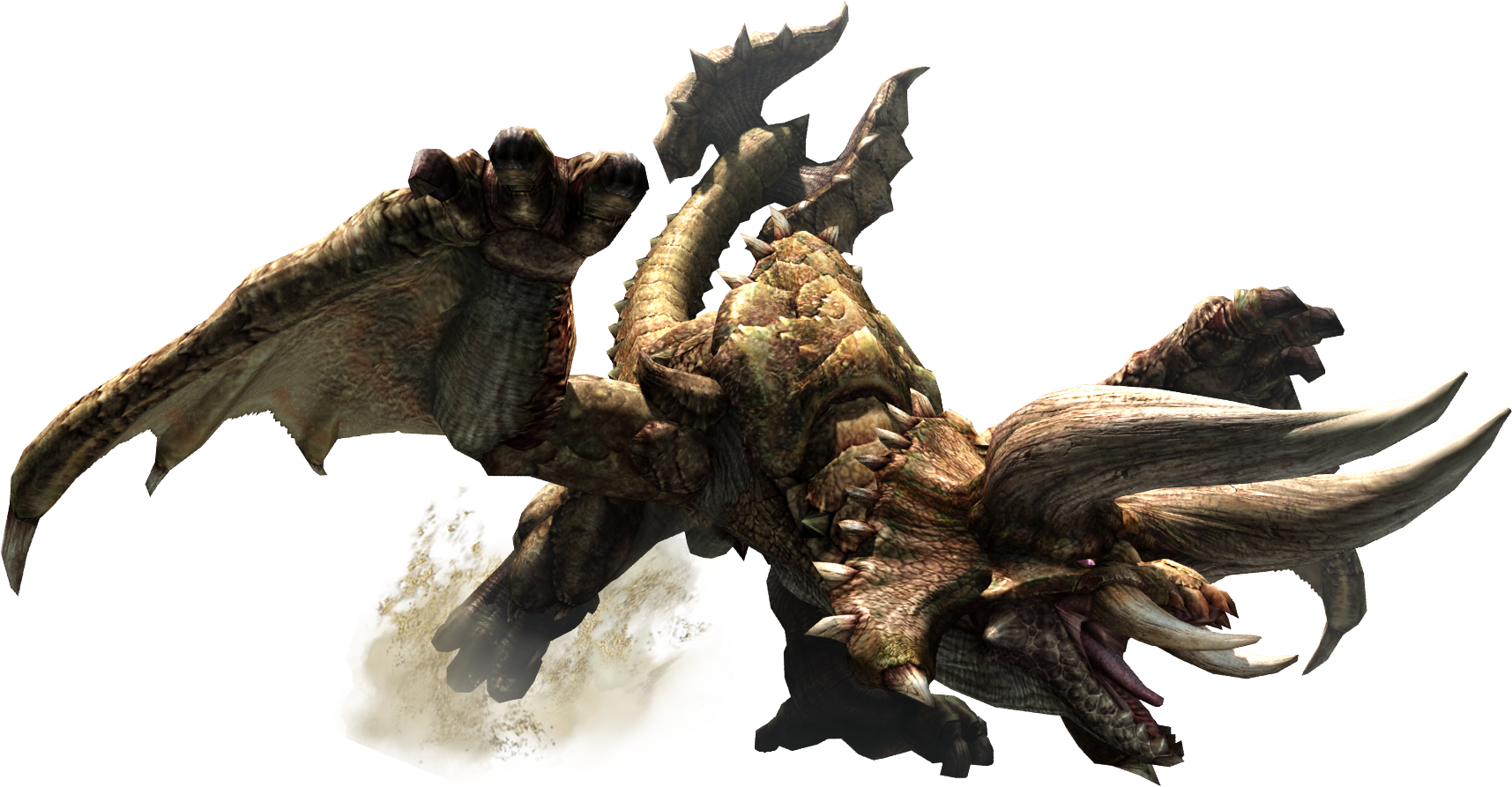
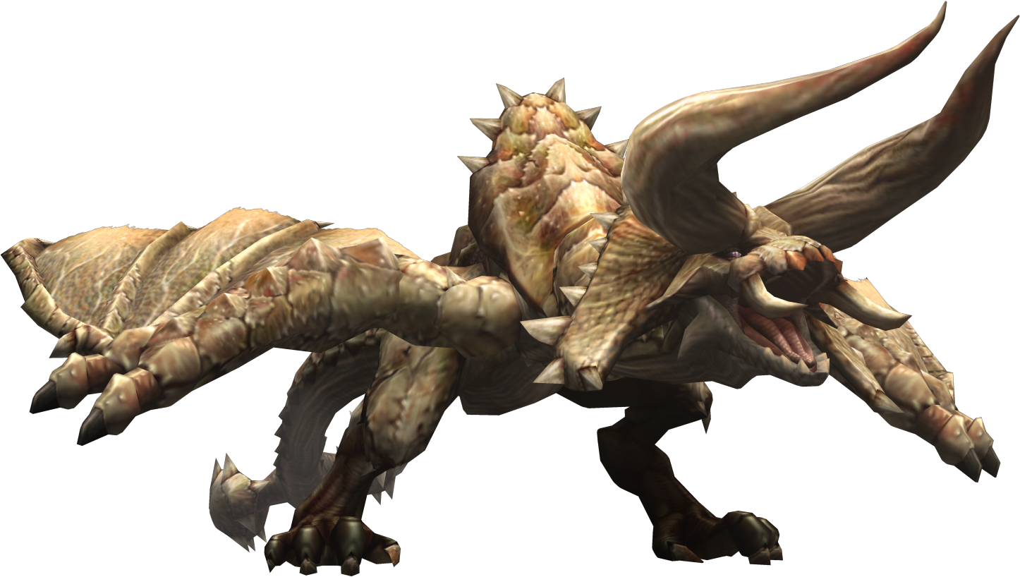
I actually thought his eyes worked out to look quite similar to the actual creature's eyes. As you can see here, the eyes are located under the horns near the snout, and they are quite small. The MOC has them in the right place, right color, and approximately the right size. In what way specifically do you think the eyes can improved?I like that he has a primarily tan colour scheme, and I do love the wings and leg's and just about everything is good.
His eyes look like the could be much better though.
Thanks for the comment! With respect to his colors, the image I linked to is artwork depicting it as considerably darker than Diablos actually is. Here's a render of Diablos from one of the older games which better shows its coloration and how it's close to Lego's tan.Looking pretty bestial here, in a good way. My one complaint is that the MOC looks a bit too bright, especially compared to the reference image, and upon first sight. Adding in some more dark tan and other darker colors could make him not look as hard on the eyes. Nevertheless. A fine MOC.
~B~
-
The return of Exo-Force, since the original run made liberal use of Bionicle and Technic pieces.
C'mon Lego, make it happen!
~B~
-
4
-
-
I have yet to successfully hunt a Diablos, but this Moc is spot-on. Your usage of pieces is fantastic and highly accurate. The highly detailed Bionicle parts combined with sleeker CCBS parts work very well and captures its bony, rugged, deserty feel extremely well. Also, it looks like it might be a good size for some Monster Hunter minifigs to fight...
I'd even bet a Deviljho would give this MOC a 10/10, which is what I also give it.
Thanks for the comment! I'm definitely am glad both Bionicle and CCBS sets have had liberal amounts of tan overall, or else I certainly wouldn't have been able to make a MOC of this size with tan. And some of the Bionicle/Technic pieces worked out extremely well, such as the clawed Piraka foot for its wing fingers and the Roborider skulls on the tailcase.
It's hard to say what a Deviljho would rate this, however, since I bet with his tiny arms using a keyboard would be a real struggle.
I've already faved this on Flickr, but that's no reason not to comment on its awesomeness again. This thing is phenomenal. One of the top ten MOCs I've ever seen, I'd say.
In that case I think you need to see more MOCs.
But seriously, thanks!~B~
-
Tear 'em apart and make things out of their parts!
~B~
-
2
-
Eyday 2016
in General Discussion
Posted
Happy birthday! Enjoy being old.