


Reznas
-
Posts
1,314 -
Joined
-
Last visited
Content Type
Profiles
Forums
Gallery
Events
Blogs
Store
Raffles
Posts posted by Reznas
-
-
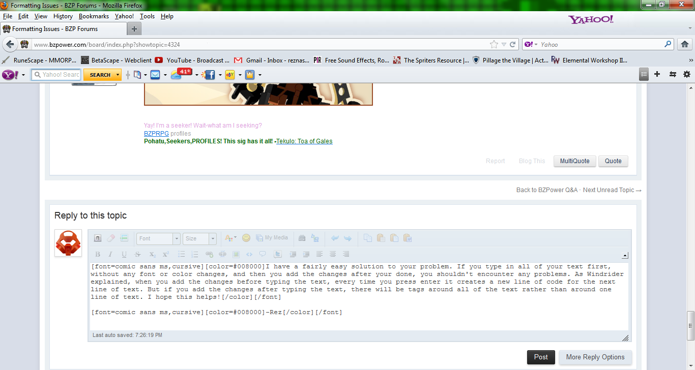
I have a fairly easy solution to your problem. If you type in all of your text first, without any font or color changes, and then you add the changes after you're done, you shouldn't encounter any problems. As Windrider explained, when you add the changes before typing the text, every time you press enter it creates a new line of code for the next line of text. But if you add the changes after typing the text, there will be tags around all of the text rather than around one line of text. Here is a screenshot demonstrating what this will do to the code (For part of this post).I hope this helps!-Rez
-
Nah, it's alright man. I can see that you a bit of help making a banner. Go ahead and PM me, and I can help you out.Hi. I hope my breaking Rule #2 isn't a problem here, but I'm not sure exactly what I want. I'd like a banner for my stories, and would like some advice. I'm not sure where else to post this or who to PM, and I think you guys could come up with something I like if I can find out what that is. I understand if you're busy or will ignore this because it isn't a work request sheet, but I'd appreciate it if someone could chat with me a little and help me come up with an idea.
 -Rez
-Rez
-
Yeah, Toa of Dancing is right Velox. It is all one entry. The question is asking whether I can post a certain question in the contest, which is confusing, but that's why I did it.
Only one entry per day. Please choose one and re-post it; the others you can post tomorrow and Saturday, respectively.Member Name: Reznas NuvaAnswer/Entry Category: 1Entry Question: "I heard there was this thing called the BZP Q&A Contest going on right now. I decided to join, but I'm not sure if this entry is allowed:Member Name: Reznas NuvaAnswer/Entry Category: 1Entry Question: 'I heard there was this thing called the BZP Q&A Contest going on right now. I decided to join, but I'm not sure if this entry is allowed:Member Name: Reznas NuvaAnswer/Entry Category: 1Entry Question: 'Cookiez!'"-Rez

 -Rez
-Rez
-
Member Name: Reznas NuvaAnswer/Entry Category: 1Entry Question: "I heard there was this thing called the BZP Q&A Contest going on right now. I decided to join, but I'm not sure if this entry is allowed:Member Name: Reznas NuvaAnswer/Entry Category: 1Entry Question: 'I heard there was this thing called the BZP Q&A Contest going on right now. I decided to join, but I'm not sure if this entry is allowed:Member Name: Reznas NuvaAnswer/Entry Category: 1Entry Question: 'Cookiez!'"-Rez
-
Member Name: Reznas NuvaAnswer/Entry Category: 1Entry Question: "Can we post pictures of ponies disguised as Bionicles? I'm not sure if that's Bionicle related, so I wanted to make sure. Thanks in advance!" (Yes, I included ponies. I just had to make fun of them, sorry guys.
)-Rez -
Okay guys, I made a new guide. This time it's on outlined text and speech bubbles:http-~~-//vimeo.com/39540787Also, here are the steps for the outline text script:1. Copy and paste this code into a notepad document:
(define (script-fu-outline-text-logo-alpha img text-layer glow) (let* ( (font-size (car (gimp-text-layer-get-font-size text-layer))) (grow (if (= glow TRUE) (/ font-size 3) (/ font-size 5))) (feather font-size) (new-layer 0) ) (gimp-image-undo-group-start img) (set! new-layer (car (gimp-layer-copy text-layer TRUE))) (gimp-image-add-layer img new-layer -1) (gimp-layer-resize-to-image-size text-layer) (gimp-selection-layer-alpha text-layer) (gimp-selection-grow img grow) (if (= glow TRUE) (gimp-selection-feather img feather) ) (gimp-edit-fill text-layer BACKGROUND-FILL) (gimp-selection-none img) (gimp-image-merge-down img new-layer 0) (gimp-image-undo-group-end img) (gimp-displays-flush) ))(script-fu-register "script-fu-outline-text-logo-alpha" _"Add Text Outline..." _"Add an outline to text characters using the background color" "" "" "June 2009" "" SF-IMAGE "Image" 0 SF-DRAWABLE "Drawable" 0 SF-TOGGLE _"Glowing Outline" FALSE)(script-fu-menu-register "script-fu-outline-text-logo-alpha" "<Image>/Filters/Alpha to Logo")
2. Save the file in C://Program Files/GIMP-2.0/share/gimp/2.0/scripts. Make sure you save it as an .scm file. So the name should be something like "outline_text.scm".3. If you saved the file while Gimp was open, then go to Filters/Script-Fu/Refresh Scripts and the option to add outline text should be under Filters/Alpha to Logo.Hope this helped guys! Enjoy!-Rez
-
Officially approved by bonesiii.Hey guys! It's been months since we had the GIMP Help Topic up. In fact, it's been over a year! But, fortunately, it's now back up. Here you can ask questions about GIMP, discuss about GIMP, and post guides about GIMP. It's a win, win, win, right? So, I have made a beginners guide for GIMP in video format right here (Turn down your volume a bit, because my voice breaks up a bit in the first 30 seconds. Also make sure to click fullscreen.):http-~~-//vimeo.com/39339333Here is the script to the part that breaks up:GIMP is a photo-editing program and it’s a lot like Photoshop, except the only differences are that it’s free compared to Photoshop’s price, which is about $700 currently for the newest CS5. And the other difference is that Photoshop is definitely more professional. GIMP can do a lot of things that Photoshop can, but it will probably take a lot more steps generally.Here is a little bit about layers and paint brushes that I couldn't fit into the first video:http-~~-//vimeo.com/39475771Soon I will create more guides for you explaining different things about GIMP. If you have a specific thing you want me to make a guide about, please PM me telling me what you want or post the question here in the topic, of course.Guides:Outlined Text and Speech Bubbles - Steps to making an Outline Text ScriptFlame TextSo, post your questions, thoughts, and answers here guys! I hope I can be of help to you!-Rez
-
Okay, Lord Ghirahim, here is your banner (Pohuaki made this by the way. Give credit to the shop for this.):
 And Triggons, here is your banner and avatar:
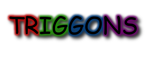 ____________________________________________________________________________________
 Notify me if you need any changes. Enjoy! -Rez
 -
I'll get this one done after I finish Triggons' banner.Image Type & Dimensions: PNG, I suppose; the same dimensions as the Sundown image would work (note that I don't have to fit this in my current signature, but it would be nice if it could fit)Exact Text: INFECTICIDE in letters dripping green slime (or as close as you can get, of course)Describe What You Want: Splitface, or at least his upper body and head (http://hf.biosector0...Sigma_Sigma.png), in this mysterious forest (http://www.antipixel...est_day1_lg.jpg).
-Rez
-
No problem. When you say you want it a bit wider, is that a must? Because it was fairly hard to get it how I did. If I need to, I can. It's my job afterall.Thanks, that's brilliant! :)Although as a want (and to make it wider) you could have the sides of him kind of fading into the blackness, then have the writing kind of to his left and right and below him rather than overlapping. Although I don't know much about this kind of thing, so that might be harder than it sounds.As it is, though, is great
 EDIT: In fact, could you downsize it a bit? It's a little too big to fit in my signature. Also, I made a smaller version of it for you. It's not 275x275. Is that suitable for you? Here it is:
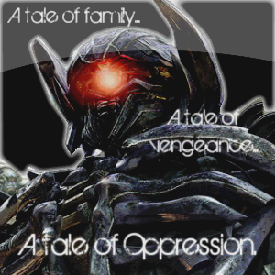 Enjoy! -Rez
-
However, the filesize of avatars can easily be decreased without the loss of much quality. And most avatars don't go over 15-20Kb at max, so I find that a 85-90Kb banner is an okay size. I see what you mean though. Thanks for the suggestion and as always, thank you for your feedback!
But if you want a good-quality avatar (which is somewhere around 12 pixels for me) then the 90 KB kind of kills it. Just a suggestion though.
Actually, the file size is just fine. They all are around 90Kb, which is perfect unless you have an avatar above 10Kb. And I see what you mean by the bordering, but I think it looks kind of nice without it. Yeah, Tahu is kind of pixelated. I didn't do as well on this banner as on the next ones. Also, I kind of want to make separate topics because they all are a bit different, and I want to get separate feedback on each one. Thanks for the feedback!Yikes, the file size in these are huge. I'd suggest shrinking the image. Also bordering it.The text is really nice, I like the effect on it. That font is a good one. Perhaps make it a little more visible?One last thing is that Tahu looks a little pixelated. That's probably because the text is right on him, so maybe you could try moving it somewhere else.And finally, if you're going to make anymore, I suggest making one topic and putting all your banners in it instead of making individual topics for each of them.
-Rez
Thanks man! Yeah, I totally agree with you on the text. I really messed up on the visibility and it was my first try, so I messed up on the "F".I really like the banner, but in my opinion, the text could be slightly easier to read. I could make out "flame" fine, but the f is blurry on the bottom.
However, on my next few banners, the text is way more visible, so thank you for the suggestion. Thanks for the feedback! -Rez
-
Okay, it's finished.I look forward to it :)Good timing too, I actually just posted a new chapter of my epic [/shamelessadvertising]
I'm sorry it's not the 500x200 you requested, but since the image of Shockwave cuts off the sides of some of him, putting him in a different image would make him look a bit odd. I hope this works:Is it okay? It's about 88Kb, so be aware of that. If you need any changes please notify me. Enjoy! -Rez
-
Thanks! I did make him much more visible this time. On Tahu, what happened, was I merged the text with the lava background (Not the one Tahu is on) and when I lowered the opacity, it made the text less visible as well, so I didn't want the text to be hard to read, but I didn't want Tahu not to visible as well, so it was a bit difficult. But on this one, did the background effects and such before I added the text, so it's much more visible. Thanks for the feedback!Very nice job. Lewa is a LOT more visible than Tahu was.
Thanks man! I always appreciate you guys feedback!It looks great. Lewa is really clear to see. Great work on it!
-Rez
-
Actually, the file size is just fine. They all are around 90Kb, which is perfect unless you have an avatar above 10Kb. And I see what you mean by the bordering, but I think it looks kind of nice without it. Yeah, Tahu is kind of pixelated. I didn't do as well on this banner as on the next ones. Also, I kind of want to make separate topics because they all are a bit different, and I want to get separate feedback on each one. Thanks for the feedback!Yikes, the file size in these are huge. I'd suggest shrinking the image. Also bordering it.The text is really nice, I like the effect on it. That font is a good one. Perhaps make it a little more visible?One last thing is that Tahu looks a little pixelated. That's probably because the text is right on him, so maybe you could try moving it somewhere else.And finally, if you're going to make anymore, I suggest making one topic and putting all your banners in it instead of making individual topics for each of them.
-Rez
-
Thanks man! You think Gali should stick out more? Hmm, okay. Well, I think it looks fine, but, I can see what you mean. Thanks again for the feedback!dang that is good. I will say when i look at it i get a dark feeling from it with the color of the water you chose and how the water stands out more than gali actually does. When I look at the word water on it i see a kinda of puzzle look with the way you did the letters.My only suggestion is maybe have gali stick out a little more.overall i give it a 4/5
-Rez
-
Okay, so I got to making a third banner in this series, and this time, it's of Lewa:
 I'm pretty happy with the outcome of this banner. If you would like to use it, credit isn't required, but appreciated.Comments and Constructive Criticism are appreciated as well. -Rez
 -
Thanks! And as for the black, I find it to be a nice addition to the text. You see, the original text was a dark blue and if I didn't have any black behind it, it would blend in with the background. Thanks again for the feedback!It's great that Gali is really visible but there's a bit of unnecessary black on the word water. It's a great improvement!
-Rez
-
Well, it's been like 1-2 hours since my last artwork. But I was bored, so I made yet another banner. I think I'll do all of the Toa Mata and Toa Nuva. But, back on topic, here it is:
 I think I did better on this one than my previous banner. As you can see, Gali is fairly visible in this banner. If you want to use it, credit isn't necessary, but appreciated.Comments and Constructive Criticism are appreciated as well. -Rez
 -
Well, it sort of does. But it's obvious what it actually says. And I agree he could be visible, but you can still make him out fairly well. I'll work on that on my next banner though. Thanks for taking the time to give me feedback!The word flame looks a bit like "elame." Tahu should also be more visible since he's the one to focus on.
-Rez
-
Thanks! Hmm, really? I can see him find to be honest. I, however, made the banner, so maybe it's just me. If I ever make another banner like this, I'll be sure to make the character more visible. Thanks again for the feedback!It looks awesome, but you could probably make Tahu Nuva a bit more visible, I had to press my face against the screen before I could recognise him. XD
-Rez
-
Yes, you are right indeed. He is Windrider. And actually, I never revealed who the murderer was. I just decided to leave you guys in suspense.I got to reading this on my computer, so I could read the text. And the Miru dude is -Windrider-?!But who did it?
-Rez
-
Hey guys! I haven't posted here in General Art for awhile, but I was messing around on GIMP (Making Flame Text) and came up with this:
 If you want to use it, no credit is required. However, it would be nice if you did. It's about 90Kb, so keep that in mind. Comments and Constructive Criticism are appreciated! -Rez
 -
Wotsiznaim, expect your banner soon.
I'll get this done after I do Wotsiznaim's banner.Image Type & Dimensions: PNG, any size that works
Exact Text: Triggons
Describe What You Want: A banner with the word "Triggons" in chrome, black text and an avatar with the letter "T" also in chrome, black text
Thanks!
Okay, that's quite alright. I forget to reply to things all the time.@Reznas: Sorry I didn't reply earlier, thought I had. The banner's fine as it is, those were wants, not musts.
-Rez
-
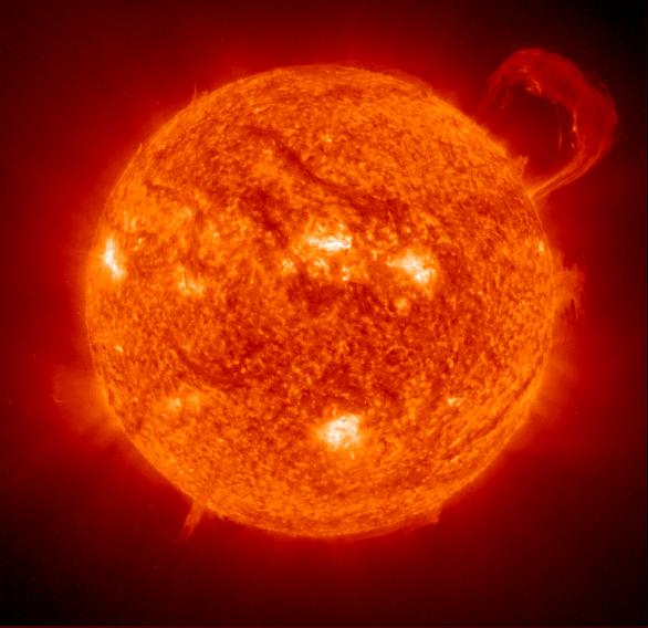
Okay, Pohuaki gave me this:Image Type & Dimensions: PNG, a size that would fit snugly with my Makuta Hunt banner (I'm sorry, I'm clueless about pixels).Exact Text: SUNDOWNDescribe What You Want: A background of http://photojournal....3149_modest.jpg, with the text in fiery letters (without blending into the sun, of course). Possibly the intensity of the sun should be faded slightly to fit with the story it will advertise.Thanks for your work!
 If you use it, give credit to him. Let me know if you need any changes. Enjoy!
Um, just a question, does the Shelek have to be bigger? Because I would have to make a completely new banner to enlarge it. I'm not a professional, so it's kind of difficult to make those kind of changes. But if you would like me to do that, I can do it. It is my job after all.Thanks!Could you just make the Shelek a bit bigger?And, if you can (although it's not a must) could you get an image of one looking forward? (I don't mind if there are eyes behind it)
-RezEDIT: Oh, and Wotsiznaim, I'll have your banner soon.
Official Gimp Help Topic
in General Art
Posted
Okay guys, I have made a new guide, and this time it's on flame text:http-~~-//vimeo.com/40243295So, if you have any questions, don't hesitate to ask! Thanks again to Pohuaki, as he originally told me these directions.Enjoy!-Rez