


Reznas
-
Posts
1,314 -
Joined
-
Last visited
Content Type
Profiles
Forums
Gallery
Events
Blogs
Store
Raffles
Posts posted by Reznas
-
-
I apologize for the wait. I'll get it done as soon as possible. I've been very busy lately.It's been a week, and I was just wondering how my banner's coming along.
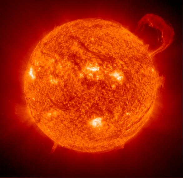
I'll get this done after I finish my first request.-RezImage Type & Dimensions: PNG, a size that would fit snugly with my Makuta Hunt banner (I'm sorry, I'm clueless about pixels).Exact Text: SUNDOWNDescribe What You Want: A background of http://photojournal....3149_modest.jpg, with the text in fiery letters (without blending into the sun, of course). Possibly the intensity of the sun should be faded slightly to fit with the story it will advertise.Thanks for your work!

-
Dibs on this one. I'll get it done soon.-RezImage Type & Dimensions: PNG, 500x200.Exact Text: DARK MIRROR PART IDescribe What You Want: A Shelek, Chirox-style, on a background similar to that of the Shadows banner, with 'DARK MIRROR' written in a sleek, modern font and PART I written below it on the right-hand side, but much smaller.Thanks in advance!
-
If BZP had a like button for posts, I would totally like this one.
Unfortunately for you, of our many fears, blackmail is not one of them.Staff members revealing their phobias? ... Welp, I guess it's blackmail time.Oh whoops did I say it loud.
 Anyways, I think it's quite interesting that the staff are doing this. Some of their names are quite hysterical. May I ask, what is "sinophobia" exactly? -Rez
-
Thanks! Yeah, it's all right. I wasn't expecting to get a lot of votes anyways. I just did it to have a fun experience. Of course, I wouldn't mind winning.This one was a pretty decent mystery. It had a very professional police feel to it and that made for a fun story to follow. This one didn't end up getting my vote (but, hey, don't worry your entry still has more votes than mine. XD), but it's still a nice comic. Glad to see some sprite comics in the contest, and good luck. ^^
Thanks again for the feedback!-Rez
-
I agree with you that hand-drawn comics can take longer. In fact, most of the time they do. I was mainly commenting on the fact that some people were saying that sprite comics are easier to make than hand-drawn comics.
*raises hand* I now decide to jump into that discussion!First off: I suck at spriting. It never worked for me, so I've always preferred traditional media..So yes, spriting is an awful lot of work if you want to get it right. You're right with that.But I still think that hand-drawn comics take a tad longer to make. Why? Because the higher you want the level of detail to be, the more time you'll have to invest. And it can be an awful lot of time, with imagining, then pencilling, inking, and maybe colouring. When working with traditional media, you can't really use anything pre-made. So it takes looong.... just my opinion.Before you start saying that making hand-drawn comics are more difficult than sprite comics, you need to make your own successful sprite comics yourself. It took a lot of work for us to get where we are. Making sprite comics isn't as easy as it seems.

Yeah, I'm pretty sure it will too. I just feel it shouldn't be that way.Anyways, guys, I think that we need to stop arguing about whether or not hand-drawn comics are better than sprite comics and things like that. I admit that I was a part of the argument, but I for one think that we should stop. I think that neither of the types of comics are better than the other. They are simply different styles. Neither are harder than the other. Both have their difficulties and some aspects of hand-drawn comics are more difficult than spriting comics, and the same for spriting comics. I think it's quite a silly thing to argue about. Just because you like a certain style of comics doesn't mean that other styles are bad. I myself have done that at times, because I'm used to sprite-based comics. But hand-drawn comics are amazing too. We can't really compare the two because there's no better style. So let's just have our opinions and stop arguing. This topic wasn't made so we could argue about what style of comic is better.
That's a good and noble idea, but it's a lot easier to judge appearance/graphics than story. I fear it will happen.No, no, no. I wasn't implying that we shouldn't vote based on the author's skills, I was simply implying that we shouldn't vote just because someone is good at graphics. Sorry if I wasn't clear on that. -Rez
 -Rez
-Rez
-
Before I say anything, I'd like to point out that the banner is 224.88 KB. So I made a file that is less that 100 KB right here. The quality did get lowered a bit, but not much. Now, since this would be counted as spam if I didn't critique it, I will do so. So, first off, I'd like to say that I really like this banner. I enjoy the style you used in it and it has an overall nice feel to it. Your color choice for the background is wonderful and the texture added to it is an amazing effect. I personally agree with Fantasia (Currently known as The Swedish Chef) about the square shape of the banner. I think a good way to get rid of the square shape would be to possibly add a border of some kind, or perhaps rounded corners. But besides that, I really liked it. You did a nice job! Keep up the good work!
-Rez -
Whoa, you've been introducing some interesting concepts here, Oneker. But it is adding a nice twist to your comics. I thought Oneker's true form to be quite interesting. But it seems like it's all for the best. I really enjoyed the new comic you made; the one where Oneker gets captured. I found the last panel's line to be quite funny. "Well that didn't help!" Although I found it odd that you used a character from Arthur as the person to say that. Actually, just using her in general was a bit odd. Also, I'd like to point out that when the car passes her it's on the grass contrary to the preceding panel where it's on the road. It's just a minor thing I noticed. I'm probably being too picky about it, but I thought I'd just point it out.
But overall, a job well done, Oneker. Keep up the good work! -Rez -
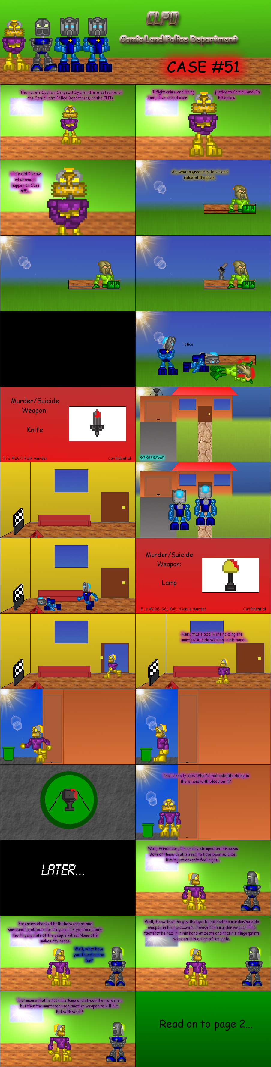
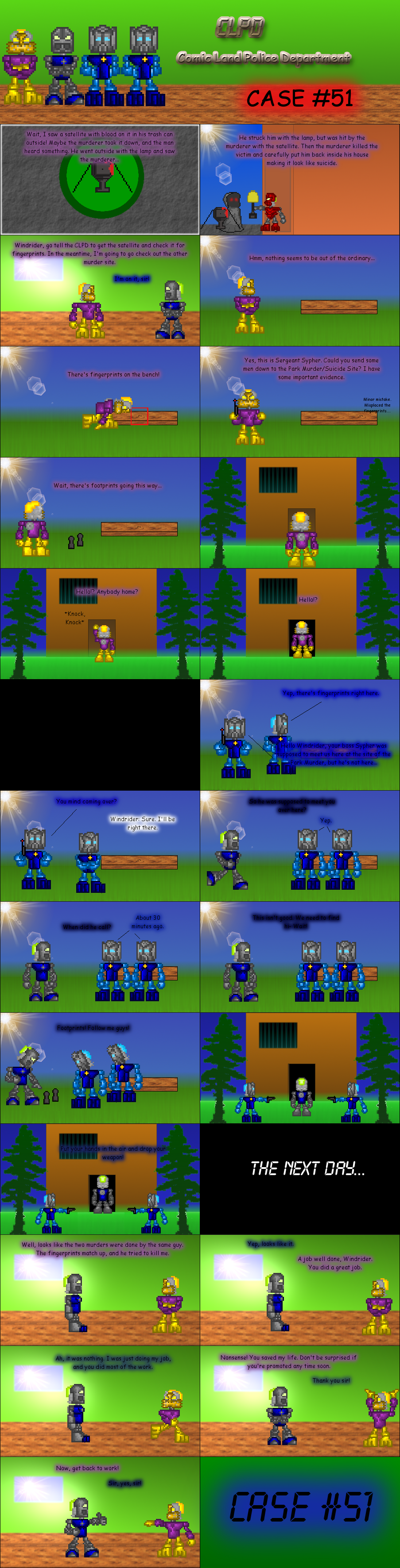
Thanks. A lot of my inspiration was from classic murder-mystery shows; well actually, they're more modern than classic, but basically it's the same idea. Anyways, mystery novels, TV shows, and other things like them are really good to look at when making a mystery. I used a few to get some ideas and such.Yeah, I noticed that as well. I would have changed it, but I don't have the best eye-sight, so I thought that it would be easier for most members to see than for me. Plus my parents didn't have much trouble reading it. But at least it's actually readable when you look a bit closer. Sorry for the inconvenience. I'll remember to keep my text-outline color a bit lighter in some of my next comics.Thanks! I'm glad that you enjoyed it. Also thank you for the encouragement!-RezInteresting. In light of this debate, I'm glad to see a decently composed and finished entry in a classic murder-mystery format. I'm dropping all my biases against sprite comics for the time being to keep art direction from being the main catalyst in my voting decision.That said, I was very sad to see Wind's text nearly unreadable in the second half of the last page. I had to zoom in and squint to see the text at all, which really hindered the flow of the story for me.Regardless, the rest of the entry went well and was easy to follow. Best of luck in the polls!
-
I can totally see what you mean, but honestly, a month is a really long time if you're committed. Making a plot shouldn't take more than a week at most if you're taking the time to work on it daily. After that, you would have about three weeks to work on it. And also, you don't realize how difficult it can be to use sprites for comic-making. Every panel you make has to have certain poses for multiple characters, and sometimes you even have to rotate them based on the angle. The backgrounds take some work as well. It took me probably 2-3 hours to make all my backgrounds. You have to remember that you have to add props and such to the backgrounds. And I myself actually sprited (or created, whatever would be the correct terminology) all my props; including all of the houses or buildings that are in my backgrounds. That, in itself, actually took awhile to make. Before you start saying that making hand-drawn comics are more difficult than sprite comics, you need to make your own successful sprite comics yourself. It took a lot of work for us to get where we are. Making sprite comics isn't as easy as it seems.
Anyone who uses sprites can make a comic pretty fast, sure. But that's because they're using kits they didn't make - a lot of their work is done before they've even started. And I see a lot of sprite comics even use photographs as backgrounds, and I doubt the creators even took the photos themselves.People who want to create something original (AKA people who draw their work or whatever) have a lot more work to do, and if they want to do a full blown mystery, it's a fairly large undertaking. For stuff like that, a month isn't a huge amount of time.A month is a pretty long time to come up with a mystery, and most comic makers here can make the actual comic pretty fast.
No, no, no. I wasn't implying that we shouldn't vote based on the author's skills, I was simply implying that we shouldn't vote just because someone is good at graphics. Sorry if I wasn't clear on that. -Rez
Well, that's the thing. This entire contest is based on judgement on skill. Some people here have very good handdrawn skill, others are good with Photoshop. If you're going to say "we shouldn't vote for someone because of their skill", then really, voting for anyone is really kind of pointless. Now, if you're only going to vote for people because they only have good graphics, then you should probably reconsider.Also, I don't really think that people should vote for the comics with the best graphics because people like Gavla, Tavakia, and Kahi would have a much better advantage than everyone else.
-
I see what you're saying here, but the point of this contest is to make people really think and try something new. A month is a pretty long time to come up with a mystery, and most comic makers here can make the actual comic pretty fast. I know it's not super easy to come up with a good mystery, but as I said, a month is a long period of time. And it's actually about a month and a week. Also, I don't really think that people should vote for the comics with the best graphics because people like Gavla, Tavakia, and Kahi would have a much better advantage than everyone else. And as I, again, said before, this contest is to make people really think of a good mystery, not to make comics that they're already used to making. No one ever said that people should be disqualified for not having much of a mystery. D-Shadow was simply explaining his opinion of the matter, and I personally agree with him.-RezIts also hard to write a mystery when so many of the authors are used to either epics or comedy. Not many people actually write mysteries or have experience with it. Also I agree with that everyone is going for graphics and not so much story. I myself am hoping that people understand the entry, which you actually have to have knowledge of people in the Bionicle storyline, their powers, positions, and such. I don't think anyone should be disqualified in my opinion. Rarely is anyone use to mystery enough for anyone to be disqualified. its a comic genre not many people use.~Soran
-
Thanks man! Yeah, that's a pretty thrilling part. He was laying down behind the bench and when the time was right, he killed the guy sitting down. Thanks again for the feedback!-RezI saw this from my kindlefire and I couldn't see the text well, but I could still see the great job you did! My favorite part had to be the part when the arm with the knife came out.But I have a question about that: was the murderer guy laying down or was he in a hole?
-
-
-
Have a great birthday Nuju metru! I would send you a cake, but I live in Russia, so it'd be pretty hard to mail it to you.
Thanks for all your work on the forums! I hope you'll have a great day!-Rez -
This code contains all of your new comics:
[img=http://www.majhost.com/gallery/DrGiggles/AA/comingsoonblood.png]Comics:[url="http://www.iaza.com/work/120221C/iaza15007191578100.png"]I'll be there soon[/url][url="http://www.majhost.com/gallery/DrGiggles/AA/comics/2.png"]Comic Name[/url][url="http://www.majhost.com/gallery/DrGiggles/AA/comics/3.png"]Comic Name[/url][url="http://www.majhost.com/gallery/DrGiggles/AA/comics/4.png"]Comic Name[/url]Credits to Dark709 for the Sprites.
All you have to do is add the comic names and make sure to change the editor mode. As for the comics, I must agree with Kodrak that they are a bit slow-paces, but I'm sure they will develop as you go on. It looks like a nice start. Your graphics are fairly good, your grammar as well, but I find that your characters aren't very developed. Once you work on the plot and characters, you're comic will go pretty far. Keep up the good work!-Rez
-
I know this isn't exactly the same size as the one you resized, but it's as close as I could get without cutting off some of the text. Does this work:I hate to be a botherer, but I just want to ask if it's possible to put it at the same size as the one I've currently squashed down, but hopefully in much higher quality. Sorry to nitpick.
 And don't worry, it's no bother. It's my job after all. -Rez
-
Alright "The Wretched Automaton", I made the height in your banner a bit smaller. Is this alright:
It's the exact same url, so you don't need to reenter it into your signature. If you need me to decrease the height any more, I can do that. Enjoy! -Rez -
Everybody has forgotten about my awesome avatar! It tops everyone's by far.
Just kidding. On serious matters however, I think that bonesiii's avatar is quite amazing. He has quite a talent with powerpoint art. It's just amazing! But I also like Sumiki's and Windrider's. Plus I'm sure there's a lot more people with awesome avatars too.
-Rez
-
Alright. Sounds good.Yeah, as in height, if that's alright.
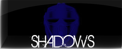
Called. I'll have it soon!-RezEDIT:Image Type & Dimensions: PNG, 500x200.Exact Text: SHADOWSDescribe What You Want: A dark-blue Mahiki on a black background, with 'SHADOWS' in a white font below the Mahiki (although maybe slightly covering the bottom).The font should be kind of scratch-y (as in, scrathed into a wall, so now curves, all straight lines and sharp angles).I'd like it pretty soon, if possible.
 Notify me if you need any adjustments.
-
Could you explain what you mean by shorter? Like shorter in width, or height?-RezOoh! That looks lovely!Just one minor request, could it be a little shorter? Only a little bit. Everything else is brilliant though. =D
-
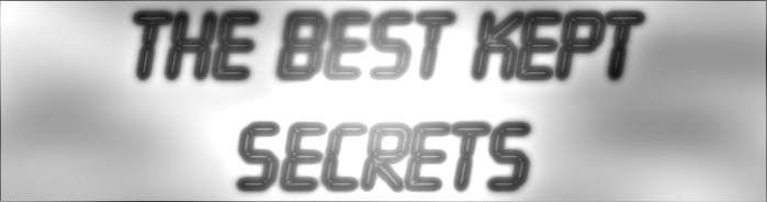
Dibs on this one. I'll have this ready ASAP.Image Type & Dimensions: I'm gonna say 700 x 250, but anything similar to my current banner's fine.
Exact Text: "The Best Kept Secrets"
Describe What You Want: The text in front of a dark, cloudy background.
If that's alright, that'd be great, thanks. =)
-RezEDIT: I really meant ASAP. Inform me of any changes needed (If you have any).-Rez
-
If you think that bickering is what makes BZP, than you have a messed up view of what it is.But bickering is what makes this BZP!
I totally agree with this. This better explains what I was saying, except in like 1 paragraph.Hey guys? Can you do me a huuuuge favor?Shut up.What needs to change most is the constant, needless bickering. Seriously, it's annoying. This isn't the place for that and its cyclical nature leads to nowhere but bitterness and resentment. You're mad at the staff? Be mad. Vent all you want to yourself. But you really should stop attacking them and degrading them. Because they don't hate you. Now. But the more and more you push, the more and more they will come to hate you, and in some cases the more obvious their resentment will become in their posts. Too many pushes by numerous people who don't even know you and won't even get to know you and just go off of mindless hearsay (ie "this person did this mean thing once I was told, so he's a horrible, evil person"), and that staff member will very easily make mistakes he'll regret immensely. And now everyone suffers and nobody is happy.So there's that. Oh, and the main page needs updated rather badly. Pretty much all I actually want to see changed. Perhaps networking with other sites, to try and increase our active member populationg again, but that one's not as likely.~|ET|~
Actually, I was mainly saying that BZP should focus even more on LEGO than it already does. Not completely forgetting Bionicle, but definitely putting more focus on LEGO. In order to catch more LEGO fan's eyes, we're going to have to focus a little more on LEGO.It already pretty much does. We review sets from all lines, the toyfair news is all about the general lines coming out, artwork is now just general lego artwork. It's a definite trend.
I never said that we should do away with Bionicle entirely. I simply said that BZP should focus a bit more on other LEGO Themes.-RezI agree that BZP needs a less BIONICLE-specific focus, but I don't think that we should do away with BIONICLE entirely. To make BIONICLE no more important on BZP than any LEGO line would effectively kill the site - just as much as taking it down entirely. In fact, it probably would lead to taking down the site entirely.
-
You are actually incorrect. Look in the posts above, and you will find the true answer. And just because LEGO didn't say they would keep the site going and Greg became inactive, doesn't mean that the site is done all together.Basically, Greg stopped updating them, completely disappeared from the internet, and Lego didn't say they'd keep the site going after 2011, so, yeah, it's done.
-Rez
-
I'm glad to be on your side then. Sorry guys, but you're on your own.But you don't understand. The reason this topic has lasted as long as it has, and why proto has not been deducted?Lulling you all into a false sense of security.And it is then that we will strike.It's on our to-do list, I swear
Anyways, since this would basically be considered spam, I probably should say something else and considering this topic is about the future of BZP, I should probably talk about the future of BZP, so...I think that in order to keep BZP active, it must focus a lot more on other LEGO themes. Less and less people are posting on the forums, and people are moving on. In a few years from now, people will have forgotten, at least most will (Minus us BZP folks who will never forget Bionicle ). Now, I'm not saying that BZPower should change it's name, or remove our Bionicle theme, but we should start focusing more on stuff like Hero Factory and other similar LEGO themes. That's just my view. Anyone have other ideas?-Rez
Shattered Mask Productions
in General Art
Posted