


Zorrakh
-
Posts
383 -
Joined
-
Last visited
Content Type
Profiles
Forums
Gallery
Events
Blogs
Store
Raffles
Posts posted by Zorrakh
-
-
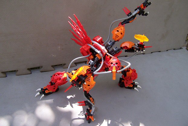
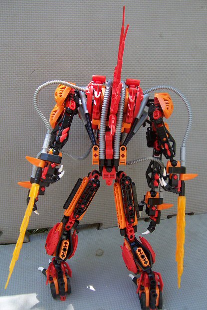
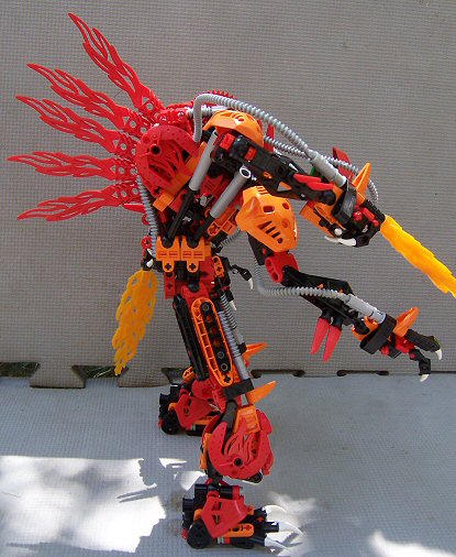
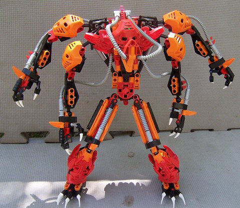
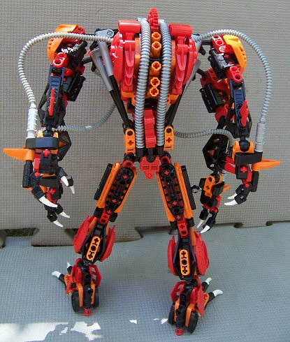
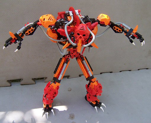
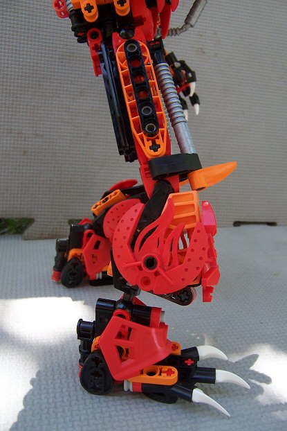
 ^ Please Click to see Entry PictureEDIT: I took second place in the preliminary poll! Thank you to all who voted for my creation and good luck to the other finalists.
  Pose 1 | 2 | 3FrontLeftBackRightNo Fire Front | Back | Back Arms FoldedLeg Detail 1 | 2Mask 1 | 2So, here are some of my boring thoughts on the matter:The most difficult thing for me was to decide on something that appeals to both the BZPower members as well as the public at Brickfair, which are more often than not to very distinct groups. Unfortunately I did not have the time to create what I wanted that I know appeals to both groups (something big
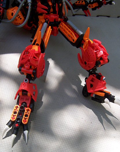
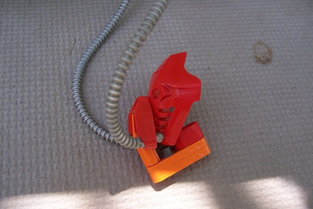
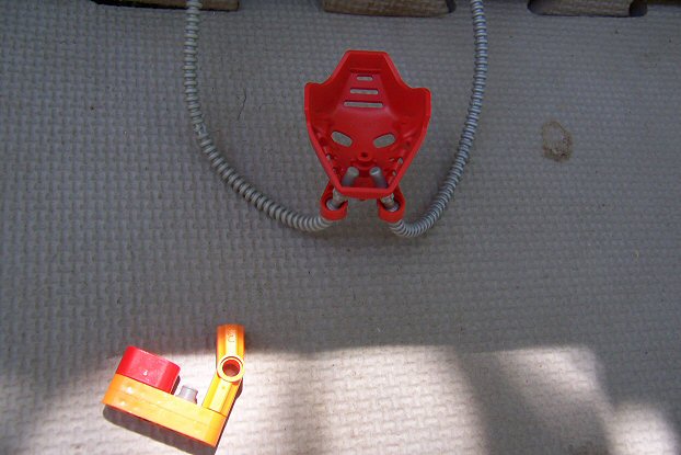
  ), but I did what I could. The basic idea came from Maxilos' torso design, which is, in my opinnion, just about the best designed set in the entire Bionicle line because of the posability as well as the shape. The mask was actually something I created several years ago for two of my self-MOCs (Phantoka and Mistika). The overall design is actually kind of a cumulation of the years of Bionicle as well as Technic figures from 1999-2000; I used a gear from the Silzers series, as well as pieces that were made for specific years, like the Tahnok Shields.EDIT: I guess I should mention that a lot of my red parts are being used in another creation right now, and I am NOT taking that other MOC apart for a while.Oh, and I actually have six orange Pakari in total; I couldn't figure out how to put the last two on. Storyline-wise, I'll do a short write-up like the ones in the Dark Hunters book from The Shadowed One's perspective.But for now: Pyraxx was once a Matoran who volunteered for experimentation for a Nynrah Ghost project. The main goal of the project was to allow Matoran to tap into their elemental power without the need of transforming into a Toa. The project backfired and now Pyraxx has been hideously mutated and continously exhales enormous amounts of fire (much like the Kardas Dragon with energy). The mask and tubing allows him to transfer the fire to his wrists to use as weapons as well as his out his back for exhaust purposes. Since the fire is directly controled by how much Pyraxx exhales, the longer he is fighting, the greater his power. Although he does not have access to his Kanohi Pakari, Pyraxx is incredibly strong. He is also very clever, however the procedures he endured caused him to go insane. Therefore he is only sent off on high-damage missions (usually by himself) and kept off Odina as much as possible. He is also impervious to fire and heat as well as lava due to the experiments. Pyraxx can also use the fire out of his back hands to use as a means of flight. The only real danger he faces is against Toa of Air because they can cut off his air. He recognizes that they are a threat and eleminates them first.Thanks for looking. Please post your comments.
 -
No problem.@Zorrahk: This reply would have no end if I quoted your post and replied So I'll just go old school for this one.Thanks for proving my point :)Yes, it's from the hockey sets. Thank you, the chest piece really seems to work well with the new HF shoulder armor. The articulation is a bit restricted, but works well enough to pose it, thankfully Yes the do look a bit out of place, I couldn't think of an alternative way to use the Mahri pipe in the time I had  They really should make those T-bars in black, then I'd be in heaven <3 Also, I regret not using the old ball joints, I completely missed the fact that I could have used those.Thanks! The brain bucket was the helmet piece for the hockey sets, just so you know Thanks.Completely understood, I guess it would be a bit too sleek for the bionicle universe. But I trie to make sure that the proportions were similar (the big-ish head, the somewhat short legs). But the theme did say not terribly out of place, I wouldn't say it's that different But I do see where you're coming from. Let's hope the judges feel that it fits.Thanks for the review! I appreciate it Concerning the pipes, I guess I should have said that normally the use of both on the same MOC usually looks a bit strange (I actually have both kinds of tubes on my BBC entry, which I thought was kind of funny ), but it works well on this one. I think it's because they're the same color. I also hope that we'd get more colors for those T-bars, especially in in black (I would also like the pins and axles to go back to black, but I doubt that will happen, unfortunately).I thought those were from the hockey sets, but I remember seeing them on some Exo-Force sets (I have some orange ones with stickers on them). Now I want some of those in black. What set is it from?Thanks for understanding. It can especially be difficult to have a Bionicle feel to something when the toyline has ended. Just call in a Dark Hunter and you might not have a problem.
-
I, as well as a few others (such as Ballom, Lord Oblivion, DeeVee), can tell you from experience that it can be very difficult to mix System parts with Bionicle Parts, especially getting the flow of pieces right. Due to the nature of System pieces, there are more angles on them. There also is the issue of even getting the pieces connected to a mostly Bionicle MOC. I would in fact argue that the exact opposite is true because System pieces add a whole new level of designing and thinking that must (usually) be developed by experimentation.Anywways, on to the main reason I posted.I do not like the mix because it takes so much less effort and time.The torso is probably my favorite part of the MOC. It seems nice and solid. I especially like how well the black Hockey chest piece (I think that's what it's from) works with the Hero Factory pieces. The tubing looks good and even though they aren't the same diameter they still look like they match, possibly because they're the same color. The shoulder armour is also works well, even though it looks like they might restrict movement a bit. The back looks good for the most part, although the headlight System piece as well as the square plate look a bit out of place because of the blockiness of the pieces compared with the smoothness of the rest of the MOC. The System T piece connected to the Inika leg piece also looks a little out of place because it sticks out a bit. Another thing I want to draw attention to, although it's not too important, are the ball connectors. I think the older ball connectors (the ones without a hole through them) would fit with the flow of the rest of the MOC. However, I do understand that because they're so old they lose their tightness in the axle connection and they can be difficult to find. That's something that's not terribly important.I like the lowers limbs; they have the same solid look of the torso. the hand with the "sword" works well and I like the fire laser on the right arm. It reminds me of some ray gun from the fifty's with the multiple circular pieces. I also like the Roborider heads on the back of the lower legs and how it blends with the Hero Factory armour piece on the front. Probably the thing I like the least about the MOC are the thin upper sections of the limbs. I've seen it on several other MOCs and can't say I like it a whole lot. It seems to throw off the solid look of the rest of the MOC. Such a contrast is a bit jarring, at least for me. The holes in the elbows and knees also look a bit strange.The head, while a little large, blends well with the rest of the MOC. the brain bucket (I don't know what else to call it ) works very well with the Hero Factory pieces as well as the chest piece. The eyes look very alien and large, which seems to work. the "mask" part also looks good.While the MOC looks great for the most part, I'm not sure how well it'd fit into the Bionicle universe. It doesn't seem to have that bio-mechanical feel to it that most of the Bionicle characters and creatures have (even Maxilos, the robot guardian has the same kind of style), but of course that is something for the judges to decide.Overall, though, the MOC looks great. Again, the torso is very nice. Good luck in the contest.
-
There is no mention of the entries having to look like something from the first year of Bionicle, as the first post does not specify a certain year:This is a little testy. It absolutely needs to be something that looks like it can fit in the 2001 Bionicle Universe (and, obviously, it needs to be red and fire-themed). If it's something fire-themed that would not be out-of-place in Ta-Koro, it should be fine. If it doesn't look like something that belongs in the '01 Bionicle universe, then we have a major problem (for instance: notice there are no wheels/treads in Bionicle).
But if the rules were not clear enough and they were to specifically state that entries have to be fire-related as well as something that looks like it belongs in the first year of Bionicle, it seems as though it's too late to change it, due to the fact that preliminary voting needs to be completed at an early enough time so that MOCs (both for final and non-final) can be sent in with enough time to spare for Brickfair. It also seems a bit unfair to the people who have already submitted their entries.Regardless of what was intended, the theme of the contest should stay (as well as the end date for receiving entries) as it is because five days is not a whole lot of time to build an entirely new entry from scratch (for most people).And there actually are treads in some of the first year sets, which include the Manas (8539), Tarakava (8549), and Muaka and Kahne-ra (8538) sets.This time around, you're going to build a fire-related MOC that wouldn't be terribly out of place in the Bionicle universe. -
Wow, it seems like you got your entry done much faster than usual; were you already working on this prior to the contest?Anyways, the Skakdi skull and Kanohi Garai work well with the MOC, although there is a slight problem with color schemes (which I'll get to later). The torso looks solid and the spine looks great, however the flames on the lower section seem a little weird from the front because of how much they stick out. Also, that one light-grey axle in the base of the neck sticks out a bit. The tubing looks nice and the System parts are used well. I also like the use of the Hero Factory 2.0 chest armour; it flows well with the rest of the MOC. The only real question I have is the use of the rubber band: is it being used to hold the upper and lower torso together?The arms and legs look nice and sturdy. I like the System parts on the lower arms and the upper leg armour has a nice thickness to them. Unfortunately the lower legs have a lot of Keetongu Orange on them because of the Inika leg piece (because there is so much of it on the sides, which I know can't really be helped); I think perhaps that could be partially solved by putting some more red on the back of the legs. The feet also look good and it seems to blend well with the Rahkshi heads right above them.I really like the flamethrower.
I especially like the canister (nice use of those circular pieces, by the way) and the tube. Does a System-thin tube fit through those connectors? Or are you using several pieces of tubing to connect them together? The Rahkshi head and the Hero Factory armour pieces work well together.Now, for the color scheme. The balance looks great, but I really think that adding black would help a lot with the color scheme. Since it's so prominent on the head I think it would have looked even better to have a color scheme of Red/Keetongu Orange/Black. Without that third color it feels like, to me at least, that there's something missing. But aside from that, you did a really good job balancing out the colors you used, which can be a difficult thing to do.Great job, Ballom, and good luck in the contest. -
Will there be cloths on the tables at Brickfair (I want to make sure my MOC can stand up if I send it in
)? -
Actually:
Sorry to break it to you, only finalists go to Brickfair and Prototype Parts. So if your Moc doesn't go to Brickfair, there is no prototype piece. :/~Gravity...I really got to get a digital camera, because I might just enter this one.Question: even if you're not a finalist, do you still get a prototype piece if you send in the MOC to BrickFair?
So if you send in your entry (regardless of whether or not it is in the finals, so long as it's eligible), you will get some prototype pieces. You will just need to cover both ends of shipping costs as well as supply the things that the coordinators will require, such as a picture of the finished creation and/or instructions on how to put it together.And then' date=' once you've built and entered your MOC, [b']send it to Brickfair![/b] We'll have a diorama of fire MOCs there and it's gonna be sweet. Finalists will be required to send their MOCs, but all eligible entrants are welcome to participate as well.And why might you do this? Besides the standard ovation and fame forever, MOCs sent in to Brickfair will come back with shiny prototypes.
EDIT: I just realized I probably should let a staff member answer this, so I understand if this needs to be removed.
-
Ehlekdude: Thank you.
Ballom: Thanks. I've actually neve seen Little Shop of Horrors; neither the movie nor the play. I just remember seeing it at Blockbuster as a kid. I really want to try and see what else I can do with the Pick-a-Brick cup. I was thinking about maybe using it as a crab shell or something, so maybe you'll see more of it from me.  ankyofdarkness: Thank you. I think one of the reasons the red works well is because the red mixed with the green looks more plant-like. Some species of venus flytraps have a red "mouth" to help attract flies and other insects. And I also knew black axles would look a little weird on this. Zaxvo: Thank you. That is one disadvantage with using strands of socket pieces; you really need three strands to cover up most of the gaps. Thankfully it also gives the MOC a more vine-like appearance, and this is something that sometimes occurs in nature. I did forget to mention (I've added it in now) that this is also inspired by the Deku Baba from the Legend of Zelda series (more specifically from Twilight Princess). The "head" on the MOC looks a lot like a Deku Baba's, actually. Thanks again for all the replies.
 -
Ballom:No problem.
Thanks for catching my incomplete sentence; formatting is a little weird for me on the new forums. I like the idea of the energy being encased in the armour. That makes even more sense than it just being one of the colors and I can see it now that you've mentioned it. Again, great job. -
Will the public at Brickfair be voting for the winner, or will there be designated judges?Also, are canon creatures allowed, such as Lava Eels?EDIT: And will models sent in be eligible for other awards at Brickfair?
-
Does lava count as fire (at least in name only)?EDIT: Also, could one of the staff members give information on sending things in for Brickfair? It'd be a little difficult for people to mail their stuff in if they don't know how.
-
the black/ bley axle-pins are very rare' date=' expensive and limited here, so I use the blue one.[/quote']No problem. As I said, I don't consider that too much of a problem because of the rarity.
Technically, all those silvers, aside from the mask, are "silver" according to Lego. Unlike gold, where there's different shades of it, there are no different shades of silver. It's just because the pieces are from different years (there's a difference between the 2007 silver and 2008 silver, for example). That's always been a pet peeve of mine, but it can't be helped for the most part (you'd have to get a certain mold from a certain year to get the right "shade").Very nice! I love the body. Very well built, and very unique. The weapon is also quite good. The only thing I personally don't like, though I don't know of a real way around it, is the use of so many different silver colors. Overall, amazing job! -
Thank you.I would say this is spot on.Its also ice that you used connectors instead of limbs, wich gives it a darker, edgier feel.
The darker and edgier feel was something I wasn't shooting for; I was just going for something more organic than what's normally done with Bionicle parts. Actually, there's another MOC I'm working on that uses lots and lots of black ball socket connecters (some of the strands are twisted up like in this), and that definitely gives off a darker and edgier feel. I guess color makes a difference.
-
Geez guys, don't be so hard on him for making something "simple."
 It's a Hero Creator MOC, not a real MOC, and so there are a less amount of pieces to choose from.Anyways, I think you captured the overall feel of Hakann pretty well. The weapons are good representations of their original counterparts and I love the spikes. I just wish that there was a way to have some of those parts dark red instead of it being all red. While the head doesn't look like Hakann's, I like the white skull with the red helmet. I also like the spikes on the upper legs; it reminds me of the Piraka armour piece and they do the job well.Overall, good job. I haven't used LDD for Hero Factory creations, but it would definitely help to experiment with pieces with your hands before moving to the computer; you might figure out a lot of neat things that you wouldn't normally find using LDD because of that physical barrier.
 -
This is very cool. I like the mix of green, lime green, and silver, although I think it could use just a little more green. It's a shame that the Miru doesn't match the normal silver, but that can't be helped. The blue pins stick out a bit on this; perhaps light grey or black pins would work if you have them (I know they are rare nowadays, so It's not too much of a problem for me). The torso had a nice Toa Mata torso shape to it and the light grey works fine with the rest of the colors; it doesn't detract from the MOC at all, which is nice. The system parts on the back stick out a little, however, because of the corners; maybe light grey 1x2 Technic plate would hold it together. The gear on the back is a nice touch, although I'm curious to see what it would look like if it were light grey.The arms and weapons are really cool; I think the weapons are the best part of the MOC. The axe is very nice and I love the tube and the Playset weapon on the end. The "shield" is also nice. Again, the blue pins stick out, and I think that the lime green armour piece might be a bit much in terms of color (I don't think there's enough green). The arms seem to have nice articulation, although the Nuva shoulder armour looks like it hinders mobility just a bit.The legs are nice; I especially like the silver Roborider pieces on the shins. The feet look a little strange with the added height on the bottom, mostly the sides on the bottoms of the feet. Did you try using the silver Pohatu feet additions? I think those would work perfectly for this.Overall, great job. There's just a couple things, but I really like it in general.
-
Veigar's Shadow: Thank you.
Tomaku: Thank you. The "dirt" is certainly dark enough to look like it's been watered, plus these things live in very humid climates. Gravity Caiox: Thank you. I was surprised how plant-like the stringing together of ball sockets is, plus it gives it great articulation.thebeggerpie: Thank you. I'd love to see what you come up with if you do try it; I don't think there's actually that many organic-looking MOCs and making plants is one of the ways to expand that boundary of Bionicle/Hero Factory. -
I'm surprised by how nice the black Av-Matoran torso looks with the Hero Factory armour pieces. I also like how the Hero Factory armour blends with the smoothness of the Kanohi Shelek. The Inika feet are a nice choice as well. The torso does seem a bit thin on the front, however (the back is fine, and I really like the Metru chest piece on the back); perhaps use some technic plates on the chest area to bring it out, if you have any.The limbs also are a bit out of proportion with the body, or vice-versa, however you wish to look at it, but the limbs are a good thickness and I like the armour on the shoulders. The Thornaxx launcher (or whatver it's called) is nice, and the Black Phantom blade looks nice, especially with the black tube. The heartlight is also a nice addition.Good job.
-

Gallery ^ ^ ^(when Public)
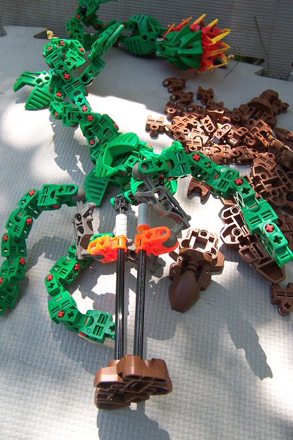
I have had this built for over a year now.
But the idea came to me a little before Christmas time in 2010, when my family and I were at Disneyland and I was spending some early Christmas money at the Lego Store. I got Xplode and the Furno Bike, and when I opened Xplode's box I saw the shoulder pieces, and I thought "these would be perfect for a venus fly trap mouth."This is the fruit of my labor (get it, because it's a plant? ) and has been on display at Bricks by the Bay 2011 (it won the "Best Parts Usage" award in the Bionicle/Hero Factory theme) and 2012. Audrey's Seed was also on display at the Arden Fair Lego Store, along with another of my creations, which will eventually get posted. This is completely made out of Lego parts; the pot is a Pick-a-Brick cup and lid. EDIT: I guess I should mention that this looks a lot like a Deku Baba from the Legend of Zelda series and is probably more of an inspiration than Audrey. Onto the pictures!EDIT: here are some things that inspired me to make this:
That's all, folks! Please post your thoughts and thanks for looking.
-
Thank you.I really like the build but the legs are way too thin and small for the body. If the armor is supposed to be for "high-speed missions," why is the armor so big? I mean it's great but the armor doesn't really fit really well since all of that armor stops you from moving so fast.
The legs are a little thin, but the length is correct: legs plus feet are supposed to be a little taller than the head and torso, when put side by side, which these legs are. The turbines on the back give it the high speed. This armor is essentially a "lightning bruiser," which is something that is very fast and hits very hard, like a tank with the speed of a racecar. I'll clear that up in the main post.
Thank you.Hm, I love the addition of silver pieces and the weapon. No complaints here^^
the gun is a little bit inspired by the guns from the Transformers movies; I'd thought it'd be cool to give Stormer a weapon similar to what he had in his 1.0 form. I also think that the silver is a nice contrast to all the white; it gives it more of a robotic feel.
-
Yeah, I can see the Space Pirate inspiration, especially in the legs. The torso looks EDIT: good (yay for formatting
); I really like the silver dragon head on the back and how the tubes connect to it. The tubing, more specifically where it goes through the Technic plates, looks a little thin, but it still looks fine. The system plate on the front, however, seems a little out of place because it's flat, compared to all the angles on the rest of the MOC. I also think that the torso could use a little more trans blue on the front to balance it out.I think my favorite parts are the arms; the visors look very cool and create nice shoulder armor, even though it does look like they stifle some articulation in the arms. Do the shoulders have much movement? The silver Inika shoulder armor pieces work well, too, and the Mahri plating on the back of the Vahki leg piece looks good. I really like the use of the Glatorian heads for "hands."The legs look good for the most part. The lower legs and feet have a nice thickness to them, as well as a good color balance. The upper legs, especially where the legs connect to the torso, seem a little thin, and the silver Piraka armor looks like it's too high up, making the trans blue leg connector sparse. But otherwise, the legs look good.Now, for the head. The crest reminds me of Megabyte from Reboot, so that brings back memories for me. I like the fixed position of the mouth, but I'm curious to see what it'd look like closed. Also, it doesn't look like there's much articulation in the neck, which somehow reminds me of the Juggernaut from X-Men: Evolution, but that lack of articulation kind of detracts from the MOC. I do really like the use of the Silver Crast, and I really can't tell if the eyes are trans blue or trans dark blue, but it looks good.Overall, great job. There's just a couple of things I have a problem with, but they are only minor things. Thanks for posting this. -
I was thinking the exact same thing when I played through Nightfall Incident a couple of months ago.I think a turn-based strategy game in the vein of Spybotics: Nightfall would be great; there could be some form of storyline, and the game could even be expanded into an online game where players can trade with and compete against other players. The various units and bonuses could be based on elemental and / or Kanohi powers.I'd make such a game, but I'm not sure how to program it.
There could be PvP, team against AI, that'd be fun to play. I'd love to talk with you about getting some ideas for this if you're interested.
-
Be warned, I made this about a year and a half ago, I've finally been able to take pictures of it.
This has been on display at Bricks by the Bay Conventions 2011 and 2012.OK, you've been warned. Onto the pictures! FrontLeftBackRightPose 2Pose 3"You feelin' lucky, punk?"
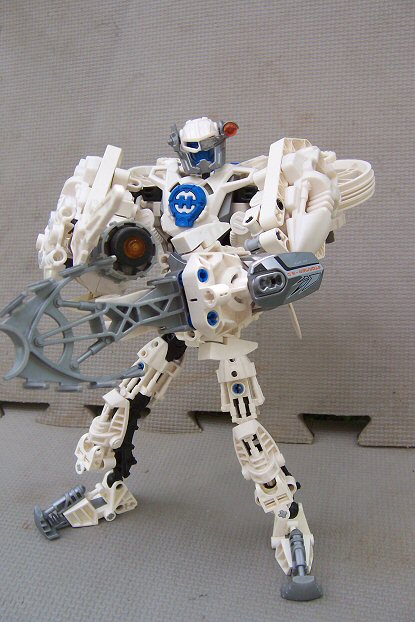
Thanks for looking and please post your thoughts.This armor for Stormer was developed by Hero Factory to specialize in high-speed, hard-hitting missions and pursuits. Armed with a single Frost Blaster for projectile weaponry, the armor and shield arm is designed for body slams and other such physical combat and situations, especially against criminals who resist arrest very forcefully.
-
Yes! Thank you for that, fishers64. I couldn't have said it any better (which would have been very difficult on my part
Lego's primary audience is still children, however. The things approved have to be buyable by kids, otherwise it is not profitable.Adults already decide what sort of toys are sold to kids anyway; for example, Bionicle was created by adults who worked for Lego. Cuusoo is just opening up the creative pool to allow more adults to use their creativity to make toys for kids.I would like to point out that LEGO does have entire lines of products aimed squarely at adults. CUUSOO is already a specialty line that caters to an adult market. One would think that in terms of what might come to fruition, their standards for what is acceptable would be a bit broader.
). That was why I was so excited by the idea of Lego Legend of Zelda sets because it's a viable, and potentially awesome, product. Cuusoo is a marketing tool, not a place to decide what would be cool to see in Lego (that's what MOCing is for, is it not?). LEGO is giving people a chance to give their own ideas for a viable product that the community, both children and adults (mostly children) would buy.
-
OK, so I looked into Firefly a little bit, and I found the premise for the show:
Gee, I wonder why LEGO rejected it...Cowboys, thieves, fugitives, priests, and ########### on a spaceship. They do crime!
I'm dissapointed with people who believe that a show based on that premise should have Lego sets based off of it. At least in Star Wars, Lord of the Rings, etc., there are good guys fighting bad guys, instead of criminals being the main characters of the show and their crimes being the main focus of the show. What kind of a reputation would be set by LEGO if they did that? I would question my own faith in the company, and I certainly wouldn't let my children, if I had any, buy any Lego Firefly sets.
I'm not sure if that's exactly relavent to the discussion at hand...
I know. And it's absolutely backwards.one of the most important reasons is because it's far easier to shrug off a violent scene than a sexual one.


Official BBC Contest #63: You're Fired!
in Bionicle-Based Creations
Posted
Entry Name: Dark Hunter PyraxxEntry Picture: LinkEntry Topic: Link