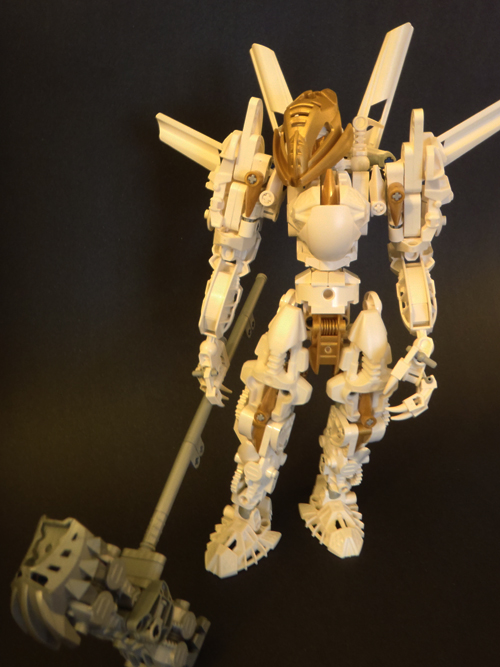
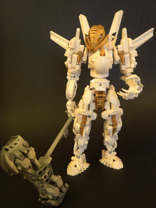
White Makuta Help MOCin' Entry posted by Chunky! March 28, 2010 1,035 views Share https://www.bzpower.com/blogs/entry/83472-white-makuta-help/ More sharing options... Followers 0 Okay, so I'm done, but which picture should I use for my entry?
Chunky! Posted March 28, 2010 even though i was personally leaning towards the first, the decision is unanimous my cyberarts teacher tells me other people's opinions matter more than yours (in graphic design of course) thanks guys Quote
Chunky! Posted March 28, 2010 cyberarts º__º CYBERARTS CYBERARTS CYBERARTS CYBERARTS CYBERARTS CYBERARTS CYBERARTS CYBERARTS CYBERARTS CYBERARTS CYBERARTS CYBERARTS CYBERARTS CYBERARTS CYBERARTS Quote
kongutohunga Posted March 28, 2010 cyberarts º__º CYBERARTS CYBERARTS CYBERARTS CYBERARTS CYBERARTS CYBERARTS CYBERARTS CYBERARTS CYBERARTS CYBERARTS CYBERARTS CYBERARTS CYBERARTS CYBERARTS CYBERARTS ಠ_ಠ Quote
Chunky! Posted March 28, 2010 cyberarts º__º CYBERARTS CYBERARTS CYBERARTS CYBERARTS CYBERARTS CYBERARTS CYBERARTS CYBERARTS CYBERARTS CYBERARTS CYBERARTS CYBERARTS CYBERARTS CYBERARTS CYBERARTS ಠ_ಠ For some reason, my mac doesn't register those characters Quote
Reimu Posted March 29, 2010 Second, but if you could get another, have him posing like he's tapping the handle of the hammer on his other hand. Quote
Kylus Posted March 29, 2010 I choose numba 2. EDIT: Actually, numba 1 is better- it's a lot more focused than the second one. EDIT 2: Never mind. DON'T STRANGLE ME YOU CANNOT RESIST THE STRANGLING *strangles* Quote
Chunky! Posted March 29, 2010 Methinks the middle one looks the best what is this i don't even 1st. why you little *strangles* Let's be friends. no Quote
Tradakk Posted April 24, 2010 I actually like the first one more than the second, but both are a little unfocused. Think you might wanna try fitting in the entire entry (hammer and all) and it would be better; right now the hammer is all blurry and discolored ugly-looking. Quote



25 Comments
Recommended Comments