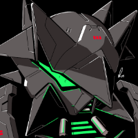
Lord Oblivion Posted June 25, 2014 Posted June 25, 2014 (edited) This is for BBC #68: Get in the Robot! This is: Warpath Gundam (^Click for larger picture^) Back/Side ViewView of Jets Gallery (when public)Flickr Link I based some of this from Turn A Gundam, but otherwise it's mostly aesthetically and proportionally based on various Gundams. I tried to give it a samurai-esque feel, with the crest, shoulder armor (and the flower, for shintoism), and the skirt to some extent. Other than that, I did what I could to maintain the Gundam aesthetic and design, with the longer legs, boxier torso, and I even gave it 5 fingers! The shoulder armor and skirt do not restrict articulation, the skirt is connected via balljoints, and the shoulder armor is able to swivel up and down (while the tiles can also go up and down) due to a system of pins and stuff. I wanted to keep it as real to Gundams as I can. The ankle armor does restrict it a bit, but it is necessary in order to support the mass of the MOC. C&C appreciated. Edited June 25, 2014 by Lord Oblivion 4 Quote Twitter Instagram
Chro Posted June 25, 2014 Posted June 25, 2014 I love the shaping on this, especially in the legs, as well as the upper torso.Not sure I like the flower but it doesn't really detract from the MOC.Fantastic work. Quote save not only their lives but their spirits
Akavakaku Posted June 25, 2014 Posted June 25, 2014 Excellent design! The details made with round sliding tiles are great. Quote ( The bunny slippers hiss and slither into the shadows. ) -Takuaka: Toa of TimeWhat if the Toa you know best were not destined to be? Interchange: The epic begins
Makaru Posted June 25, 2014 Posted June 25, 2014 I honestly am pumped to the 11s to see all these gundams in a display. So: System bits are clustered and don't really blend well into the design. They stick out a lot. Your balance on the red/blue colours is... jarring. I'm not sure if they look reversed or if it's the wrong blend but something about that is off. Also, that square visor just looks all sorts of weird. Not at all meshing with the curves you've got goin on all over the place. Which leads me to my next point. Those curves? MMMMMM so good. I'm very jealous. Every technic part you chose FEELS right where they are applied. It's a nice theme. The back mounted pistons are also a NICE touch and really give you a sense that this Gundam is armored and HEAVY. Two of tem don't look connected though? I think you could have done that connection a little better. A solid entry. Can't wait to see you in the contest! Quote Spoiler Alert
Lord Oblivion Posted June 25, 2014 Author Posted June 25, 2014 I love the shaping on this, especially in the legs, as well as the upper torso.Not sure I like the flower but it doesn't really detract from the MOC.Fantastic work. Thanks! Yeah, the flower was more of a late add-on, I was running out of white boat studs, so I felt that having some design there to symbolize something from the samurai culture would be nice. If I had tiles in blue and red, I would probably have used them instead. Excellent design! The details made with round sliding tiles are great.Thank you! I honestly am pumped to the 11s to see all these gundams in a display. So: System bits are clustered and don't really blend well into the design. They stick out a lot. Your balance on the red/blue colours is... jarring. I'm not sure if they look reversed or if it's the wrong blend but something about that is off. Also, that square visor just looks all sorts of weird. Not at all meshing with the curves you've got goin on all over the place. Which leads me to my next point. Those curves? MMMMMM so good. I'm very jealous. Every technic part you chose FEELS right where they are applied. It's a nice theme. The back mounted pistons are also a NICE touch and really give you a sense that this Gundam is armored and HEAVY. Two of tem don't look connected though? I think you could have done that connection a little better. A solid entry. Can't wait to see you in the contest! Gundams are awesome, thereby making this contest all the more awesome. Yeah, my white system parts selection is limited, kinda made me regret having white be so prominent xD I agree that they do stick out and ruin the texture in some parts. I think the skirt is most likely the problem for the color balance, that and possible the lack of color on the legs? Yes, the visor is lacking - I mean it does do the job, but something different would've been better. You're right on all points. Thanks! The shaping was the toughest part on this, considering that Gundams have some weird textures that are difficult to translate into MOC form, glad you like it. Yeah, I felt the pistons would help emphasize how big this is (it really is though!). I was finalizing the jetpack today, and I felt that finding a way to fully connect them would've cluttered up the jetpack a bit much, and made it look cluttered, which I aimed to avoid. Thank you, I appreciate your post! You too! Quote Twitter Instagram
Toa Imrukii Posted July 3, 2014 Posted July 3, 2014 (edited) HOLY MOTHER OF MATA NUI THIS IS AMAZINGLY AWESOME DUDE. ICOULD NEVER MAKE SOMETHING THIS GOOD IN MY WILDEST DREAMS Edit: Please try to be more specific! -Wind- Edited July 4, 2014 by -Windrider- Quote Quote: "Love has no fear, and no vengeance." | :i: | Andekas ⴳ A RUDE AWAKENING - A BIONICLE G1 Continuation and Video Game Project (ARTIST AND CONCEPTUALIST) | I am an ENFP, that is my Personality. Check Out Makuta Teridax: Reaper of Darkness | Check out my Taknuva Stars MOC | ⴳ

Recommended Posts
Join the conversation
You can post now and register later. If you have an account, sign in now to post with your account.
Note: Your post will require moderator approval before it will be visible.