Lenny7092 Posted July 23, 2020 Share Posted July 23, 2020 (edited) Hi, guys. Are you ever picky about BIONICLE sets’ colors? Well, I can say some things: 1. The Toa Mata/Nuva has black socket joint pieces, like you know, Tahu’s shoulders? 2. From summer 2006 onwards, the brown sets are replaced by mainly orange and yellow. Doesn’t feel classic if you ask me. I get that the brown sets weren’t selling well, but Lego could have made the other colors primary and brown secondary in my opinion. 3. The Toa Inika/Mahri have some color problems. Their armor don’t match their Matoran forms. I’m fine with the Toa Inika’s masks, though (Hewkii’s should have been brown, though), and the Toa Mahri’s masks should have been the same. 4. 2008 uses a lot of lime green, dark blue, and maroon. 5. Since Onepu and Nui-Jaga with his purple colors, there are no more sets with purple pieces after them until 2015. 6. The Toa Masters/Uniters are fancy with their colors, but they should be the same as the Toa Mata much more. 7. Tahu has too much gold in his United look. 8. The Elemental Beasts in 2016 have weird color schemes, which are hard to tell who use certain elemental powers. 9. The Matoran sets from 2001, 2003, 2006, and 2007 don’t have eye colors. 10. The Skull Creatures have pretty weird color schemes. 11. The Av-Matoran, Mazeka and the Stars heroes (Tahu, Takanuva, and Gresh from 2010) have yellow-green eyes. Same with the Toa Inika, Jaller Mahri and Kongu Mahri and the Toa Nuva in 2008, Takanuva in 2008, and Toa Ignika. The rest of the Toa Mahri have red eyes. 12. 2008 Takanuva should have gold pieces. 13. Mata Nui in 2009 could use some more gold. 14. The Toa Nuva in 2008 have weird secondary color choices. The Phantoka have dark gray while the Mistika use silver. 15. The Vahki and Toa Metru/Toa Hordika all use gray as a secondary color. 16. The Toa Metru/Toa Hordika have different eyes from their Turaga forms. 17. 2016 Ekimu use a lot of transparent blue. 18. Makuta Teridax’s eyes in 2003 are blue when you flip his head vertically. Shouldn’t they be red? Same with Icarax with his green eyes. 19. The Protector of Stone’s eyes are different from Master Pohatu. 20. Makuta Antroz’s eyes are green when he is in the Jetrax T6. 21. The Skrall in 2010 have green secondary color rather than red. 22. There are a lot of silver in some storylines. It doesn’t have to be the sets. It can be color problems in the story, like the colors of the Toa Kaita’s masks and the Toa Inika’s Zamor Spheres. Edited July 23, 2020 by Lenny7092 Forget some things. Quote I like Lego, Bionicle, and Hero Factory! Link to comment Share on other sites More sharing options...
That Matoran with a Vahi Posted July 24, 2020 Share Posted July 24, 2020 Oh yeah. For me, mainly, the fact that characters never seemed to keep the same colour schemes when they transformed was a often puzzling. The Toa Metru, for example, could have looked neat with highlights in their Turaga colour schemes, instead of the ever-present dark grey... in fact, the Miramax movie designs do add traces of those shades to them, which feels a lot more natural to me. And even more so with the Toa Inika. I get that the bright colours of the Matoran didn't exactly lend to the 'dark and gritty' look that 2006 was striving for (and that teal was out of production by then, so Kongo would have lost out either way); but personally speaking, familiar colour schemes would have made a world of difference in making the Inika look like the characters we already knew and loved. Some hints of orange on Nuparu, maybe; not overmuch, just to make the connection with the little Matoran from the boxor in 2002. A bit of yellow for Jaller. Maybe going the Vorox route and making Hewkii's secondary colour tan, instead of yellow, since it was one that he wore as a Matoran. At least, that's my personal thoughts ^^ And I don't even know what to say about the canonically black and gold Karzahni being green in set form! I wonder, though. I wonder if the set department didn't design the Toa waves first, with no specific intent for them to be transformations of already-known characters; and it's only later that the story department decided "oh, this set of new Toa we've been given? They can be the same people as the little guys from 2001..." I've honestly long been curious whether sets were designed to meet story needs, or story had to just take whatever sets they were given and make something of them; though I feel like the latter might be more likely. Quote "New legends awake, but old lessons must be remembered. For that is the way of the BIONICLE." Link to comment Share on other sites More sharing options...
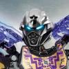
Xboxtravis Posted July 25, 2020 Share Posted July 25, 2020 19 hours ago, That Matoran with a Vahi said: I wonder, though. I wonder if the set department didn't design the Toa waves first, with no specific intent for them to be transformations of already-known characters; and it's only later that the story department decided "oh, this set of new Toa we've been given? They can be the same people as the little guys from 2001..." I've honestly long been curious whether sets were designed to meet story needs, or story had to just take whatever sets they were given and make something of them; though I feel like the latter might be more likely. I wonder that too... its hard to look at the Toa Mistika/Phantoka and think they were ever supposed to be the Toa Mata, or if the design team originally intended them to be the third incarnation of the Mahri/Inika team, before somebody sent them a memo that "Matoro is dead and the story team wants to bring back the original Toa, so slap some asymmetry on that figure's mask and call it Kopaka now!" Then again, that's impossible to tell if that is the case or not, since we have very little behind the scenes info on how set design was working in that era. The uniform look of the Metru didn't bother me to much since it kind of adds to the whole... cosmopolitan city vibe of Metru-Nui. Yes its kind of bland, but it just fits so well to have the team feel uniform like that. With that said, I understand why the film team mixed in the Turaga colors, and I have seen plenty of MOCs do the same; and its a nice "what might have been" to imagine Vakama sporting more orange or Matau with some lime green in the mix. G2's color choices, never bothered me if only in part because the visual design was much more consistent. Yes, Tahu 2016 looses almost all his red in favor of gold and flame orange and even azure blue bits... but I can still look at him and say "yep that's Tahu" thanks to the Hau-inspired mask and the flame swords, much more than I could ever look at Tahu Mistika and believe it was the same character Lining up Tahu's sets (skipping over the Mistika and Star incarnation) from 2001-2016 is actually a neat visual trip, since all the variants share enough similarities it is clear that the designers were iterating the same character over the years. The other stuff like the Protector's eye colors not matching their Toa never bugged me since G2 eye colors never were locked to one village or tribe like the original 2001-2004 sets were, and Ekimu's 2016 trans-blue fest looks very nice in person; much better than it looks in many of the set renders. 2 Quote All aboard the hype train! Link to comment Share on other sites More sharing options...
Zestanor Posted July 25, 2020 Share Posted July 25, 2020 20 hours ago, That Matoran with a Vahi said: I wonder, though. I wonder if the set department didn't design the Toa waves first, with no specific intent for them to be transformations of already-known characters; and it's only later that the story department decided "oh, this set of new Toa we've been given? They can be the same people as the little guys from 2001..." I've honestly long been curious whether sets were designed to meet story needs, or story had to just take whatever sets they were given and make something of them; though I feel like the latter might be more likely. That's a very interesting theory. But I doubt it, since it would only apply to 2006-2008, and in each case it doesn't really seem to apply. The Nuva were obviously powerups of the Mata, and the Hordika were obviously "powerups" of the Metru, and the 2009 toys have some radical differences. So only 2006-2008 are relevant. During '04 and '05 they were certainly planning out how the story would pick back up in the present. There were going to be six new Toa toys which would have to be given the focus for each story year to come: that was a given. They had the option to use the Toa Nuva again, or to use some other characters. I don't think introducing totally new characters for Toa was ever really on the table. I heard that bringing the Nuva bring in '06 was on the table, as was waiting even longer (until like '09) to bring them back. For whatever reason they decided to make Jaller and co. the new Toa. What I suspect happened with the Inika is that the set designers knew full well what characters they were working on, but they just made the decision to not recycle Kanohi, and not to incorporate the oddball colors found on these characters' old sets. I'm partial to the Inika line, by the way. The Mahri are still obviously meant to be the same as the Inika. The '08 Nuva's Kanohi are similar to the Mata Kanohi, and this seems to have been intentional. Quote Has following the story become too complex? Look no further:How to Follow BIONICLEA Simple, chronological checklistUPDATE May 22 2013: Every is now color coded!Contains every bit of content, organized by story year Link to comment Share on other sites More sharing options...

Recommended Posts
Join the conversation
You can post now and register later. If you have an account, sign in now to post with your account.
Note: Your post will require moderator approval before it will be visible.