.:Dandezille:. Posted November 28, 2011 Share Posted November 28, 2011 Quote Link to comment Share on other sites More sharing options...
Ehlekdude Posted November 28, 2011 Share Posted November 28, 2011 WOW! The colours are great on such a huge and impressive MOC. The torso is my favourite part, that Fenrakk head works well. This is a milion times better than the set, 10/10. Quote Link to comment Share on other sites More sharing options...
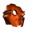
The Marlfox Posted November 28, 2011 Share Posted November 28, 2011 whoaaa! that' so cool! i really like the closeup of his head. i like how bulky you made him. Quote Link to comment Share on other sites More sharing options...
PooZy Posted November 28, 2011 Share Posted November 28, 2011 IMO arms need to be bulkier.Tail needs to be made of lots of chunky segmentsthen this would be PERFECT, It's a very good MOC. I especially like how it actually resembled canon shadowed one but in a way that looks... well.. good. Torso is excellent and has some real depth to it. Quote Link to comment Share on other sites More sharing options...
Ice the Great Posted November 28, 2011 Share Posted November 28, 2011 Love it. I could see that vaporizing Ancient. I could see that guy being an evil spymaster.When does this become official? (Saying that as if it's already happening, because it really should) Quote The Fleet - MoC FlotillaThe Exo-Toran! Link to comment Share on other sites More sharing options...
Zarohum Posted November 28, 2011 Share Posted November 28, 2011 (edited) OH MY GOD! YES! YES! THIS IS ABSOLUTELY PERFECT! Except get rid of the third leg/tail. Its purpose has been fulfilled in the bad set form. I doubt you need it. GET RID OF IT!But yeah, get rid of the third leg/tail, and I'd give you 12/10. Edited November 28, 2011 by Zarohum Quote Link to comment Share on other sites More sharing options...
Paleo Posted November 28, 2011 Share Posted November 28, 2011 I love the head. It seems quite… theshadowedone-ish?I like the hip and legs, they're very well designed and flow. However, the arms are disproportionately thin compared to the rest of the MOC, and the hands seem a little large as well. I would try to make the whole thing sleeker.Also, I like the story accurate tail! Quote Flickr Link to comment Share on other sites More sharing options...
Akuna Toa of Sonics Posted December 1, 2011 Share Posted December 1, 2011 You've fixed so many aspects of TSO, yet kept the whole look to it! The chest is simply stunning, and the legs are amazing.But, I feel the shoulders are pressed too far back and are too skinny compared to the torso. Quote Does anyone want to play the Master Chief Collection with me? I'm trying to get a team going for ranked. PM for GT. Link to comment Share on other sites More sharing options...
.:Dandezille:. Posted December 3, 2011 Author Share Posted December 3, 2011 I feel the shoulders are pressed too far back and are too skinny compared to the torso.if you look closely at the back shot, the shoulders are on ball joints, so they can move forward and backward Quote Link to comment Share on other sites More sharing options...
BZCoolness Posted December 4, 2011 Share Posted December 4, 2011 The tail and arms could use a little more bulk-up, but other than that it looks great! And may I commend you on the use of the Fenrakk head piece. 9.5/10 Quote *Insert some sort of banner or photograph here* Link to comment Share on other sites More sharing options...
Fisch Posted December 4, 2011 Share Posted December 4, 2011 Oh man, I remember the shadowed one. He (or she?) was my favorite combiner back in the day. Really like what you've done with it, my only complaint is the tail is a bit awkward. Quote Link to comment Share on other sites More sharing options...
The 1st Shadow Posted December 19, 2011 Share Posted December 19, 2011 Absolutely gorgeous! I feel that this figure suits the character of TSO much better than the original. The build makes hm look much stronger, more agile, and just adds an air of power that his canon form doesn't carry. Nice work! Quote ~Your friendly, neighborhood Shadow ~Credit for Avatar and Banner goes to NickonAquaMagna~ Link to comment Share on other sites More sharing options...

Recommended Posts
Join the conversation
You can post now and register later. If you have an account, sign in now to post with your account.
Note: Your post will require moderator approval before it will be visible.