

Shakar
-
Posts
132 -
Joined
-
Last visited
Content Type
Profiles
Forums
Gallery
Events
Blogs
Store
Raffles
Blog Comments posted by Shakar
-
-

Did somebody say..LOBELIAAAAA?OR just have a lobelia tea.~EW~

-

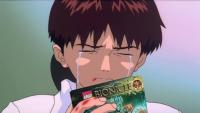
Shakar is getting Berix, for his dark blue Toa feet, for his light blue Tahu Mata sword, and for his awesome helmet.
Shakar
-

Virgo Shaka did it, of course. On Chuck Norris's behalf.
Shakar
-

BUNDA DIDNT SAY ANYTHING ABOUT SEPHIROTH-SAMA
IM GONNA REPORT U
-
Probably just for the lulz.
-

-
 NO THANKS I PREFER MY STORK
 -
BOTH ARE YES
BtB
-
"Ew"?
"Lime"?
...
HERETIC. TRAITOR. BURN HIM AT THE STAKE.


Should've used Nocturn, but whatever.
Anyway, I agree with your comments TOM, cept that weird Latin-esque plural name (it is neutral, so you use -a).
Shakar
-

Forgive me if I've already given it to you. Ayway, your sister is....
-
Best. Bionicle song. Ever.
Congratulations to Christine Lorentzen. She sings very well, she's got a powerful voice and her English pronunciation is good, not to mention she's one beautiful girl (the short haircut suits her more, IMO).
Shakar
-
I really don't consider the quality of a set basing on the pins, but I really feel that blue pins and red axles (especially the red axles) ruin the flow of the colour scheme. Takanuva 2008 is a very painful example of this.It's not really sarcasm... it's an issue I see some people will have. Hopefully people aren't yet to the point where they swear off sets of this quality based on the colors of the pins.No, I don't give a flea's ears about pin colors, but there are many people who do enough to take offense at any canister set or smaller with a high number of pins, thus I'm warning anyone who feels the need to take that a step further.
I agree on the Axalara Miru. The eyes are more reminiscent of a Kakama Mata and it looks way too squished and evil IMO- definitely not a Miru Nuva. Just a question that has been bugging me for a while....is the spiked visor compatible with the other masks that are supposed to have a visor? I really wanna see it attached to the Miru Phantoka.It's sarcasm to a certain degree. I really, really hate the Miru Nuva on the Axalara version of Lewa Nuva. Its spines are not even in the same number, let alone the same places, as those on the original Miru Nuva. And it features the same propellor-cheeks as the Phantoka version except ridiculously squished, eliminating even the slightest notion that those propellors have a function. Let's not even get into the Miru/Miru Nuva similarities that have been thrown to the gutter for this mask's sake. It doesn't seem to me at all impossible to make a new mask to fit this visor and actually maintain Miru Nuva similarities of the Phantoka version, such as the spike on top of the head, so it was appalling for LEGO to have casually tossed aside such an opportunity, choosing rather to produce a mask that at best looks badly squished and stretched.
You are welcome. I think you're full of good ideas and I like reading your thoughts. I'll be sure to comment here again.Thank you! I hope that sometime I can go the next step and make a picture review, which I know is often very helpful.Shakar
-
What does this mean?Replacing all those blue pins will vastly deplete your resources of black ones. (but come on, who wastes their time on that?)
Is this sarcasm? If it is I don't understand what this means either.Replacing all those blue pins will vastly deplete your resources of black ones. (but come on, who wastes their time on that?)Sorry, guys, you don't get a horrendous new Kakama Nuva that destroys the sanctity of the original. I hear a lot of whining for LEGO to give us one of those.
Good review, BTW.
Shakar
-

C'mon guys! Only 18 days before Shakar's birthday!
.......I don't want it to begin........schoooooooooool....
-
SWOOOOOOOOOOOOOOOOOOOOOOOOOOOOOOOOOOOOOOOSH
-
You pretty much stole the words from my mouth. I think that the majority of those who look at the artwork forum isn't an art expert, they just want some good looking, eye catching art. So, while the second one has definitely more effort put into it, the first one seems to attract more views.Catchiness. The former provides more to talk about and is more inventive and original -- thus catchy. That catches my eye more. Second link is technically better art, but there's really not that much to say about it. It's kinda run-of-the-mill in terms of content (rather than style and method) in comparison.Plus there's more improvement suggestions to give about the first one, which adds to the number of posts.
Shakar
-
no guius (sp) this is alll wrong te smbol of th ignika and mata nuil loock like a x that mean that mata nui is from xia so hes roodaka!!1 lol hes a femal


-

I also was pleasantly surprised that there was no romance stuff.
And the ending was just awesome. Me and my dad bursted into laughter.
Shakar
-

Not bad. Ed does need a pair of big cool anime eyes however.
Shakar
-
Uh...maybe he was actually responding to Biomech's joke? I don't know.He needs to watch it? lol anyone with a sense of humor can tell what Bio said was a joke.
Shakar
-
TELL ME WHERE IS GANDALF, FOR I MUCH DESIRE TO SPEAK WITH HIM.
My dad loves this, too.
Shakar
-
Uhm... "Cold Justice"?
-
I'm from Italy! I am dying to know what you mean by different culture...Culturally, it’s not that different; I just visited Italy on vacation – now THAT’s a different culture.Shakar
-
 IT WASN’T RIGHT THE FIRST TIME! WHY THE HECK WOULD IT BE RIGHT THE NEXT TEN TIMES?
Hey Peoples
in blogs_blog_142
A blog by Bundalings in General
Posted
This one. I mean, it's supposed to be LARISKA.
Shakar