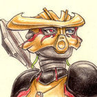
Taka Nuvia Posted July 13, 2012 Share Posted July 13, 2012 click the thumbnail or this link to view the full image [841px × 1152px; 383 kB]~:][:~What can I say about this? Several things, actually. I tried to do something different, and decided that sticking to only a few colours would do the trick. In the end I used far more shades of blue and turquoise than originally intended, but it was certainly an interesting experience. ^^Look, a background.The design of the Toa was very loosely based on a character from my comics, but I doubt anyone would recognise that. Coloured pencils are great for colouring. My favourite medium. <3Comments and Criticism greatly appreciated. =) Quote My art collection topic - updated! (21/09/2021) Link to comment Share on other sites More sharing options...
Eeko Posted July 13, 2012 Share Posted July 13, 2012 Oh wow. I think you've outdone yourself here Taka.Only using blues looks really cool, it makes the whole piece seem very sad.I love the shadow It's perfect, and doesn't look like it was easy to pull off.I can't really find anything "wrong" with this, but it would be neat if there were some reflections in the puddle.Great job on this Taka! Quote Link to comment Share on other sites More sharing options...
Mare Tranquillitatis Posted July 13, 2012 Share Posted July 13, 2012 Hmmm, I think I've seen this Toa before... Can't say where, but I feel like I've seen this one in one of your comics.Whatsoever, this one's one of my overall favourites, perhaps your best in my opinion. Actually, I've always loved monochromatic designs. The cave is represented very well, with the stalactite and the stalagmite and the rocks on the ground. And the title fits nicely with the theme, yet it intrigues the reader and makes him/her say "Contemplation? What does that mean? How's that?" and, ta-da, here that he/she looks for the answer. That's one of the most important things when drawing/writing and posting the final result.Nothing more could be said, I think. Your style is easily recognized, the design is good, colouring is perfect. This recent ( you made it yesterday ) piece of your art deserves a 10/10. Very good job! Quote Link to comment Share on other sites More sharing options...
Nuparu1995 Posted July 13, 2012 Share Posted July 13, 2012 Great organic look to the face. And the shading definitely makes the monochromatic color scheme work!! Quote Nuparu1995 92% of teens have moved onto rap.If you are part of the 8% that still listen to real music, copy and paste this into your signature. R.I.P. - 7/20/2012 Link to comment Share on other sites More sharing options...
AuRon the champion Posted July 15, 2012 Share Posted July 15, 2012 What is this? =O Excellent job! I think I know who you tried to draw here... But knowing me and my guesses, I don't think mein guess it right. Overall, again we see the very "human" side of the BIONICLE-verse. Is said characters armor supposed to be blue? Or is that reflection from the water? Quote BZPRPG Characters Link to comment Share on other sites More sharing options...
Sybre Posted July 15, 2012 Share Posted July 15, 2012 The art is so beautiful and human-like with a relaxing setting.And isn't that the Toa of Powers? Quote mindeth the cobwebs Link to comment Share on other sites More sharing options...
Toa Turing Posted July 16, 2012 Share Posted July 16, 2012 This is really good. i love the shading and the detail. The background looks good too. Quote I really need a better signature. Link to comment Share on other sites More sharing options...
Taka Nuvia Posted August 6, 2012 Author Share Posted August 6, 2012 Oh wow. I think you've outdone yourself here Taka.Only using blues looks really cool, it makes the whole piece seem very sad.I love the shadow It's perfect, and doesn't look like it was easy to pull off.I can't really find anything "wrong" with this, but it would be neat if there were some reflections in the puddle.Great job on this Taka!Thanks a lot! =DTrue, true, and to be honest I was quite surprised by how much colour actually adds to the atmosphere of a drawing. I mean, knowing it, and seeing it are two entirely different things... so yeah, glad it came out well. ^^Funny, I didn't find the shadow ( on the wall) to be that very hard to do. The shading, however... no, that neither; the trick is to work with dozens of faint layers. ^^... yeah, and I had some reflections in the original concept, but then decided against it. why? Not sure. Maybe I was just lazy. Maybe because I am not sure whether a glowing puddle would nactually reflect something. :shrugs:Thanks again!Hmmm, I think I've seen this Toa before... Can't say where, but I feel like I've seen this one in one of your comics.Whatsoever, this one's one of my overall favourites, perhaps your best in my opinion. Actually, I've always loved monochromatic designs. The cave is represented very well, with the stalactite and the stalagmite and the rocks on the ground. And the title fits nicely with the theme, yet it intrigues the reader and makes him/her say "Contemplation? What does that mean? How's that?" and, ta-da, here that he/she looks for the answer. That's one of the most important things when drawing/writing and posting the final result.Nothing more could be said, I think. Your style is easily recognized, the design is good, colouring is perfect. This recent ( you made it yesterday ) piece of your art deserves a 10/10. Very good job!I too wonder where :PWow, thank you, this really means a lot to me. Seriously. Even more because this was a very...ö experimental drawing, so I'm really really happy that you like it.The title. Hm. Well, I actually hate giving my art titles, because IMO they force the viewer into a distinct direction, leaving little to the imagination - unless they're cryptic. Like this one. ^^A 10/10? Thanks a lot! =DGreat organic look to the face. And the shading definitely makes the monochromatic color scheme work!! Really glad to hear that. ^^ And that you enjoy the organic design.What is this? =O Excellent job! I think I know who you tried to draw here... But knowing me and my guesses, I don't think mein guess it right. Overall, again we see the very "human" side of the BIONICLE-verse. Is said characters armor supposed to be blue? Or is that reflection from the water?Well, as said, the Toa's design was just very loosely based on a character from my comics; in the end I realized that I'd moved quite far away from that first idea, so basically, it could be any Toa.It's supposed to be because of the water, but it didn't quite turn out that way; no I think you can chose which idea you like better. ^^The art is so beautiful and human-like with a relaxing setting.And isn't that the Toa of Powers?Thank you =3Maybe? Who knows. As pointed out earlier, the Toa's design was just based on... well yes, the Toa of Powers. although he's barely recogniseable by now. ^^This is really good. i love the shading and the detail. The background looks good too.Thanks! =DMhm, I fear caves are the only settings/backgrounds that I'm actually able to draw Maybe I should get back to practising landscapes... Quote My art collection topic - updated! (21/09/2021) Link to comment Share on other sites More sharing options...

Recommended Posts
Join the conversation
You can post now and register later. If you have an account, sign in now to post with your account.
Note: Your post will require moderator approval before it will be visible.