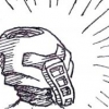
Dwanny Posted July 21, 2012 Share Posted July 21, 2012 When i saw the Flash Fire contest, i said 'By golly, i'll enter this thing if it's the last thing i do'.So i did.Deep linked for your convenienceThe reason it's so small, is because it had to be. This is the size you will see now, later, at brickfest and probably for the rest of its time as a BZP topic.I intentionally went for the "focused on a couple of bits but completely ignoring other ones" look.You see, it's all about the expression.In this scene in MoL, takua is excited, curious, perhaps even a little bit clumsy.Now imagine takua with a different personality.In this case, he's a little bit cautious.Having picked up the totem, he stops. He thinks about what he has done (not the takua we know, then).He realises that this could be an object of importance, and that it could have the potential to be life-changing.For brief moments, doubt flickers in his mind.This is those few moments.Enjoy.-Dwanny Quote Find me over here! http://danielvangele.tumblr.com/ Link to comment Share on other sites More sharing options...
FrozenFlash Posted July 21, 2012 Share Posted July 21, 2012 Awesome! It great that it's the MoL version of Takua. The torso and the mask are both well done. The frowning face is also a great addition. Nice job on this! Quote Link to comment Share on other sites More sharing options...
Toa Turing Posted July 22, 2012 Share Posted July 22, 2012 This is really good! The details are nearly perfect, even down to the expression. It would have been better colored, but I know how hard that can be. Quote I really need a better signature. Link to comment Share on other sites More sharing options...
Dwanny Posted July 23, 2012 Author Share Posted July 23, 2012 This is really good! The details are nearly perfect, even down to the expression. It would have been better colored, but I know how hard that can be.Thanks!In truth, i thought it wouldn't have looked very good in colouring, mainly due to shading, but also for other reasons.So yeah, the shading.I know shading can work with colour, and can look very good that way, but i prefer shading in but one colour.It adds liveliness and contrast to the piece, wich colouring would have surely broken up.You see, colour tends to distract from the things that are actually important.The shape, the details (!), the structure...Colour can make a drawing look more finished, but it cannot quite make it look better. On the contrary.Also, black and white MoL style is pretty much my signature when it comes to drawing bionicles. :PI'm glad you liked it^^ Quote Find me over here! http://danielvangele.tumblr.com/ Link to comment Share on other sites More sharing options...
Terra Nuva Posted July 23, 2012 Share Posted July 23, 2012 I really can't think of any criticism. Very nice job. Quote Link to comment Share on other sites More sharing options...
Nuparu1995 Posted July 23, 2012 Share Posted July 23, 2012 Definitely one of my favorites for this competition so far! Looks exactly like the MoL rendition!! Quote Nuparu1995 92% of teens have moved onto rap.If you are part of the 8% that still listen to real music, copy and paste this into your signature. R.I.P. - 7/20/2012 Link to comment Share on other sites More sharing options...
Lemony Lepid Posted July 28, 2012 Share Posted July 28, 2012 although the legs are a little short, it is great! Quote ~~ Link to comment Share on other sites More sharing options...
Taipu1 Posted July 29, 2012 Share Posted July 29, 2012 A brilliant movie style Takua there. I've been working on trying out Takua's kanohi as a new avatar, it's difficult to get it right. You've done a great job on it. Quote - Taipu1.HighFly MatoranShowdownBZPRPG ProfilesHave you seen my Blog? I understand if you haven't Link to comment Share on other sites More sharing options...
Dwanny Posted July 30, 2012 Author Share Posted July 30, 2012 A brilliant movie style Takua there. I've been working on trying out Takua's kanohi as a new avatar, it's difficult to get it right. You've done a great job on it.Gee, thanks! It took ages to get right, and i felt quite accomplished when i had it done.Sadly, i forgot about FF for a while after... i only remembered it the day before the deadline, wich is why the body isn't as finished as the head.If you look closely, you might just be able to make out some of the failed attempts, though they were done in 2H pencil, wich doesn't turn up very well on my scanner... Quote Find me over here! http://danielvangele.tumblr.com/ Link to comment Share on other sites More sharing options...
Taka Nuvia Posted August 17, 2012 Share Posted August 17, 2012 How come I haven't seen this before?`D=It's so adorable, and as you know I simply adore your drawing style. It's always so full of emotion. And you got the facial expression 100% right. I am moved by looking at it, and that's quite something. :3My only point of 'criticism' is that the head appears a bit very large, even for a matoran. Apart from that, it's nearly perfect. This is really good! The details are nearly perfect, even down to the expression. It would have been better colored, but I know how hard that can be.Thanks!In truth, i thought it wouldn't have looked very good in colouring, mainly due to shading, but also for other reasons.So yeah, the shading.I know shading can work with colour, and can look very good that way, but i prefer shading in but one colour.It adds liveliness and contrast to the piece, wich colouring would have surely broken up.You see, colour tends to distract from the things that are actually important.The shape, the details (!), the structure...Colour can make a drawing look more finished, but it cannot quite make it look better. On the contrary.Also, black and white MoL style is pretty much my signature when it comes to drawing bionicles. :PI'm glad you liked it^^I'm not sure whether I agree with this. While I certainly see the appeal of monochrome artwork, or even pure black-and-white (which is incredible fun to do, I admit that), I wouldn't say that colour can't make a drawing look 'better'.It's different. You achieve different structures and textures, and it's possible to establish a certain mood.Of course, if it's too colourful, it can be really distracting. On the other hand, it can add another layer of detail to the image.... I don't think either is better than the other, they're just different ways to achieve different things. :3But yes, it's definitely your style, and a very recogniseable one, too. ^^ Quote My art collection topic - updated! (21/09/2021) Link to comment Share on other sites More sharing options...
Dwanny Posted August 21, 2012 Author Share Posted August 21, 2012 How come I haven't seen this before?`D=It's so adorable, and as you know I simply adore your drawing style. It's always so full of emotion. And you got the facial expression 100% right. I am moved by looking at it, and that's quite something. :3My only point of 'criticism' is that the head appears a bit very large, even for a matoran. Apart from that, it's nearly perfect. This is really good! The details are nearly perfect, even down to the expression. It would have been better colored, but I know how hard that can be.Thanks!In truth, i thought it wouldn't have looked very good in colouring, mainly due to shading, but also for other reasons.So yeah, the shading.I know shading can work with colour, and can look very good that way, but i prefer shading in but one colour.It adds liveliness and contrast to the piece, wich colouring would have surely broken up.You see, colour tends to distract from the things that are actually important.The shape, the details (!), the structure...Colour can make a drawing look more finished, but it cannot quite make it look better. On the contrary.Also, black and white MoL style is pretty much my signature when it comes to drawing bionicles. :PI'm glad you liked it^^I'm not sure whether I agree with this. While I certainly see the appeal of monochrome artwork, or even pure black-and-white (which is incredible fun to do, I admit that), I wouldn't say that colour can't make a drawing look 'better'.It's different. You achieve different structures and textures, and it's possible to establish a certain mood.Of course, if it's too colourful, it can be really distracting. On the other hand, it can add another layer of detail to the image.... I don't think either is better than the other, they're just different ways to achieve different things. :3But yes, it's definitely your style, and a very recognisable one, too. ^^Wow, i'm glad you like it so much! :DThere is a very good (if not lazy) reason for the head, and that is because in the flash fire competition, characters had to be a certain size.I drew the head first, and made the mistake of doing it well.Once i started working on the body, i realized i didn't have enough space left, but i was too proud of the head to erase it.When i say 'coloring', i mean 'the way i color'.not a pretty sight.I realize full well that color can lift a drawing from the ground, and give it a brisk push in the right direction- and i think you are living proof of that.sadly, i, unlike you, have not mastered the colored pencil.So for me, color drags the drawing way back to where it started from and then kicks it an additional six feet underground.yes, i should start experimenting more with color...what happens when i attempt coloringTo quote, not a pretty sight. Quote Find me over here! http://danielvangele.tumblr.com/ Link to comment Share on other sites More sharing options...

Recommended Posts
Join the conversation
You can post now and register later. If you have an account, sign in now to post with your account.
Note: Your post will require moderator approval before it will be visible.